A poster shouldn't just display a product. It should direct attention. This series explores how hierarchy, scale, and composition influence what we notice first-and what we remember.
Minimalism isn't about using less-it's about making every element matter. This concept blends editorial layouts, wow print aesthetics, and contemporary music branding into a single poster.
Minimalism meets chaos. Atlas Weekend Kyiv City blends oversized typography, scattered memories, and festival energy into a bold editorial poster experiment.
#posterdesign#typography#digitaldesign#swiss#grid
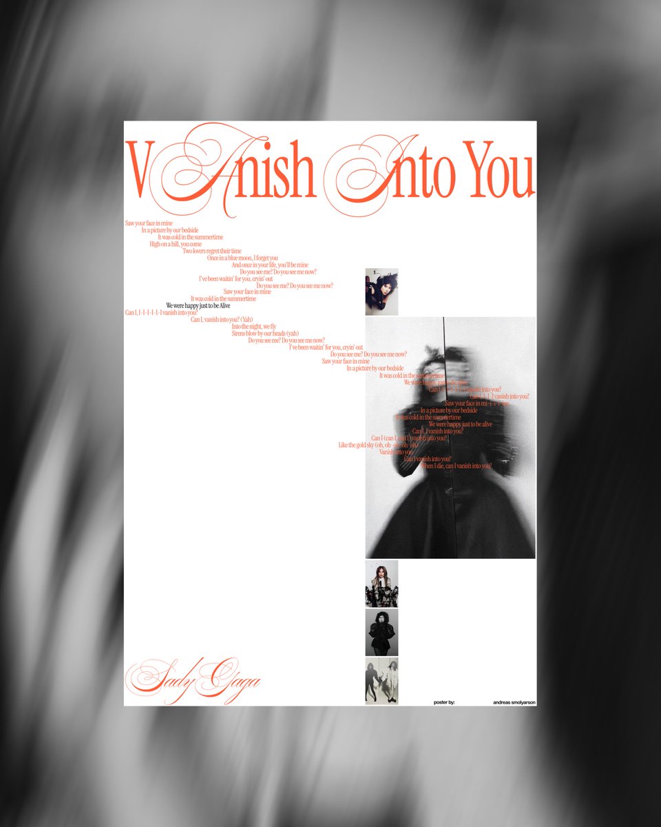
Editorial poster inspired by Lady Gaga’s “Vanish Into You” blending cinematic blur, luxury typography, and minimalist design.
#LadyGaga#PosterDesign#Typography
01:59:30. The barrier is gone. ⏱️
A minimalist look at Sebastian Sawe’s historic London Marathon run. Clean lines, bold type, and pure emotion.
#ADIZERO#Running#GraphicDesign#LondonMarathon







![smolyarson_1's tweet photo. White editorial music poster featuring a Spotify-style logo, bold orange “Can’t Stop The High” typography, multiple blurred black-and-white portrait crops, and a clean grid-based layout. "Non-commercial concept project. Images © @ladygaga ]. Typography: [@PangramPangram_ ]." https://t.co/7FqMZ97GDq](https://pbs.twimg.com/media/HKUkLP7XAAAm56d.jpg)