It is difficult to model a three dimensional topography in two dimensions. As much as I think it would be interesting to see the data as three dimensional mapping each view you present serve interesting at a glance information. The table allows a scan across price ranges to see what price segment differs. The line graphs show time series trending for list price to sales deltas. The buyer wants to know if they can offer less. The seller if they can price higher. The asset owner if they can transfer their asset without loosing capital. So I suppose a dashboard gauge indicator for each of those would be an interesting interpretative curiosity. Seems like these metrics are going to be under pressure with a rising 10Y treasury yield. I'm wondering what kind of lag there will be between yield rise and housing pricing response.
@KaiXCreator Stages:
* Yawn, boring
* WTF, hell no!
* No, I wrote my resume myself.
* You want me to babysit AI now???
* I'm going to spend more time in nature and with my family.
@KingKong9888 The bar was worth about $130 to $184 when this was filmed. The chocolate bar was worth about $2 at the time. They could have walked into the coin shop and walked away with $120 easy.
@GoldFishCharts It appears that if your chart is based on SGE daily volumes, the chart is under reporting volume as daily volume only reports matched same day trades, not trades that settle and deliver on different dates. Daily reports evidently also do not report for low volume days.
@GoldFishCharts Correction, low daily delivery in January with some days showing no data. Only two entries in April show no data. I have a hard time believing there were no silver deliveries for 2 consecutive months.
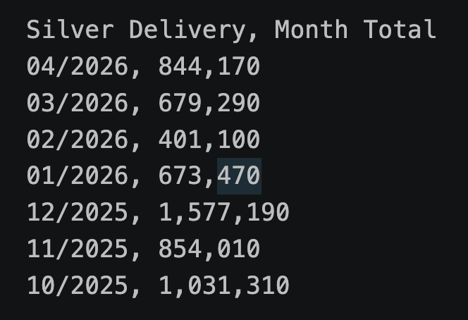
@GoldFishCharts The SGE silver delivery data does not make sense to me. The daily delivery data has no deliveries for any of 2/26 and 3/26 and several days in 4/26. Meanwhile the monthly delivery data shows delivery for every month: