A History of Stock Market Percentage Declines In Charts (15% to 50%+)
https://t.co/loRMy40jCK
There are loads of 15% and smaller declines. When a decline starts, inevitably, many claim it will turn into the next great crash. Yet even 30% declines are very rare.
Here's the data, in charts, back to 1871.
Yes, this recent bout of volatility hasn't been fun for investors, but remember, volatility is the toll we pay to invest.
These three charts are timeless and always come in handy in times like this.
Chart 1 - The average years sees more than three separate 5% mild pullbacks a year and one 10% correction on average a year. This is our first 5% mild pullback since November, it happens.
Chart 2 - Peak-to-trough the S&P 500 corrects 14.1% on average since 1980. Looking closer at those past 46 years, 24 of them saw a 10% correction and incredibly 14 of those years still finished higher.
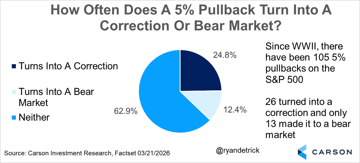
Chart 3 - We are in a mild correction, but how often do things get worse? 24.8% of the time stocks move into a correction and only 12.4% do they move into a bear market.
Markets correct through price or time!
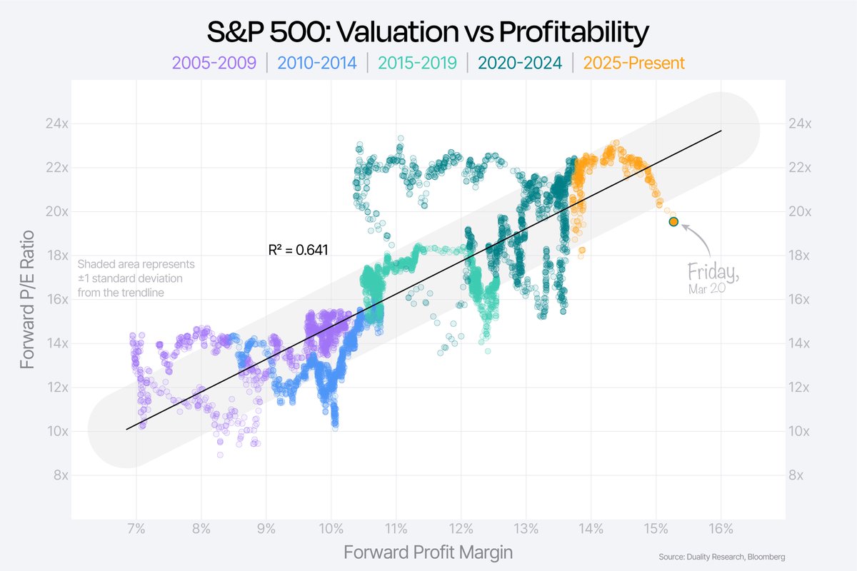
In this case, a lot of the work had already been done through time, with strong earnings growth bringing valuations down even before the Middle East conflict.
The recent selloff has just accelerated that — but most people are still focused on the relatively small price drop from the highs.
(Link in reply to read more)
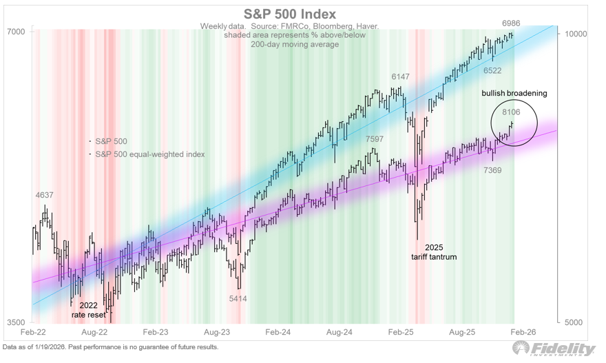
At least for now, the US stock market is rebalancing in one of the best ways possible. The mega caps seem to be taking a rest while the rest of the market breaks out. For now, the broadening is not a zero sum game.
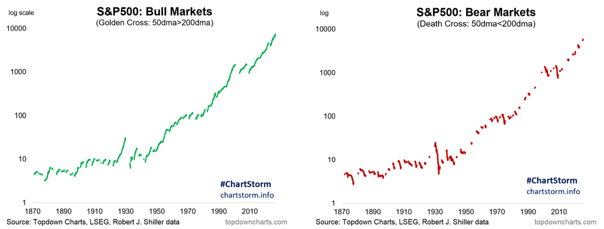
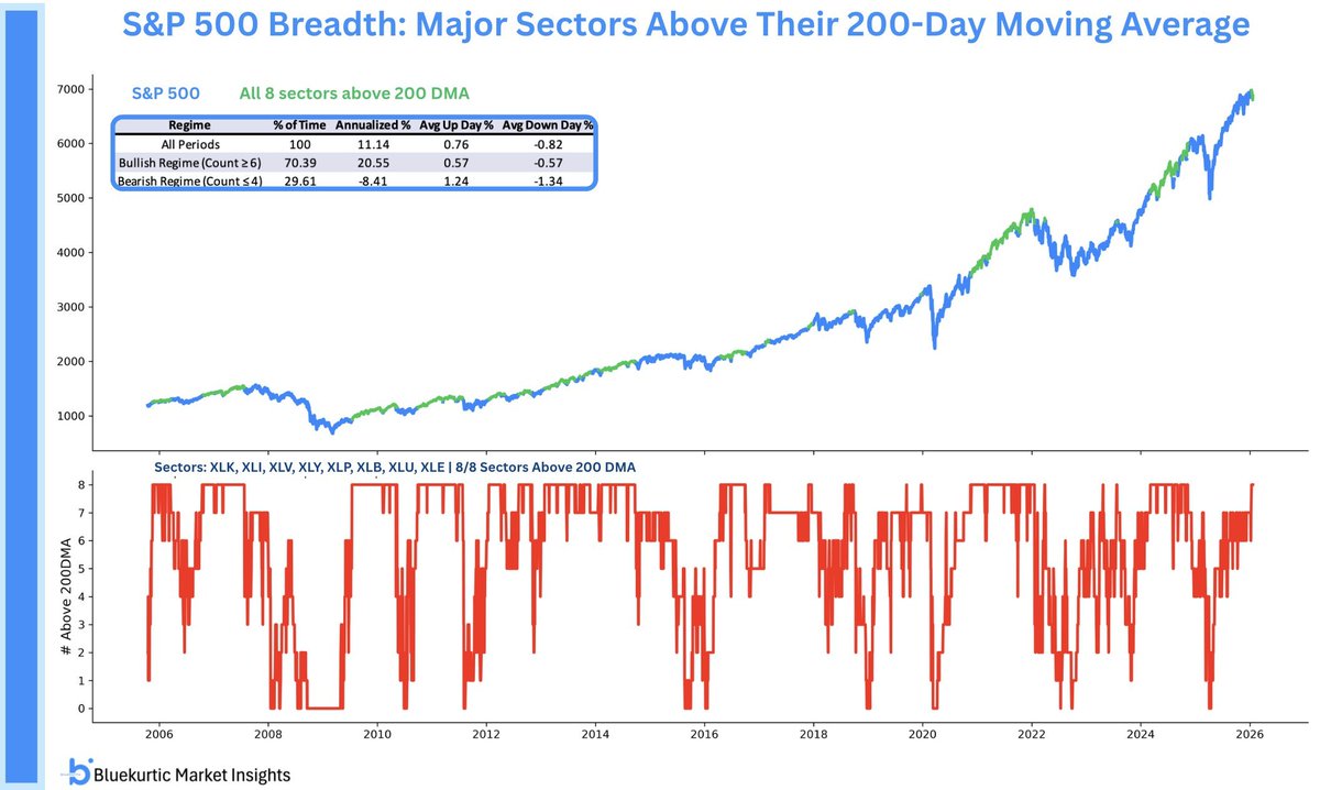
When at least 6 S&P 500 sectors trade above their 200-day moving average, forward returns for $SPY have historically been stronger. Today, all 8 major S&P 500 sectors are above their 200DMA. A sign of broad market participation.
Best Trading Indicator To Build A Strategy Upon—200-day Moving Average & 10-month Moving Average https://t.co/mEuGKb3K1I
Meb Faber: A Quantitative Approach to Tactical Asset Allocation (2013) https://t.co/si0I6K67RY
Faber Tactical Asset Allocation (2025) https://t.co/MxnEP2gWE3
Best Trading Indicator To Build A Strategy Upon (200-day Moving Average & 10-month Moving Average) https://t.co/KfUrnXclDX
Meb Faber: A Quantitative Approach to Tactical Asset Allocation (2013) https://t.co/si0I6K6FHw
The S&P 500 is up more than 35% the past six months, for one of the best six-month rallies in history.
The five other times this happened (since 1950) saw stocks higher a year later each time.
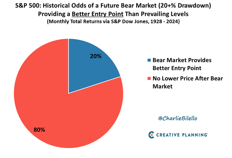
Are you waiting for a Bear Market to invest?
This is a great idea in theory, but historically only 20% of future Bear Markets brought prices below prevailing levels.
Video: https://t.co/aaBQflVP8q