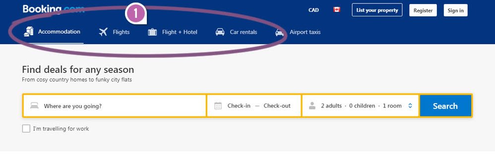
Booking replicates Google's experiment using navigation links WITH icons. Sweet. As evidence piles up like this, predictions of better design get easier - paving the way for further imitation. :) https://t.co/6Cmqh2ULot
reason you shipped a shitty UI:
- PM/ENG/Legal/... made me do it
- other company(s) did it
- A/B testing results
- just followed guidelines
reason you shipped an awesome UI:
- understood the problem you’re solving & the people you’re solving it for
Подтверждаю эту гипотезу на своем опыте. на всех проектах, с которыми работал раньше. Amazon's $10B Growth Hack That Nobody Knows About https://t.co/CxIFriDFnN
Looks like Safari will start reducing 1st party cookie expiry to 1 day when cookie is set on landing page from a tracking domain (https://t.co/IF1xPWIlQr, https://t.co/iqJnHVp6EN) and url has non-empty query string or hash (fbclid, gclid).
https://t.co/bLckI75iho
#measure#ppc
This is so cool - you can programmatically build your own User Explorer -type queries with this new GA API:
https://t.co/xgFgOVAbGF
The granularity it introduces to session parsing is impressive. You can analyze individual paths with more detail now.
#measure#googleanalytics
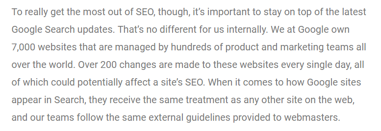
У компании #google своих сайтов 7 тыс (сервисы, форумы, туториалы и т.д.), и они вносят больше 200 правок ежедневно, точно так же улучшая свои сайты для нас, как мы их улучшаем для своих клиентов https://t.co/3RoyYArh01
We've got an incredible deal going on until EOD Tuesday. ROUNDTRIP - Los Angeles • Sydney • Singapore • Bangkok • Beijing • Los Angeles for ONLY $999 per passenger. Hurry before the deal runs out! #TravelDeals#FlashFlight#Sale
BUY HERE: https://t.co/EDeZAEWRZv
@Atamovich@fenixru@vigodnee@Zhandosweb Людям важен контент, дизайн вторичен и только помогает комфортно потреблять контент, а также задает настроение при посещении сайта
Размер шрифта для текстов на сайте должен быть не меньше, чем размер, когда вы переключаете на режим "для чтения" в Safari на iPhone — тогда вашим посетителям будет намного легче "потреблять" ваш контент
@Zhandosweb Не могу сказать точно, но я всегда ориентируюсь на 17-18px. На некоторых сайтах можно и 19px. Главное, чтобы шрифт можно было легко прочитать даже людям 45+, у которых зрение уже не в лучшем состоянии