Today's article on Nightingale is an exceptional piece that translates research to practical #dataviz recommendations on how we can avoid perpetuating bias through our charts.
Must read: https://t.co/wsHy1lltYP
Princeton Architectural Press called designers and artists to create posters that evoke a sense of urgency and action in countering the climate crisis.
Of a 1,000 entries, 50 were chosen and collected as a book: POSTERS FOR THE PLANET. @PAPress
https://t.co/wbRZgigf6y
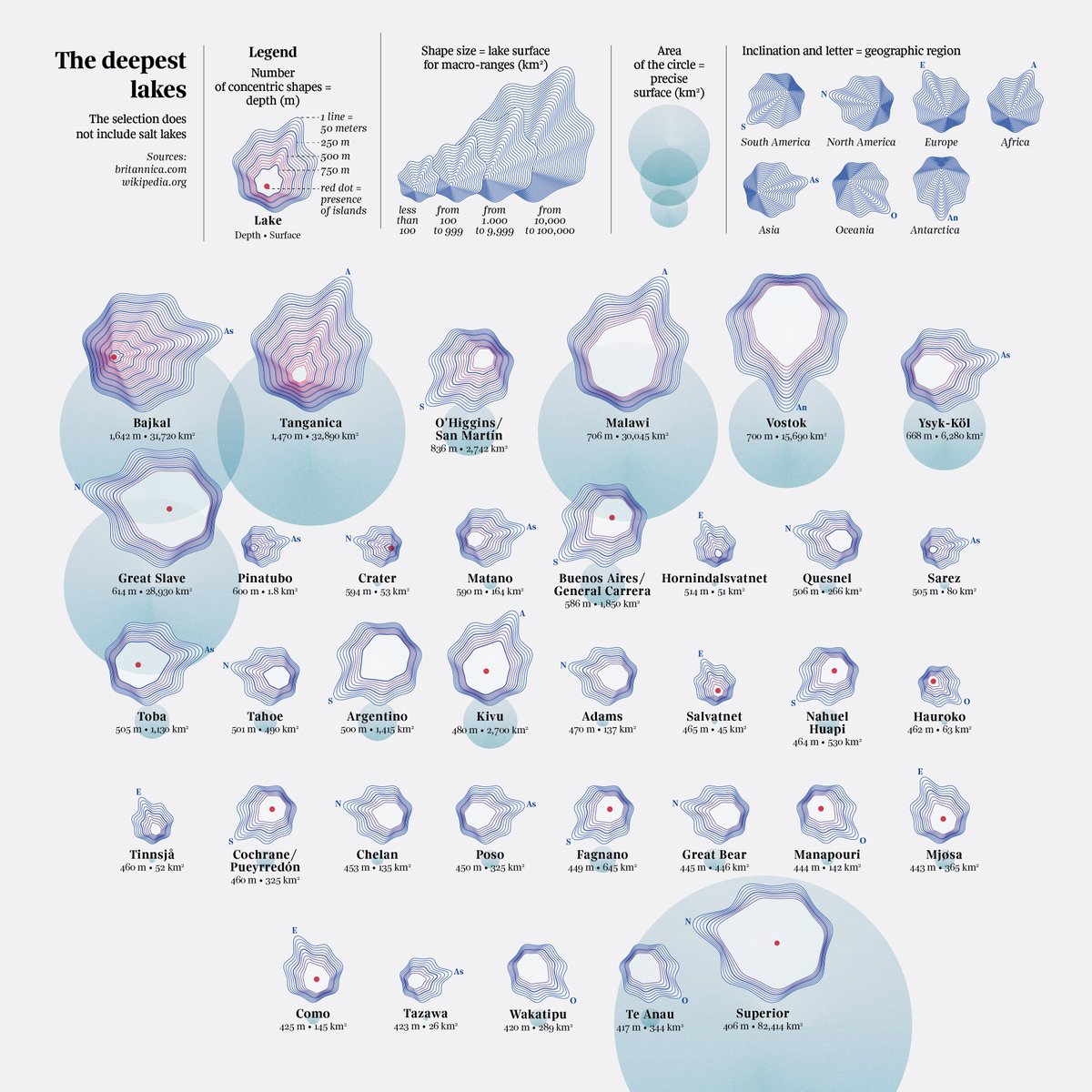
New amazing @CREDS_UK data visualisations by @fedfragapane
In our search for demand-side flexibility we analyse how #energy demand goes hand in hand with what people do and price of #electricity
https://t.co/QTH5Y5FF6R
Great write-up in today's Guardian by @Odangaring about the real-life consequences of #disinformation spread on social media platforms in #Kenya. The link to his full report is in the story. Read it. https://t.co/91z1YKR1A3
Oooh, nice, the awesome @ONS has released template spreadsheets for the big Census data drop next Tuesday so you can get your data ingestion code working ahead of time!
We need you! ☝
We are currently carrying out a follow-up review of @ONS’s COVID-19 Infection Survey (CIS) and want to hear feedback from users of the statistics.
Complete our short survey: https://t.co/4kNrKy95mU
Disinformation has real-life consequences for #HumanRights. We're proud to have supported @ISDglobal and @TheSyriaCmpgn to design and visualize their #data-driven report 'Deadly Disinformation', covered in... https://t.co/XKWmdbukfX
Do you know someone who was on holiday in Sanday at the end of May, who has now gone home to Ealing in west London? They might - without realising it - have taken a bird tracker with them, which fell off an oystercatcher. And it's been tracking their every move. (1/2)