I read this and realized my setup already does 80% of what you describes plus agents that act on the knowledge autonomously.
Broke it down in a thread → https://t.co/2xzJlgN8AC
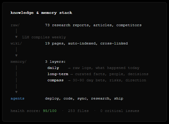
LLM Knowledge Bases
Something I'm finding very useful recently: using LLMs to build personal knowledge bases for various topics of research interest. In this way, a large fraction of my recent token throughput is going less into manipulating code, and more into manipulating knowledge (stored as markdown and images). The latest LLMs are quite good at it. So:
Data ingest:
I index source documents (articles, papers, repos, datasets, images, etc.) into a raw/ directory, then I use an LLM to incrementally "compile" a wiki, which is just a collection of .md files in a directory structure. The wiki includes summaries of all the data in raw/, backlinks, and then it categorizes data into concepts, writes articles for them, and links them all. To convert web articles into .md files I like to use the Obsidian Web Clipper extension, and then I also use a hotkey to download all the related images to local so that my LLM can easily reference them.
IDE:
I use Obsidian as the IDE "frontend" where I can view the raw data, the the compiled wiki, and the derived visualizations. Important to note that the LLM writes and maintains all of the data of the wiki, I rarely touch it directly. I've played with a few Obsidian plugins to render and view data in other ways (e.g. Marp for slides).
Q&A:
Where things get interesting is that once your wiki is big enough (e.g. mine on some recent research is ~100 articles and ~400K words), you can ask your LLM agent all kinds of complex questions against the wiki, and it will go off, research the answers, etc. I thought I had to reach for fancy RAG, but the LLM has been pretty good about auto-maintaining index files and brief summaries of all the documents and it reads all the important related data fairly easily at this ~small scale.
Output:
Instead of getting answers in text/terminal, I like to have it render markdown files for me, or slide shows (Marp format), or matplotlib images, all of which I then view again in Obsidian. You can imagine many other visual output formats depending on the query. Often, I end up "filing" the outputs back into the wiki to enhance it for further queries. So my own explorations and queries always "add up" in the knowledge base.
Linting:
I've run some LLM "health checks" over the wiki to e.g. find inconsistent data, impute missing data (with web searchers), find interesting connections for new article candidates, etc., to incrementally clean up the wiki and enhance its overall data integrity. The LLMs are quite good at suggesting further questions to ask and look into.
Extra tools:
I find myself developing additional tools to process the data, e.g. I vibe coded a small and naive search engine over the wiki, which I both use directly (in a web ui), but more often I want to hand it off to an LLM via CLI as a tool for larger queries.
Further explorations:
As the repo grows, the natural desire is to also think about synthetic data generation + finetuning to have your LLM "know" the data in its weights instead of just context windows.
TLDR: raw data from a given number of sources is collected, then compiled by an LLM into a .md wiki, then operated on by various CLIs by the LLM to do Q&A and to incrementally enhance the wiki, and all of it viewable in Obsidian. You rarely ever write or edit the wiki manually, it's the domain of the LLM. I think there is room here for an incredible new product instead of a hacky collection of scripts.
Built this in ~30 days. First client revenue is already flowing through the system.
The setup is open and reproducible. Ask me about any specific part — or show me yours. Curious what other production agent stacks look like.
@karpathy described building an LLM knowledge base for research.
I built one that runs 3 businesses while I sleep.
Same foundation — markdown wiki, auto-indexed, no RAG — but extended into a full operating system for a solo founder. Here's the setup 🧵
Karpathy says there's "room for an incredible new product."
I think the pieces exist: OpenClaw for the runtime, Claude/Codex for the brains, markdown for the format.
What's actually missing is the month of iteration — shaping the memory, writing the right AGENTS.md, teaching agents to trust the knowledge base enough to act autonomously.
Vercel Sandbox is the easiest API to give your agent a computer. Now generally available.
Try it with our CLI:
▲ ~/ npx sandbox create --connect
GA highlights:
▪️ Now powering @blackboxai, @roocode, @v0
▪️ Snapshotting support for clone/fork/resume
▪️ Open-source SDK & CLI, refined APIs.
It builds on 10 years of lessons from Vercel's deployment hyper-growth. Think: battle-tested scheduling, placement, capacity planning, regional failover, OS patching, hardening & pentesting, zero-downtime machine upgrades, …
We're very excited for Vercel Sandbox to power your next AI agent and platforms 🫡
Create an OG image for your website with Nano Banana Pro:
Create a premium open-graph hero image for [BRAND]:
A wide horizontal layout (16:9 ratio) designed for social sharing, website headers, and marketing collateral. This is a high-end designer mockup presentation suitable for a branding portfolio or product launch. The focus is on clarity, balance, negative space and visual confidence.
LAYOUT STRUCTURE:
The composition is split into two clear zones with generous breathing room between them.
LEFT ZONE:
The [BRAND] logo and brand name are placed in the top-left corner. The logo is sized appropriately for the format, not too large, not too small. It reads clearly but doesn't dominate.
Below the logo, a single large headline is set in a clean, modern sans-serif typeface. The headline is short, typically 3-6 words maximum. It is confident, left-aligned, and sits comfortably within the left third of the canvas. The text color is derived from the brand palette.
RIGHT ZONE:
One floating, rounded rectangular panel suggesting a product interface, dashboard, or app screen. The panel has subtle depth, either through a soft drop shadow or slight elevation effect. The contents of the panel are suggestive rather than detailed, hinting at functionality without clutter.
The panel is angled very slightly or presented straight-on depending on what feels most balanced. It floats naturally in the composition, grounded by its shadow but with clear separation from the background.
NEGATIVE SPACE:
Strong use of negative space throughout. The background is clean and uncluttered. There is clear visual breathing room between the left text block and the right interface panel. Nothing feels cramped or crowded.
COLOR & STYLE:
Colors are drawn directly from the [BRAND] palette. The background can be a brand color, white, off-white, or a subtle gradient that complements the brand.
The overall style is flat or near-flat. No heavy gradients, no glossy effects, no 3D renders. Shadows are subtle and serve only to create gentle depth. Typography is modern, confident, and legible at small sizes.
MOOD & FEEL:
Clean SaaS homepage hero. Quiet confidence. The image should feel premium, polished and intentional. Every element is placed with purpose. The overall impression is of a company that knows what it's doing.
WHAT TO AVOID:
No stock photo elements. No people. No complex illustrations. No decorative graphics or patterns. No multiple interface panels. No visual noise. No text other than the headline and brand name. No borders or frames around the image.
OUTPUT:
A single 16:9 image with no watermarks, no mockup frames, and no external branding. Ready to use as an open-graph image, social header, or presentation slide.
[COUNTRY] — ultra-clean infographic poster (editorial + lifestyle)
Generated by Google Nano Banana Pro on Gemini app 📱
Full prompt ⤵️
Ultra-clean modern country infographic poster (1080x1080), premium editorial layout meets lifestyle travel photography.
Showcase [ENTER COUNTRY NAME] as the hero visual in the center: a slightly angled 3D map cutout / glossy paper-cut map silhouette with subtle shadow, with a small flag pin marker on the capital city. Add a soft natural studio lighting feel, gentle gradient + minimal texture background for an upscale magazine look.
Around the hero map, arrange information like a recipe infographic—dynamic, floating panels and clusters, not restricted to top-down. Clear hierarchy: hero map > key stats badges > cities/provinces > culture/foods > tips.
SECTION 1 — Quick Facts (clean glassmorphism badges near the hero):
- Capital: [CAPITAL]
- Population: [POPULATION]
- Currency: [CURRENCY]
- Language(s): [LANGUAGES]
- Time zone: [TIMEZONE]
- Best time to visit: [BEST SEASON]
Display as modern rounded pills/bubbles with accent color highlights.
SECTION 2 — Provinces/States/Regions (ingredients-style clusters):
List [NUMBER] provinces/regions with mini icons/mini map segments or simple pictograms.
Example: [PROVINCE 1], [PROVINCE 2], [PROVINCE 3]...
Each item includes a small icon (mountains, river, desert, forest, coastline) and one short label (e.g., “coastal”, “historic”, “wine region”). Arrange in curved flows connected with thin lines to the map.
SECTION 3 — Major Cities (connected pin points):
Show 5–8 key cities with small pin markers on/near the map and clean labels:
[City 1], [City 2], [City 3]...
Use lines/arrows from labels to map pins, avoiding clutter.
SECTION 4 — Signature Foods (recipe vibe):
Show 4–6 famous foods of [COUNTRY] with small tasty mini illustrations or photo-style cutouts:
[Food 1], [Food 2], [Food 3]...
Add short descriptors (spicy, street food, dessert, grilled). Keep vibrant natural food colors.
SECTION 5 — Culture & Highlights (editorial callouts):
Include icons and 1-line notes for:
- Famous festival: [FESTIVAL]
- Traditional music/dance: [CULTURE]
- Landmark(s): [LANDMARKS]
- Nature highlight: [NATURE]
Use clean vector icons and minimal text.
SECTION 6 — Travel Tips (step-like numbered panels):
Show 4–6 numbered “tips” panels arranged around the hero map with arrows showing flow:
1) [Tip 1]
2) [Tip 2]
3) [Tip 3]
Add small icons (plane, train, hotel, safety, budget, camera, SIM card). Use glassmorphism panels with soft gradients and subtle drop shadows.
Typography & Style:
Modern sans-serif typography, high readability, strong grid alignment, airy negative space, subtle shadows, crisp vector icons, accent color palette inspired by [COUNTRY] flag (tasteful, not overwhelming). Editorial, premium, ultra-clean, social-feed optimized.
Output requirements:
Ultra-crisp, no watermark, no logo, no extra text beyond the provided labels, balanced spacing, high contrast readability, 1080×1080.
“How It Works” Educational Dioramas
Gemini Nano Banana Pro Prompt:
Create a clear, 45° top-down isometric miniature 3D educational diorama explaining [PROCESS / CONCEPT].
Use soft refined textures, realistic PBR materials, and gentle lifelike lighting.
Build a stepped or layered diorama base showing each stage of the process with subtle arrows or paths.
Include tiny stylized figures interacting with each stage (no facial details).
Use a clean solid [BACKGROUND COLOR] background.
At the top-center, display [PROCESS NAME] in large bold text, directly beneath it show a short explanation subtitle, and place a minimal symbolic icon below.
All text must automatically match the background contrast (white or black).
Have you tried prompting with the word "risograph"? It makes a cool effect.
Prompt: Create a collection of icons representing [a theme], they belong together as a single theme. Put them in a 2x2 grid (no lines). The background is pure white. Make the icons as risograph prints. No text. No color distortion. Vibrant and not faded. Stochastic stippling and sand-like noise pattern within color fills. Each icon has a thick black outline.
The theme in this image was "cute but weird animals (that are real)".


![rincidium's tweet photo. Create an OG image for your website with Nano Banana Pro:
Create a premium open-graph hero image for [BRAND]:
A wide horizontal layout (16:9 ratio) designed for social sharing, website headers, and marketing collateral. This is a high-end designer mockup presentation suitable for a branding portfolio or product launch. The focus is on clarity, balance, negative space and visual confidence.
LAYOUT STRUCTURE:
The composition is split into two clear zones with generous breathing room between them.
LEFT ZONE:
The [BRAND] logo and brand name are placed in the top-left corner. The logo is sized appropriately for the format, not too large, not too small. It reads clearly but doesn't dominate.
Below the logo, a single large headline is set in a clean, modern sans-serif typeface. The headline is short, typically 3-6 words maximum. It is confident, left-aligned, and sits comfortably within the left third of the canvas. The text color is derived from the brand palette.
RIGHT ZONE:
One floating, rounded rectangular panel suggesting a product interface, dashboard, or app screen. The panel has subtle depth, either through a soft drop shadow or slight elevation effect. The contents of the panel are suggestive rather than detailed, hinting at functionality without clutter.
The panel is angled very slightly or presented straight-on depending on what feels most balanced. It floats naturally in the composition, grounded by its shadow but with clear separation from the background.
NEGATIVE SPACE:
Strong use of negative space throughout. The background is clean and uncluttered. There is clear visual breathing room between the left text block and the right interface panel. Nothing feels cramped or crowded.
COLOR & STYLE:
Colors are drawn directly from the [BRAND] palette. The background can be a brand color, white, off-white, or a subtle gradient that complements the brand.
The overall style is flat or near-flat. No heavy gradients, no glossy effects, no 3D renders. Shadows are subtle and serve only to create gentle depth. Typography is modern, confident, and legible at small sizes.
MOOD & FEEL:
Clean SaaS homepage hero. Quiet confidence. The image should feel premium, polished and intentional. Every element is placed with purpose. The overall impression is of a company that knows what it's doing.
WHAT TO AVOID:
No stock photo elements. No people. No complex illustrations. No decorative graphics or patterns. No multiple interface panels. No visual noise. No text other than the headline and brand name. No borders or frames around the image.
OUTPUT:
A single 16:9 image with no watermarks, no mockup frames, and no external branding. Ready to use as an open-graph image, social header, or presentation slide.](https://pbs.twimg.com/media/G_oFuAla8AAZ9WM.jpg)
![rincidium's tweet photo. Create an OG image for your website with Nano Banana Pro:
Create a premium open-graph hero image for [BRAND]:
A wide horizontal layout (16:9 ratio) designed for social sharing, website headers, and marketing collateral. This is a high-end designer mockup presentation suitable for a branding portfolio or product launch. The focus is on clarity, balance, negative space and visual confidence.
LAYOUT STRUCTURE:
The composition is split into two clear zones with generous breathing room between them.
LEFT ZONE:
The [BRAND] logo and brand name are placed in the top-left corner. The logo is sized appropriately for the format, not too large, not too small. It reads clearly but doesn't dominate.
Below the logo, a single large headline is set in a clean, modern sans-serif typeface. The headline is short, typically 3-6 words maximum. It is confident, left-aligned, and sits comfortably within the left third of the canvas. The text color is derived from the brand palette.
RIGHT ZONE:
One floating, rounded rectangular panel suggesting a product interface, dashboard, or app screen. The panel has subtle depth, either through a soft drop shadow or slight elevation effect. The contents of the panel are suggestive rather than detailed, hinting at functionality without clutter.
The panel is angled very slightly or presented straight-on depending on what feels most balanced. It floats naturally in the composition, grounded by its shadow but with clear separation from the background.
NEGATIVE SPACE:
Strong use of negative space throughout. The background is clean and uncluttered. There is clear visual breathing room between the left text block and the right interface panel. Nothing feels cramped or crowded.
COLOR & STYLE:
Colors are drawn directly from the [BRAND] palette. The background can be a brand color, white, off-white, or a subtle gradient that complements the brand.
The overall style is flat or near-flat. No heavy gradients, no glossy effects, no 3D renders. Shadows are subtle and serve only to create gentle depth. Typography is modern, confident, and legible at small sizes.
MOOD & FEEL:
Clean SaaS homepage hero. Quiet confidence. The image should feel premium, polished and intentional. Every element is placed with purpose. The overall impression is of a company that knows what it's doing.
WHAT TO AVOID:
No stock photo elements. No people. No complex illustrations. No decorative graphics or patterns. No multiple interface panels. No visual noise. No text other than the headline and brand name. No borders or frames around the image.
OUTPUT:
A single 16:9 image with no watermarks, no mockup frames, and no external branding. Ready to use as an open-graph image, social header, or presentation slide.](https://pbs.twimg.com/media/G_oFrWmbAAIrFjK.jpg)
![rincidium's tweet photo. Create an OG image for your website with Nano Banana Pro:
Create a premium open-graph hero image for [BRAND]:
A wide horizontal layout (16:9 ratio) designed for social sharing, website headers, and marketing collateral. This is a high-end designer mockup presentation suitable for a branding portfolio or product launch. The focus is on clarity, balance, negative space and visual confidence.
LAYOUT STRUCTURE:
The composition is split into two clear zones with generous breathing room between them.
LEFT ZONE:
The [BRAND] logo and brand name are placed in the top-left corner. The logo is sized appropriately for the format, not too large, not too small. It reads clearly but doesn't dominate.
Below the logo, a single large headline is set in a clean, modern sans-serif typeface. The headline is short, typically 3-6 words maximum. It is confident, left-aligned, and sits comfortably within the left third of the canvas. The text color is derived from the brand palette.
RIGHT ZONE:
One floating, rounded rectangular panel suggesting a product interface, dashboard, or app screen. The panel has subtle depth, either through a soft drop shadow or slight elevation effect. The contents of the panel are suggestive rather than detailed, hinting at functionality without clutter.
The panel is angled very slightly or presented straight-on depending on what feels most balanced. It floats naturally in the composition, grounded by its shadow but with clear separation from the background.
NEGATIVE SPACE:
Strong use of negative space throughout. The background is clean and uncluttered. There is clear visual breathing room between the left text block and the right interface panel. Nothing feels cramped or crowded.
COLOR & STYLE:
Colors are drawn directly from the [BRAND] palette. The background can be a brand color, white, off-white, or a subtle gradient that complements the brand.
The overall style is flat or near-flat. No heavy gradients, no glossy effects, no 3D renders. Shadows are subtle and serve only to create gentle depth. Typography is modern, confident, and legible at small sizes.
MOOD & FEEL:
Clean SaaS homepage hero. Quiet confidence. The image should feel premium, polished and intentional. Every element is placed with purpose. The overall impression is of a company that knows what it's doing.
WHAT TO AVOID:
No stock photo elements. No people. No complex illustrations. No decorative graphics or patterns. No multiple interface panels. No visual noise. No text other than the headline and brand name. No borders or frames around the image.
OUTPUT:
A single 16:9 image with no watermarks, no mockup frames, and no external branding. Ready to use as an open-graph image, social header, or presentation slide.](https://pbs.twimg.com/media/G_oFrWjaYAA-7MM.jpg)


![Strength04_X's tweet photo. [COUNTRY] — ultra-clean infographic poster (editorial + lifestyle)
Generated by Google Nano Banana Pro on Gemini app 📱
Full prompt ⤵️
Ultra-clean modern country infographic poster (1080x1080), premium editorial layout meets lifestyle travel photography.
Showcase [ENTER COUNTRY NAME] as the hero visual in the center: a slightly angled 3D map cutout / glossy paper-cut map silhouette with subtle shadow, with a small flag pin marker on the capital city. Add a soft natural studio lighting feel, gentle gradient + minimal texture background for an upscale magazine look.
Around the hero map, arrange information like a recipe infographic—dynamic, floating panels and clusters, not restricted to top-down. Clear hierarchy: hero map > key stats badges > cities/provinces > culture/foods > tips.
SECTION 1 — Quick Facts (clean glassmorphism badges near the hero):
- Capital: [CAPITAL]
- Population: [POPULATION]
- Currency: [CURRENCY]
- Language(s): [LANGUAGES]
- Time zone: [TIMEZONE]
- Best time to visit: [BEST SEASON]
Display as modern rounded pills/bubbles with accent color highlights.
SECTION 2 — Provinces/States/Regions (ingredients-style clusters):
List [NUMBER] provinces/regions with mini icons/mini map segments or simple pictograms.
Example: [PROVINCE 1], [PROVINCE 2], [PROVINCE 3]...
Each item includes a small icon (mountains, river, desert, forest, coastline) and one short label (e.g., “coastal”, “historic”, “wine region”). Arrange in curved flows connected with thin lines to the map.
SECTION 3 — Major Cities (connected pin points):
Show 5–8 key cities with small pin markers on/near the map and clean labels:
[City 1], [City 2], [City 3]...
Use lines/arrows from labels to map pins, avoiding clutter.
SECTION 4 — Signature Foods (recipe vibe):
Show 4–6 famous foods of [COUNTRY] with small tasty mini illustrations or photo-style cutouts:
[Food 1], [Food 2], [Food 3]...
Add short descriptors (spicy, street food, dessert, grilled). Keep vibrant natural food colors.
SECTION 5 — Culture & Highlights (editorial callouts):
Include icons and 1-line notes for:
- Famous festival: [FESTIVAL]
- Traditional music/dance: [CULTURE]
- Landmark(s): [LANDMARKS]
- Nature highlight: [NATURE]
Use clean vector icons and minimal text.
SECTION 6 — Travel Tips (step-like numbered panels):
Show 4–6 numbered “tips” panels arranged around the hero map with arrows showing flow:
1) [Tip 1]
2) [Tip 2]
3) [Tip 3]
Add small icons (plane, train, hotel, safety, budget, camera, SIM card). Use glassmorphism panels with soft gradients and subtle drop shadows.
Typography & Style:
Modern sans-serif typography, high readability, strong grid alignment, airy negative space, subtle shadows, crisp vector icons, accent color palette inspired by [COUNTRY] flag (tasteful, not overwhelming). Editorial, premium, ultra-clean, social-feed optimized.
Output requirements:
Ultra-crisp, no watermark, no logo, no extra text beyond the provided labels, balanced spacing, high contrast readability, 1080×1080.](https://pbs.twimg.com/media/G_LT82WaQAATdaH.jpg)
![Strength04_X's tweet photo. [COUNTRY] — ultra-clean infographic poster (editorial + lifestyle)
Generated by Google Nano Banana Pro on Gemini app 📱
Full prompt ⤵️
Ultra-clean modern country infographic poster (1080x1080), premium editorial layout meets lifestyle travel photography.
Showcase [ENTER COUNTRY NAME] as the hero visual in the center: a slightly angled 3D map cutout / glossy paper-cut map silhouette with subtle shadow, with a small flag pin marker on the capital city. Add a soft natural studio lighting feel, gentle gradient + minimal texture background for an upscale magazine look.
Around the hero map, arrange information like a recipe infographic—dynamic, floating panels and clusters, not restricted to top-down. Clear hierarchy: hero map > key stats badges > cities/provinces > culture/foods > tips.
SECTION 1 — Quick Facts (clean glassmorphism badges near the hero):
- Capital: [CAPITAL]
- Population: [POPULATION]
- Currency: [CURRENCY]
- Language(s): [LANGUAGES]
- Time zone: [TIMEZONE]
- Best time to visit: [BEST SEASON]
Display as modern rounded pills/bubbles with accent color highlights.
SECTION 2 — Provinces/States/Regions (ingredients-style clusters):
List [NUMBER] provinces/regions with mini icons/mini map segments or simple pictograms.
Example: [PROVINCE 1], [PROVINCE 2], [PROVINCE 3]...
Each item includes a small icon (mountains, river, desert, forest, coastline) and one short label (e.g., “coastal”, “historic”, “wine region”). Arrange in curved flows connected with thin lines to the map.
SECTION 3 — Major Cities (connected pin points):
Show 5–8 key cities with small pin markers on/near the map and clean labels:
[City 1], [City 2], [City 3]...
Use lines/arrows from labels to map pins, avoiding clutter.
SECTION 4 — Signature Foods (recipe vibe):
Show 4–6 famous foods of [COUNTRY] with small tasty mini illustrations or photo-style cutouts:
[Food 1], [Food 2], [Food 3]...
Add short descriptors (spicy, street food, dessert, grilled). Keep vibrant natural food colors.
SECTION 5 — Culture & Highlights (editorial callouts):
Include icons and 1-line notes for:
- Famous festival: [FESTIVAL]
- Traditional music/dance: [CULTURE]
- Landmark(s): [LANDMARKS]
- Nature highlight: [NATURE]
Use clean vector icons and minimal text.
SECTION 6 — Travel Tips (step-like numbered panels):
Show 4–6 numbered “tips” panels arranged around the hero map with arrows showing flow:
1) [Tip 1]
2) [Tip 2]
3) [Tip 3]
Add small icons (plane, train, hotel, safety, budget, camera, SIM card). Use glassmorphism panels with soft gradients and subtle drop shadows.
Typography & Style:
Modern sans-serif typography, high readability, strong grid alignment, airy negative space, subtle shadows, crisp vector icons, accent color palette inspired by [COUNTRY] flag (tasteful, not overwhelming). Editorial, premium, ultra-clean, social-feed optimized.
Output requirements:
Ultra-crisp, no watermark, no logo, no extra text beyond the provided labels, balanced spacing, high contrast readability, 1080×1080.](https://pbs.twimg.com/media/G_LT81abYAA2jyY.jpg)
![Strength04_X's tweet photo. [COUNTRY] — ultra-clean infographic poster (editorial + lifestyle)
Generated by Google Nano Banana Pro on Gemini app 📱
Full prompt ⤵️
Ultra-clean modern country infographic poster (1080x1080), premium editorial layout meets lifestyle travel photography.
Showcase [ENTER COUNTRY NAME] as the hero visual in the center: a slightly angled 3D map cutout / glossy paper-cut map silhouette with subtle shadow, with a small flag pin marker on the capital city. Add a soft natural studio lighting feel, gentle gradient + minimal texture background for an upscale magazine look.
Around the hero map, arrange information like a recipe infographic—dynamic, floating panels and clusters, not restricted to top-down. Clear hierarchy: hero map > key stats badges > cities/provinces > culture/foods > tips.
SECTION 1 — Quick Facts (clean glassmorphism badges near the hero):
- Capital: [CAPITAL]
- Population: [POPULATION]
- Currency: [CURRENCY]
- Language(s): [LANGUAGES]
- Time zone: [TIMEZONE]
- Best time to visit: [BEST SEASON]
Display as modern rounded pills/bubbles with accent color highlights.
SECTION 2 — Provinces/States/Regions (ingredients-style clusters):
List [NUMBER] provinces/regions with mini icons/mini map segments or simple pictograms.
Example: [PROVINCE 1], [PROVINCE 2], [PROVINCE 3]...
Each item includes a small icon (mountains, river, desert, forest, coastline) and one short label (e.g., “coastal”, “historic”, “wine region”). Arrange in curved flows connected with thin lines to the map.
SECTION 3 — Major Cities (connected pin points):
Show 5–8 key cities with small pin markers on/near the map and clean labels:
[City 1], [City 2], [City 3]...
Use lines/arrows from labels to map pins, avoiding clutter.
SECTION 4 — Signature Foods (recipe vibe):
Show 4–6 famous foods of [COUNTRY] with small tasty mini illustrations or photo-style cutouts:
[Food 1], [Food 2], [Food 3]...
Add short descriptors (spicy, street food, dessert, grilled). Keep vibrant natural food colors.
SECTION 5 — Culture & Highlights (editorial callouts):
Include icons and 1-line notes for:
- Famous festival: [FESTIVAL]
- Traditional music/dance: [CULTURE]
- Landmark(s): [LANDMARKS]
- Nature highlight: [NATURE]
Use clean vector icons and minimal text.
SECTION 6 — Travel Tips (step-like numbered panels):
Show 4–6 numbered “tips” panels arranged around the hero map with arrows showing flow:
1) [Tip 1]
2) [Tip 2]
3) [Tip 3]
Add small icons (plane, train, hotel, safety, budget, camera, SIM card). Use glassmorphism panels with soft gradients and subtle drop shadows.
Typography & Style:
Modern sans-serif typography, high readability, strong grid alignment, airy negative space, subtle shadows, crisp vector icons, accent color palette inspired by [COUNTRY] flag (tasteful, not overwhelming). Editorial, premium, ultra-clean, social-feed optimized.
Output requirements:
Ultra-crisp, no watermark, no logo, no extra text beyond the provided labels, balanced spacing, high contrast readability, 1080×1080.](https://pbs.twimg.com/media/G_LT8v2XcAAZWBm.jpg)

![aleenaamiir's tweet photo. “How It Works” Educational Dioramas
Gemini Nano Banana Pro Prompt:
Create a clear, 45° top-down isometric miniature 3D educational diorama explaining [PROCESS / CONCEPT].
Use soft refined textures, realistic PBR materials, and gentle lifelike lighting.
Build a stepped or layered diorama base showing each stage of the process with subtle arrows or paths.
Include tiny stylized figures interacting with each stage (no facial details).
Use a clean solid [BACKGROUND COLOR] background.
At the top-center, display [PROCESS NAME] in large bold text, directly beneath it show a short explanation subtitle, and place a minimal symbolic icon below.
All text must automatically match the background contrast (white or black).](https://pbs.twimg.com/media/G_FdezEWsAAJGe6.jpg)
![aleenaamiir's tweet photo. “How It Works” Educational Dioramas
Gemini Nano Banana Pro Prompt:
Create a clear, 45° top-down isometric miniature 3D educational diorama explaining [PROCESS / CONCEPT].
Use soft refined textures, realistic PBR materials, and gentle lifelike lighting.
Build a stepped or layered diorama base showing each stage of the process with subtle arrows or paths.
Include tiny stylized figures interacting with each stage (no facial details).
Use a clean solid [BACKGROUND COLOR] background.
At the top-center, display [PROCESS NAME] in large bold text, directly beneath it show a short explanation subtitle, and place a minimal symbolic icon below.
All text must automatically match the background contrast (white or black).](https://pbs.twimg.com/media/G_Fdey3XgAA0l1f.jpg)
![aleenaamiir's tweet photo. “How It Works” Educational Dioramas
Gemini Nano Banana Pro Prompt:
Create a clear, 45° top-down isometric miniature 3D educational diorama explaining [PROCESS / CONCEPT].
Use soft refined textures, realistic PBR materials, and gentle lifelike lighting.
Build a stepped or layered diorama base showing each stage of the process with subtle arrows or paths.
Include tiny stylized figures interacting with each stage (no facial details).
Use a clean solid [BACKGROUND COLOR] background.
At the top-center, display [PROCESS NAME] in large bold text, directly beneath it show a short explanation subtitle, and place a minimal symbolic icon below.
All text must automatically match the background contrast (white or black).](https://pbs.twimg.com/media/G_Fdey1WUAA_X_u.jpg)


![rincidium's tweet photo. Create an OG image for your website with Nano Banana Pro:
Create a premium open-graph hero image for [BRAND]:
A wide horizontal layout (16:9 ratio) designed for social sharing, website headers, and marketing collateral. This is a high-end designer mockup presentation suitable for a branding portfolio or product launch. The focus is on clarity, balance, negative space and visual confidence.
LAYOUT STRUCTURE:
The composition is split into two clear zones with generous breathing room between them.
LEFT ZONE:
The [BRAND] logo and brand name are placed in the top-left corner. The logo is sized appropriately for the format, not too large, not too small. It reads clearly but doesn't dominate.
Below the logo, a single large headline is set in a clean, modern sans-serif typeface. The headline is short, typically 3-6 words maximum. It is confident, left-aligned, and sits comfortably within the left third of the canvas. The text color is derived from the brand palette.
RIGHT ZONE:
One floating, rounded rectangular panel suggesting a product interface, dashboard, or app screen. The panel has subtle depth, either through a soft drop shadow or slight elevation effect. The contents of the panel are suggestive rather than detailed, hinting at functionality without clutter.
The panel is angled very slightly or presented straight-on depending on what feels most balanced. It floats naturally in the composition, grounded by its shadow but with clear separation from the background.
NEGATIVE SPACE:
Strong use of negative space throughout. The background is clean and uncluttered. There is clear visual breathing room between the left text block and the right interface panel. Nothing feels cramped or crowded.
COLOR & STYLE:
Colors are drawn directly from the [BRAND] palette. The background can be a brand color, white, off-white, or a subtle gradient that complements the brand.
The overall style is flat or near-flat. No heavy gradients, no glossy effects, no 3D renders. Shadows are subtle and serve only to create gentle depth. Typography is modern, confident, and legible at small sizes.
MOOD & FEEL:
Clean SaaS homepage hero. Quiet confidence. The image should feel premium, polished and intentional. Every element is placed with purpose. The overall impression is of a company that knows what it's doing.
WHAT TO AVOID:
No stock photo elements. No people. No complex illustrations. No decorative graphics or patterns. No multiple interface panels. No visual noise. No text other than the headline and brand name. No borders or frames around the image.
OUTPUT:
A single 16:9 image with no watermarks, no mockup frames, and no external branding. Ready to use as an open-graph image, social header, or presentation slide.](https://pbs.twimg.com/media/G_oFuAlbAAEfnEx.jpg)
![Strength04_X's tweet photo. [COUNTRY] — ultra-clean infographic poster (editorial + lifestyle)
Generated by Google Nano Banana Pro on Gemini app 📱
Full prompt ⤵️
Ultra-clean modern country infographic poster (1080x1080), premium editorial layout meets lifestyle travel photography.
Showcase [ENTER COUNTRY NAME] as the hero visual in the center: a slightly angled 3D map cutout / glossy paper-cut map silhouette with subtle shadow, with a small flag pin marker on the capital city. Add a soft natural studio lighting feel, gentle gradient + minimal texture background for an upscale magazine look.
Around the hero map, arrange information like a recipe infographic—dynamic, floating panels and clusters, not restricted to top-down. Clear hierarchy: hero map > key stats badges > cities/provinces > culture/foods > tips.
SECTION 1 — Quick Facts (clean glassmorphism badges near the hero):
- Capital: [CAPITAL]
- Population: [POPULATION]
- Currency: [CURRENCY]
- Language(s): [LANGUAGES]
- Time zone: [TIMEZONE]
- Best time to visit: [BEST SEASON]
Display as modern rounded pills/bubbles with accent color highlights.
SECTION 2 — Provinces/States/Regions (ingredients-style clusters):
List [NUMBER] provinces/regions with mini icons/mini map segments or simple pictograms.
Example: [PROVINCE 1], [PROVINCE 2], [PROVINCE 3]...
Each item includes a small icon (mountains, river, desert, forest, coastline) and one short label (e.g., “coastal”, “historic”, “wine region”). Arrange in curved flows connected with thin lines to the map.
SECTION 3 — Major Cities (connected pin points):
Show 5–8 key cities with small pin markers on/near the map and clean labels:
[City 1], [City 2], [City 3]...
Use lines/arrows from labels to map pins, avoiding clutter.
SECTION 4 — Signature Foods (recipe vibe):
Show 4–6 famous foods of [COUNTRY] with small tasty mini illustrations or photo-style cutouts:
[Food 1], [Food 2], [Food 3]...
Add short descriptors (spicy, street food, dessert, grilled). Keep vibrant natural food colors.
SECTION 5 — Culture & Highlights (editorial callouts):
Include icons and 1-line notes for:
- Famous festival: [FESTIVAL]
- Traditional music/dance: [CULTURE]
- Landmark(s): [LANDMARKS]
- Nature highlight: [NATURE]
Use clean vector icons and minimal text.
SECTION 6 — Travel Tips (step-like numbered panels):
Show 4–6 numbered “tips” panels arranged around the hero map with arrows showing flow:
1) [Tip 1]
2) [Tip 2]
3) [Tip 3]
Add small icons (plane, train, hotel, safety, budget, camera, SIM card). Use glassmorphism panels with soft gradients and subtle drop shadows.
Typography & Style:
Modern sans-serif typography, high readability, strong grid alignment, airy negative space, subtle shadows, crisp vector icons, accent color palette inspired by [COUNTRY] flag (tasteful, not overwhelming). Editorial, premium, ultra-clean, social-feed optimized.
Output requirements:
Ultra-crisp, no watermark, no logo, no extra text beyond the provided labels, balanced spacing, high contrast readability, 1080×1080.](https://pbs.twimg.com/media/G_LT89UbgAApFc2.jpg)

![aleenaamiir's tweet photo. “How It Works” Educational Dioramas
Gemini Nano Banana Pro Prompt:
Create a clear, 45° top-down isometric miniature 3D educational diorama explaining [PROCESS / CONCEPT].
Use soft refined textures, realistic PBR materials, and gentle lifelike lighting.
Build a stepped or layered diorama base showing each stage of the process with subtle arrows or paths.
Include tiny stylized figures interacting with each stage (no facial details).
Use a clean solid [BACKGROUND COLOR] background.
At the top-center, display [PROCESS NAME] in large bold text, directly beneath it show a short explanation subtitle, and place a minimal symbolic icon below.
All text must automatically match the background contrast (white or black).](https://pbs.twimg.com/media/G_Fde3HX0AAGVJC.jpg)
![NanoBanana's tweet photo. Have you tried prompting with the word "risograph"? It makes a cool effect.
Prompt: Create a collection of icons representing [a theme], they belong together as a single theme. Put them in a 2x2 grid (no lines). The background is pure white. Make the icons as risograph prints. No text. No color distortion. Vibrant and not faded. Stochastic stippling and sand-like noise pattern within color fills. Each icon has a thick black outline.
The theme in this image was "cute but weird animals (that are real)".](https://pbs.twimg.com/media/G-uNF-ZXQAAKbIH.jpg)


