I used @observablehq and @d3js_org to visualize proportion of women in national parliaments in the last 20 years.
I love how easy and efficient it is to prototype with data using Observable notebooks.
#DataViz#DataVisualization@worldbankdata
https://t.co/o0RnxlooBc
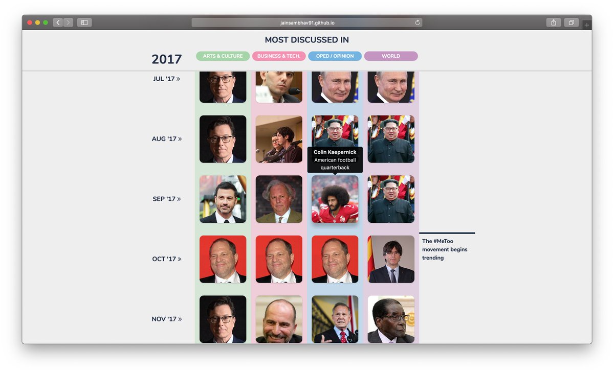
To close out the decade, I downloaded every @nytimes article and generated the nation's Most Talked About People. I used the Wikipedia API to generate images and descriptions. #Decade#DecadeinReview#dataviz@nytgraphics
Scroll through the timeline here
https://t.co/xnwefx6ZuJ
Which North American sports city is the #GOAT 🐐? @samvickars looked at the last 150 years of professional and collegiate sports to find the towns that brought home the most titles. 🏆🏅https://t.co/pgJRuKNSLh
@EqRevolutions @Mapbox@transitapp I used Google’s Location History to collect the data - It basically just gives you the geo coordinates and not the route you traversed. I converted that to a continuous geoJSON line and mapped it using @mapbox :)
New essay: understanding neighborhoods by their businesses (the Upper West Side has the highest rate of Personal Shoppers in NYC) https://t.co/dXERu3cYYY