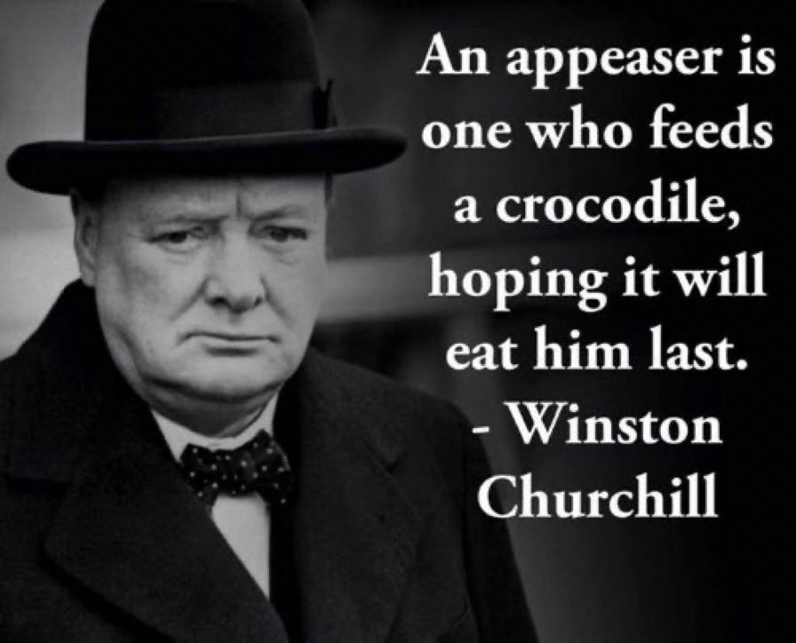
No-one will take seriously a weak and divided Europe: neither enemy nor ally. It is already clear now. We must finally believe in our own strength, we must continue to arm ourselves, we must stay united like never before. One for all, and all for one. Otherwise, we are finished.
That time @marcorubio explained how USA, Russia & the UK promised Ukraine to provide for their defense forever if they gave up the huge stockpile of nuclear weapons left in the country after the Soviet Union fell.
Good times.
Bring your data visualizations to life with animation! The gganimate package extends ggplot2 by adding animation capabilities, making it easy to create dynamic and engaging plots that reveal patterns over time or across categories.
✔️ Dynamic Storytelling: Transform static charts into animated visuals, allowing you to showcase changes, trends, and sequences clearly and effectively.
✔️ Customizable Animations: Control the speed, transitions, and aesthetic elements of your animations, giving you full flexibility to highlight key points.
✔️ Engage Your Audience: Animated graphics make complex data easier to understand, keeping your audience engaged and helping them grasp insights faster.
✔️ Easy Integration with ggplot2: Works seamlessly with ggplot2, so you can animate your existing plots without needing to learn complex new syntax.
The example shown here is from the package website, illustrating how gganimate can transform typical plots into informative animations: https://t.co/GrCEqDQquK
Ready to master ggplot2 and its powerful extensions to make your visualizations stand out? Enroll in my online course, “Data Visualization in R Using ggplot2 & Friends!” See this link for additional information: https://t.co/ztlEzoEDWv
#datastructure #RStats #tidyverse #DataAnalytics #rstudioglobal #DataScientist
Take your data visualizations to the next level with ggalt, an R package that adds a collection of innovative geometries and annotations to ggplot2. Designed to handle specific use cases and enhance customization, ggalt makes it easier to present data with clarity and style.
Why choose ggalt?
✔️ Enhanced geometries: Access specialized geoms like dumbbell plots, lollipop charts, and curved arrows for visualizing comparisons and relationships.
✔️ Improved annotations: Add stylish annotations such as labeled slopes and custom grids to provide additional context and clarity.
✔️ Seamless ggplot2 integration: Works directly with ggplot2, allowing you to expand your existing plots effortlessly.
The example visualizations included here are sourced from the ggalt website, showcasing how its unique features can bring your data to life: https://t.co/zpalDHb7Te
Want to explore more tools like ggplot2 and its extensions to enhance your data visualizations in R? Check out my online course, "Data Visualization in R Using ggplot2 & Friends!" Take a look here for more details: https://t.co/ztlEzoEDWv
#Rpackage #RStats #DataViz #datavis #ggplot2 #R #DataAnalytics #database
The ggmulti package is an extension for ggplot2 that allows you to combine multiple visualizations into a single plot. It simplifies the process of overlaying different types of graphs, such as scatter plots, line graphs, and histograms, to compare multiple data sets at once.
✔️ Multiple Plots in One: ggmulti lets you layer various plot types, helping you present different perspectives on your data within a single visual.
✔️ Clear Data Comparison: Ideal for situations where you need to compare or highlight relationships between multiple data sets in a compact format.
✔️ Effortless Integration: Works smoothly with ggplot2, making it easy to add multiple layers to your existing plots without much adjustment.
For those times when you need to convey complex data relationships in a single view, ggmulti provides a powerful, streamlined solution. The example visualization shown here is taken from the package website: https://t.co/JNXdWRqfvY
Ready to enhance your data visualization skills? Enroll in my online course, Data Visualization in R Using ggplot2 & Friends, where you’ll learn to leverage ggplot2 and its versatile extensions for clear, impactful visuals.
More details are available at this link: https://t.co/ztlEzoEDWv
#coding #DataViz #tidyverse #ggplot2 #Rpackage #Data #DataAnalytics
I recently discovered the tidyplots package in R, and it’s impressive how effortlessly it enables you to create beautiful, publication-ready plots. Designed with scientific papers in mind, tidyplots lets you build, adjust, and refine plot components gradually, all with a consistent and intuitive syntax that takes the complexity out of visualization.
✔️ Simple Syntax: Tidyplots offers user-friendly functions for creating polished visuals with minimal coding, saving you time and effort.
✔️ Consistent Style: Achieve a cohesive look across all visuals, eliminating the need for repetitive adjustments.
✔️ Flexible Customization: Easily customize colors, labels, and themes to align with your project’s goals, resulting in professional and engaging data displays.
✔️ Enhanced Data Storytelling: Built for clarity, tidyplots helps you convey insights effectively, making your data stand out.
The example visualizations shown here were created by the package author, Jan Broder Engler, and are featured on the tidyplots website: https://t.co/fgIWzxFVZI
For a deeper dive into R data visualization, join my Data Visualization in R Using ggplot2 & Friends course, starting November 25, 2024, where we’ll explore ggplot2 and related tools in depth! Check out this link for more details: https://t.co/ztlEzoEDWv
#DataAnalytics #RStats #tidyverse #Rpackage #pythonprogramming #DataScientist #Python #database #DataVisualization #datasciencetraining #ggplot2
Un Röstigraben et un fossé villes-campagnes sur les autoroutes 🛣️. Les centres urbains se sont opposés avec +63% de non. En Suisse romande, la résistance est très nette: 58,5% des francophones ont refusé ce projet
👇🏼
https://t.co/RV9ROohesL
#dataviz#autoroutes#CHVote@LeTemps
Visual of the Week 🥇
In 2024, mobile phone users reached 5.6 billion (69.4% of the world's population). As of January, the global average price for 1GB of mobile data is $2.59, with Switzerland having the highest at $7.29 and Israel as low as $0.02 📲
https://t.co/JvbOdZ6qAa
Bring your data visualizations to life with animation! The gganimate package extends ggplot2 by adding animation capabilities, making it easy to create dynamic and engaging plots that reveal patterns over time or across categories.
✔️ Dynamic Storytelling: Transform static charts into animated visuals, allowing you to showcase changes, trends, and sequences clearly and effectively.
✔️ Customizable Animations: Control the speed, transitions, and aesthetic elements of your animations, giving you full flexibility to highlight key points.
✔️ Engage Your Audience: Animated graphics make complex data easier to understand, keeping your audience engaged and helping them grasp insights faster.
✔️ Easy Integration with ggplot2: Works seamlessly with ggplot2, so you can animate your existing plots without needing to learn complex new syntax.
The example shown here is from the package website, illustrating how gganimate can transform typical plots into informative animations: https://t.co/GrCEqDQquK
Ready to master ggplot2 and its powerful extensions to make your visualizations stand out? Enroll in my online course, “Data Visualization in R Using ggplot2 & Friends,” starting on November 25, 2024!
See this link for additional information: https://t.co/ztlEzoEDWv
#VisualAnalytics #RStats #database #tidyverse
Want to make your data visualizations more dynamic and engaging? The ggstream package extends ggplot2 by providing a simple way to create streamgraphs, which are ideal for displaying changes in data composition over time.
✔️ Intuitive Visualizations: ggstream makes it easy to create streamgraphs, which are perfect for showing trends, patterns, and shifts in data composition, all in a visually appealing, flowing style.
✔️ Flexible Design: Offers customization options for colors, labels, and themes, helping you create clean and informative visualizations that suit your needs.
✔️ Clear Communication: Streamgraphs help convey information effectively, making complex data easier to understand at a glance.
✔️ Seamless Integration: Works directly with ggplot2, so you can use the same syntax and methods you’re already familiar with.
The visualizations shown here are taken from the package website and demonstrate how ggstream can turn data into beautiful, flowing visuals: https://t.co/5c0wx7HOTo
If you’d like to learn more about ggplot2 and how to create stunning visualizations, check out my online course on “Data Visualization in R Using ggplot2 & Friends,” starting on November 25, 2024!
The early bird promotion is active until November 6.
Further details: https://t.co/ztlEzoEDWv
#DataVisualization #Statistical #programmer #VisualAnalytics #database
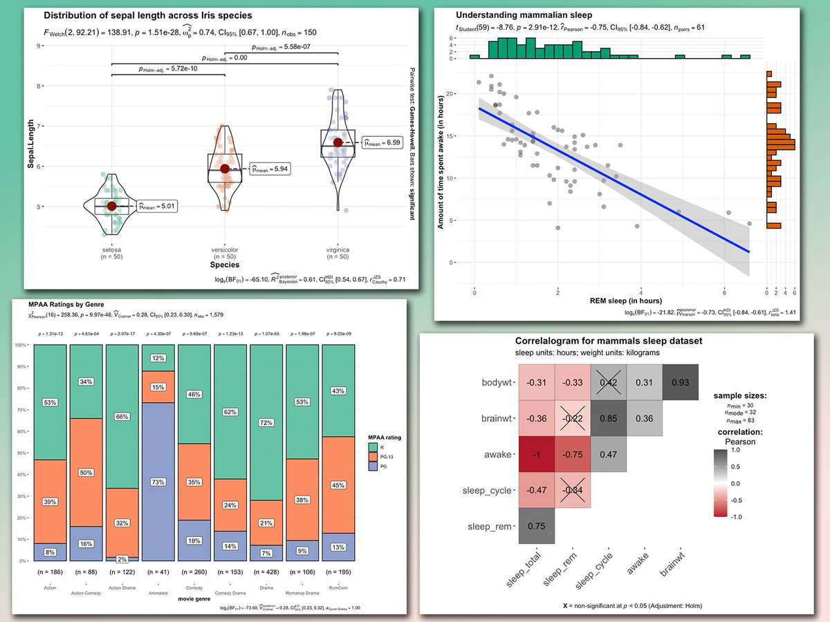
Looking to add statistical insights directly to your ggplot2 visualizations? The ggstatsplot package simplifies this by incorporating statistical tests, effect sizes, and other analyses right within your plots.
✔️ Enhanced Visuals: Automatically includes statistical information in your plots, providing clear insights without the need for extra steps.
✔️ Wide Range of Analyses: Supports various statistical tests, including t-tests, ANOVAs, correlations, and more, making it versatile for different types of data sets.
✔️ Customizable Output: Lets you control which statistical details are displayed and customize the appearance of plots, ensuring clarity and focus on key findings.
✔️ Seamless Integration: Designed to work directly with ggplot2, using the same syntax and functions you’re already familiar with.
The visualizations shown here are from the package website and demonstrate how ggstatsplot integrates statistical results seamlessly into ggplot2 graphics: https://t.co/kQ1KUseS6u
Want to deepen your knowledge of ggplot2 and learn how to create informative visualizations? Join my online course, “Data Visualization in R Using ggplot2 & Friends,” starting on November 25, 2024!
Claim the early bird promotion before it closes on November 6.
Further details: https://t.co/ztlEzoEDWv
#DataVisualization #Statistical #programmer #VisualAnalytics #database