Meet Google Sans Code — the new font meticulously crafted for coders, made by @Google! It blends geometric precision with a touch of calligraphic flair in a fixed-width design that's super easy to read, even at tiny code editor sizes. Say goodbye to squinting and hello to clear, beautiful code! ✨
How did Google Sans Flex evolve from an internal design solution to a beloved global resource?
We’re sharing the years-long journey behind the font. And now, that evolution is in your hands, with the typeface going open-source 🎉
Learn all about it → https://t.co/gyaOMjGP5L
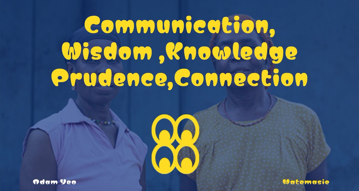
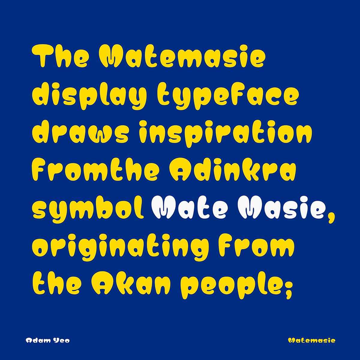
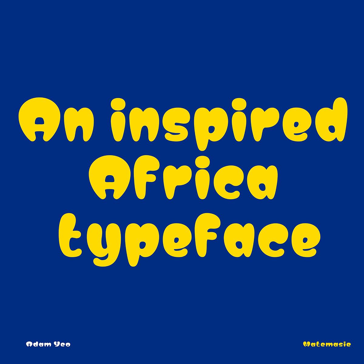
Matemasie is an ultra-bold display typeface characterized by rounded edges and a distinctive feature where the shapes widen towards the top.
It draws inspiration from the Adinkra symbol "Mate Masie," meaning "what I hear, I keep." This symbolizes interconnected ears, emphasizing the importance of listening and communication in oral traditions and cultures.
Designed by @YeoADAM , it features the Google Fonts GF Latin Core character set: https://t.co/Ru6t6eQXjQ
I am holding a type design workshop tomorrow at @untitledsgnrs by 11:30am. I will be speaking about everything I've learnt in my type design journey @useafrotype.
You will leave the workshop with broad type design knowledge so you can read/research more deeply about what interests you. Come through!
The New York Times calls it “The Internet's highest honor.”
Thank you to the International Academy of Digital Arts and Sciences for declaring as the Webby Winner, Websites and Mobile Sites, Best User Interface 2024!!!!
https://t.co/U347CaEXcn
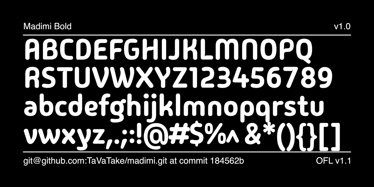
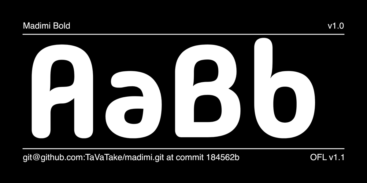
Madimi One by @TaVaTake1 is a rounded sans with a mixed geometric and organic design.
Madimi takes inspiration from the gentle curved geometry of certain Southern Afrikan graphic symbols. Circles are a main feature, the circle being a shape that represents the womb of a woman in KiNtu symbologies. The idea behind Madimi is to enact the subtle visual subtext of Afrikan visual traditions. Madimi is simple, clean and round edged but still remains clear and easy to read.
https://t.co/j5EJRXuZ2U
“The idea behind this typeface is to act as a sort of subtle visual subtext of Afrikan visual traditions, like the curved lines of a lusona drawing, which is hoped to distinguish it from standard typefaces of the Latin alphabet, as we move towards greater incorporation of indigenous writing and graphic systems in our design texts.”
Ojuju is a reverse contrast Weight axis variable font inspired by African Masquerades.
It draws inspiration from a variety of African traditional dance costumes to inform the design decisions. https://t.co/zw9j8mBUOW
Again, my UDC talk was a note to self. I was invested in typography at that point in time & so decided to practice what I was preaching.
If there’s anything to take out from this, it’s possible to design with Africa in mind. The question to how is left for us to discover.
Making it easier to get Google Fonts - Website and API updates are making it simpler to get fonts and use them in your project, on the @materialdesign blog.
https://t.co/nxfhVjYWul
#googlefonts
With Chrome 121, we can animate a smooth transition between font-palettes in Color Fonts using only CSS.
Here is a demo using Nupuram Color font.
#variablefonts#colorfonts#metapost
We at Google Fonts believe in open source, so you can now also find us on the federated social web at https://t.co/byJacma3xg
And if you use a feed reader you can even subscribe and get our updates about new fonts here: https://t.co/uuLWQmX6rn