@milosmakesmaps I have a bot watching the activity on my X profile since I don't use it anymore and wanted to know when sth 'suspicious' happens. Imagine my surprise seeing your repost of my small tutorial. And I totally miss the old days too when we were a very active GIS/DS community :(
Hey dataviz and sci people. I was absent for quite a while but decided to give bluesky a try to post my #dataviz#RStats#ggplot#gis work. I would love to reconnect there. You can find me with the handle '@toebr.bsky.social'.
See you there :)
#30DayMapChallenge · Day 20 · OpenStreetMap. What better way to showcase the richness of OSM data than to have ten layers of data over shaded relief? :)
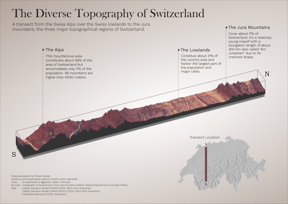
#rayshader adventures, an #rstats tale
Our Human World on a Breathing Planet. This piece merges monthly precipitation patterns with population density, visualized to reflect the interplay between nature and human life, centred on Africa. Created with #Blender3D & #Rstats for the #30DayMapChallenge - Day 6: Raster / Day 28: Blue Planet
😳 I've spent 5 years in a top tech company building charts with D3 and React.
I just wrote down how we do it!
- 11 Modules
- 55 Lessons
- 120+ graph examples
- 45+ exercises
😅
Available online for free:
https://t.co/J9GUljrCap
It took me weeks, please tell me it helps! 🙃
🧵 spain has some of europe's best neighbourhood-level income data, but it's buried in the statistical office website
i scraped and structured the data to make it accessible with one line of code
check out my new R package:
https://t.co/2FmsJ4Dxah
Microsoft has released Data Wrangler, a VS Code extension that gives you a UI for data viewing & cleaning and that generates clean Python/pandas code. I really hope that they rip out Power Query in Excel and replace it with this! I'd go as far a saying that this should have been the first deliverable for Python in Excel...https://t.co/qKtSjt3iL2 #pythoninexcel #vscode #pandas #microsoftexcel
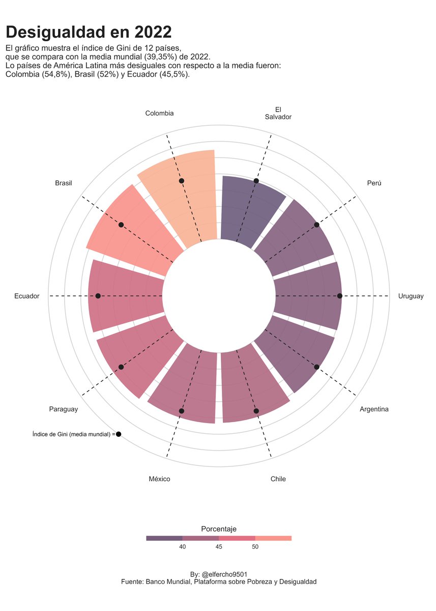
En algunos países latinoamericanos la desigualdad (medida por el coeficiente de Gini) fue superior a la media mundial de 2022.
El gráfico se inspiró en el genial trabajo de @toeb18
Datos del Banco Mundial: https://t.co/IRlICudVlk
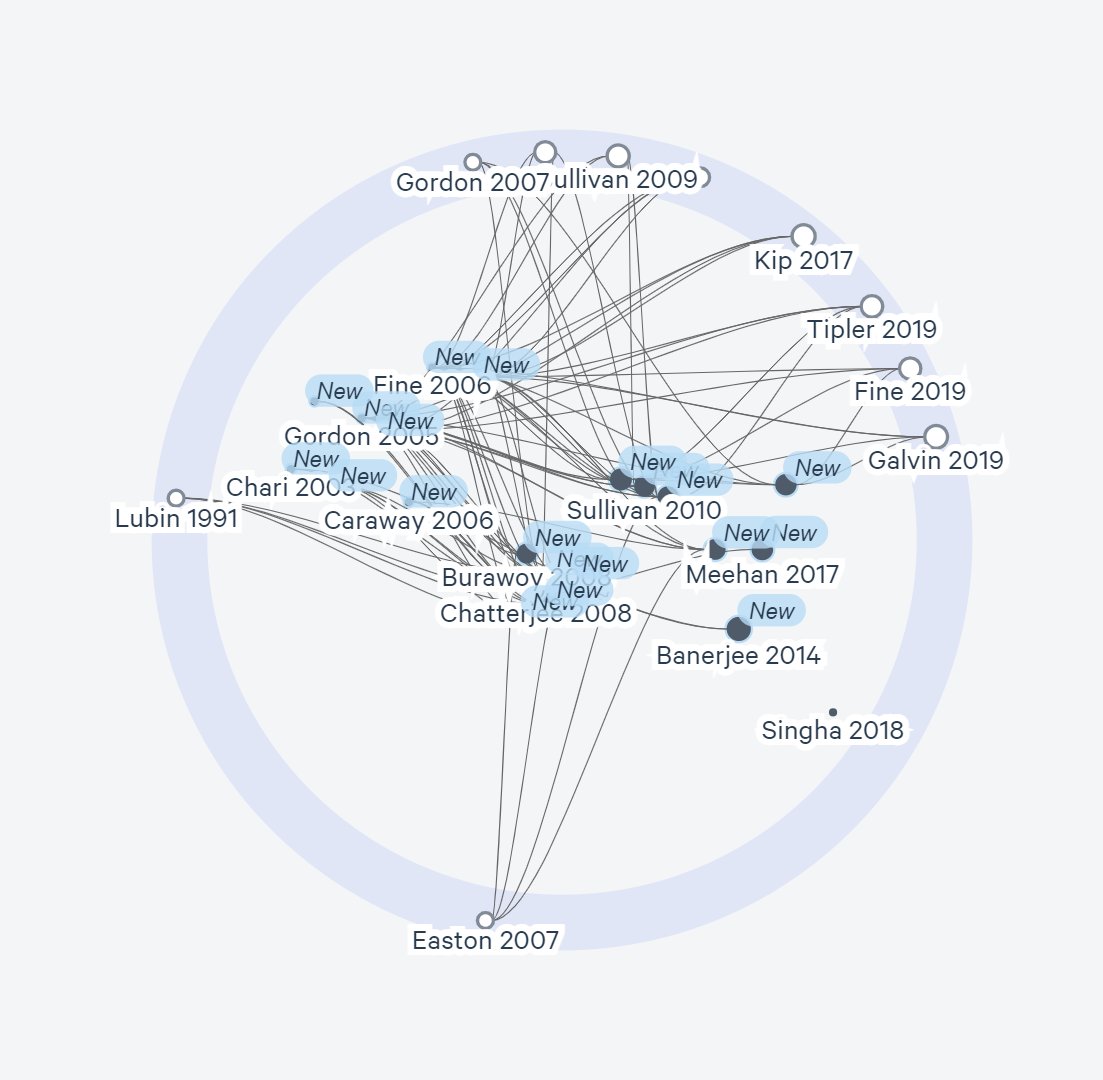
☹️Google Scholar is a great tool. But it doesn't show how papers are connected with each other.
😀Here's how to fast-track your literature review with a "visual search."
And export your papers to Zotero, Mendeley, or EndNote.
You can learn this workflow in 15 min:
😅 Finally! 🍾
➡️ 6 months of work later, I'm launching my https://t.co/wK6l6vXJe9 project! ❤️
If you're using #Rstats for data analysis, you will very likely enjoy it!
🙏 Thanks so much to the 200+ early adopters!
⏰ Pre-launch price available until the end of the day
✨ Using colors in the chart title is MUCH better than a legend.
➡️ Does anyone know how to make this with Python and @matplotlib?
😢 I can't believe how easy it is in #rstats in comparison
(Chart by @toeb18 )
I wrote a blog post on the extreme cold spell in Europe in February 1929. Back in 2019 I collected a total of 1255 observations from various sources including newspaper archives and contemporary weather bulletins.
https://t.co/rzUgGchjrW
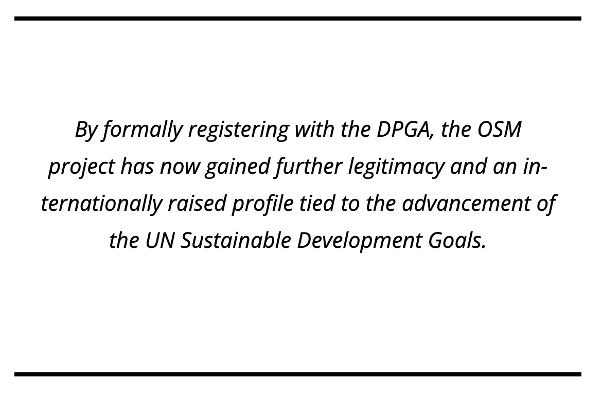
#openstreetmap is officially a "public good!"
The Digital Public Goods Alliance (DPGA), a UN-affiliated agency, has recognized the role of OSM with regard to global sustainable development. Read all about it on https://t.co/T1FLoD6dsZ
New #RStats x #Nix blog post: Reproducible data science with Nix, part 9 -- rix is looking for testers!
https://t.co/1Re8MQT5rw
Check out the latest feature implemented by @PhilippBauman15 , with_nix(), it'll blow your mind!