@JustinBleuel a little bug with the chatgpt table of contents feature: when a new message is sent, the first table of contents entry sometimes gets incorrectly highlighted. after some moments, it flips back to highlight the correct (latest) table of contents entry that you're on
Caltrain is electrified now so the situation is much better (and no fumes).
Concrete viaducts are also pretty quiet (vs the steel elevateds in NYC/Chicago that shake the whole surroundings).
They should really cut down on the horns (regulations and at-grade crossings and lack of platform barriers)
The relevant areas of Eastern seaboard agriculture in New England were just not suited to anything but small subsistence-type farms. Even subsidized farm preservation would have been going against intense headwinds.
Other areas of the Eastern Seaboard like Pennsylvania, Delaware, and Virginia still see a reasonable amount of agriculture.
This chart is a bit misleading.
The East Coast suburbs are notoriously "low density" sprawl. Leafy rural-feeling suburbia that isn't true wilderness but does not feel clustered. Think Greenwich, CT and that sort of leafy bucolic environment.
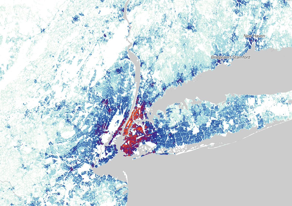
Compare to West Coast development patterns which show no ultra-dense core but also remains at a moderate density all the way to the edge, at which point all development ceases. See pictured NYC vs LA density maps.
So for this chart, the x-axis for New York captured the enormous population located within the 75-km radius, of which most comes from the ultra-dense core. But the y-axis average tree cover across all the "dense cells," where dense cells is defined as just >1000 people/km^2. That's a pretty low threshold. It's just enough that a place feels populated, but encompasses very low density sprawling semi-rural suburbs. NYC (and other East Coast cities like Boston and DC shown on that chart) have enough of these low-density cells that they dominate the area-weighted tree cover average. But again, the x-axis all comes from the city core which is decidedly less tree-covered.
You'd see a very different picture emerge if you weighted the tree-cover of cells by population, to show what the "typical resident" experiences.
As is, the chart just demonstrates that NYC has 1. a large population 2. many low-density suburbs.
This is all relevant because it surfaces a real policy debate. The West Coast land use policy encourages full preservation of outlying lands by developing in a denser manner in the suburban area (but yet, a weak true urban core due to the auto-orientedness). The East Coast sprawled indefinitely into the countryside in a way that blurred the boundaries between exurban and rural, but leaves little true wilderness. And some of this also relates to the legacy of public lands in the West vs private farms in the East.
You can provide singular full-body edit prompts or an inline edit prompts, but I'm really looking for a bit more back and forth with the model. This isn't possible with the current interface.
Eg. "make this sentence punchier" and then "nice but please make it less ai cliched"
Some stuff requires some back and forth and I don't think the singular edit request at a time preserves context in a way that the model gets what's going on.
The ideal UX is the doc open persistently on the side and continuous chat on the side.
@iansilber the inline to selection of text to "Ask ChatGPT" doesn't work when output is streaming.
i often want to start queuing up a followup even while a long response is still streaming.
in fact, the inline selection even on *previous* model responses gets blocked while a downstream output is streaming. this feels suboptimal, especially in a world where you can queue/turn messages.
it's nice not to sit and wait for a long response before prodding in different directions
@JustinBleuel@santortiz15@ChatGPTapp It's often hard to tell which picture corresponds with what part of the answer. Ideally, the images would be inlined into the answer, instead of floating on top.
At the least, they should each have clear captions