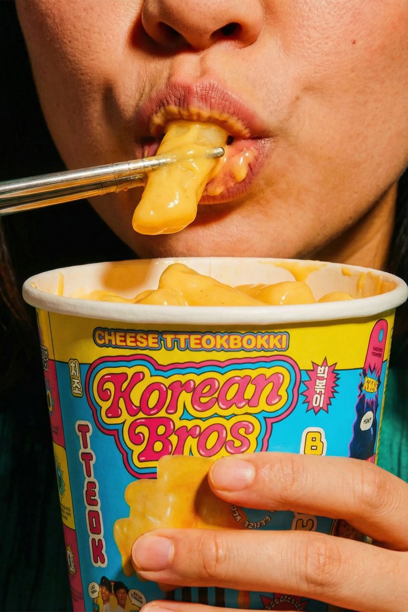
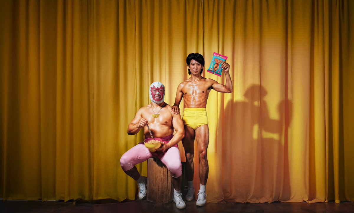
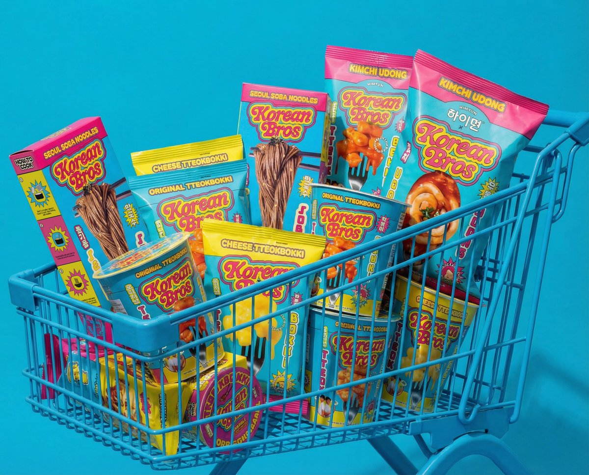
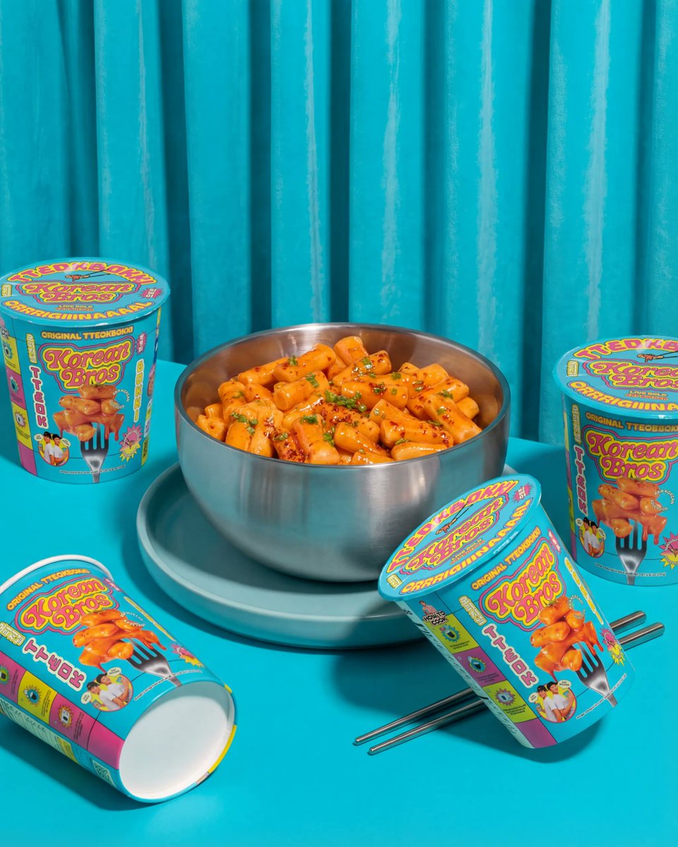
LA-based agency @truffl has built Korean Bros into a satirical comedy universe disguised as a food brand.
The agency’s strategic move was to position the founders as mock heartthrobs and celebrities. That premise shaped everything – a custom bubble-lettered wordmark drawn from 90s teen magazines, a saturated yellow-pink-cyan palette built to dominate the Korean food aisle, and a six-typeface bilingual typography system.
LA-based agency @truffl drew on 90s teen magazines and Korean pop culture to give Korean Bros a six-typeface, bilingual identity system.
Explore the full case study below ↓
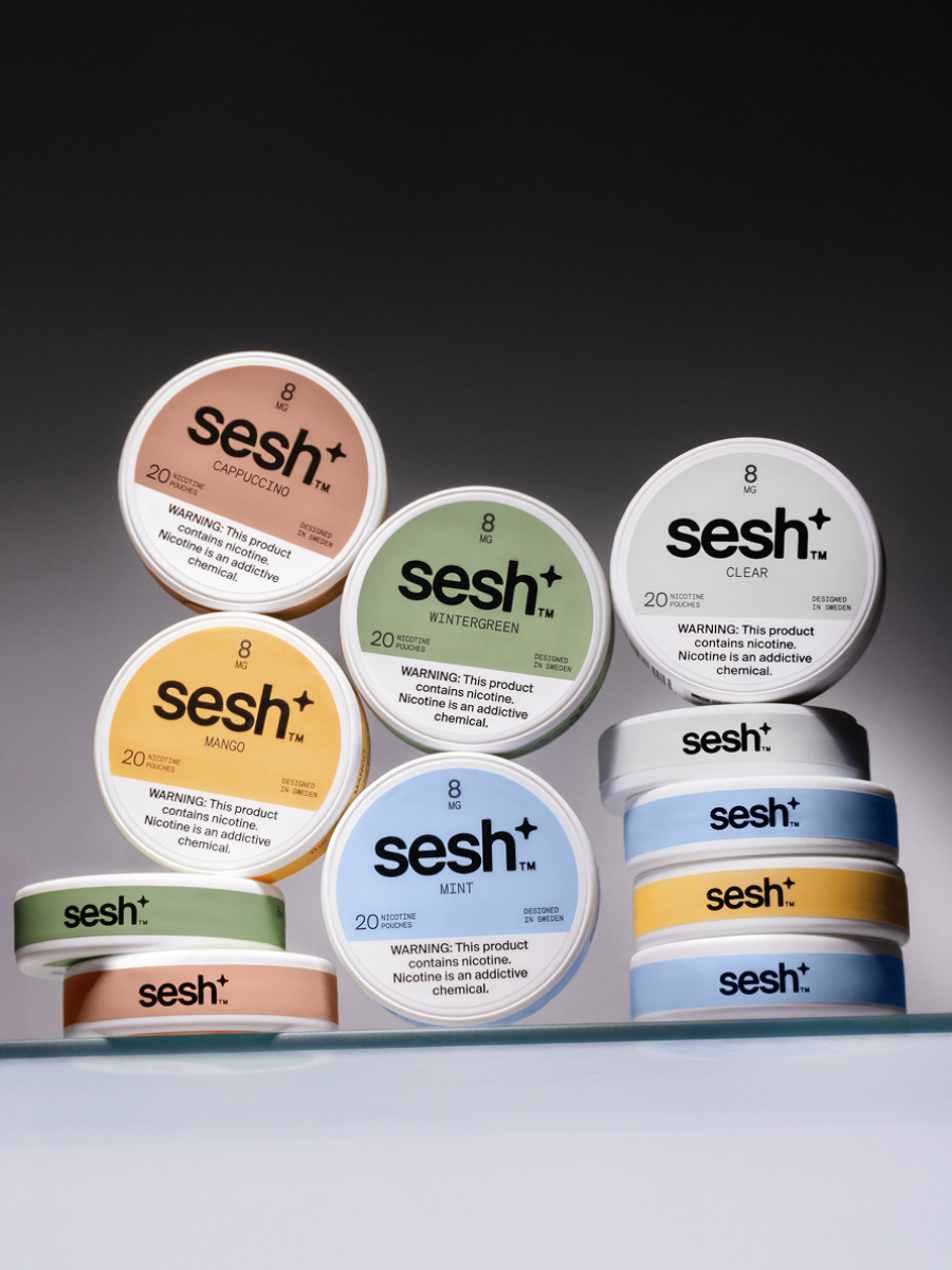
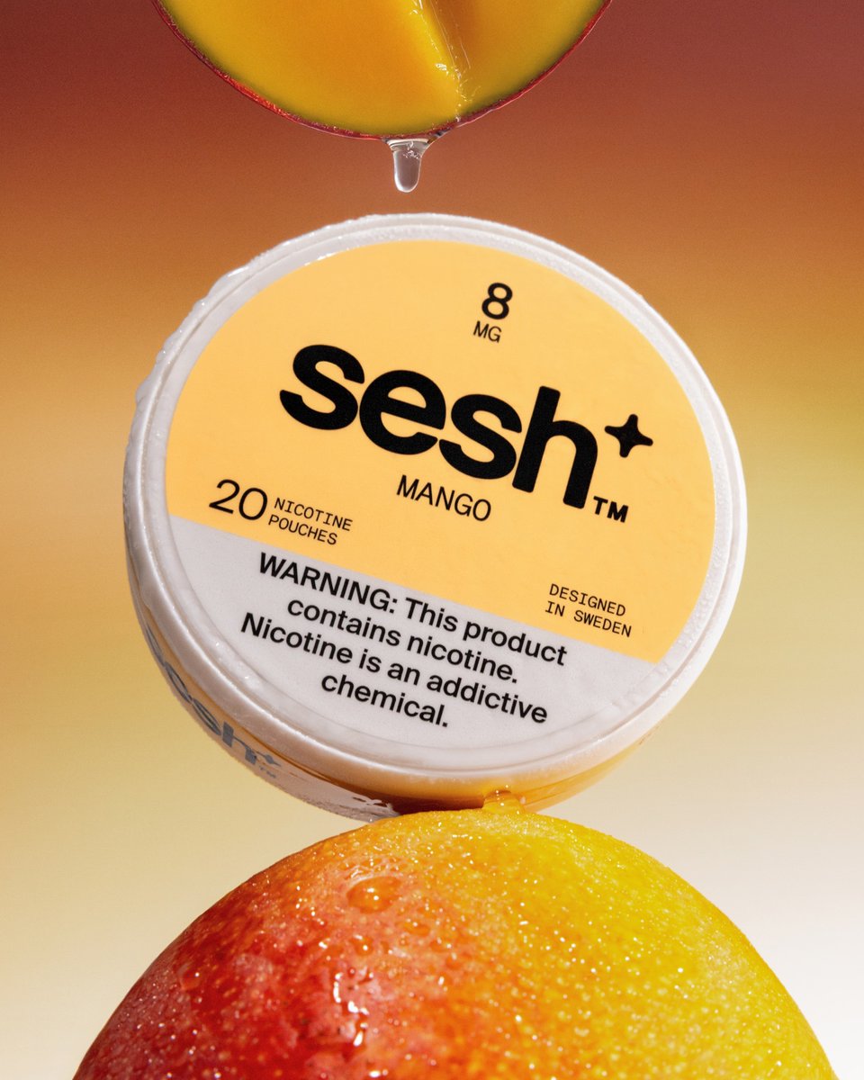
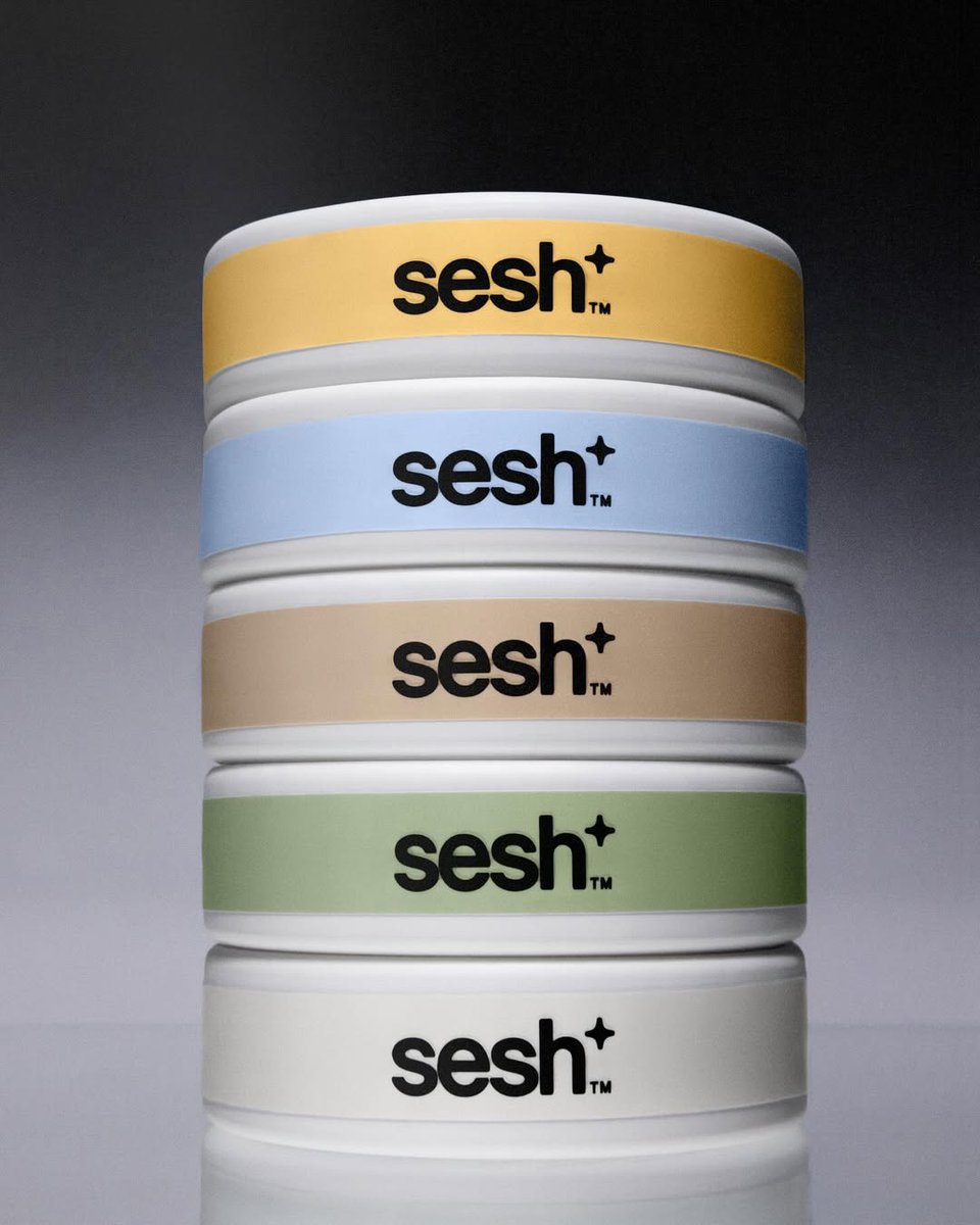
Truffl Branding Agency partnered with Sesh+, the fastest-growing independent nicotine-pouch brand, to elevate a category dominated by big-tobacco aesthetics and juvenile messaging. https://t.co/14sUlvPRFG
Truffl's #packagingdesign for sesh takes a minimalist and modern approach, with clean typography and bold use of colours. The round tins are sleek and uniform, creating a cohesive identity while the varied palette adds vibrancy and recognition. #DailyDesignInspiration
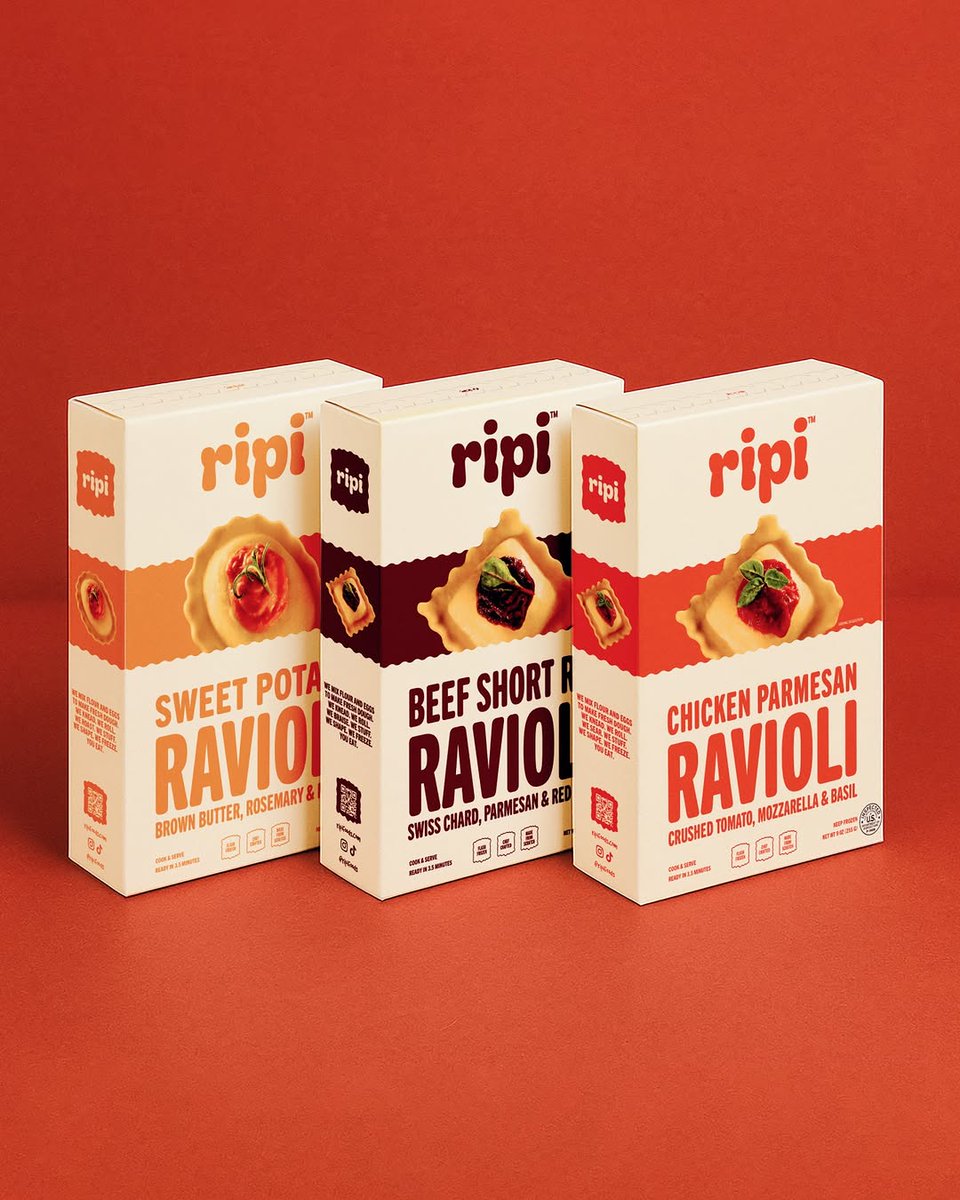
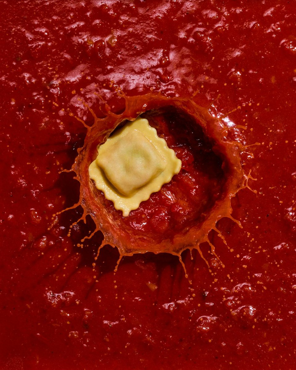
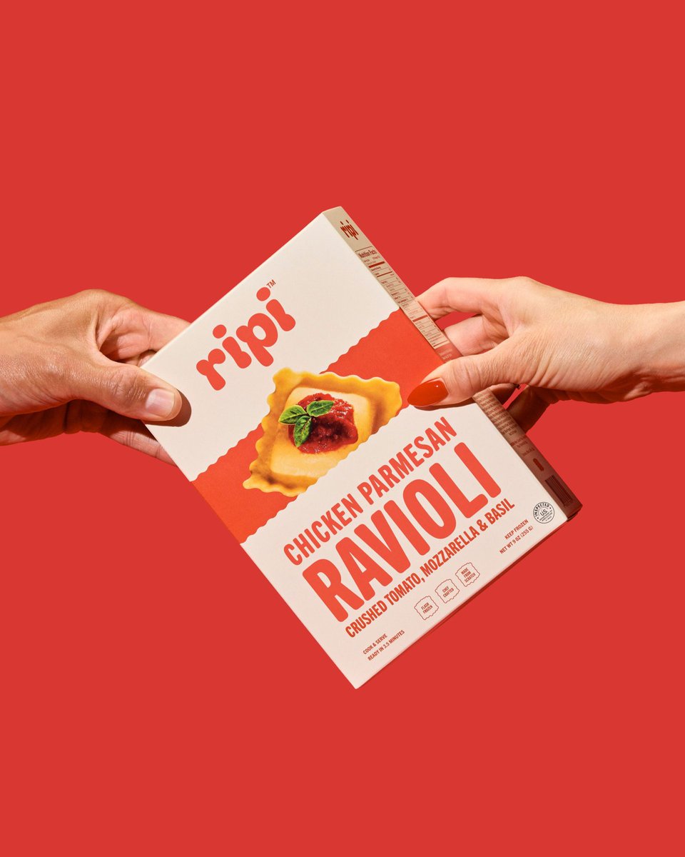
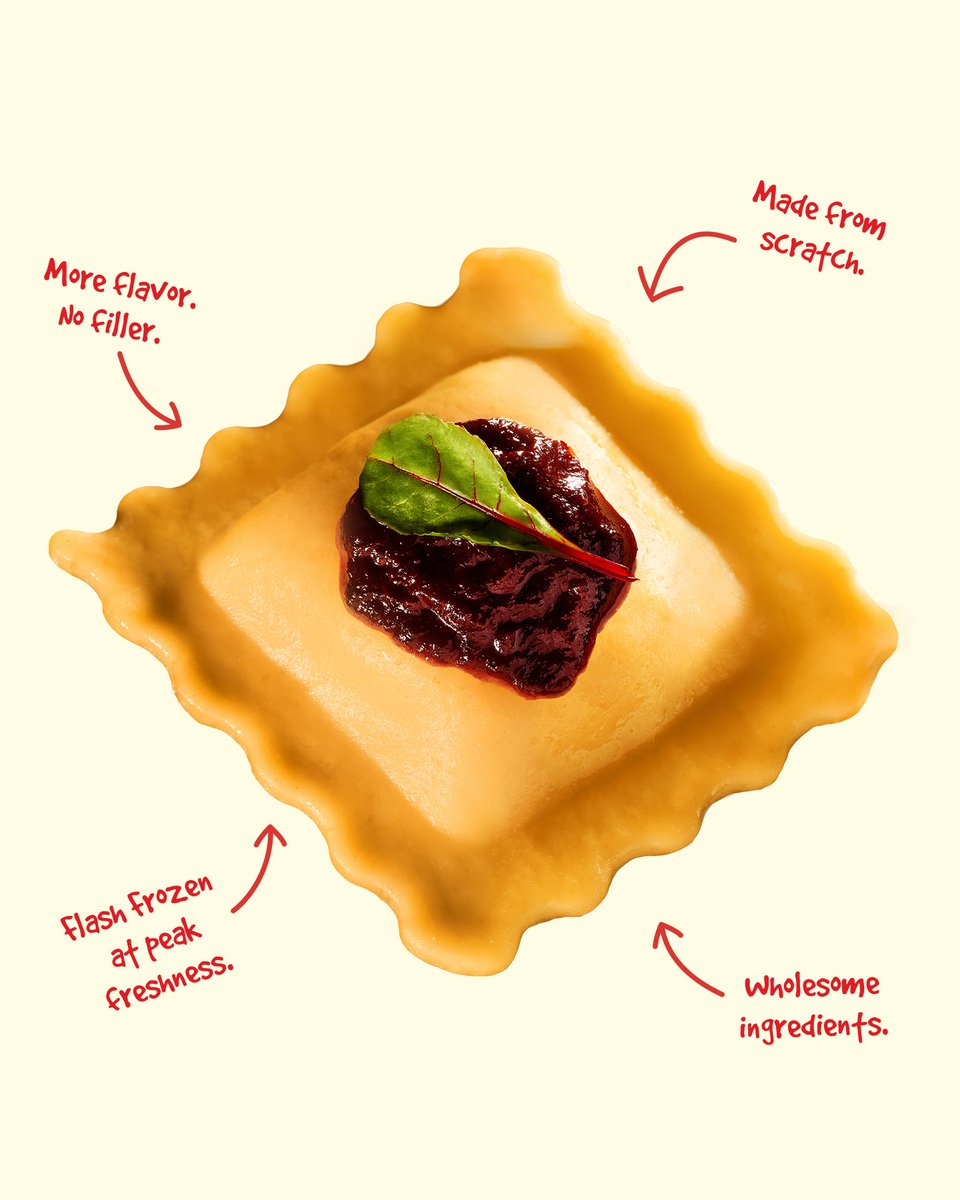
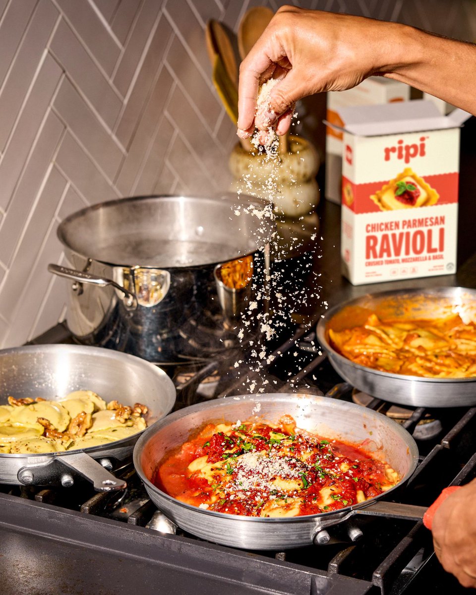
@truffl's #packagingdesign for Ripi combines bold modernity with warmth. A ravioli-inspired logo and hand-drawn icon reflect its artisanal roots, while chunky typography and a rich palette of reds and golds evoke hearty, culinary appeal. #DailyDesignInspiration