What could improve:
- In pricing, it seems the middle plan is the focus. But the 14-day free trial banner in the first plan grabs most of the attention. Prioritize one.
Overall, solid landing. Some sections just need to match the simplicity the rest of the page already has.
What could improve:
- I get the AI hype, but the subheading in the hero explains the value more clearly than the main heading.
- Too many features. Choose 3–5, or group them by use case. Otherwise, nothing sticks.
What could improve:
- Several primary buttons with different outcomes. Makes it harder to decide what to do next. If the main goal is booking, everything should clearly funnel toward that.
- Other options could come second in the hierarchy or be integrated into the booking flow.
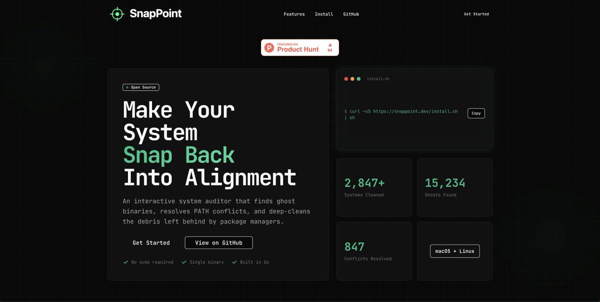
Riviu of the day: SnapPoint
Really like the hacker vibes of this landing. It clearly speaks to its intended user.
At first glance, I’m not 100% sure what it does. But, your value proposition should be simple enough to understand, kind of like a usability test.
Let's review it.
What could improve:
- The hero lacks hierarchy. Do we want users to ‘Get started’, copy the code, or ‘View on GitHub’? The first action I noticed was ‘Copy’.
- Text buttons lack interaction states. That makes them easy to ignore or mistake for regular text (see features section).
Riviu of the day: CozyTwo
Like the idea. ‘Fix your long-distance relationship’ taps into real emotions, which makes it a strong starting point to hook users.
1/3
What could improve:
- Some sections feel a bit copy-heavy
- The ‘pains’ section could be reworded to feel more relatable
- It’s not clear how the all the features connect inside the platform
- Like the logo (cute cartoon), but color selection feels a bit vibe-coded (purple tones)