Type-Ø-Tones is a type design company, we create our types and do custom work. Founded in 1990 by Joan Barjau, Enric Jardí, Laura Meseguer & José Manuel Urós.
@Fontfabric FinalSix:
Geometry meets art in this personable and warm sans from the Type-Ø-Tones foundry. We always feel like this design was baked in the warmth of Barcelona's sun ☀️
On our store: 9 fonts from $27.50 (was $55)
https://t.co/r41rZRrzoc
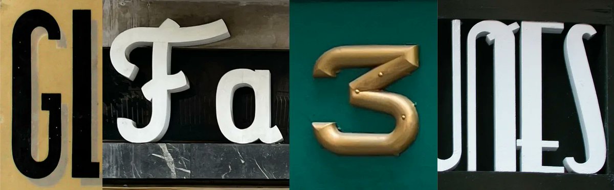
Inspired by signage throughout Barcelona's Eixample neighborhood, @typeotones' Eixample contains three families—Dip, Glaces, and Villa. Each makes an excellent choice for packaging and branding designs.
👉 See them here: https://t.co/etu1XiAU3p
Sisters typeface family in use. Packaging for Naramza Artisanal Jams from Bucarest. https://t.co/UVmDW3wJpp
——
Check more uses of Sisters at https://t.co/NSGGLagbMv
Sisters was designed by @laurameseguer
#typedesign#sisterstypeface
Per què les pàgines són com són? Com han estat les pàgines, al llarg de la història? Com poden ser les pàgines del futur?
@enricjardi ens respondrà aquestes preguntes mentre debatem sobre llenguatge gràfic amb Pere Ferrando i María Serrano 🖊️
Entrades: https://t.co/gNLgQ48Ibi
Us convidem a conèixer "Veure-hi" el podcast d'Enric Jardí @enricjardi
Un anàlisi particular d’elements de la la cultura visual, aparentment inconnexos i que s'aniran relacionant programa a programa.
https://t.co/rGjqBJf5Dg
Karol Sans by @typeotones pairs with Karol, but has its own humanist personality, with a range of weights and various OpenType features. Karol Sans works well from text to display sizes and makes a natural companion to Karol.
👉 See Karol Sans here: https://t.co/l3ufrSla8K
The newest addition to the TN library comes from foundry partner @typeotones:
Ella consists of four families, each in two styles: Regular and Bold. Wherever personality, expressionism, and sophisticated brutalism are needed, use Ella.
👉 See Ella here: https://t.co/8xkWTYLL7a
Laura Meseguer lanza “Ella”, «una tipografía que se inspira en la caligrafía sin querer ser una tipografía caligráfica» https://t.co/KASsvZi37H
Gracias @graffica_info!
@laurameseguer
This is final post about Ella family release designed by @laurameseguer
The unapologetic Ella Brutalist, explores the next level of plasticity and takes the calligraphic expression to the limits of construction.
👀 https://t.co/8s9BFAmobj
Welcome Ella Brutalist (Regular and Bold)
This is the 3rd post about Ella family, Ella Rustic (Regular and Bold) by @laurameseguer
Inspired by the Rustic capitals shapes with less rigid rectilinear shapes and more curved lines. It has the same lc as Ella Roman and Ella Uncial
👀 https://t.co/8s9BFAmobj
#Ellatypeface
2nd post about Ella family, Ella Uncial (Regular and Bold) by @laurameseguer
Inspired in the roman uncial majuscule script with wider, rounder shapes, and broad diagonal and vertical strokes. It has the same lc as Ella Roman
👀 https://t.co/8s9BFAmobj
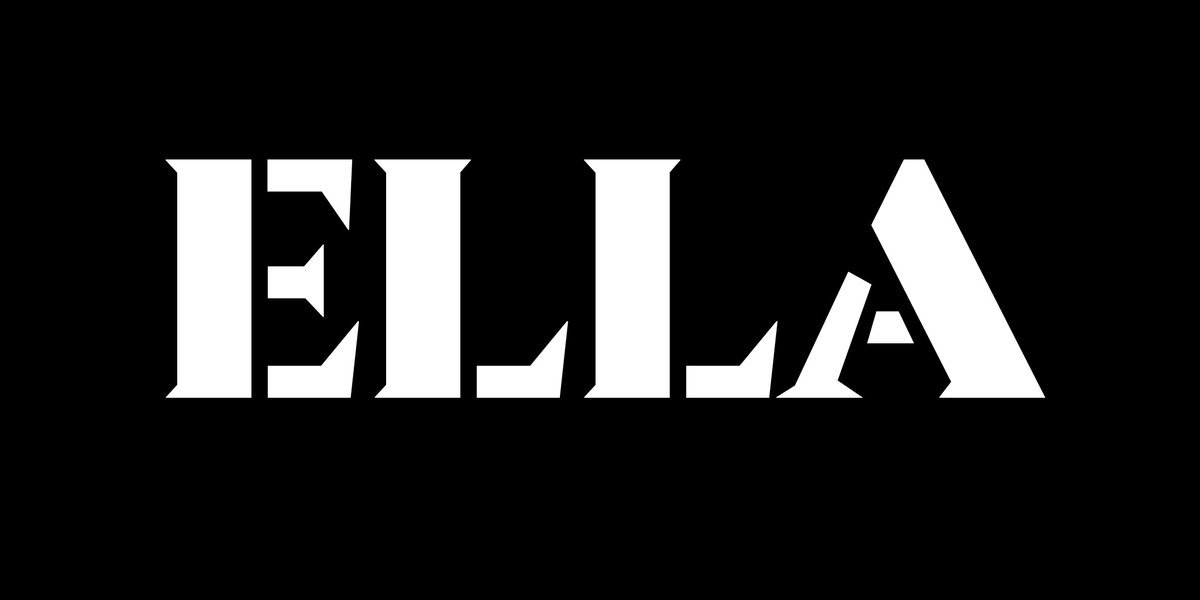
This is the first post of 4 to present Ella, our new typeface family release designed by @laurameseguer 🥳
Ella can be defined as a “A synthesis between a stencil typeface family and Calligraphy”.
https://t.co/8s9BFAmobj
Please welcome Ella Roman, Regular and Bold :)
#typedesign
Letters of note:
N: Structure is distinctive yet legible & lends itself very nicely to logos. That's how you do it!
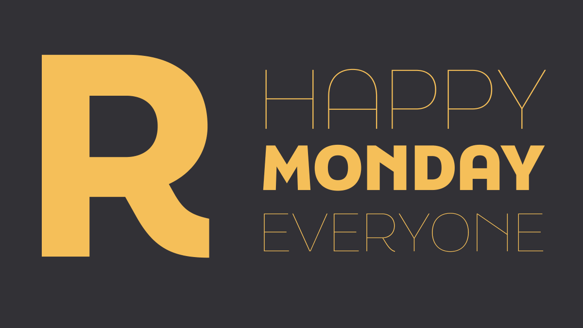
A: This is the letter equivalent of a hug. Or a big happy smile. We always like to use yellow with this typeface, maybe because it captures the Barcelona sun?


![typecache's tweet photo. [New Font Release] Type-Ø-Tones released Ella designed by Laura Meseguer. https://t.co/o5FPGi7qj8 #typecache https://t.co/Eb9wfk7Q0q](https://pbs.twimg.com/media/Ff6zhhHacAICT9R.jpg)