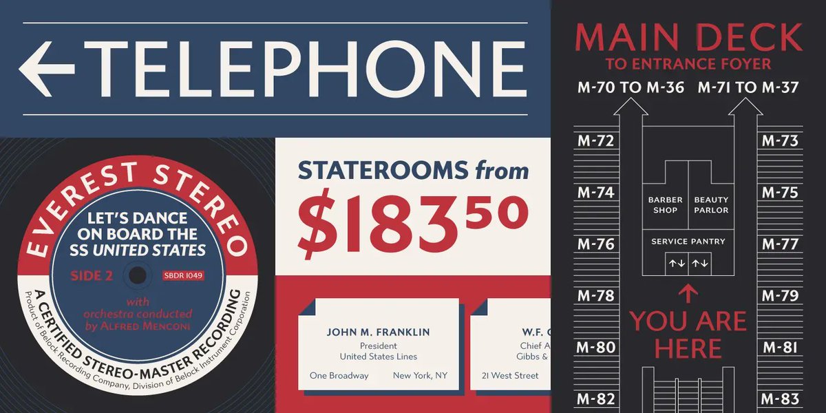
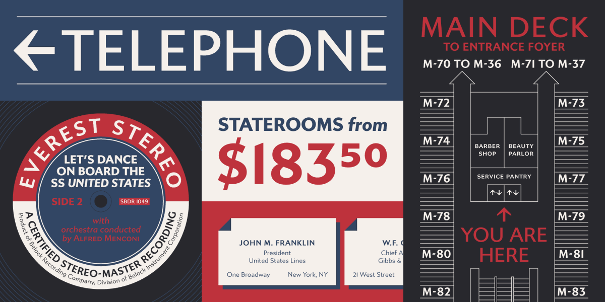
Gibbs from @Typetanic is a rugged, sophisticated sans, inspired by the unique cast aluminum signs on a 1950s luxury liner, the SS United States. The result is uniquely stylish and comfortably readable at both text and display sizes.
👉 Learn about Gibbs: https://t.co/IknoRVDpW0
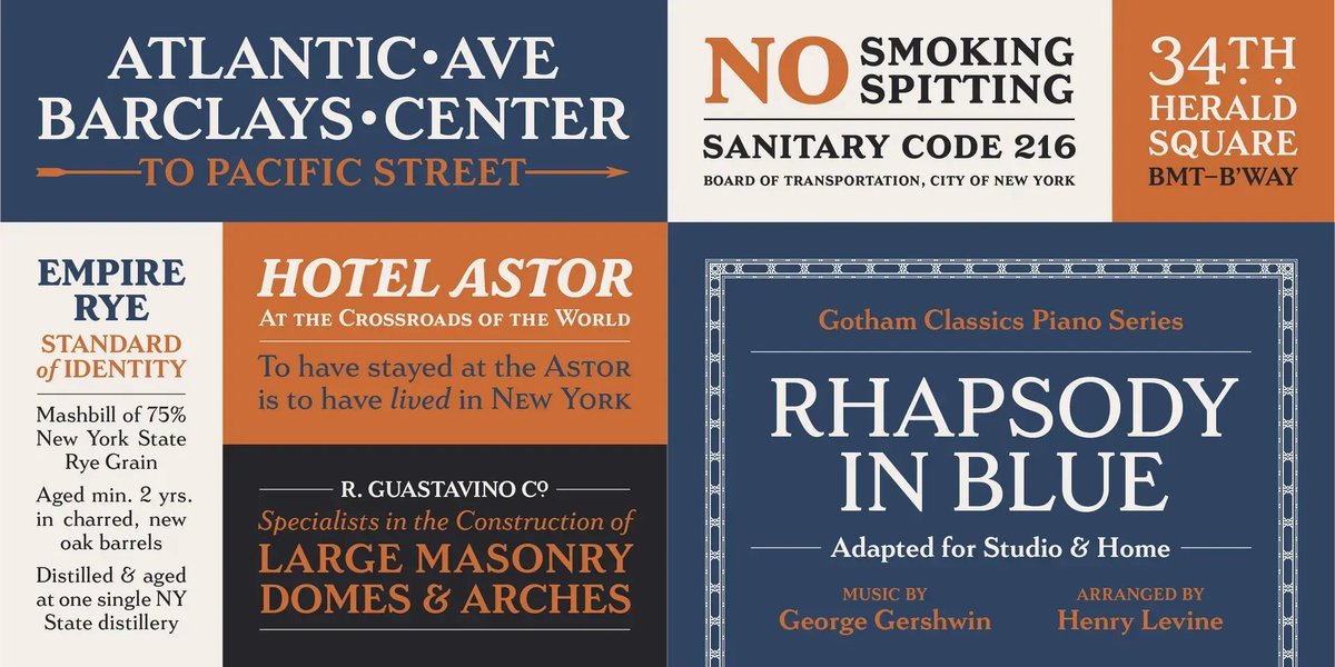
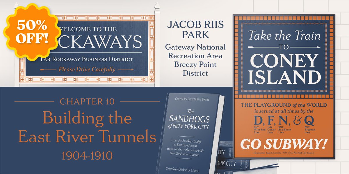
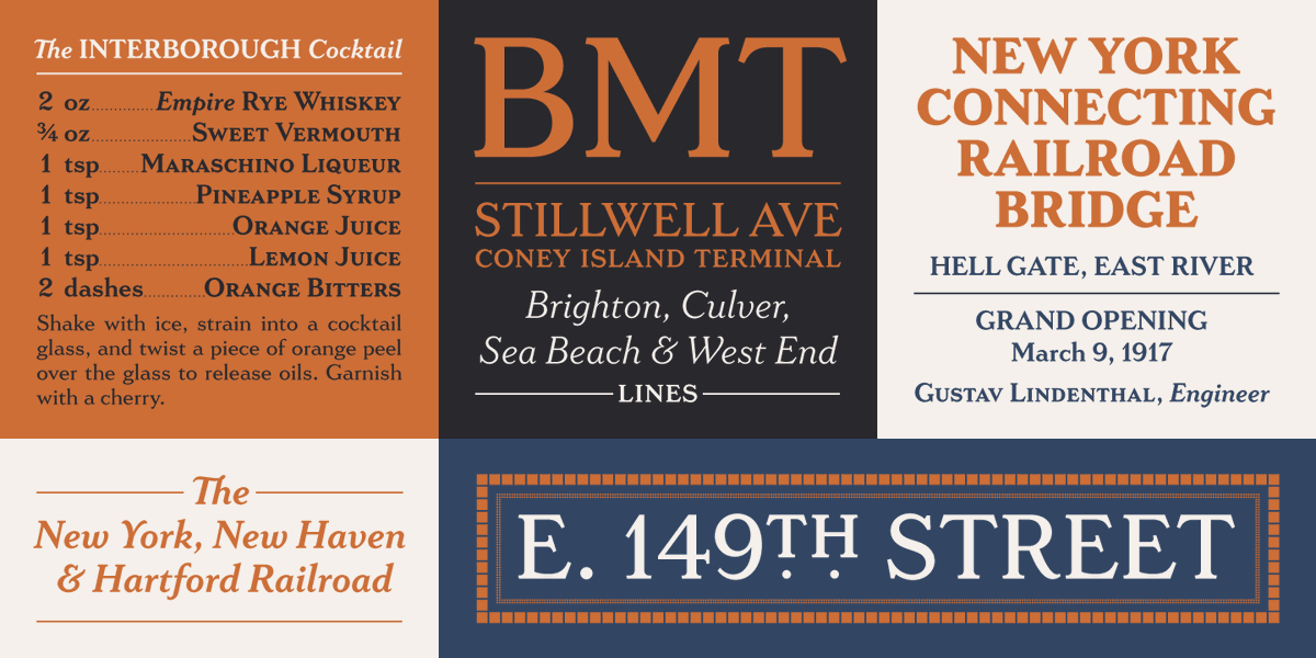
Inspired by New York City subway stations, LaFarge from @Typetanic is a fashionable, architectural typeface that works just as well on the façades of grand public buildings as it does on packaging, magazines, or web.
👉 Read about LaFarge: https://t.co/H56HS4t1w0
Criminally underused, Gregory Shutters’ (@Typetanic) award-winning Lafarge – based on titling caps found throughout the NY subway system – was one of our favorite #serifs of 2021. This large & flexible family is 50% off in #MissedHits, and you need it: https://t.co/xXYPjgrVIo
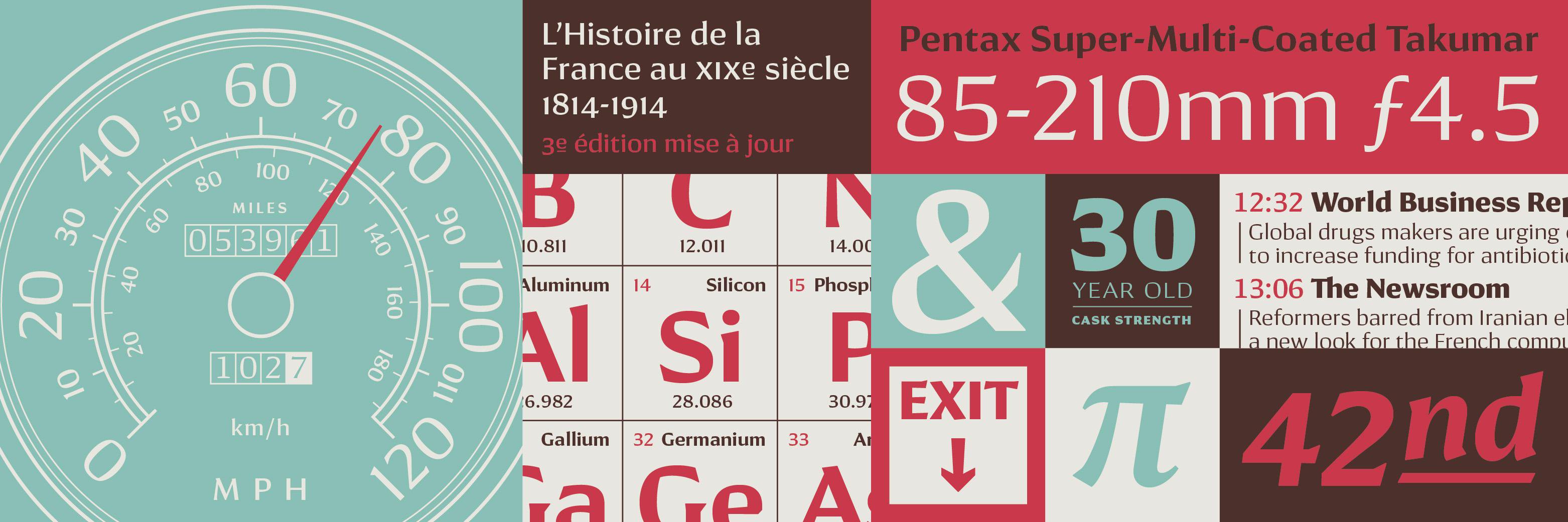
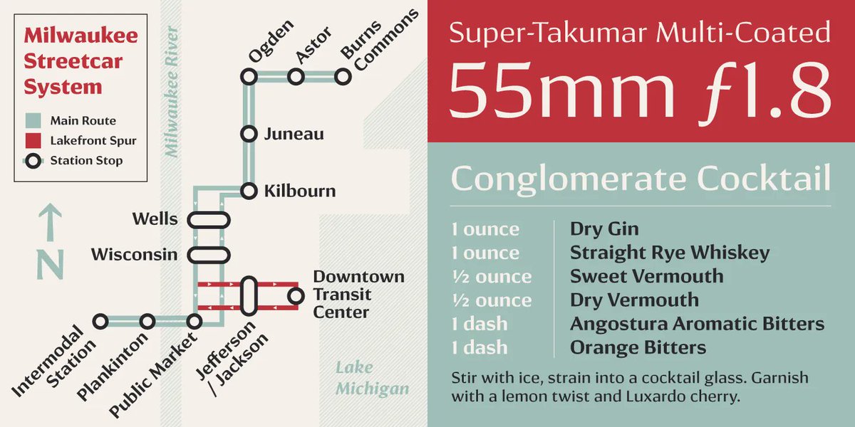
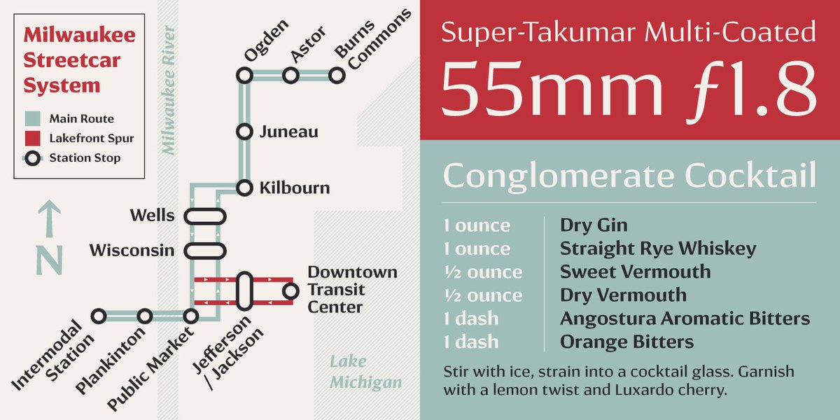
With a subtle blend of serif and sans serif traits, Conglomerate from @Typetanic strikes a perfect balance. It’s ideal for projects that need a more contemporary feel than a traditional serif without resorting to sans.
👉See Conglomerate here: https://t.co/sCTidxY7Al
I’m thrilled to share that Typetanic Fonts is one of twelve foundries (so far!) joining @thetypefounders, a new company devoted to creating unique and distinctive type. This means now I’ll be releasing new fonts more than once every five years! More here: https://t.co/mY4Vkmgdqm
Did you know the @SSUSC uses its own font? Founded by @grshutters, @Typetanic has produced intriguing historical typefaces - including our very own "Gibbs." Check out this recent conversation w/ Shutters that includes a shout-out to a sign from the Big U -https://t.co/H2oC1l8sGx.
With a subtle yet unorthodox blend of serif and sans serif traits, Conglomerate from @Typetanic strikes a perfect balance. It’s ideal for projects that need a more contemporary feel than a traditional serif without resorting to sans.
See Conglomerate here: https://t.co/vQUaN5ZzEe
I released Gibbs back in 2014, but prior to releasing it on @TypeNetwork this month I added some new glyphs and improved bézier structures on the existing ones. If you haven’t looked in a while, check it out now! cc: @SSUSC
Gibbs from @Typetanic is a rugged, sophisticated sans, inspired by the unique cast aluminum signs on the 1950s luxury liner SS United States. The result is uniquely stylish and comfortably readable at both text and display sizes.
👉 Learn about Gibbs: https://t.co/vQUaN5ZzEe
Inspired by New York City subway stations, LaFarge from @Typetanic is a fashionable, architectural typeface that works just as well on the façades of grand public buildings as it does on packaging, magazines, or the web.
👉 Read about LaFarge here: https://t.co/vQUaN5ZzEe
🏆 Our Best Fonts of 2021 list is here! 🏆 We’ve chosen our favorite families released on Fontspring in 2021, and many are running exclusive sales to celebrate! See our top picks at https://t.co/iuhODJs1Tq #toptiertypography#bestfonts2021#toptiertype
“I’m thrilled to be joining Type Network, primarily because of TN’s focus on maintaining strict quality standards. It’s quite an honor to be included!” – @grshutters
on @Typetanic being the newest addition to the Type Network family
�� Read the story here: https://t.co/vQUaN5ZzEe
I’m thrilled to announce that @Typetanic is now a foundry partner at @TypeNetwork! 🎉 I recently did an interview with them about my work and future plans. Check it out here: https://t.co/xCaZGXkUVf
Founded in 2013 by @grshutters, @Typetanic has produced some of the past-decade’s most intriguing historical typefaces. We spoke with Shutters to discuss how he started in type, where he finds inspiration, and what’s next for him.
👉 Read the interview: https://t.co/vQUaN5HYfE
Love seeing my typefaces out in the wild, but this one is really cool: LaFarge featured prominently in reigning MLS Cup champions @NYCFC’s season branding. They’re even using LaFarge’s border typeface here!