No April Fools’ joke: yesterday was my last day at Type Network. This means the editorial power team of @tamye, @litherland, and myself is now available to work with you. Yes, you!
Movie buff, design fan, or typography geek? You can be all three at my #SXSW session about #movieposters tomorrow @ 5pm at the JW Mariott. #SXSW18#SXSW2018 https://t.co/KdLUhkngeh
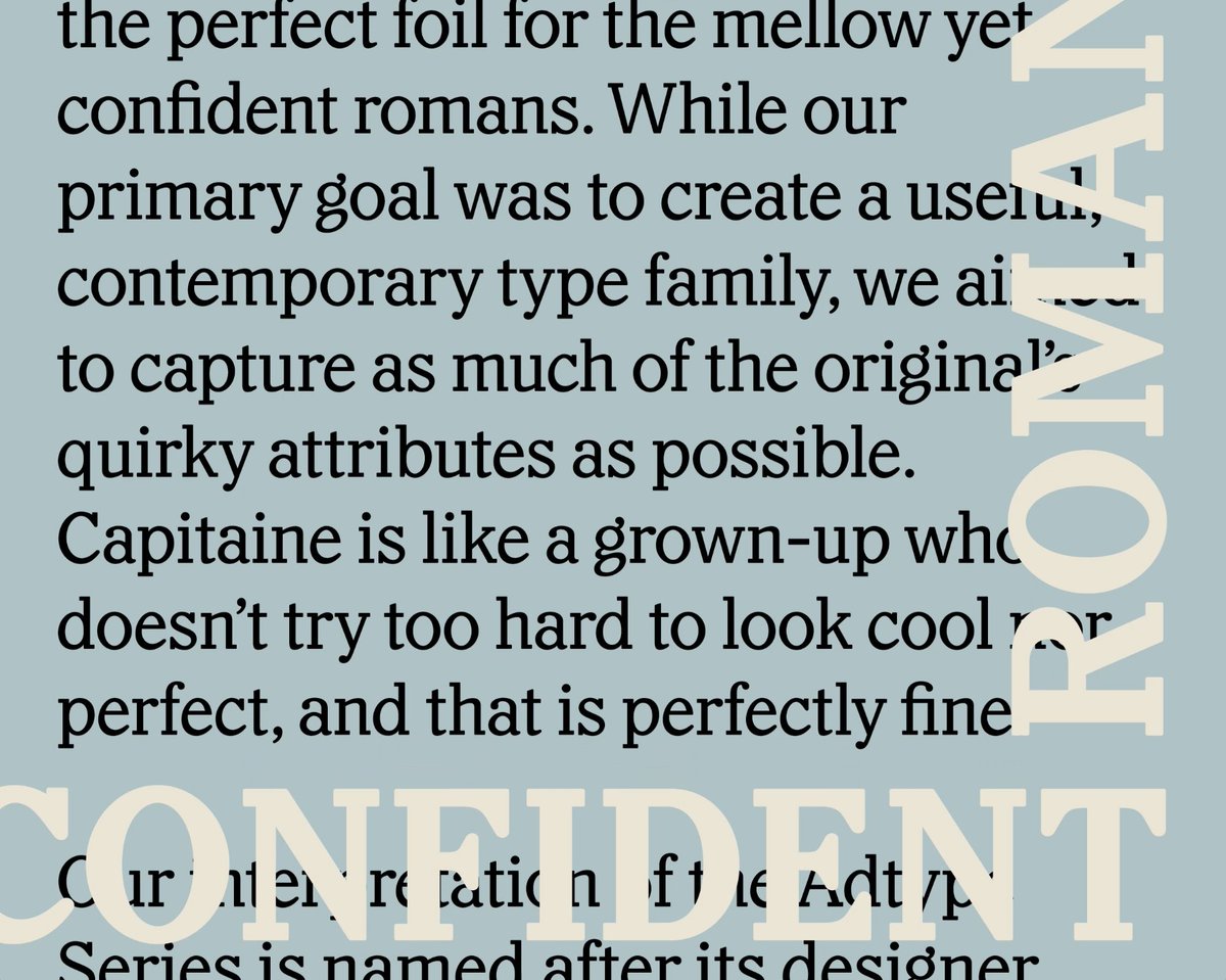
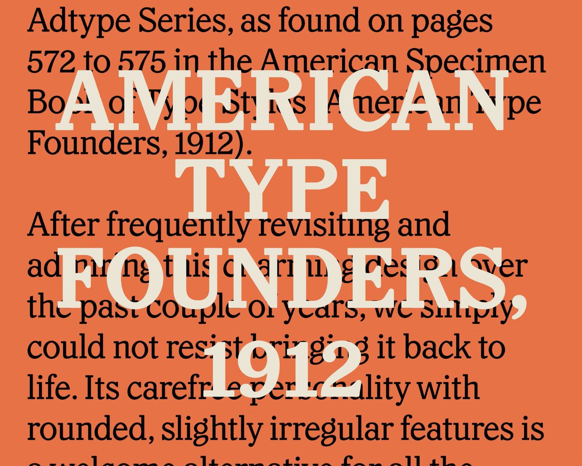
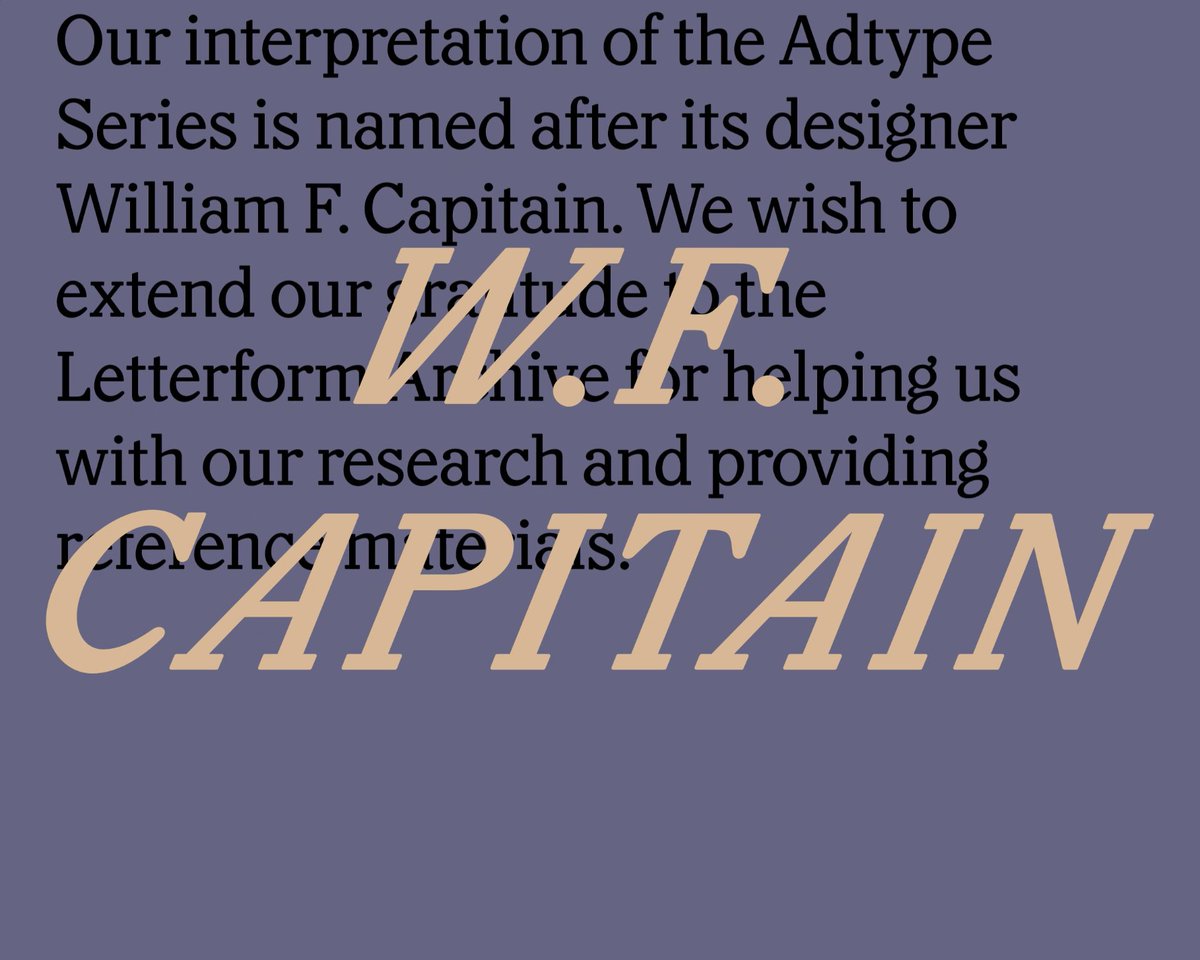
NEW! Capitaine is a good-humoured, chunky slab serif based on the Adtype Series (American Type Founders, 1912).
Samples by @charlesfredrik Thanks to @Lett_Arc for help with research.
https://t.co/EVLV0gUmO3
Love monospaced typefaces, but also love your readers? Proportionally spaced typefaces with a monospaced appearance may be what you are looking for. Here is a list I compiled (with the help of many others) ☞ https://t.co/lcos4hut93. Additions are highly welcome.
The most amazing thing about this absolutely amazing car commercial, is that it doesn’t seem to realize how effectively it makes the point that cars are a huge waste of space in cities. #multimodalcities HT @javiermalagon
Allow me to send you into the weekend with a huge smile on your face, #typography lovers. Plus it’s a Libre font, so go have fun with it! https://t.co/hVZ9qvBcdy
Say hello to Conductor, our next retail release! The design began with a set of vintage lottery tickets, and soon absorbed references from New York and across Europe. Conductor is also the first family I’ve worked on with @ninastoessinger from the start. https://t.co/zc3GwL6NPD
Laurence has been the superhero of variable fonts since day 1 (actually day 45) when he made @axis_praxis, a playground for #VariableFonts. https://t.co/HTlThlKNUE
[NEW TALK] Laurence Penney @Lorp at dotCSS 2017 - Variable fonts: a million times the possibilities, in less bandwidth than before https://t.co/cAnsmiybOc
Ysans by Jean-François Porchez is a razor-sharp sans serif with a remarkable layered chromatic Mondrian style that you can try for free. https://t.co/MRzYLSPFeR
How absolutely exciting—@jesseragan & @benkiel launch their joint venture https://t.co/fzuIEE9EOT with Cortada & 2 brand new type families. https://t.co/GlqiYeXjy9
@HoeflerCo@connordavenpo I keep telling people that the grunge boom, while it produced a gigantic amount of crap fonts, is the key factor for this golden age.


![dotCSS's tweet photo. [NEW TALK] Laurence Penney @Lorp at dotCSS 2017 - Variable fonts: a million times the possibilities, in less bandwidth than before https://t.co/cAnsmiybOc https://t.co/N7luHxxo58](https://pbs.twimg.com/media/DRkHwrgX4AAm3zT.jpg)


