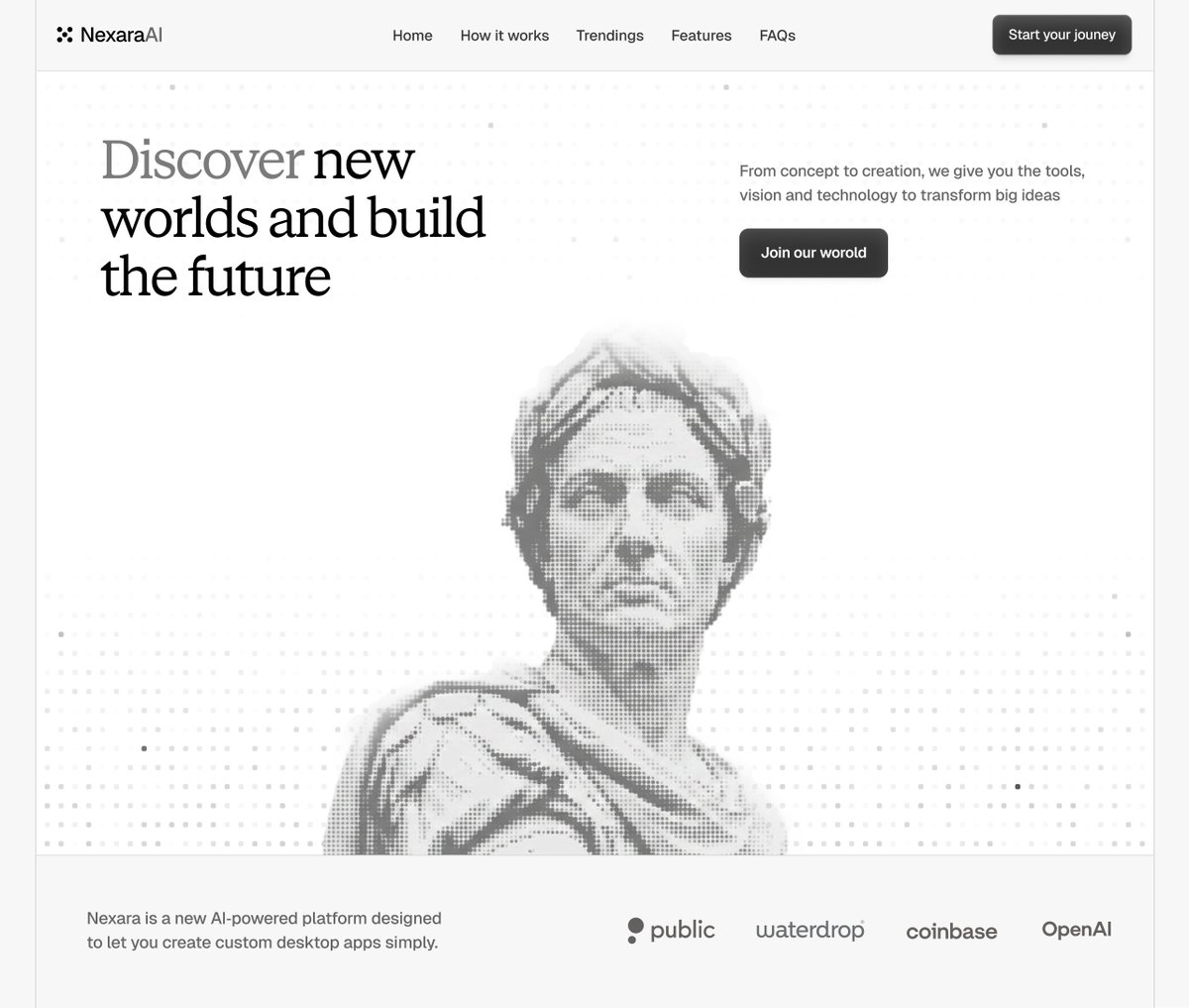
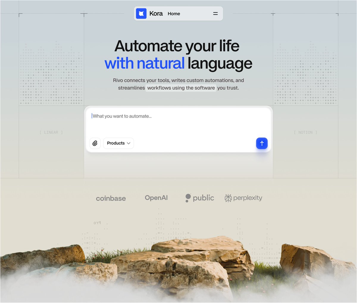
Soft grid marks, rounded controls, and a misty rock base offset the large automation prompt without crowding it.
by @yasirahmadnoori
https://t.co/uvkGHydA5r
An old desktop, keyboard and cable sit in a centered isometric field, leaving wide margins to make the hardware read as an object.
by @wheresryan22
https://t.co/Tm22dus9in
The dark workspace holds three work areas in one frame, using subdued panels and a single lime accent to keep the busy surface from feeling loud.
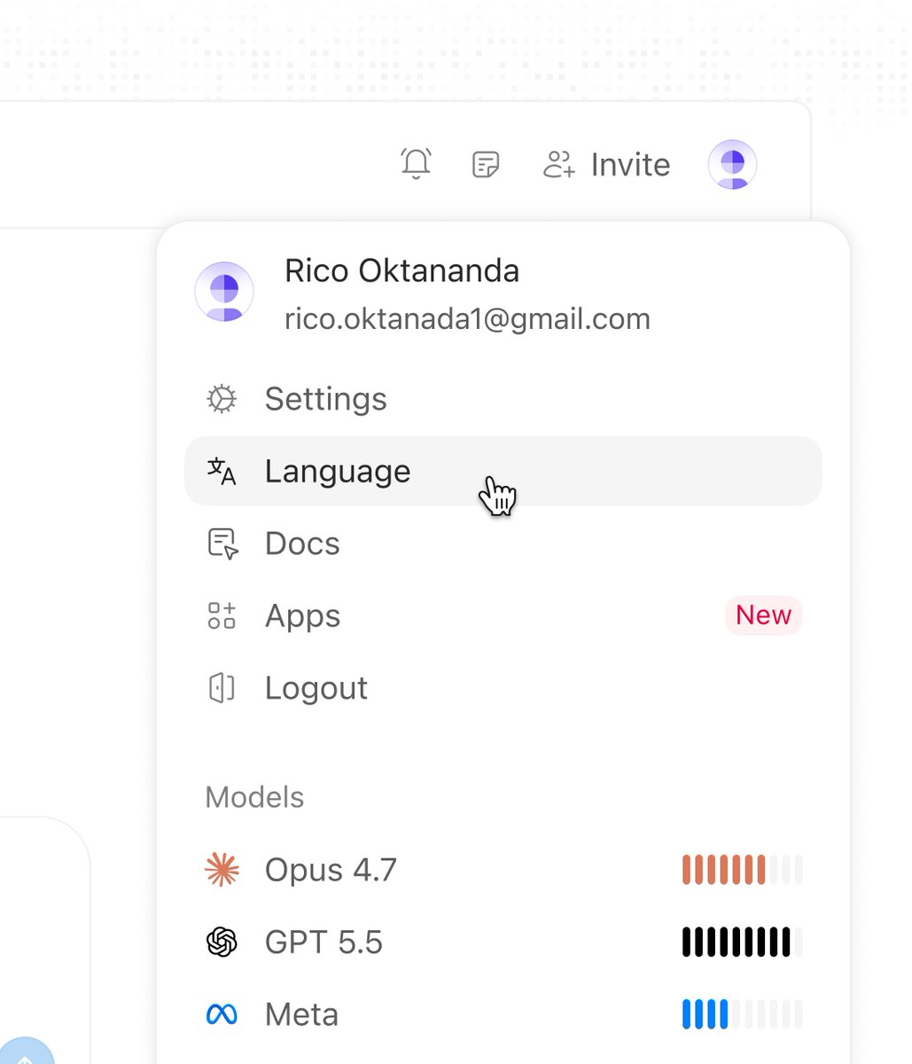
by @_heyrico
https://t.co/nVUYxfskK6
Deep red-black tones let the panel grid recede almost completely, trading quick scanning for a low-light, atmospheric app frame.
by @adriankuleszo
https://t.co/w8u4L3Q2cj
Download confirmation moves into a focused side panel, keeping the invoice table visible while the next action stays anchored at the bottom.
by @gabriell_lab
https://t.co/dEfnNCNOtg
A single tinted phrase and a stack of translucent tiles give the launch post a clear focal point without crowding the message.
by @barlydesign
https://t.co/JlkIRvZRpz
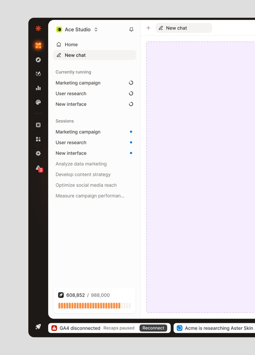
A dedicated blank canvas keeps the workspace ready for the next project while active sessions stay visible at the side.
by @_heyrico
https://t.co/myqvjI7YGd
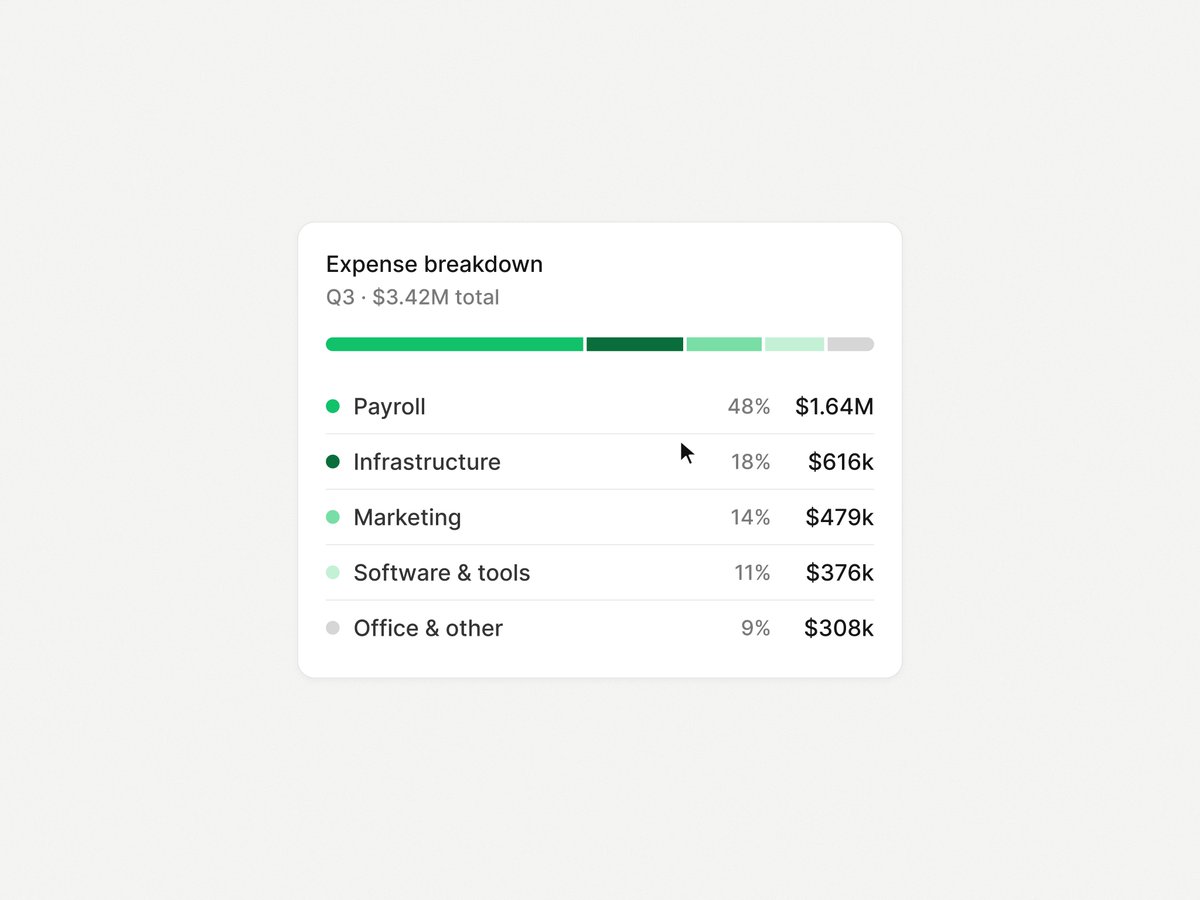
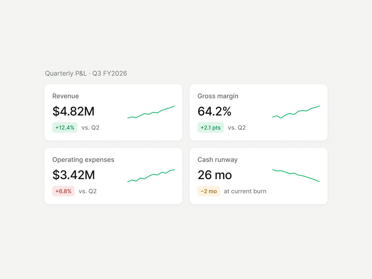
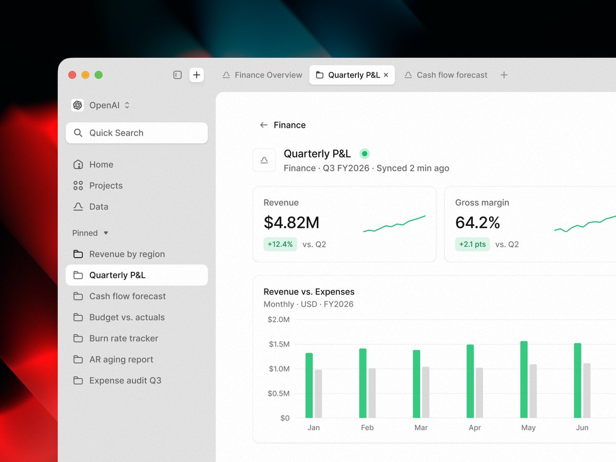
Finance dashboard typography gives summary figures the largest voice, while compact labels and muted chart axes keep the scan focused.
by @n___vc
https://t.co/Pr0ItIIv9F
Blue bars carry the active metric, while pale neighboring cards keep the wider analytics view present without competing.
by @keviduk
https://t.co/NcYkm5tAGZ
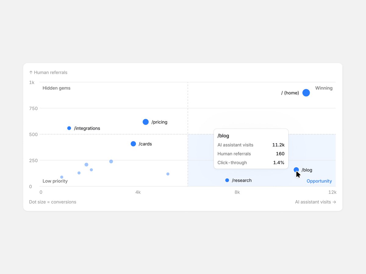
Two equal cards hold dense diagnostics in place, letting a distribution map and latency curve scan as a single comparison.
by @yurygok
https://t.co/2llTlgQ2gU
The map shifts behind the transaction header, freeing the detail view for a compact rewards card and progress marker.
by @Hollysem
https://t.co/9bjgm9943n
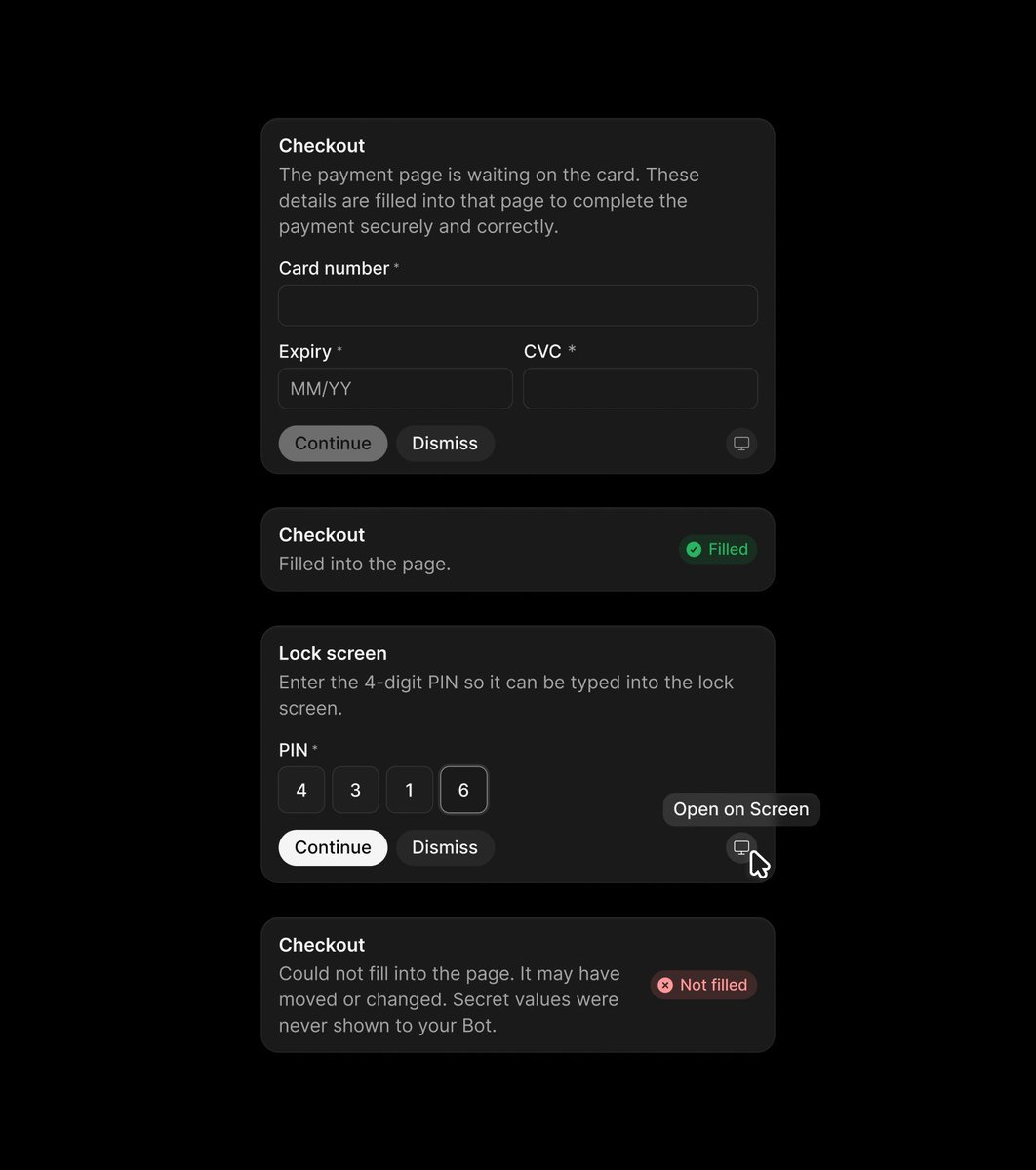
A pale monochrome system keeps secure-input states legible, letting code entry and sign-in share one quiet visual language.
by @kvnkld
https://t.co/J4Hqm0KeA3
A compact sans-serif label sits beside a star mark, while a low-contrast dot field gives the dark pill texture without crowding it.
by @maybepratikk
https://t.co/J2MPKSpWkm
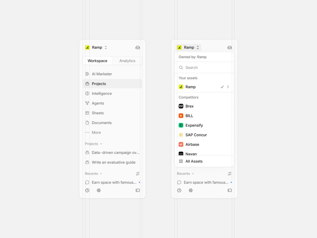
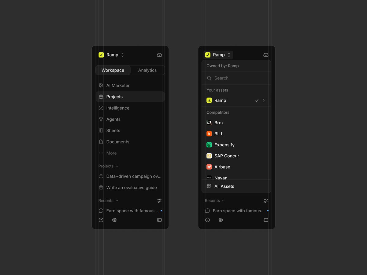
A narrow sidebar keeps navigation icon-led, then gives the asset picker its own quiet layer without crowding the project list.
by @keviduk
https://t.co/z5jMkKnK3W
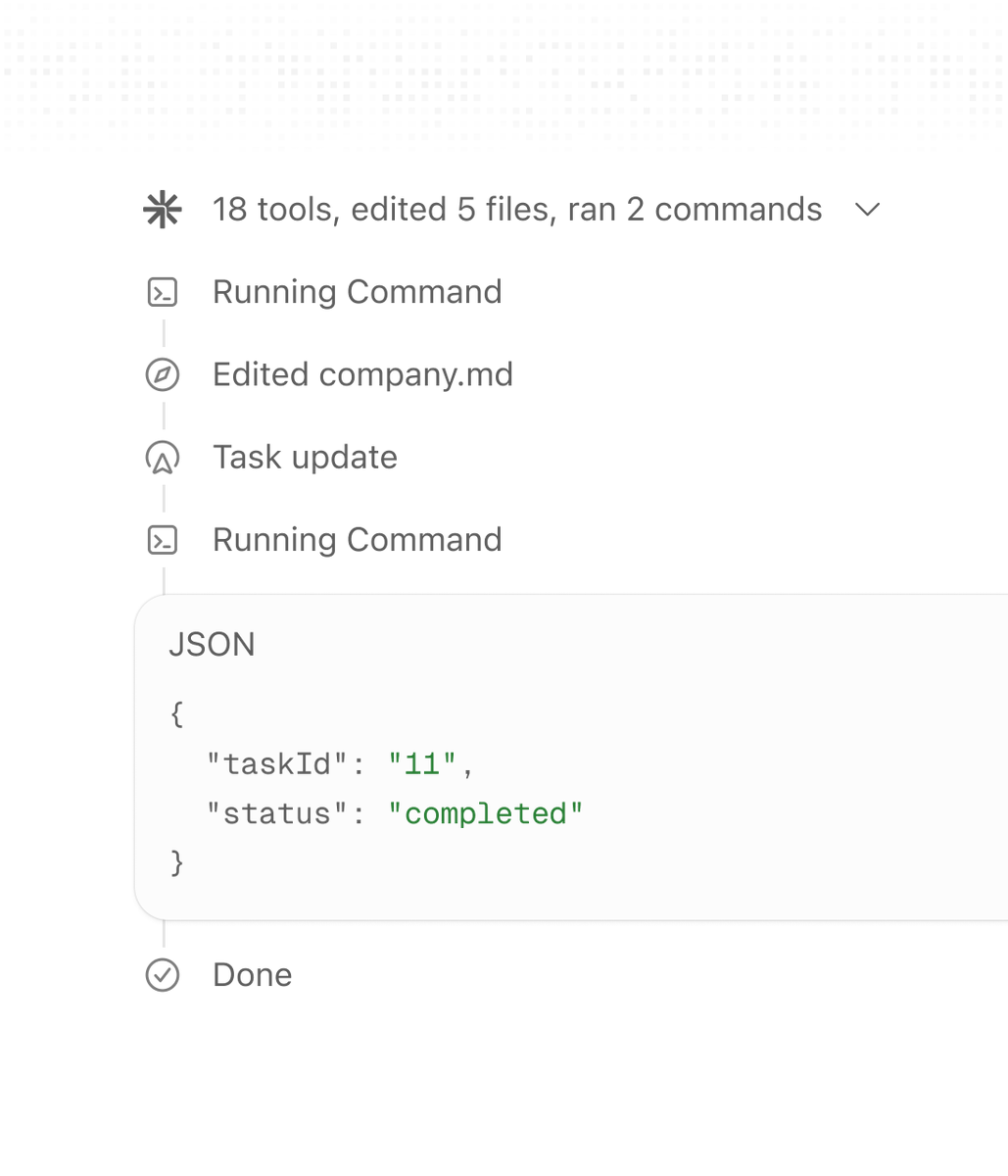
A white rebrand turns tool activity into a quiet vertical record, with outlined icons and a softly bordered output panel separating detail from progress.
by @_heyrico
https://t.co/gPdSowG8JO
An oversized sans-serif headline gives way to compact serif copy, shifting cleanly from statement to explanation.
by @jakubkrehel
https://t.co/RfCQ43A2bj
A compact action row sits directly below the reply, keeping feedback and utility controls close without widening the message block.
by @kvnkld
https://t.co/ZxhoLSJtek