Make your design life 10X easier and use these 5 color contrast score ranges for specific UI elements.
👇Here's the breakdown...
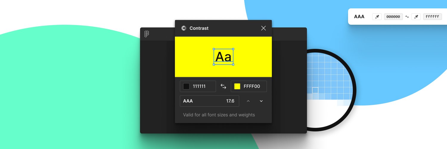
(I started writing this after the recent @usecontrast launch)
Until then, if you haven't tried @usecontrast yet, go do it! It's free and it's awesome. https://t.co/giN0bNNmsv
I guess this is technically now an @adobe product. 😜
I have a bunch of stuff queued up to keep talking about @usecontrast and some solid guidelines for ideal contrast ratios for specific pieces of UI, beyond just pass/fail.
But with all the other design news™ I'm gonna wait until next week.
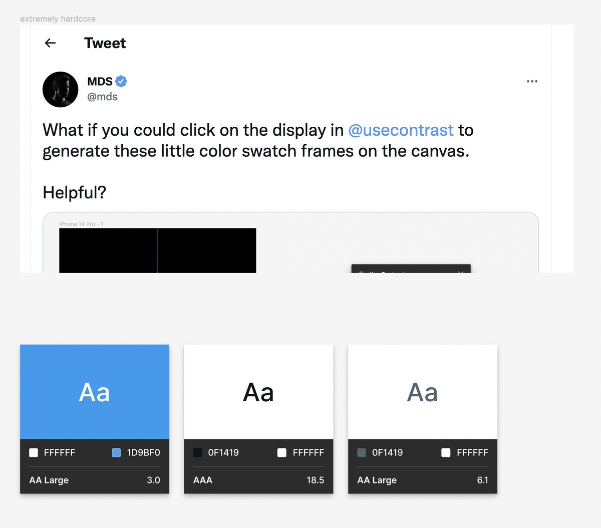
Look at this absolute magic @gusso is sprinkling into @usecontrast. ✨
This is selecting foreground or background and holding holding down an arrrow key.