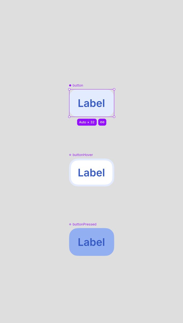
@pieteromvlee To put it another way, we are squeezing designers into the development workflow but maybe developers could adapt more to the design workflow.
In Elyx, these three folders set you up:
📁 Controls – the UI basics
📁 Blocks – groups of controls
📁 Screens – complete views
Each component gets its own file. Import controls into blocks, and blocks into screens.
Small pieces 🪢 connected.
My thinking is at the moment the development formats (e.g. XIB) were devised by developers, but we must be at a point where the UI toolkits could take something closer to what designers are working with and their intentions and work from that. Elyx sounds like it could be in a good position for that.
One of the challenges with modern UI design is responsive design, both for designers and developers.
It got me thinking, prior to the last couple of decades humans never had a need for responsive design, so it isn't something that comes naturally to us.
I wonder if instead it would be better to design for say two or three sizes and then have the software work out the responsiveness between those fixed sizes.
a little eod @elyxdesign sneak peek?
this is collections. on the surface, just a way to gather and browse things. but you can bend it into all sorts of useful stuff:
- see what your team edited recently
- flag files that need attention
- build a proper iconography browser
- get a git-modified overview of the files you changed
basically, a feature for making more features. my favorite kind.
closed software is dead. but i think the way we think about open source and forking is dead too.
we need new primitives for software that is meant to be extended. forks shouldn’t mean choosing between your changes and upstream. distribution shouldn’t depend on maintainers merging everything back.
maybe “upstream” becomes a protocol instead of a product.
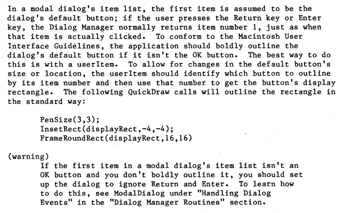
I was just looking into this some more. I first used a Mac in the 90s and the double border button was always there, but not sure if it was there from the start.
Running System 1.0 on https://t.co/Igv7cBeETx there is no double border button on any dialog I could find, except for TeachText, but that is version 1.2 from 1986.
I did find this description of "default button" in Inside Macintosh Volume 1, which has various revision dates within it of 1982 and 1983, but so far I can only find an actual instance of a double border button from 1986.
Just to clarify the thicker second border on the first button represents that it is the default button, i.e. the button activates when you press the Enter key. The 1986 button would’ve just been a normal button in 84 and the 84 button was used up into the 90s as the default button.
@JoshuaSWarren To clarify, you said that it matched macOS output. But that can't be MLX because MLX doesn't use ANE.
You have a model running on Omarchy using ANE which matches the same CoreML model running on macOS and using ANE?
Powermove is out today. It's a video editor where the app itself is the thing you edit.
The kernel is intentionally tiny. Timeline, effects, inspector, the UI, all of it lives in extensions on top. Ask the Powermove agent for a feature and it writes an extension, the same way we built the rest of the editor.
After Effects won because of twenty years of plugins. We're trying to compress that into a prompt.
Free, open source, by Iterative Computer.