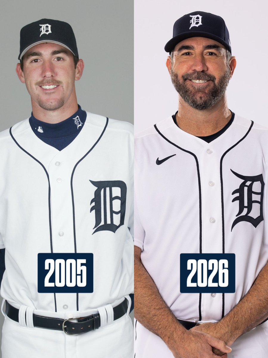
Complete aura loss.
2006: big, ornate Olde English D with real presence.
2026: a shrunk, sanitized “brand refresh,” plus the insinuation fans wouldn’t notice.
We noticed immediately. Stop meddling. Restore the big D on the home whites.
@WhiteHouse@m_fernandez60 It’s a commemorative card for his literal inauguration, you stupid motherf*ckers—not an official government-issued travel document.
@bobwojnowski Don’t worry, Bob. Michigan’s athletic department is a scandal factory. You’ll have a fresh crisis to downplay before the ink dries on the last one.
Clark needs a chain for every fly ball he drops.
Maybe — and I’m just spitballing — make the Show and prove something before you turn into Justin Jefferson. But sure, I’m old. I don’t get it. Fine. I can already tell I’ll like McGonigle more. No frills. Just shows up and plays.
@DetroitTigersPR@Dan_Dickerson Can’t prove it was another Pizza Boy (Chris Ilitch) special. But under Mike Ilitch, that change NEVER gets pitched. Ever. Instead we get ad patches—Little Caesars orange, naturally. Sure. That’ll fix everything. Rant over.
Complete aura loss.
2006: big, ornate Olde English D with real presence.
2026: a shrunk, sanitized “brand refresh,” plus the insinuation fans wouldn’t notice.
We noticed immediately. Stop meddling. Restore the big D on the home whites.
I remember Opening Day 2018: @DetroitTigersPR trotting @Dan_Dickerson out to sell a needless uniform change. They removed the larger Olde English D—worn by nearly every legend, every World Series team, even his longtime broadcast partner. They didn’t modernize it. They erased it.
@tigers@JustinVerlander “i’m emotional” — yeah, me too. I’m mourning the real Tigers home whites: the big, ornate Olde English D with a century of history and actual presence. This shrunk, minimalist “refresh” is sterile, redundant, and unnecessary. Put it back. Leave icons alone. @DetroitTigersPR