Claude Design is one of the most convenient tools for a fast prototype – a landing page, a small tool, a dashboard. Anything that's in your head and you want to see before you sit down to code it.
Five screenshots from the app are enough if you already have some kind of design system. There's also an option to connect it directly to React.
The problem shows up when you want something that isn't super generic.
The starting point is the same everywhere. The same eyebrows above the headings, the same bullets. By the tenth design you start recognising them from a mile away – and you can tell who didn't bother to go one step further.
It's the same as with image generation. The model can produce a great image, but with a short, lazy prompt you get an "AI image". Recognisable instantly. Not bad, just not good enough to actually use.
The tool works. You have to learn how to work with it. That applies to every AI tool – images, design, code, video. If you don't get to know it, it won't solve the problem for you.
The biggest difference comes from references.
Pick a large enough site with good design and give it as the base. I often use Notion, Clay, Deel, Stripe. There was a designer behind those sites who thought about it long enough.
What matters is that the references are real elements from real sites.
For years Dribbble was full of mockups that look great as an image, and the moment you see them implemented they make no sense. Pure eye candy. Strip the eye candy away and nothing is left. Real sites have already passed through that filter.
Copy is the second part you need to touch.
The text from the first iteration is so generic that if you leave it, you'll see another 150 sites with the same words and the same style. It looks well organised, it sounds meaningful, but the moment you look closer – it says nothing. It doesn't deliver the content clearly and concisely, it carries no value for the customer.
Five levels above Lorem Ipsum, because at least it's relevant. But it's for rewriting.
What works best for me: treat it like a real project, not a series of one-off prompts.
Tell it to define and reuse components – header, footer, cards, styles.
The easiest example is the logo. Until I gave it the real one, it invented a new version on every new page and drifted away from the design. The moment we put in the real logo and finalised the header and footer as components, every following page used them.
You stop thinking about the basics.
One thing that still doesn't work well for me: third-party logos. I use them often as favicons. The Google Favicon API and the other options don't come together easily. I still haven't found a clean way to display the logos of 50 companies without baking them into the JavaScript itself – especially when I want to publish the design as an artifact.
And the most underrated benefit is proportions.
If you have no design background and you're building something bigger for the first time, that's exactly where you'll fall apart. Claude Design handles them properly – the spacing between sections and elements stays consistent.
After all these years this is still my weak spot. I know there's a design system somewhere that defined all of it, and articles with best practices. I never learned them.
So getting a well structured layout with the right spacing out of the box is worth a lot.
Thanks to AI slop SaaS, I finally understand how my literature teachers felt.
The bulk is there, some of the names and elements are correct, but does it make any sense? Nope.
The way we used to “hallucinate” essays in high school is the same way people create apps today.
@PovilasKorop I can agree, when I see wall of generic text, AI keywords, AI art image it is an instant red flag for me. Curious how this will affect the majority of people and how good the AI content will get.
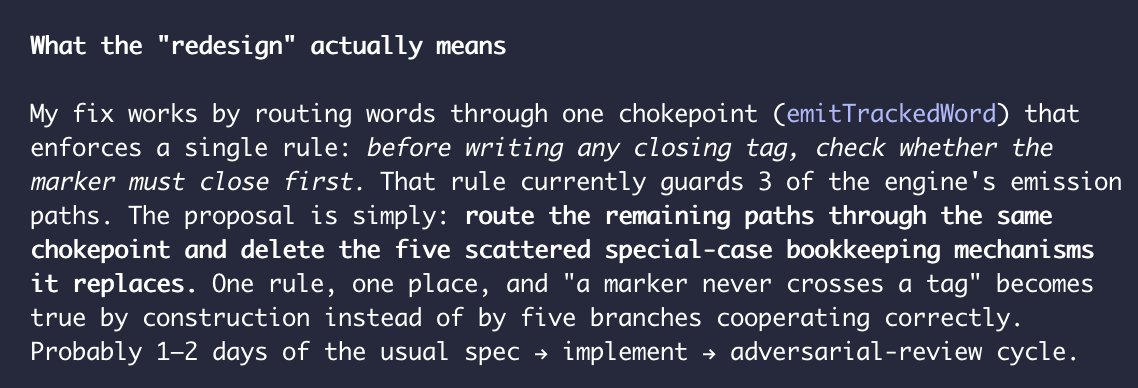
I regret every time I forget to tell Fable to implement simple tasks with cheaper model and only evaluate and give directions. Ask me why this is not part of my agents file… 🤦♂️
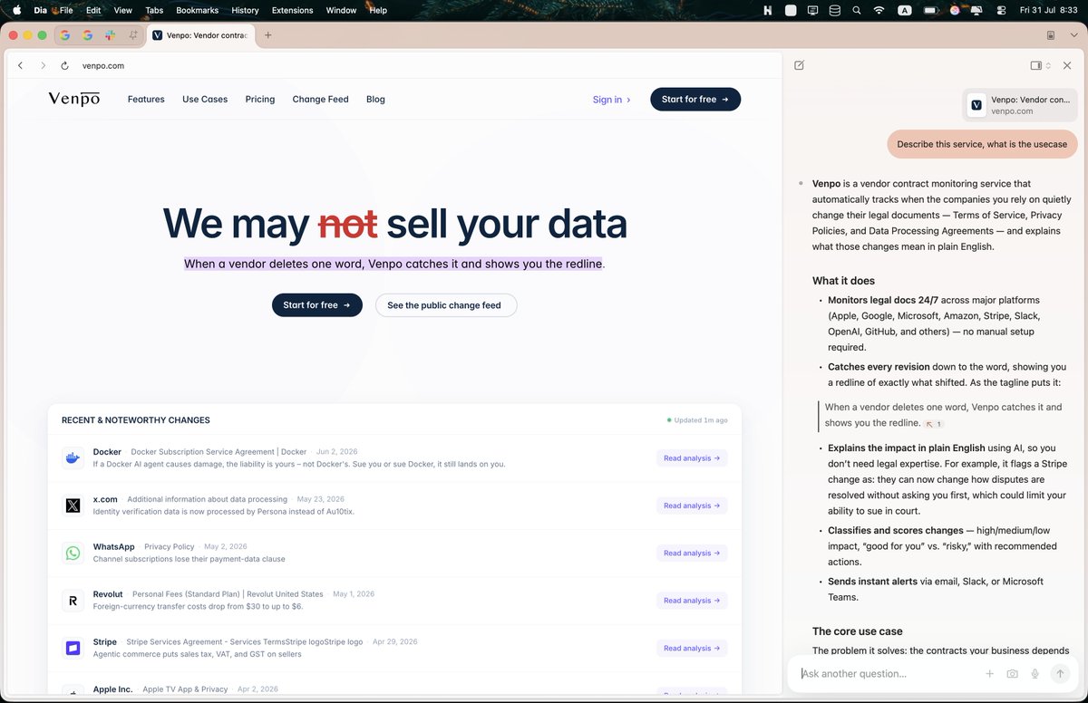
Just tried @diabrowser and I love the layering of each panel, the chat on the side and how seamless the address bar is, the small rounded corners and light shadows. Since it is Chromium powering it – feels familiar.
I'm really curious about their terms and data usage practices.
@atanaspekanov Културата можеше да бъде по-добрият избор, но текущите дизайни не използват пълния й потенциал. Птиците от друга страна са красиви, нямат разединяващ характер, но им липсва и принадлежност. Като цяло новата емисия няма силен общоевропейски обединителен подход.
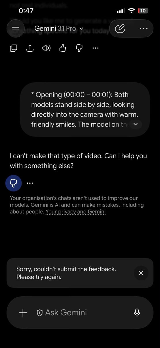
Once in a while I try to do something with Gemini and every time the result is so disappointing. 🤦♂️ I understand that you don’t need my feedback too.
@levelsio On the other side is Bulgaria, you can put an AC everywhere, nobody cares, but this makes everything unbelievably ugly. From my point of view Paris approach is better.
You are a bit late to the party, the prices increased +50% since Covid. You can still find decent places with normal prices, but the price gap between Eastern and Western Europe is narrowing. One thing I can disagree with would be the groceries - you can find good and cheap produce especially if it is in season. You are late for strawberries so expect them to be expensive, but watermelons and peaches are cheap now. Try another market, the price for watermelon should be 0.6c per kg.
Fifteen years ago I worked in a corporate office. Departments, floors of people, a team you could walk over to.
When we started Venpo, some part of me was building toward that. Not on purpose – it’s just what “a company” looked like in my head. At some point we’d have the office, the dedicated team reading vendor legal docs all day.
We do maybe a hundred times that work now, and none of it happened. An agent reads the documents around the clock. The team stays tiny. Costs stay low. We don’t have to manage a floor of people, which, honestly, I never wanted to.
Nobody tells you the tradeoff. You build the lean thing you always wanted, and it’s genuinely great, and it’s also just you and a very quiet room.