ooooh I’m Charles Leclerc. I make 40 million dollars a year to be Ferrari’s golden boy. I get to celebrate marrying my model wife by driving universally beloved, vintage Ferrari cars around my gorgeous, scenic hometown where I am a local hero. Fuck you.
My mom has a little notebook where she writes down every movie she watches and a few of her thoughts about it. I told her about Letterboxd & she said "does everyone need an audience for their hobbies now?"
consistency ≠ uniformity:
for those who haven't lived through this era – we used to have beautiful, precision interfaces. now they're replaced by a design language that originated from the Apple Watch, with icons that only fit in squircles. but that's not even the point.
the point is we used to design the whole stack – the technology, the concepts, the interfaces. when designers only care about superficial consistency, platforms lose their uniqueness.
apple used to design systems. skeuomorphism wasn't just about leather textures – it was about teaching people new mental models. the trash can empties because you understand what a trash can does. aqua's lickable buttons and sheets had depth because the OS had layers you could understand. the old apple designed the whole stack – from metal to pixels to concepts. teams weren't just shipping features in the same box, they were building coherent platforms each with opinions about what computing should feel like for the medium.
liquid glass is fine on a phone. but on macOS it's unusable – lack of precision, visual noise everywhere. this is what happens when UI language designed for fingers bleed into macOS. we went from interfaces designed for a 27" cinema display with a precise cursor to interfaces designed for a 1.5" screen you tap with one finger.
the Mac is for creation and precision work. it needs information density. it needs chrome you can grab. it needs UI that gets out of your way but gives you power when you need it. instead we got padding and whitespace and translucent blurs optimized for touch targets nobody's touching.
the squircle icon mandate is a symptom. when you force every icon into the same shape, you're saying "brand consistency" matters more than "each app icon needs to communicate its function instantly." we traded clarity for uniformity. we traded precise design for cross-platform sameness.
consistency means your system has coherent rules within itself. uniformity means everything looks the same regardless of context.
the hardware team still gets it – that macbook pro + M-series chips, chef's kiss. but software design feels like it's chasing fat fingers instead of remembering what people do on a Mac.
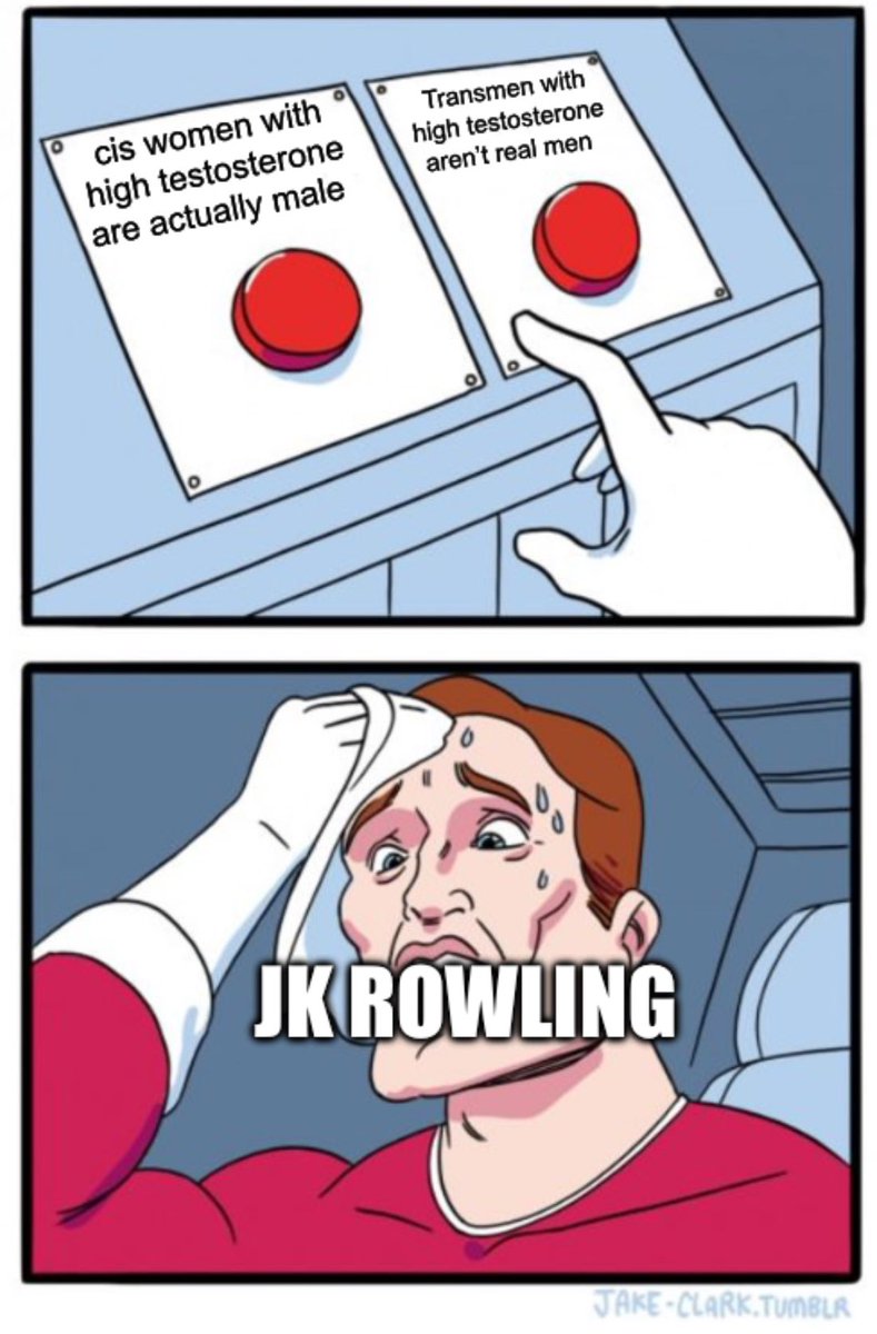
transphobes are so dumb!!! if they really cared about “biology” and “facts” and “women’s rights,” they should be championing Imane Khelif!! she was literally born a woman! but it was never about biology or genitals or whatever it is yall yap about, was it?
“I have never been hit so hard in my life. It’s up to the IOC to judge.”
Italy’s Angela Carini after lasting just 46 seconds against Algeria’s intersex athlete Imane Khelif.
Biological firestorm at Paris Olympics.