Visualization Manager @ Facebook exploring the connections between #business, #technology and #design. @tableau #IronViz Champion 2015. Views are my own.
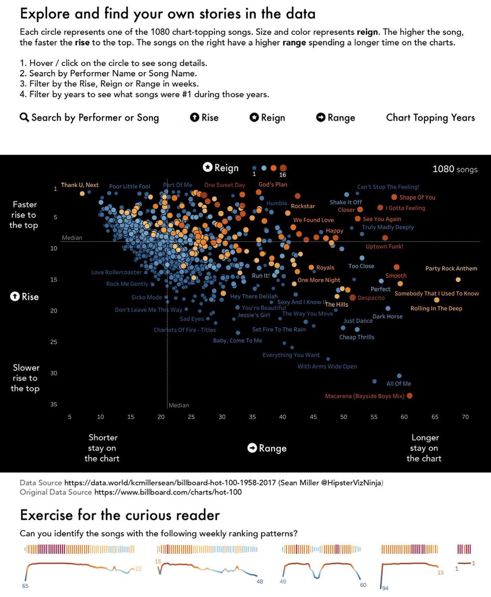
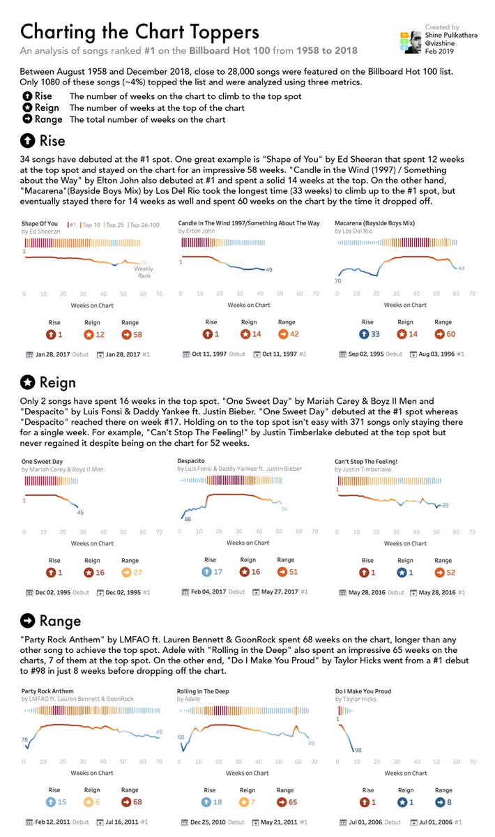
My latest @tableau#dataviz story Charting the Chart Toppers https://t.co/NrZxwKjdSM analyzes the top singles on the #BillboardHot100 from 1958-2018 using rise, reign and range. Thanks to @HipsterVizNinja for the amazing dataset.
It’s always a joy to see @infowetrust in action! Thanks for guiding us on an adventure with data! We so appreciated the opportunity to learn from and be inspired by you!
NEW!! 🎉 Super happy to share a new #dataviz project that visualizes how Planet's satellites creates a full image of Earth's landmass in ONE day! 🌍
See how the Earth is slowly build up from each of the whopping 600,000 images taken in a single day 🛰️
https://t.co/7vtn7B0evQ
What happened on the #Apollo50 moonwalk?
Presenting a 💫new data story with original art, scrolly viz, & animated map. See it on a big screen for a big experience: https://t.co/mHquTpEI14
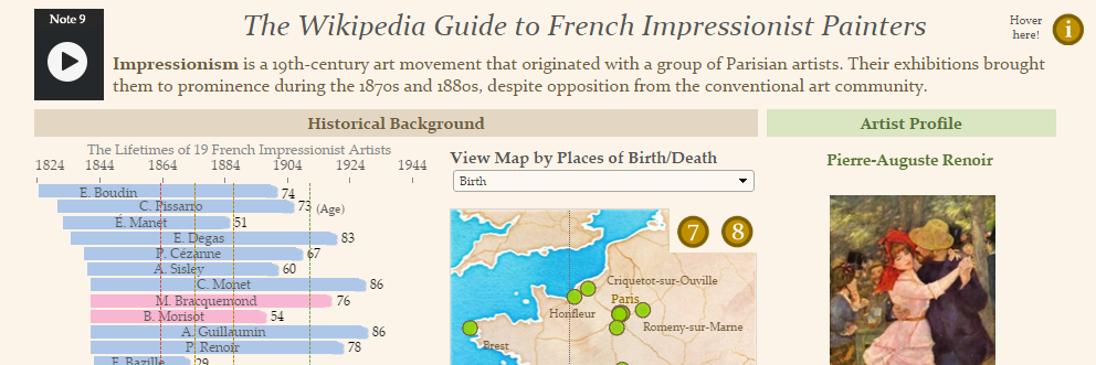
Here is my @tableau#ironviz entry. Coming from an extremely musical family I dedicate this viz to my 98 year old grandma that still plays the piano every single day!😍
Also huge thanks to @HighVizAbility @FlerlageKev@jreevers5 for all their support!
https://t.co/EdRwAWhFfr
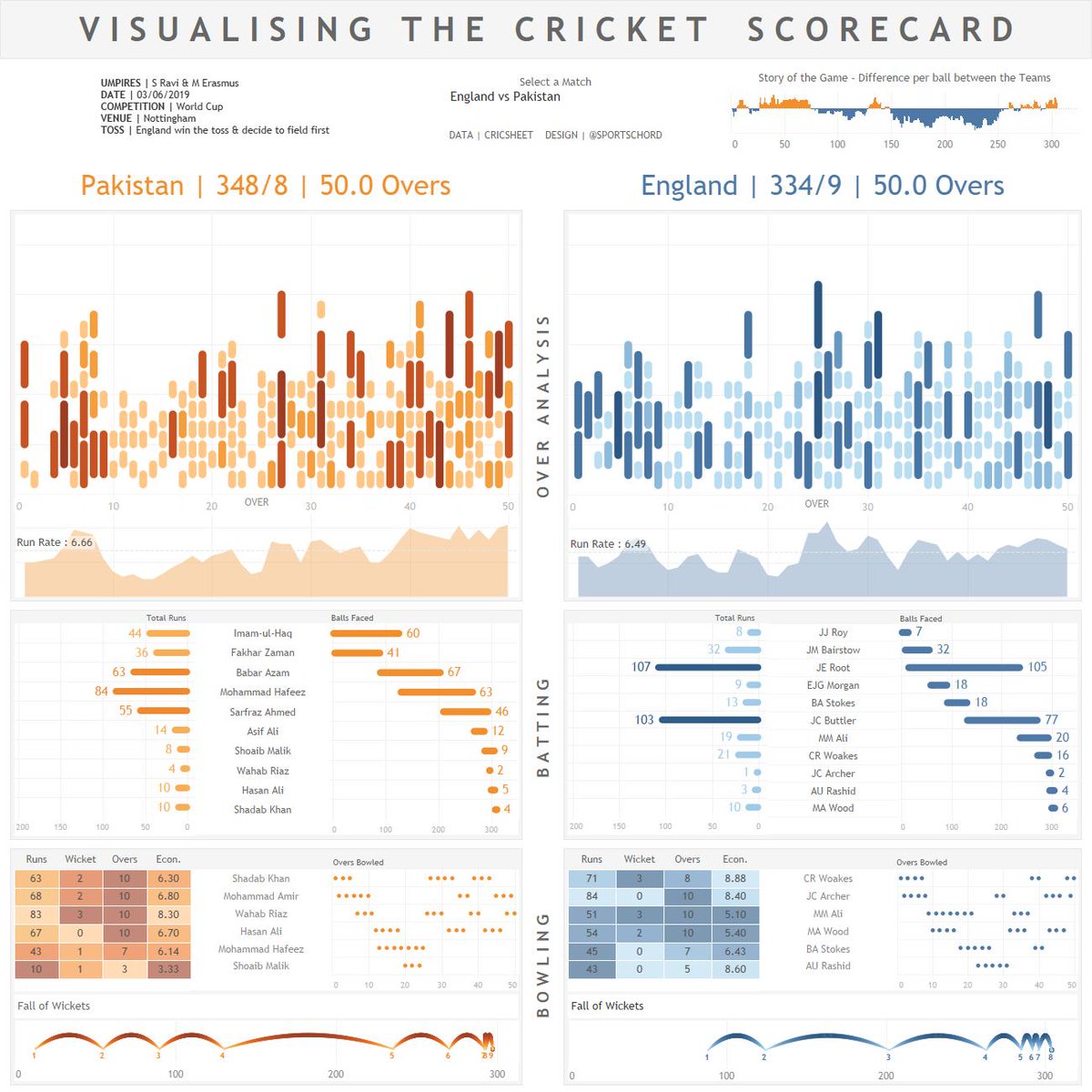
VISUALISING THE CRICKET SCORECARD 🏏📊
A #CricketWorldCup2019 inspired project to tell the story of a cricket match using data visualisation (data from @cricsheet)
Full write up: https://t.co/cPR5Zvgyqi
@tableaupublic : https://t.co/Icb4Wn13KE #sportsvizsunday
Pie charts are evil. Decoration is bad. There are so many rules in #datavisualization & it takes a long time to learn them all. Once you do, @flerlagekr points out that you then need to learn something even more esoteric and difficult: when to break them.
https://t.co/xZCDESVZrq
New blog! 🎉In which I explain 9 different "Techniques for Data Visualization on both Mobile & Desktop"
Including the more common stacking and scaling to more exotic options such as adjusting locations or even two different charts.
https://t.co/URF3X1a1Kb
@FILWD@NadiehBremer It is a little complicated to explain, but I think this is better than just throwing the chart out there and expecting people to interpret it correctly.
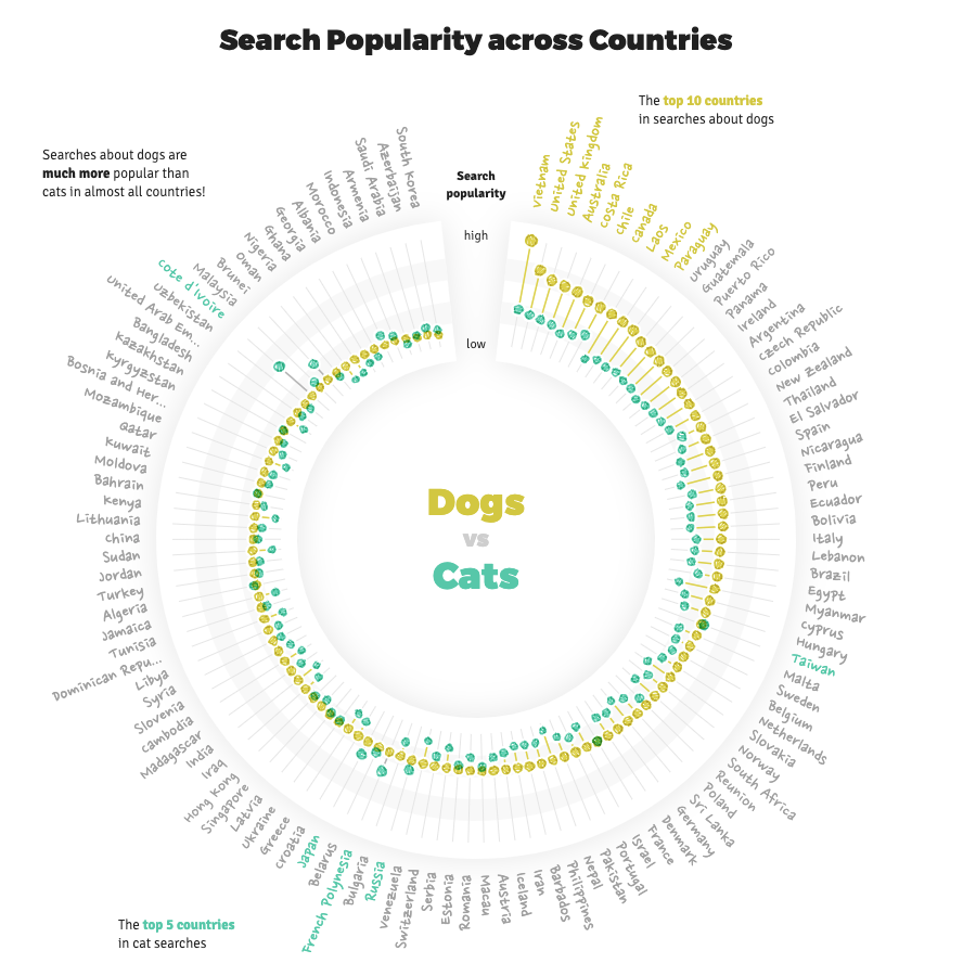
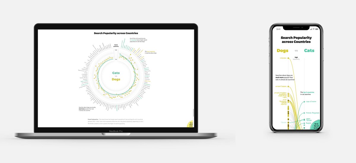
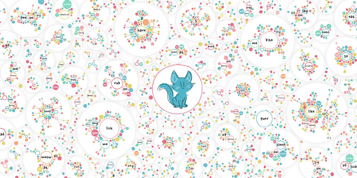
🎉 NEW!! 🎉 BIG release of my #dataviz-driven visual exploration in collaboration with Google Trends 😃
"Explore how people search on Google to understand the often weird & mysterious behavior of our 🐱 & 🐶!"
https://t.co/DAEbFqDBJg
Enjoy exploring & Happy US Pet Day!
Working on your #IronViz entry and struggling with blank canvas syndrome? Set your pace with examples of analysis, storytelling, and design: https://t.co/4VzUpey5W7