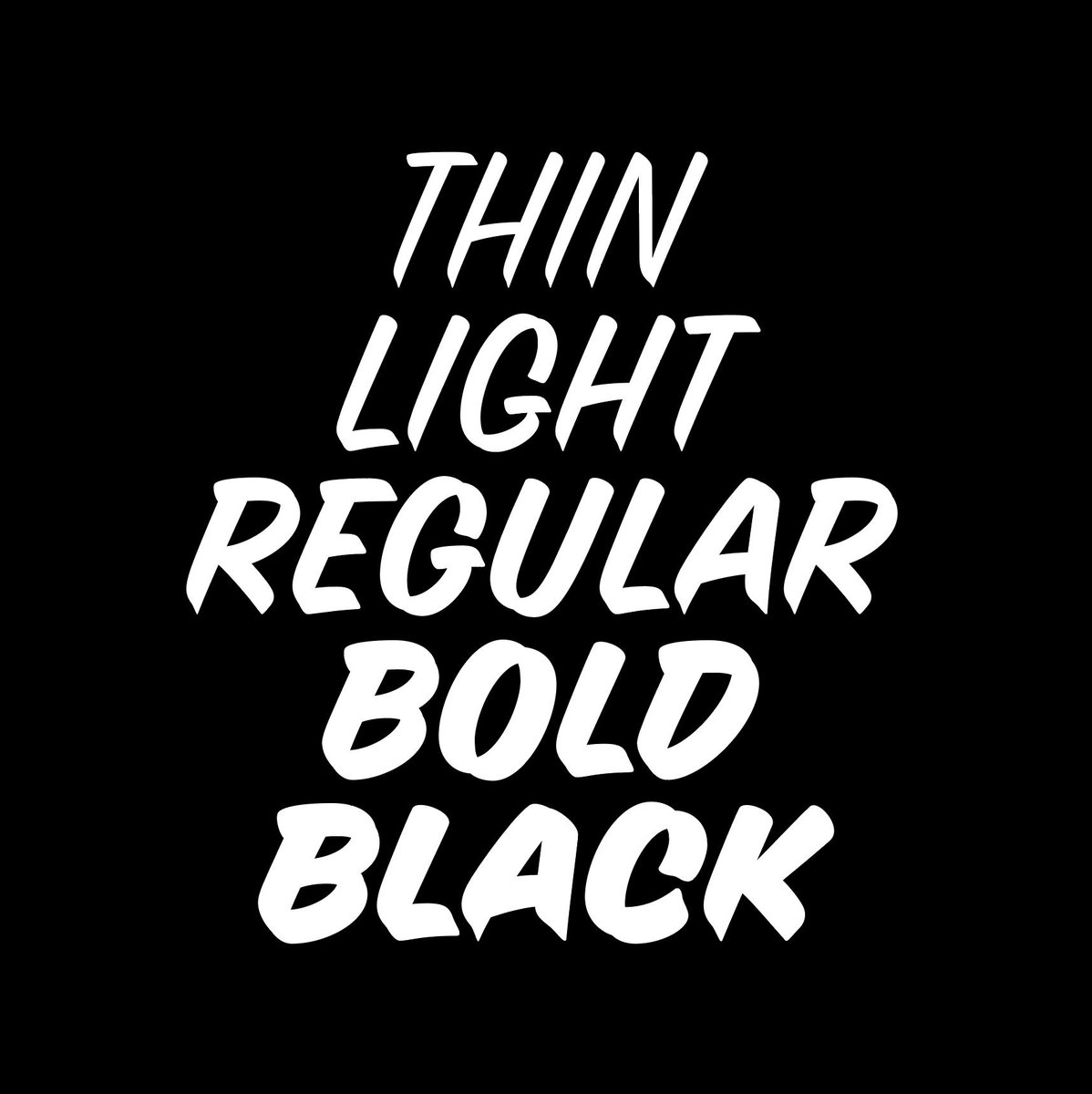
weight axis is here: thin, light, regular & black! caps only for all (4) new styles, but regular adds in swash caps and lowercase. #zccasual v.03 @futurefonts, go get it while is hot!
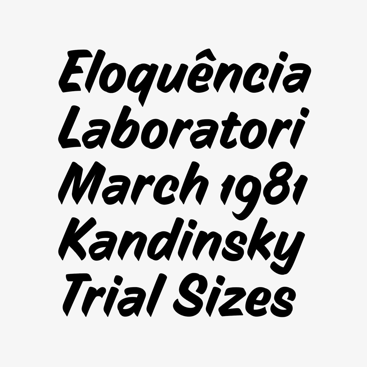
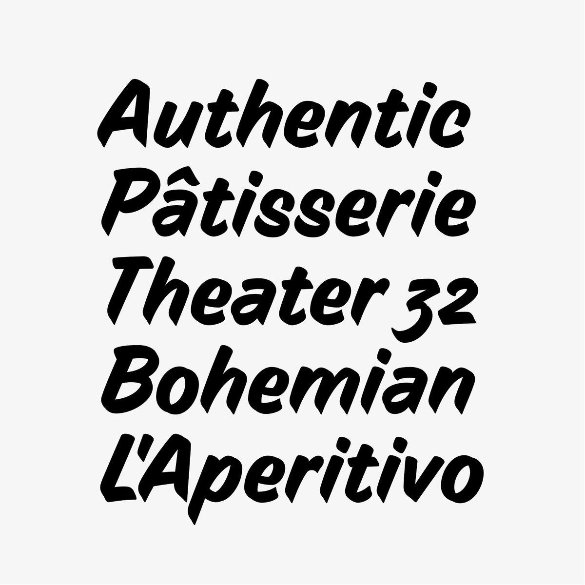
Another taste of the lowercase casual that is now part of the ZC casual V.02 available at https://t.co/6c7FHaXjkD
Swipe left to see the brush stroke sequence to recreate it by hand.… https://t.co/qgVPcEODce
The casual lowercase shouldn’t be connected or present high contrast — that'd be a “script” on a sign painter palette. And it’s not quite simple to translate the speed/expression into much more elaborate forms. But while we are at it lets add old style figures & some alternates.
ZC Casual is 3 weeks old but still has a long road ahead. Lowercase is in the works and a new version might hit @futurefonts faster than you expect! Once it upgrades the price will also increase. Get it while is only $18.
Super happy to promote our new typeface ZC Casual! Go check out on @futurefonts — the way they operate makes it very accessible to get chill fonts for a great price. The casual single stroke has always been one of @caetanocalomino favorite style to paint and work with 😄
✨NEW RELEASE✨ ZC Casual by @zcstudio. This speed stroke based on Caetano’s casual style has so much energy it bounces off the page. Soft entries, crisp exit strokes, and swashes bring a fresh energy to the compositions. Sparkles included! Get it for $18!
https://t.co/vKNyAe0LL9
Got to paint the redesign I did for @difarapizza_nyc with my good friend vanzeesignco
Always good to see digital becoming REAL. 🙏 https://t.co/9DXw4zMMkY
Good to see this one hanging.
Make sure to give frankelsofbrooklyn a visit for all your work gear. 🛠Masterfull installation by signsbylynn_ @ Frankel's https://t.co/1PWY2IMrMq