If you are a type foundry or font distributor that accepts submissions, I’d love to ask you a few questions about what you look for, so I can share some pointers with my students. Please reach out. Thanks :D
NEW TYPEFACE: Gardein—A fresh, organic type for headlines, short texts, and eco-friendly brand messaging. Try it out in my type-tester and read the design notes here: https://t.co/lJPCklFzUY
For all those designers throughout the years who have asked me for font recommendations or 'similar fonts to' requests, I'm working on a newsletter that publishes playlists of typefaces you probably haven't heard of.
Check it → https://t.co/SSTqr04KgY
This episode of the Interrogang features some of your finest summer type releases:
🃏 Kibitz from @colophonfoundry
💾 MD IO from @mass_driver_tm
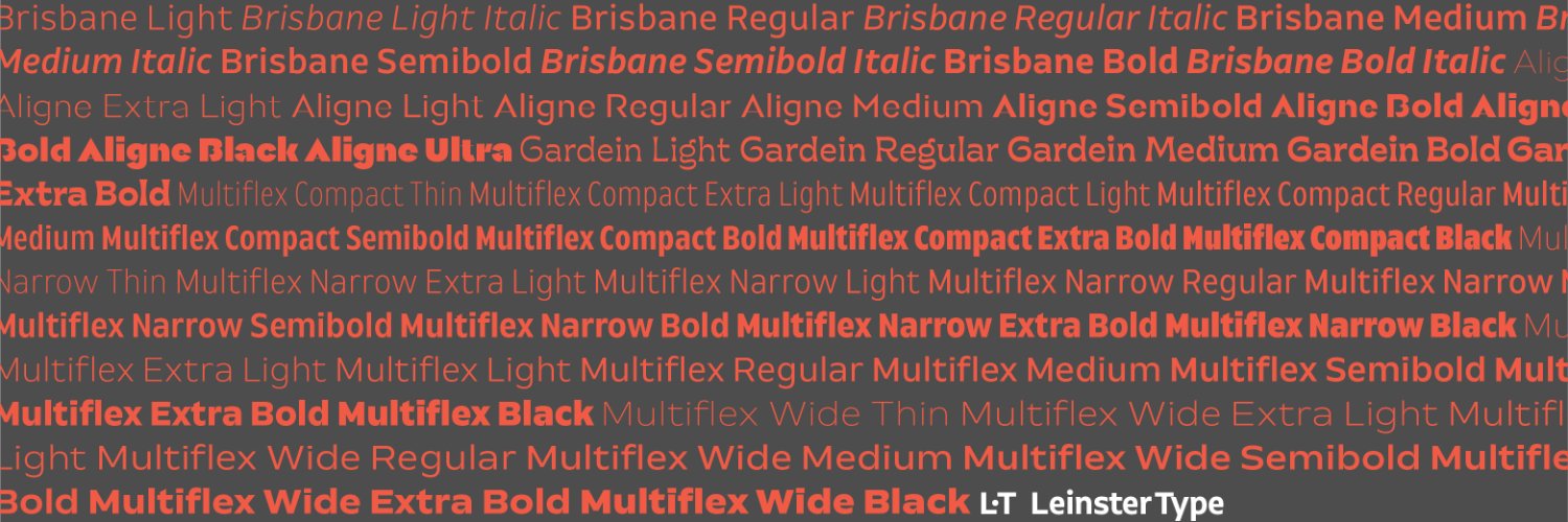
⛔️ Aligne from @7roy
♠️ Spades from @ordertypefound
Listen here → https://t.co/RnYgmwzfSm
NEW FONT: Aligne—A high contrast geo sans family available in five weights from Light to Black, or as a variable font for adjusting weight grades with fine precision. Try it out in my type-tester and read the design notes here: https://t.co/p4rfLgIF8I
Presenting Sedgwick—a mannered, upright, unconnected script with a touch of ‘tude. Sedgwick creates an eye-catching texture on the page and is perfect for short poetic texts and exquisite word-marks. https://t.co/B31ARTZnFp
Spring release coming next week! Subscribe to my mailing list for notifications of latest releases, 1-on-1 type design coaching opportunities and more. https://t.co/cLgBlPFdmM
Our latest release Brisbane is now available as a #variablefont for both the upright and italic styles. Reach out for a trial or test drive it in our type tester using the variable slider at https://t.co/EGGl0TPh6d
Registration is open for winter/spring classes and workshops. Check out the new offerings and old favs taught by @TypeLettering@ellenLupton @typetura @heykylehey @jasehueser@7roy@djrrb@Zrinka_B & more : https://t.co/16XefY7tu9
Thanks to @proof_and_co for mentioning Brisbane in this weeks episode of the Interrogang podcast. “A sans serif with a knack for clarity and precision” “Quintessential but certainly not boring” Kyle Read. https://t.co/kCuwPKpbMM
New Font Release: Brisbane. A family of ten styles from Light to Bold with accompanying italics. Designed for use in branding, wayfinding, and text settings. https://t.co/5AVhv9ulcR. Big thanks to @thedesignguyyy: Website, Chris Skinner: Animation, @arrowtype: Font Production