Basit ve güzel bir anlatımla " tüm çokgenlerin dış açılarının toplamının neden 360 derce olduğunun ispatı. Hiç bir çocuk bu şekilde anlatıldığında bunu unutmaz.
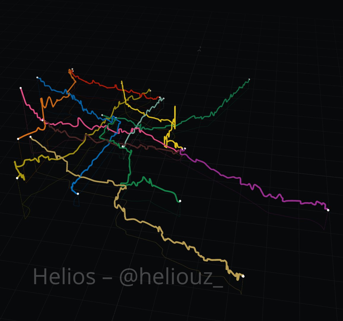
Hice esta visualización del metro de la CDMX en 3D y me gustó mucho. No es tan lineal como imaginamos.
Las estaciones más elevadas están todas al poniente de la ciudad: la más alta es Observatorio a 2,310m, luego Tacubaya a 2,288m y después Constituyentes a 2,282m.
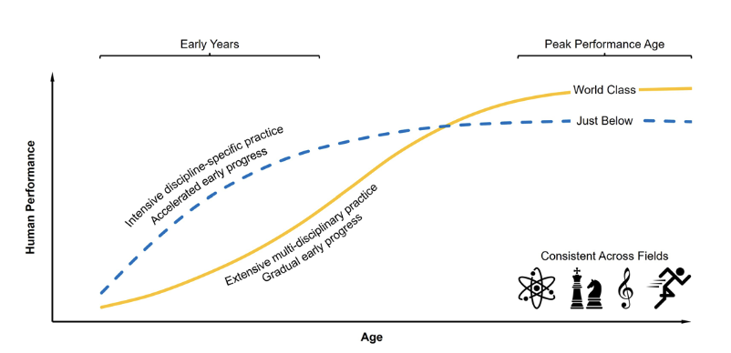
La excelencia profesional a largo plazo se construye realmente con amplitud de formación/ experiencia variada
Estudio Güllich revela que prodigios juveniles se especializan rápido, pero adultos de élite alcanzan la cima tras una práctica multidisciplinar https://t.co/HppaDzAjTg
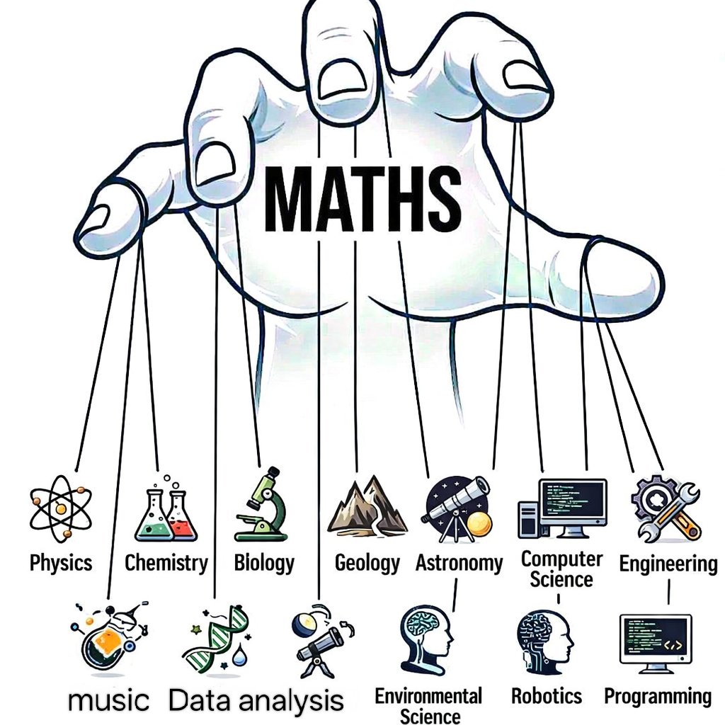
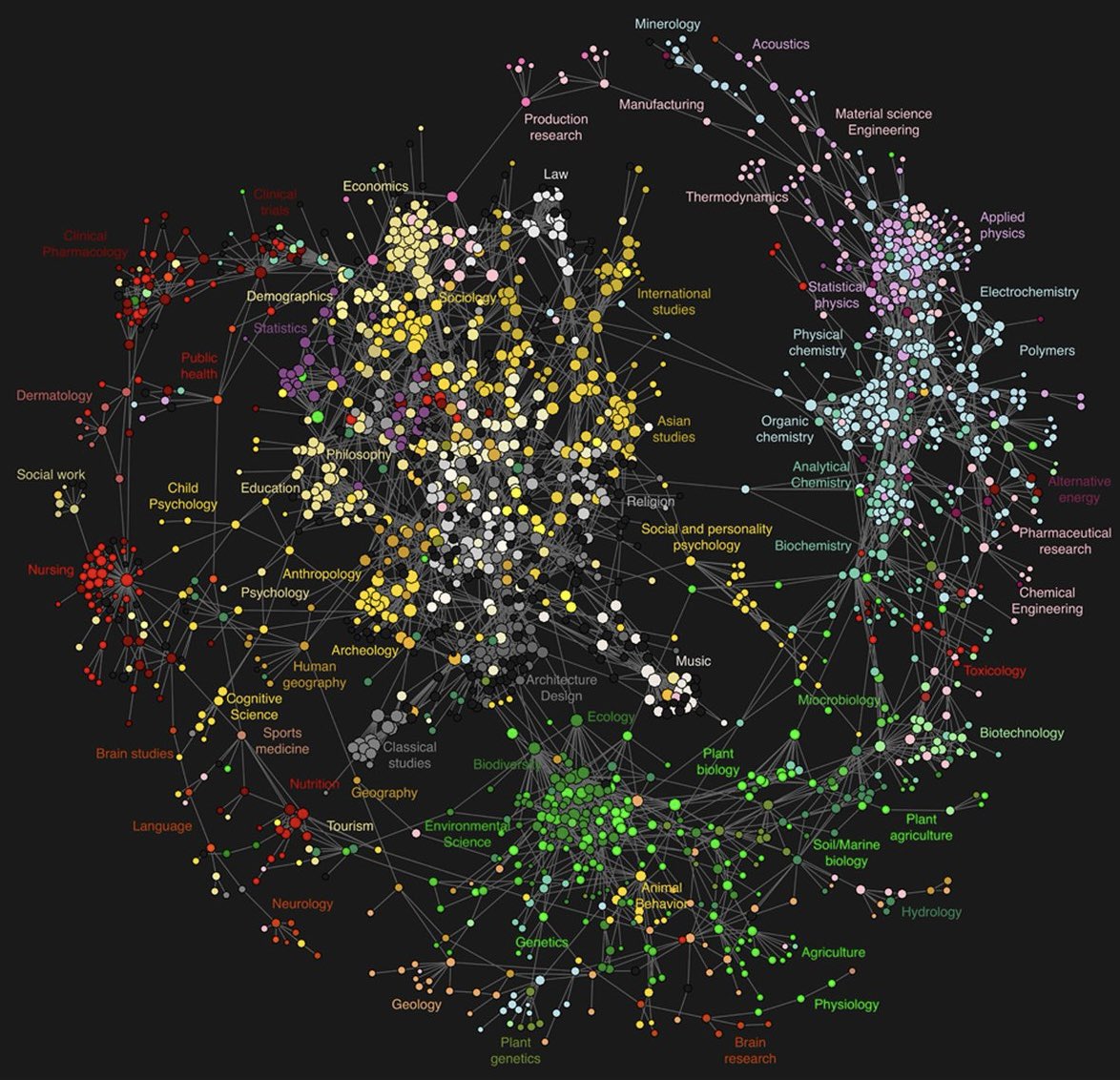
Map of All Human Knowledge
There are a few ways you can map all known human knowledge, depending how you define it, but the chart below uses academic citations.
I always thought this was cool, as it’s a good indicator of how easily (or not), you should find going from one set of expertise to another.
If you have to do a big jump across the map you will find the whole lexicon can be completely different, whereas within a cluster you can move around quite freely.
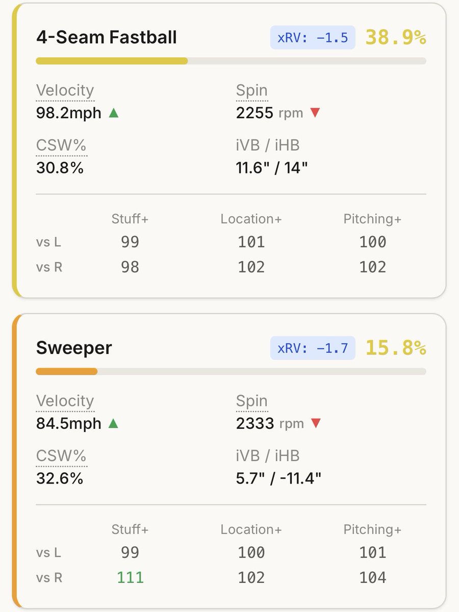
I’m a baseball player. I’ve never written a single line of code in my life.
But over the last few months, I used AI to build a pitching analytics platform from scratch.
8.9M pitches. Custom ML models. Total transparency.
Here is a look at what happens when you give an interested athlete access to AI:
How can you make your data visualizations more engaging and easier to understand?
Static plots show the result, but they often miss the process behind it. Animated visualizations allow you to reveal how values change over time and how uncertainty develops step by step.
The animation below shows an example of a time series together with its future projection. The blue line represents the observed data, while the shaded area shows the range of possible future values. As the animation progresses, you can see how uncertainty increases the further you move into the future. Please note that this example is not intended to present the best possible forecast. Instead, it demonstrates how powerful animated visualizations can be for communicating dynamic behavior and uncertainty.
In the Statistics Globe Hub, you will learn how to create these types of animations in R using the magick package and how to use them to make your analyses more clear and engaging.
The Statistics Globe Hub is my new hands on learning program designed to help you build practical skills in statistics, data science, AI, and programming with R and Python. It launches on March 2, and a new applied module will be released every week.
More info: https://t.co/NA2b7UAXJ4
#Statistics #DataScience #RStats #DataVisualization #Animation