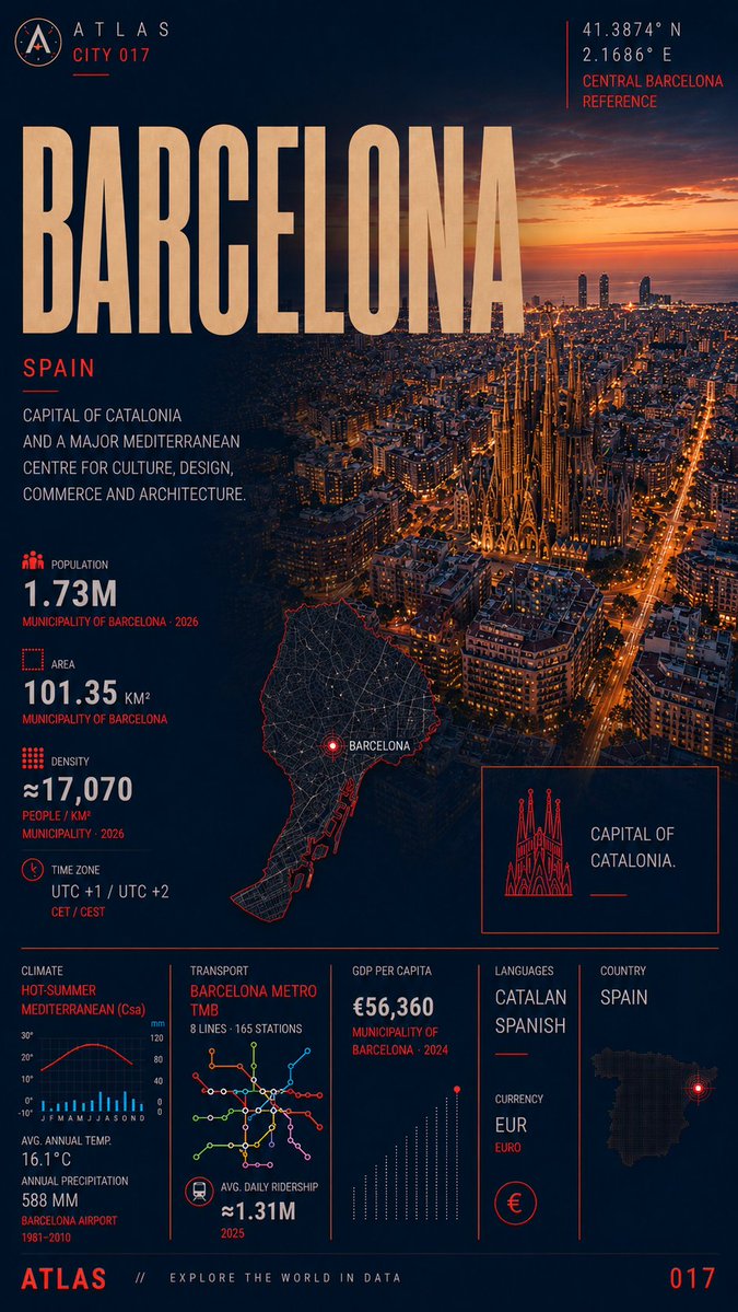
@Civixplorer Different boundaries, different story.
Barcelona municipality: 1.73M people on 101 km² ~17,070/km².
Tokyo Metropolis in our card: 14.3M on 2,200 km² - 6,500/km².
The photos are neighbourhoods. The averages are the whole administrative unit.
@DataOfStats The Spain map is a clean, classic overview that still manages to highlight something easy to overlook: how compressed the country’s urban hierarchy actually is once you move beyond the big labels.
@Globalstats_77 This Top 20 Safest Cities list is pure Atlas Index energy. Abu Dhabi, Taipei, Doha and half the UAE at the top proves it: safety is data, not vibes. Strict order still wins.
@VisualCap The map shows a clear split in the global economy. Many countries still live off fuels or raw materials, while the most advanced ones dominate machinery, electronics and chemicals. What a country exports most often reveals more about its economy than GDP numbers alone.
@DataOfStats Across much of Southern Europe the word for sun is simply “Sol” - including in Barcelona. Fitting for one of the continent’s densest cities, where the Mediterranean light is part of its identity as much as the tight urban fabric.
@Globalstats_77 Spain often ranks as one of the most festive countries - and Barcelona sits at the heart of that reputation. It’s also one of Europe’s densest cities, so the celebrations and tourism land on already limited space.
@OnlyInBOS Barcelona is one of Boston’s sister cities — and one of Europe’s densest. Nearly 1.7 million people share just 101 km², with tourism adding even more pressure on limited space. A fitting match for a city that understands density.
@onlmaps For a brief moment in the 11th century, one king ruled England, Denmark and Norway at the same time.
Cnut’s North Sea Empire was a personal union held together by ships and authority — impressive while it lasted, but too fragile to survive his death.
@LogicUniv Fewer people don’t always mean a weaker economy.
In several European countries, a shrinking population is still paired with rising income per person — until ageing and labour shortages catch up.
COMPARE 003 — New York vs Los Angeles
NY: denser.
LA: almost 2× the built-up space per resident.
Same country. Opposite urban form.
Which model actually fits how people live?
@ScopeWorldX New York’s beauty comes from its contrasts - iconic skyscrapers, peaceful parks, historic streets, and vibrant neighborhoods all sharing the same city.
COMPARE 003 — New York vs Los Angeles
NY: denser.
LA: almost 2× the built-up space per resident.
Same country. Opposite urban form.
Which model actually fits how people live?
@simongerman600 Ethnic mixing is clear from the maps, but economic segregation and rising housing costs tell a different story in many of those same neighborhoods.
COMPARE 003 — New York vs Los Angeles
NY: denser.
LA: almost 2× the built-up space per resident.
Same country. Opposite urban form.
Which model actually fits how people live?
COMPARE 003 — New York vs Los Angeles
NY: denser.
LA: almost 2× the built-up space per resident.
Same country. Opposite urban form.
Which model actually fits how people live?
@Globalstats_77 Hong Kong with 23.2M visitors makes even more sense when you look at its urban density. Figures show 7.53M people over 1,115 km² (6,870/km²), but that’s diluted by country parks, city is far denser. That intensity is a big reason it can handle triple its population in visitors.
Hong Kong - City 016
7.53M people
1,115 km²
6,870 people/km²
The photo looks tighter than the density.
Built-up Hong Kong or the whole SAR - which one are we talking about?
@TheIndexMint For more than a century New York was the largest state. Then California took the lead, and Texas and Florida kept climbing. The long-term story is the steady shift of America’s population - and political weight - toward the Sun Belt.
COMPARE 003 — New York vs Los Angeles
NY: denser.
LA: almost 2× the built-up space per resident.
Same country. Opposite urban form.
Which model actually fits how people live?