css tip ■
your rounded corners can be smoother with one line.
.𝚒𝚌𝚘𝚗 {
𝚋𝚘𝚛𝚍𝚎𝚛-𝚛𝚊𝚍𝚒𝚞𝚜: 𝟷𝟶𝟶𝚙𝚡;
𝚌𝚘𝚛𝚗𝚎𝚛-𝚜𝚑𝚊𝚙𝚎: 𝚜𝚚𝚞𝚒𝚛𝚌𝚕𝚎;
}
𝚜𝚚𝚞𝚒𝚛𝚌𝚕𝚎 is the app icon corner. the curve blends into the edge instead of bending all at once.
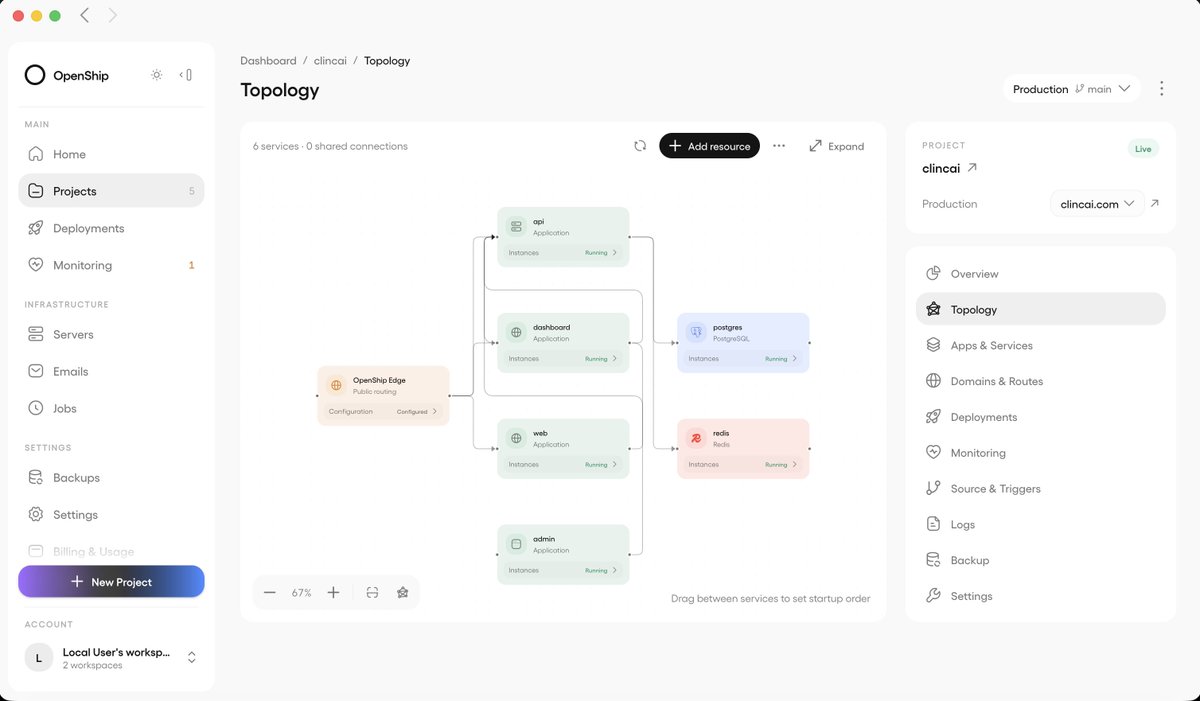
Your project architecture, now on an interactive canvas.
See how your services connect.
Click a node to inspect it, restart it, or stop it - directly from the canvas.
Open your project → Topology.
Available in Openship 0.8.0
opus 5.5 is f*cking cracked at motion design
this entire video is code, 0 after effects
im open sourcing the prompt template for these motion designs
steal it to recreate these ↓
<inputs>
Ask me for: 8 to 12 UI states I want the shape to become (e.g. button, loader, player, slider, toggle, tabs, chart, command palette, toast), pure black and white or one accent color, and a royalty-free song around 120 BPM (e.g. Mixkit, free for commercial use).
</inputs>
<direction>
Dribbble-level UI motion. One shape, never cut: every state is the same element morphing its size, radius and color while its content swaps with a short blur. A cursor drives every change with real clicks and drags. Light warm-gray canvas, black and white components, one clean UI font (Geist). Springs everywhere, a tiny overshoot at most. The camera zooms so each state fills the frame. The last frame is the first frame, so it loops.
Banned: bouncy easing, particle bursts, glows, gradients on UI chrome, mismatched icon strokes, dead time, anything that looks like a template.
</direction>
<structure>
120 BPM, 7 bars, something happens on every beat.
Button → loader → check → dynamic island → music player with a play/pause morph → scrub the progress bar → it becomes a volume slider that stretches when dragged past max → a toggle flips on the beat → the knob becomes a liquid tab indicator → the tabs open into a chart that draws itself, with a tooltip on hover → it collapses into ⌘K → type to filter → enter → toast → back to the button.
</structure>
<build>
1. One HTML file, square 1440x1440. Every style is computed from time inside seek(t): no CSS transitions, no timers, no state carried between frames.
2. Springs are closed-form step responses. A value that changes target many times is the sum of one spring per change, so it stays a pure function of time.
3. The tab indicator's two edges ride different springs, so the leading edge stretches ahead of the trailing one. Same trick for the toggle knob.
4. Drags are direct manipulation: while the cursor is held, the value is computed from its position. On release it springs back from wherever it was.
5. Analyze the song with numpy for the beat grid and start on a downbeat. Place every UI sound by its measured peak.
6. Render with Playwright: 4 subframes per frame, blended with ffmpeg tmix for motion blur at 60fps.
7. Render one frame per beat before the full render. Fix anything off the grid, cramped or hard to read.
</build>
<gotchas>
Never put will-change on anything the camera scales or the text renders blurry. Text that swaps inside a morphing container needs its own enter and exit timing or it overlaps. Make the last frame identical to the first, cursor position and speed included, or the loop stutters.
</gotchas>
<start>
Ask me for the inputs, then show me the state list on the beat grid before you write any code.
</start>
Today, we’re launching Brain into general availability.
One AI workspace for your entire company, people, agents, models, tools, and knowledge, all working together with permissions, privacy, and governance built in.
Multiplayer AI is now open to everyone.
One skill for all UI motion.
The Transitions-dev skill uses content and knowledge from the entire Transitions library and applies it to your project wherever it makes sense, for a more polished and snappy UI.
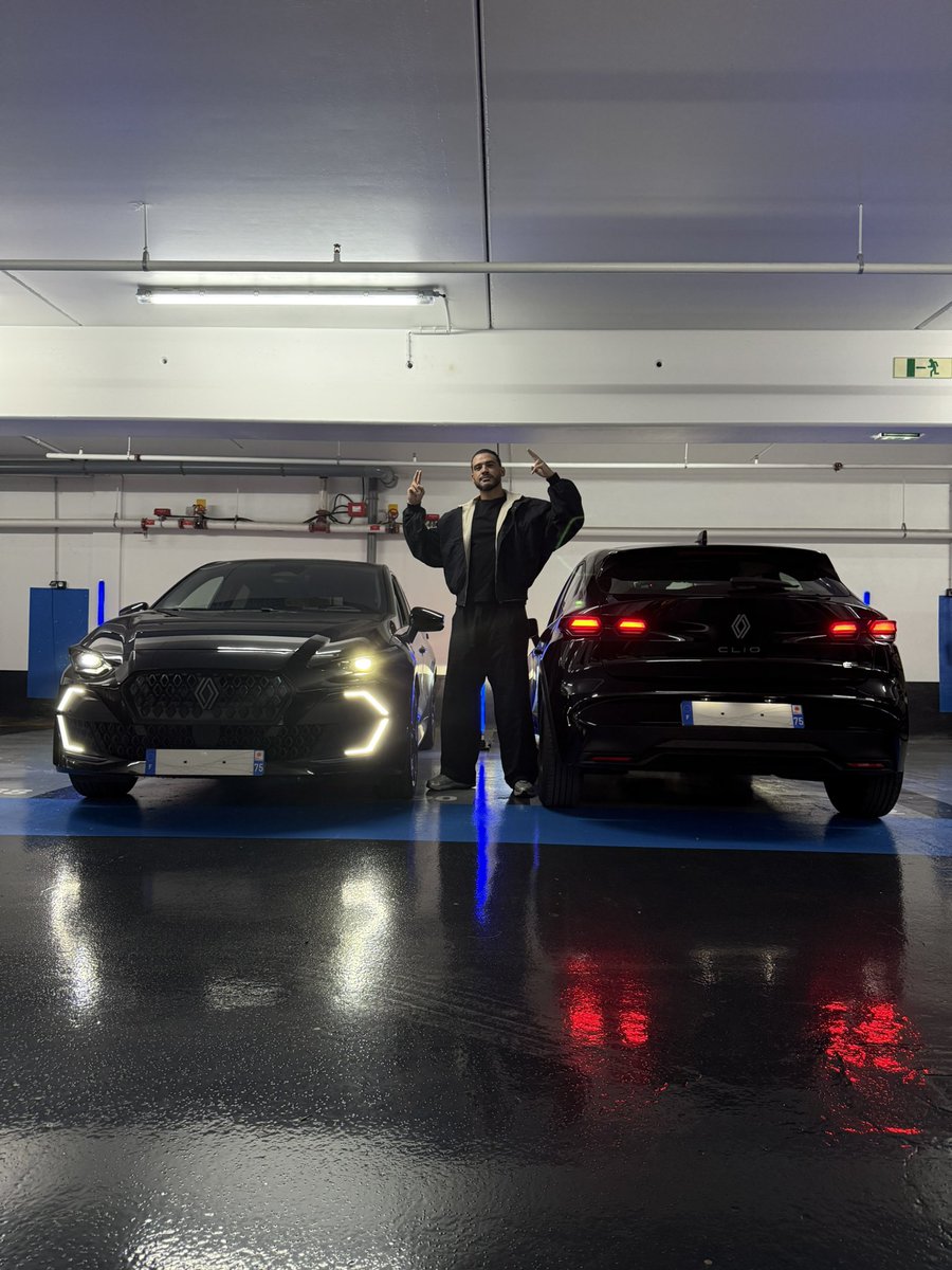
DEUX CLIOS 6 NEUVES À GAGNER 😎
La 1ère voiture : RT ce tweet et je tire au sort une personne qui gagne la Clio parmi les retweets.
La 2ème voiture : ce soir 20h je live quelque part dehors en Île De France. Le premier qui me trouve je cut le live et il gagne la voiture.
A German tweeting about grids … oh well here goes nothing:
Every component here follows a very simple and layered grid structure.
First 8px base grid. I set that up as tightly as possible to allow for max flexibility later. 24px radius + Inset 24px
Second padding (safe space) and content areas showing how things are grouped together.
Then the structure with text hierarchy, image placeholders and controls, followed by the actual font sizes and weights used in each component.
I’m only using two font families (Inter and Baskerville) and a max of three font weights and sizes per component (very important for visual hierarchy)
Those are the basics but those constraints will get you pretty far and LLM is good at maintaining those consistently as it builds out more components on the fly.
Codex users, do this now for Astra:
--- Start Prompt ---
"Codex, read @pvncher's article https://t.co/V1BzZOjcwE then audit all of my skills and AGENTS.md files inside ~/Projects"
--- End Prompt ---
You're welcome.
A new home for all my libraries.
https://t.co/wHtSRzl80E
5 UI effect libraries, 20+ variants, ready to use for free.
Border beam, Orbs, Metal, Gooey, Image
Some were asking for animated icon sites. So here you go👇
https://t.co/RQ7quA8GzV
https://t.co/5a6lWQorpT
https://t.co/RHb2GVIfez
https://t.co/5MZz9ryls0
https://t.co/6LI41kwbNh
I don't want to pay for Sentry.
So I built a tiny, self-hosted alternative that uses around 8 MB of memory with an open-source iOS app that sends errors straight to my phone.
No Slack. No Telegram. No subscription.
It’s called Boop and it's 100% free & open source.