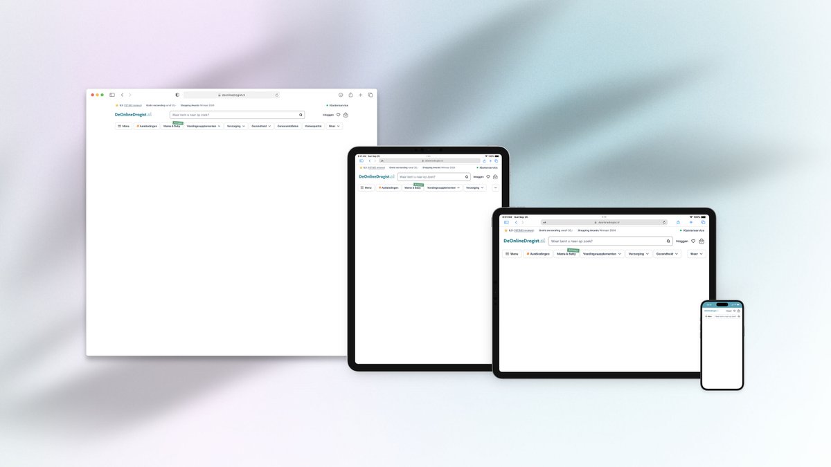
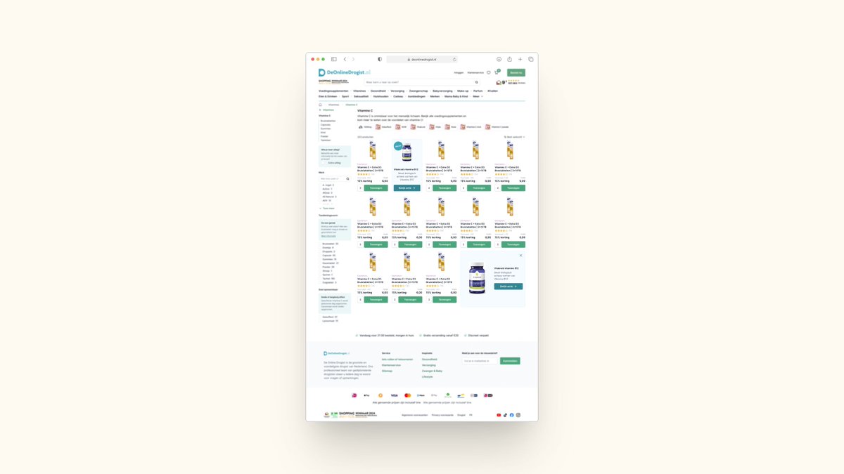
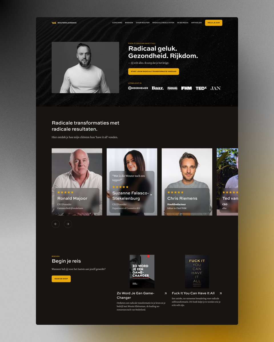
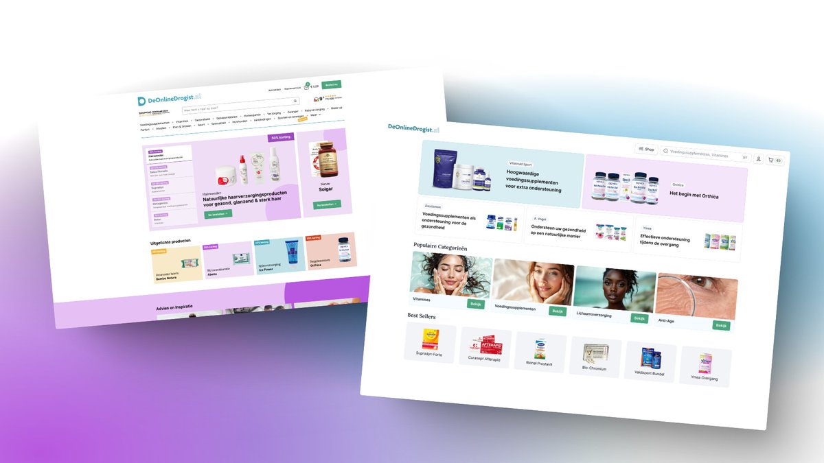
🚀 Relaunch! 🚀
We have iterated on our @BTNGstudio Unlimited #uxdesign offering!
The landing page is much more clear on exactly what you are getting!
We are super excited about it! Check it out here: https://t.co/2TQzS7PWU9
How are we different?
Many people are praising @Airbnb 's new UI thingy.
I don't like it. Here's why.
I don't feel it fits the Airbnb brand style.
They've got a clean, minimalistic UI.
These just stand out and draw too much attention.
It's about the content. Not the menu.
Does it need to bounce, twirl and twist?
Would a regular icon not suffice?
@DannPetty called it awesome.
@BrettFromDJ wants more design like this.
What do you think?
Does it float your boat?
Sales calls ≠ check-ins.
Your notes should reflect that.
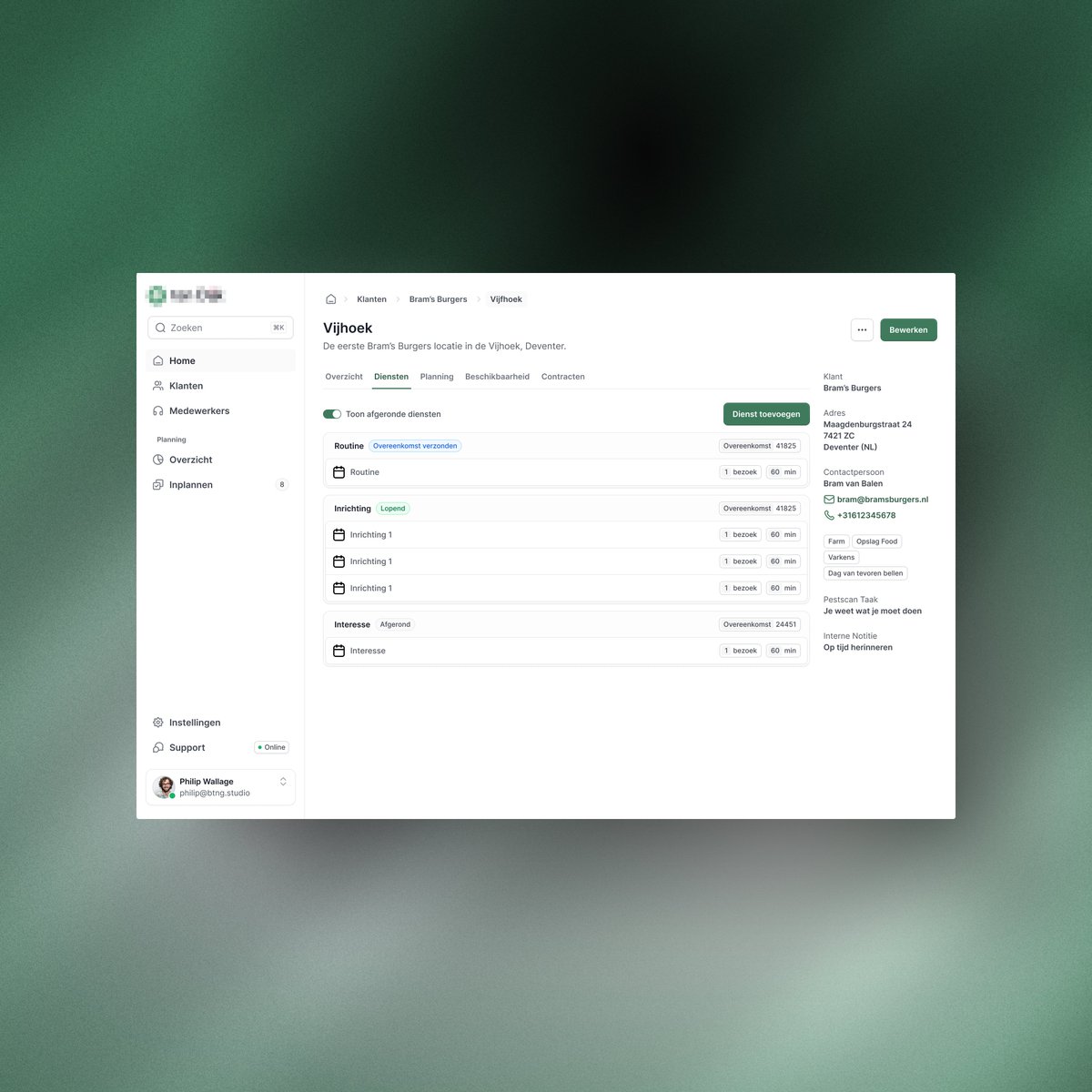
One of the things I care about most at @BTNGstudio is keeping things personal—but efficient.
I’m not just hopping on random calls.
I run a system.
→ Bi-daily discovery calls
→ Monthly 'are-you-still-happy' check-ins
→ Weekly working sessions with my clients
But here’s the thing—those are 3 completely different types of conversations.
So why would I use the same summary format for all of them?
That’s where custom templates in @attio have been a game-changer.
I’ve built one for each type of call so I get exactly what I need:
> Action items
> Emotional insights
> Client goals
Without ever writing things down manually.
It’s live. It’s smart.
And it’s saved me hours every week.
📼 Here’s how it works.
👇 I’d love to know:
What would your meeting template include?
🎥 Big shift. Better focus.
I started out helping creatives productize their services.
But while doing that, my own design subscription took off—helping ecommerce teams turn visitors into buyers.
So it’s time for a new chapter.
Introducing Conversion Layer—a weekly newsletter packed with real UX strategies I use with ecommerce clients to drive growth.
First edition drops tomorrow:
10 ways to boost AOV without adding traffic.
Subscribe now and get practical ideas that actually move the needle.
The right words can make or break your checkout.
Studies show that a confusing checkout process kills conversions.
Your delivery step should be crystal clear—but not overwhelming.
→ Too much information? Customers hesitate.
→ Too little? They worry.
→ The right balance? Trust, speed, and clarity.
I’ve designed three versions of a delivery step.
Which one strikes the perfect balance?
Wow, it’s @ProductHunt#Launch Day!
https://t.co/ybJGfSKNXv
After 12 years of Freelancing, I never expected to end up here…
BTNG Unlimited. A #UX Design Subscription service that turns the whole freelance hassle upside down.
Results within 48-hours!
We are the global Top-3% according to the @toptal standards.
+20 years of experience working for companies such as ASML, Adidas, LEGO and many more.
We are the simplest way to amazing #UX.
Wondering how we can help your product to the next level? DM me and let's chat!
🚀 Relaunch! 🚀
We have iterated on our @BTNGstudio Unlimited #uxdesign offering!
The landing page is much more clear on exactly what you are getting!
We are super excited about it! Check it out here: https://t.co/2TQzS7PWU9
How are we different?
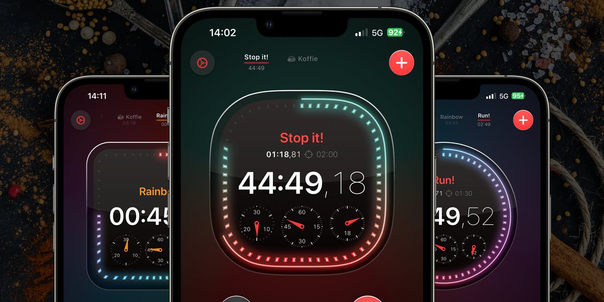
Why would you need a stopwatch that looks cool? I wouldn't know... But it's coming in an @abouttimers update very soon!
#buildinpublic#swiftui#swiftlang#iosdev
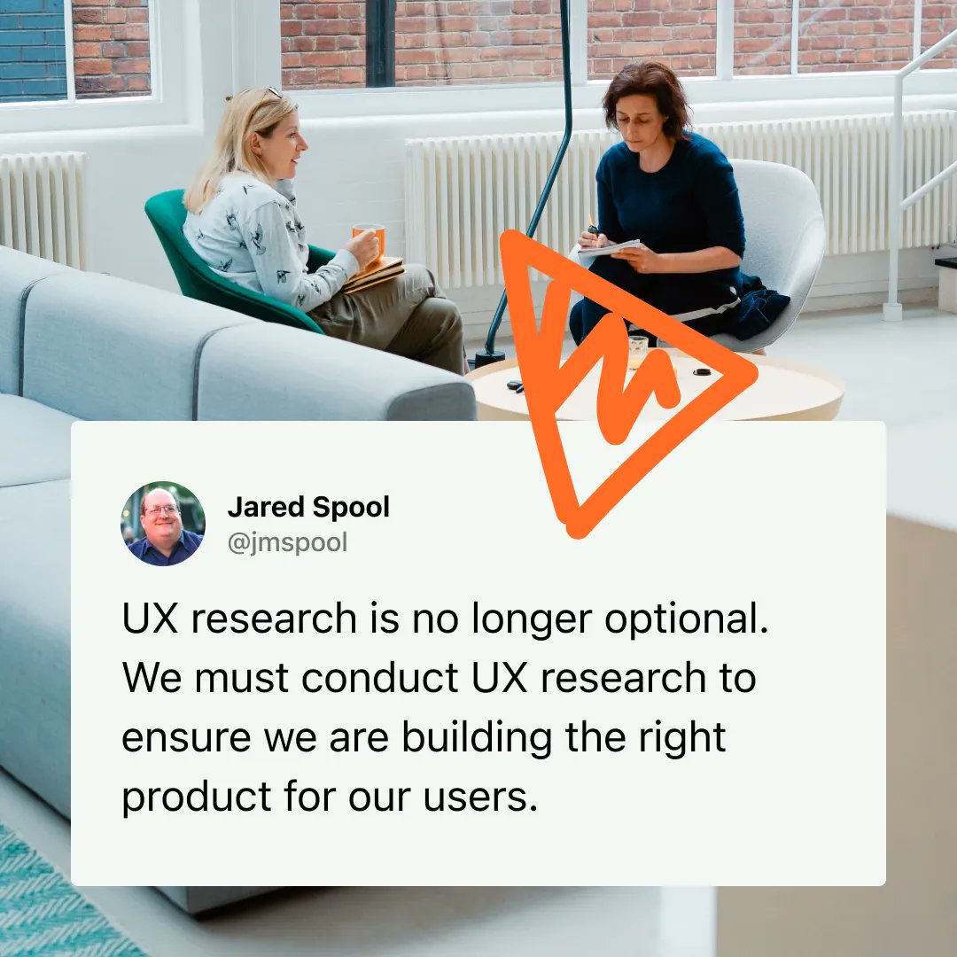
How well-adopted is UX Research within your organisation?
🌚 Does it happen once every blue moon?
🧩 Is there a structured process in place?
🪜 Do the newly gained insights make it all the way up the corporate ladder?
#ux#uxresearch#userresearch#research#customercentric