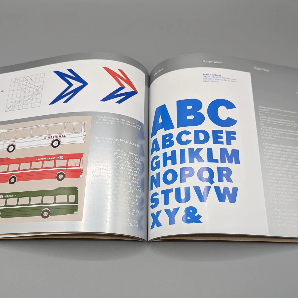
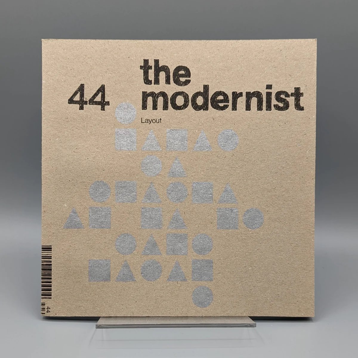
Out now: @modernistmag 44 with a piece on graphic designer Norman Wilson. His pioneering Manchester practice brought striking modernist graphics to industial Britain, famously the once-ubiquitous corporate identity for the National Bus Company. More here: https://t.co/wva1lpdvrJ
@Captain_Deltic@JeSuisUnDan DfT pretending to look tough on operators by bullying… its own business, for simply doing what it was told. GBR’s definitely going to be brilliant.
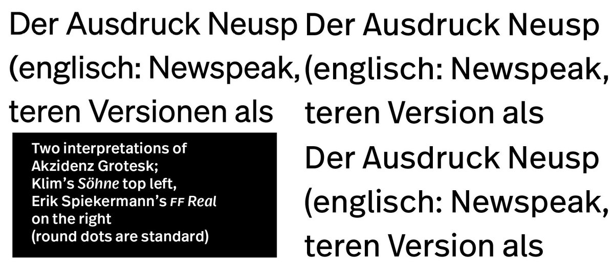
Some classic typefaces present a challenge to designers.
Here’s @klimtypefoundry Klim’s new interpretation of Akzidenz Grotesk (Söhne) and my own (FF Real) from a few years ago. Same but different.
It takes a thousand tiny details to make one good impression, as Cary Grant said. In this case, ahead of publication, that means removing decades of sellotape marks and garage oil from several beautiful NBC corporate identity posters.
Feel free to guess which one this is!
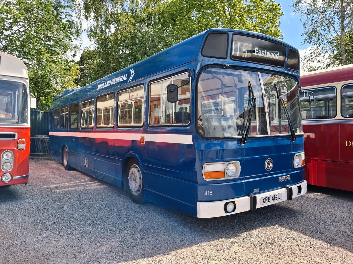
Did enjoy seeing this Midland General Leyland National at the Heritage Bus Rally at Quorn and Woodhouse station on Saturday.
415 - XRB 415L wears the mid-blue version of NBC livery.
@BusManual
@VinnieSull1van ‘Seconds’, I think, not ‘second’. This is the Greggs Seconds shop in Arthur's Hill, Newcastle, selling misshapen/imperfect products from the bakery. It didn’t open until 1972, and there were plenty of other branches of Greggs proper by then.
@railnigel They won’t, Nigel. This is performative stuff for Labour backbenchers. There’s almost no link between the content of the bill and the outcomes being claimed for it. We should talk!
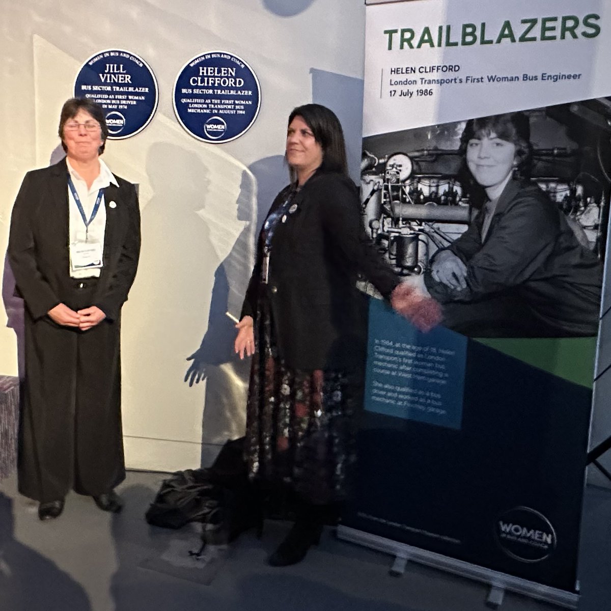
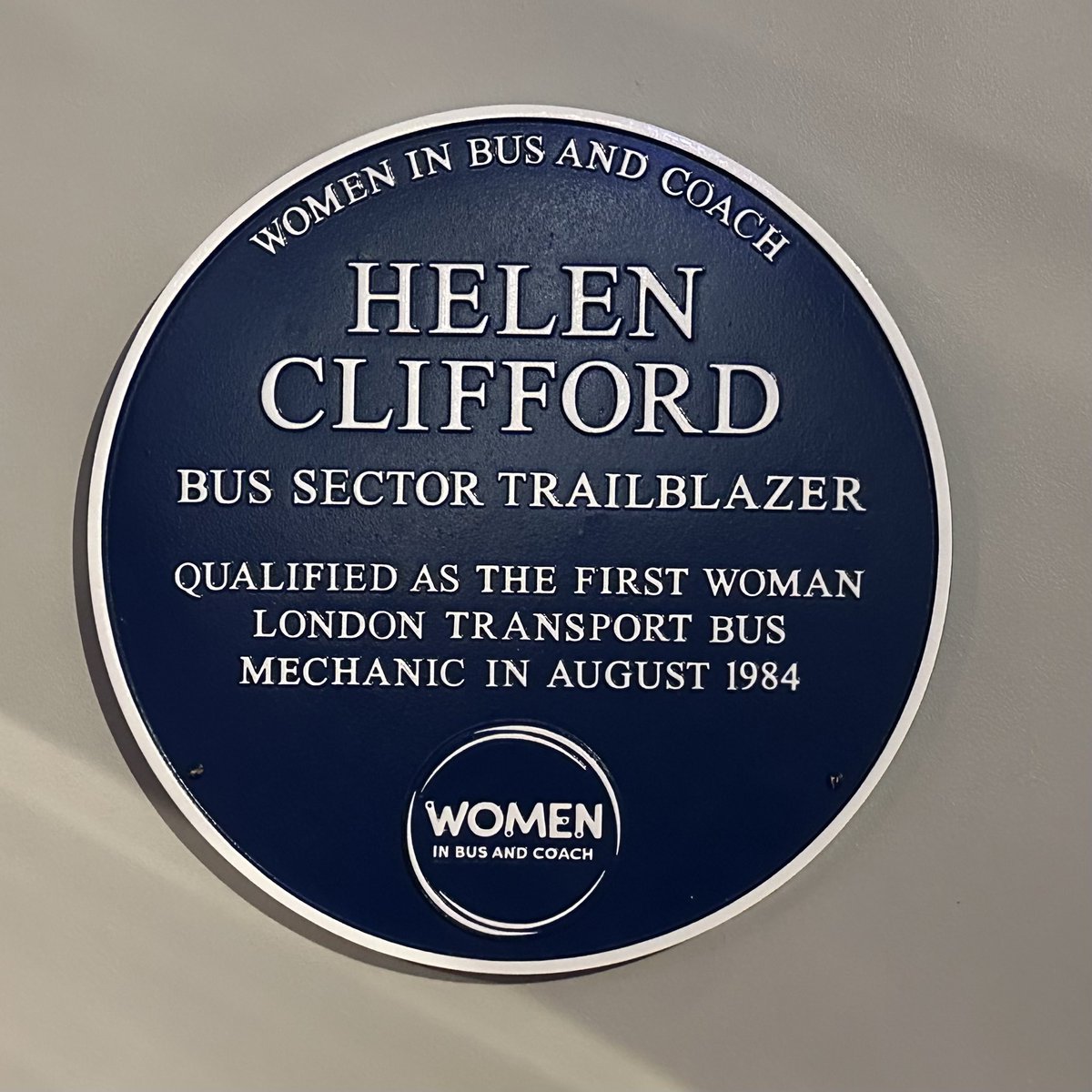
Fantastic to meet Helen Clifford this evening a the @WminBusandCoach reception at the @ltmuseum at the unveiling of her blue plaque by @TfL chief operating officer Claire Mann. Helen was the first woman to qualify as a London Transport bus mechanic in 1984.
It seems the website and blog went down earlier but is now back up and running again. We’re planning to publish the book in the coming months, so we’ll be less dependent on digital technology!
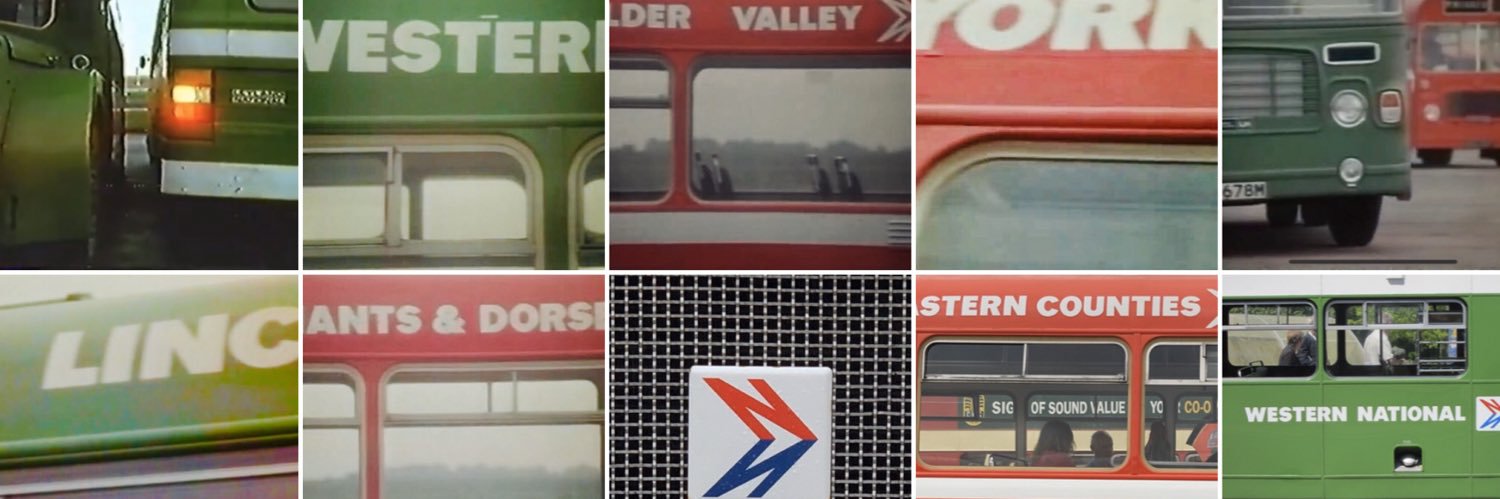
These photos are from NBC’s 1975 advert for Norwich Union, filmed at Norwich Airport.
@AnthonyTeasdale I loved Umbrella. And - since you show those two particular covers - by coincidence that’s approximately where we had our honeymoon; and Space House was my old office!
@Captain_Deltic@JeSuisUnDan Kate Mingay took then to court. I’m not sure whether the legal process concluded in her favour (or at all), but it was instrumental in forcing DfT to back down, along with the internal civil service review, which slated them.
@railLKB@MePeterNicholls Really interesting. Long experience suggests it’s counterproductive to put the symbol everywhere. Overuse breeds meaninglessness. The ‘boring & anodyne’ closely resembles what we regarded as ‘efficient, legible &elegant’ in the 70s. Attitudes change, but don’t overuse the symbol.