If, like me, you toss and turn of an evening wondering what the solar PV cost curve fit would look like if it was weighted by production, wonder no more.
It doesn't make much sense to equally weight production of a few MW of solar in the 1970s, given that the major cost drivers today are occurring on 500 GW/year scale, so I reweighted the curve accordingly. What we see is that the solar cost curve is more like 44% than the usually quoted 25-30%, mostly as a result of finding product-market fit in the last decade.
What is means is that for every doubling of cumulative production, cost declines by 44%! Currently, we're doubling roughly every 2 years.
Colored droplets in corn syrup seemingly blended together can be returned to their original state by reversing the direction of mixing, a form of laminar flow called "Stokes flow".
Credit: UNM Physics & Astronomy
@tomaspueyo@akin__akintola @Jameskbest1Best I can't think of any either, but focusing your search on countries that went from extremely high income/wealth inequality to lower GINI scores might yield some leads.
@DrEricDing Renters not being able to buy INCREASES inventory.
Owners not wanting to sell because of high rates is a wash, because they would have sold one and bought another, no net change in inventory.
Still not a good situation, but I think you have some of the causes wrong.
Reid: Many people argue that prayers aren't cutting it.
Self: Well, those are people that don't believe in an almighty god who has, who is absolutely in control of our lives.
@inkandsinewaves While the others were throwing their harpoons, you dove in, using it as a pike. They even named a dive after that move. And the market, of course.
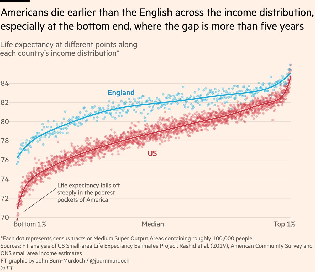
NEW: I’m not sure people fully appreciate how dire the US life expectancy / mortality situation has got.
My column: https://t.co/dBIhT9eZLv
And some utterly damning charts.
1) at *every* point on the income distribution, Americans live shorter lives than the English.