Red patches = mines. Plane icons = illegal airstrips. All inside Venezuelan rainforest. All found by a journalist in exile using satellite AI. 🛰️🌿
Map: https://t.co/FgqCYcVGXM | https://t.co/RRNWRfYIGu
#Geoawesome#GeoAI#EarthObservation#Amazon
GeoLibre v1.7.0 is here!
GeoLibre is a free and open-source, lightweight, cloud-native GIS platform for visualizing, exploring, and analyzing geospatial data. It runs everywhere you do, in the web browser, on the desktop, on mobile, and inside Jupyter notebooks, all while keeping your data local and private.
This release opens up the UI to plugins, adds inline color ramp previews across the styling panels, and makes the Whitebox toolbox browsable right from the Processing menu.
What's new in v1.7.0
- Plugin UI host API: Plugins can now register first-class right-sidebar panels, toolbar menus, and floating panels that dock beside the built-in Style panel instead of faking an overlay.
- Color ramp previews: Both the vector and raster style panels show each colormap's gradient inline, so you can see the colors while you pick rather than reading a list of names.
- Richer vector labeling: ArcGIS-style label controls for anchor, offset, rotation, wrap width, and letter case, plus modes that collapse stacked points at the same coordinate into a single label.
- Whitebox by category: Browse the whole Whitebox toolbox by category directly in the Processing menu, with an offline-bundled tool catalog for restricted environments.
- Collaboration at a glance: An on-canvas session badge and roster show a live dot, the connected-participant count, and who is in the session, with a clear way back to the map.
Try it out
- Live demo: https://t.co/hOVekblXMc
- GitHub: https://t.co/VXq8c1o2Nd
- Documentation: https://t.co/7VA2AQoCUc
- Release notes: https://t.co/Ki2oOpMzgb
#GIS #GeospatialData #OpenSource #RemoteSensing #DataVisualization #MapLibre #Python #Plugins
GeoLibre is now on the Microsoft Store!
Windows users can now install GeoLibre with a single click: signed, sandboxed, and auto-updating, straight from the Microsoft Store. No SmartScreen warnings, no manual installer downloads, no hunting for updates.
https://t.co/c2dsROEJ9g
GeoLibre is a free and open-source, cloud-native GIS platform for visualizing, exploring, and analyzing geospatial data, and it runs everywhere you do: in the browser, on the desktop, on mobile, and inside Jupyter notebooks. Your data stays local and private.
The Microsoft Store joins a growing list of one-command install paths:
- Windows: Microsoft Store / winget
- macOS: Homebrew
- Linux: AUR, COPR, Flatpak (FlatPark), .deb / .rpm / AppImage
Try it today and let us know what you build. Star the repo: https://t.co/VXq8c1o2Nd
#GIS #OpenSource #Geospatial #MapLibre #GeoLibre #DataScience #Mapping #MicrosoftStore
GeoLibre v1.6.0 is here!
GeoLibre is a free and open-source, lightweight, cloud-native GIS platform for visualizing, exploring, and analyzing geospatial data. It runs everywhere you do, in the web browser, on the desktop, on mobile, and inside Jupyter notebooks, all while keeping your data local and private.
This release brings multi-map layouts, advanced cartographic symbology and labeling, and a one-click way to install external plugins from a zip.
What's new in v1.6.0
- Multi-map grid: Split the workspace into a grid of synchronized map views to compare basemaps, layers, or time steps side by side.
- Advanced symbology: Style features with a rule-based renderer, proportional symbols, fill patterns, and a built-in marker library.
- Label engine: Label vector features by any attribute, with full placement and styling control.
- Install plugins from a zip: Add external plugins from an uploaded zip on both desktop and web.
- New vector analysis: Movement, space-time, and cell-coverage tools under Processing.
- Faster sample data: Ready-to-load example datasets from a dropdown in every Add Data panel.
- Place search in the layer panel: Geocode and fly to a location without leaving the Layers panel.
Try it out
- Live demo: https://t.co/hOVekblXMc
- GitHub: https://t.co/VXq8c1o2Nd
- Documentation: https://t.co/7VA2AQoCUc
- Release notes: https://t.co/e39LunOEWW
#GIS #GeospatialData #OpenSource #RemoteSensing #DataVisualization #MapLibre #Python #Cartography
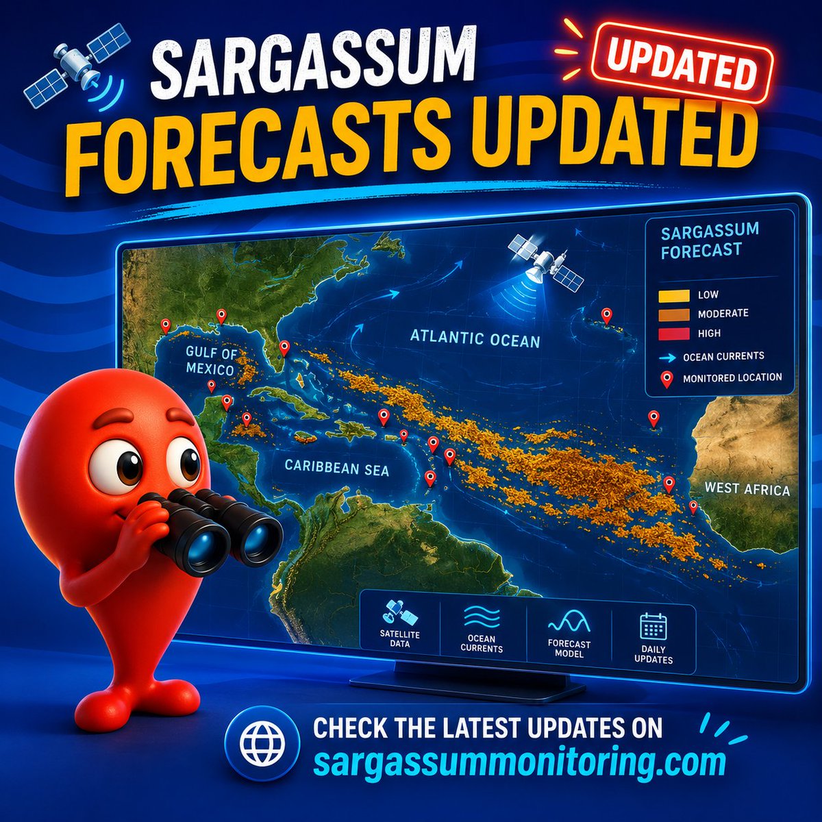
🛰️ Sargassum Forecasts updated!
New sargassum tracking data now available for the Atlantic, Caribbean Sea & Gulf of Mexico 🌊
📍 Check the latest maps & forecasts:
https://t.co/c7aot8PCKx
#sargassum#sargasses#sargazo#sargassummonitoring
GeoLibre v1.5.0 is here!
GeoLibre is a free and open-source, lightweight, cloud-native GIS platform for visualizing, exploring, and analyzing geospatial data. It runs everywhere you do, in the web browser, on the desktop, on mobile, and inside Jupyter notebooks, all while keeping your data local and private.
This release lands 90+ merged pull requests and resolves 90+ issues, adding a dashboard of chart widgets, customizable UI profiles, a saved library of web services, and an in-browser Whitebox raster engine.
What's new in v1.5.0
- Dashboard panel: Build a collapsible panel of chart widgets (histogram, scatter, bar, line, box) next to the map.
- Customizable UI profiles: Tailor the menus and filter the data sources you see, so the workspace matches your workflow.
- Saved service library: Save and reuse your favorite web-service layers (XYZ, WMS, WFS) instead of re-entering URLs.
- Whitebox in the browser: Run Whitebox raster tools fully client-side through a WASM runtime, no Python sidecar required.
- View menu and viewport history: Step backward and forward through your recent map views from a new View menu.
- A more beautiful globe: Add a spinning globe, customize the atmosphere halo and deep-space colors, and reset pitch and bearing with a rotation indicator.
- More basemaps: New Protomaps basemaps and support for stacking multiple raster basemaps.
Try it out
- Live demo: https://t.co/hOVekblXMc
- GitHub: https://t.co/VXq8c1o2Nd
- Documentation: https://t.co/7VA2AQoCUc
- Release notes: https://t.co/VhWQ4eUw3T
#GIS #GeospatialData #OpenSource #RemoteSensing #DataVisualization #MapLibre #Python
A web based GIS you didn’t know you wanted. Everything one could dream of - as a simple fast static web page. Unbelievable amount of work put in by @giswqs ! It’s already my preferred data viewer for daily workflows.
GeoLibre v1.3.0 is here!
GeoLibre is a free and open-source, lightweight, cloud-native GIS platform for visualizing, exploring, and analyzing geospatial data. One application that runs everywhere: in your web browser, as a native desktop app, on your phone, and inside a Jupyter notebook. No account, no server, no cost. Everything runs locally and your data stays private.
This release packs in 50+ pull requests of new capabilities. A few highlights:
- GIS in your pocket. A native Android build with offline tile caching and download-a-region support, so you can take your maps into the field with no signal.
- AI, built in. A natural-language GIS assistant that turns plain-English requests into real geoprocessing, plus an AI segmentation toolbox powered by SamGeo and SAM 3 for extracting features from imagery.
- Automate everything with Python. A full scripting API and an in-app Python Console, with new helpers for local rasters, choropleths, marker clusters, split-map comparisons, legends, and colorbars.
- Map together, live. Real-time multi-user collaboration so you can open a project and edit the map with others at the same time.
- Tell stories with maps. A scroll-driven story map builder and presenter that exports interactive narrative maps to standalone HTML.
- A much bigger analysis toolbox. Reproject, explode, and aggregate tools, IDW and kriging interpolation, zonal statistics, a raster calculator, a Spatial Statistics toolbox, and network analysis with isochrones, service areas, and OD cost matrices, plus batch runs and model/pipeline chaining.
- Smarter raster and SQL. Single-band pseudocolor classification, RGB band combinations, a no-backend client-side raster fallback, Apache Sedona as a SQL Workspace engine, and transparent S3, GCS, and Azure URL support in queries.
- More ways to add, view, and share. New Shapefile and GeoPackage export, glTF/GLB 3D model layers, multi-provider batch and reverse geocoding, collapsible layer groups, and a macOS Homebrew cask.
Try the live demo: https://t.co/hOVekblXMc
Star it on GitHub: https://t.co/VXq8c1o2Nd
Docs and roadmap: https://t.co/7VA2AQoCUc
Release notes: https://t.co/0OJXwBhZsh
#GIS #OpenSource #Geospatial #MapLibre #WebGIS #Android #GeoLibre
Iwfgara June update is live. Now you can extract and visualize tropical cyclones — typhoons, hurricanes, cyclones — with faster rendering for large weather datasets. Typhoon season is coming. Be ready. https://t.co/fiPanUACGS #Typhoon#Hurricane#Cyclone
A global mining dataset has 44,929 mine polygons. A new paper shows why that still isn’t enough.
The problem is the outline.
From space, mines are often easy to spot: pale scars, roads, pits, waste rock, bare ground, ponds, and disturbed land. But when those features become training data, the labels often turn into rough blobs around the site.
That matters because those boundaries are used to estimate land disturbance, monitor rehabilitation, track deforestation, and assess environmental risk.
If the outline is wrong, the measurement is wrong.
The paper introduces MineC2FNet, a model designed for this exact problem. It starts with a large coarse dataset of global mining polygons, then adds the scarce thing remote sensing models usually lack: expert-validated fine labels.
Only 219 images.
That’s the tension. The researchers have lots of rough labels and a tiny number of precise ones. A normal model can learn the object, but it can also learn the annotation style. If the coarse labels draw mines as smooth blobs, the model starts to learn “mine equals blob.”
MineC2FNet avoids this with a teacher-student setup. The teacher learns broad mining patterns from coarse Sentinel-2 and Landsat data. The student then learns from fine labels, while selectively deciding which teacher outputs are useful enough to keep.
That selectivity is the key. It learns from the big messy dataset without fully inheriting its boundary mistakes.
The domain shift is large. In the coarse dataset, mining coverage peaks around 45% of the image. In the fine dataset, it peaks around 12%. The coarse masks are bigger and smoother. The expert masks are sparse, jagged, and closer to the real footprint.
The results reflect that. On the fine-grained test set, MineC2FNet reaches 92.33% accuracy and 73.64% mean IoU. The closest competitors reach 71.99% and 71.25%.
Strangely, it performs worse against the coarse labels: 44.29% mean IoU versus 72.49% for the coarse baseline. But that’s the lesson. A model can look worse when the benchmark rewards copying bad outlines.
This is bigger than mining. Flood maps, informal settlements, cropland boundaries, deforestation fronts, construction sites, roads, and industrial land all have the same problem: lots of coarse labels, very few good ones.
MineC2FNet treats coarse labels as useful but unreliable. That feels like the right attitude for a lot of satellite-based models.
GeoLibre now supports rendering 3D Tiles!
Try it out: https://t.co/YdRkXuhvUO
GeoLibre is a lightweight, cloud-native GIS platform for visualizing, exploring, and analyzing geospatial data across desktop, mobile, and web environments.
GitHub: https://t.co/VXq8c1o2Nd
Website: https://t.co/7VA2AQoCUc
#geospaptial #opensource #maplibre #GeoLibre
📷 Jamaica, Mozambique, Vanuatu – with pitstops in St Vincent and the Grenadines, Myanmar and Micronesia; a quick tour of seven #MapAction maps from emergency responses in the last few years.
#mapssavelives#gis4good#maps
https://t.co/j3POeEBSXW
🙏🤝@AuswaertigesAmt
A large Saharan dust plume has stretched across the Atlantic from the west coast of Africa towards the Americas. CAMS data shows that large parts of the Caribbean are most impacted.
California’s tomato fields can now be identified from space with 99% accuracy using 64 numbers for every 10-metre patch of land.
No custom vegetation index. No hand-built crop calendar. No months spent tuning a satellite pipeline around clouds, missing dates, and sensor quirks.
A new paper tests a simpler workflow: take Google DeepMind’s AlphaEarth embeddings, train a U-Net on labelled fields, and ask it to separate processing tomatoes from everything else.
The dataset is a good stress test. The researchers used 9,484 field polygons from California’s 2018 LandIQ crop maps: 4,742 processing tomato fields and 4,742 non-tomato fields.
The comparison class wasn’t easy. It included alfalfa, wheat, corn, beans, orchards, and other crops that can look similar in satellite imagery at different points in the season.
Each field became an image chip. But instead of raw RGB or a stack of hand-crafted indices, every 10-metre pixel came with 64 AlphaEarth values.
Those 64 values are the interesting part. They don’t map neatly onto red, green, blue, NDVI, moisture, radar backscatter, or any single physical measurement. They’re a learned summary of how that location looked and behaved across multiple sensors and time periods.
That changes the crop-mapping problem.
Traditional remote sensing often begins with raw satellite data, then spends a lot of effort cleaning and engineering it. Clouds need masking. Time series need aligning. Missing observations need filling. Analysts build indices, choose seasonal windows, and tune the pipeline for the crop and region.
AlphaEarth moves much of that work upstream. It compresses multi-sensor Earth observation data into a compact annual representation. The downstream model starts from a richer description of the land, rather than trying to reconstruct the full seasonal signal from scratch.
For processing tomatoes, that signal is useful. Tomato fields have a distinctive rhythm: planting, canopy growth, irrigation, harvest timing, field geometry, and management patterns. A single image can miss that. A simple vegetation index can flatten it. A learned annual embedding can carry more of the fingerprint.
The researchers trained a 64-channel U-Net segmentation model. Instead of assigning one label to a whole field, it predicted tomato versus non-tomato at the pixel level.
They also used a spatially independent test set: 1,424 fields from unseen locations. That detail matters because nearby farms can share soils, irrigation systems, management practices, and landscape context. A random split can make agricultural models look better than they are.
The results were extremely strong.
Pixel accuracy: 99.19%, precision: 98.69%, and recall: 99.40%.
But the model wasn’t merely detecting farmland. It was tracing tomato fields against a negative class that included visually similar crops.
The most useful part may be the uncertainty test.
The researchers kept dropout active during inference and ran each chip through the model 100 times. That produced both an average prediction and a variance map.
The uncertainty appeared where you’d expect: field edges, narrow protrusions, irregular boundaries, roads, and mixed pixels. Field interiors were stable. Borders were less certain.
That’s important for practical mapping. A model that says “I’m confident in the centre, check this edge” is much more useful than a clean map that hides its weak spots.
There are limits. The labels come from one year, 2018. AlphaEarth is annual, so this isn’t a real-time crop monitoring system. The balanced training set also doesn’t fully match the messier class imbalance of statewide mapping. Running 100 inference passes for uncertainty adds cost at large scale.
But the direction is clear.
Crop mapping is moving from hand-designed satellite recipes towards learned Earth representations. The analyst’s job shifts from “which index should I build?” to “which labelled task can I train on top of this embedding?”
Artificial Intelligence (AI) is rapidly reshaping operational oceanography.
From multi-sensor sea surface temperature reconstruction and global wind field correction to regional wave forecasting and Arctic sea ice prediction, AI-based methods are moving from research demonstrations to validated, operational-ready solutions.
Learn more about the integration of AI into #CopernicusMarine products: https://t.co/tnWKpPK6ac
#ArtificialIntelligence
💧💧 INterpolated FLOod Surface (#INFLOS), a Rapid and Operational Tool to Estimate #Flood Depths from #EarthObservation Data for Emergency Management
✍️ Quentin Poterek et al.
🔗 https://t.co/EvtAgS2xg8
Working with Planet Tanager Hyperspectral Data (426 Bands) in QGIS with HyperCoast
Learn how to access, visualize, and analyze Planet’s Tanager hyperspectral imagery in QGIS using the HyperCoast plugin. In this tutorial, you will explore freely available Planet Tanager open data with over 426 spectral bands and learn how to stream imagery, download HDF5 datasets, inspect spectral signatures, and perform hyperspectral visualization directly inside QGIS.
Video Tutorial: https://t.co/QfPIevlsNR
HyperCoast: https://t.co/1GPh3h73Rv
QGIS Plugin: https://t.co/6CB4ApMkhd
Tanager STAC Repo: https://t.co/8Bn8I9T5bR
Tanager STAC Browser: https://t.co/ll9Hq1VEQS
#opendata #geospatial #hypercoast #QGIS #Tanager #hyperspectral