gAxis dostlar, iyi pazarlar
Bugünkü @axisrobotics görevlerine hazır mıyız?
1 saat sonra yeni görevler platforma eklenecek, bakalım bugün kaç tanesini tamamlama şerefine erişeceğiz.😇
Bu arada Axis Hub paneline 5 yeni badge eklenmiş. Tamamlandı görünmediğine göre büyük bir ihtimalle bugünden itibaren ki datalarımız dikkate alınacak.
O nedenle henüz geç kaldığını düşünerek Axis Hub'a katılmayan varsa buradan [https://t.co/yXsPZbe5Wh] kayıt olabilir. İsterseniz alıntıladığım makalemi inceleyerek adım adım nasıl ilerleyeceğinizi de görebilirsiniz.
Bu arada yeni rozetler;
Built Different -> 500 veri yörüngesi katkısı yap.
Flawless -> Farklı görevlerde 50 kusursuz puan elde et.
Seen It All -> 100’den fazla farklı görevi tamamla.
No Days Off -> 30 gün üst üste her gün görev tamamla.
Blink and You'll Mıss It -> Bir görevi 3 saniye içinde tamamla.
Birkaç gündür tamamladığım görev sayısını düşünürsem, bu rozetleri almak benim için sanki biraz uzun sürecek gibi.😊
Şimdiden herkese kolay gelsin.
Spending more time on a design does not always mean understanding it better.
Some designs make their priorities clear in seconds. Others become harder to read because they create uncertainty. If more time brings no clarity, the issue may be communication.
It is easy to judge a campaign by one visual.
But campaigns rarely work through one visual alone. They rely on communication across multiple touchpoints.
Sometimes the clearest evaluation comes from seeing how those pieces work together.
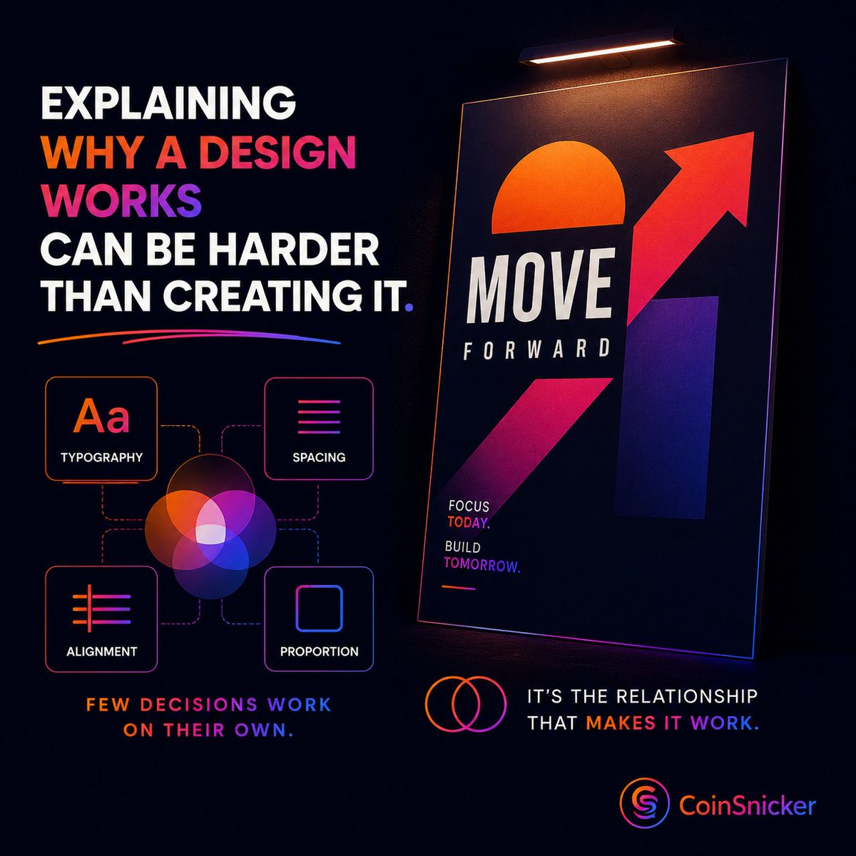
Explaining why a design works can be harder than creating it.
Because few design decisions work on their own. Typography, spacing, alignment, and proportion create meaning together. More often than not, it is the relationship between decisions that makes a design work.
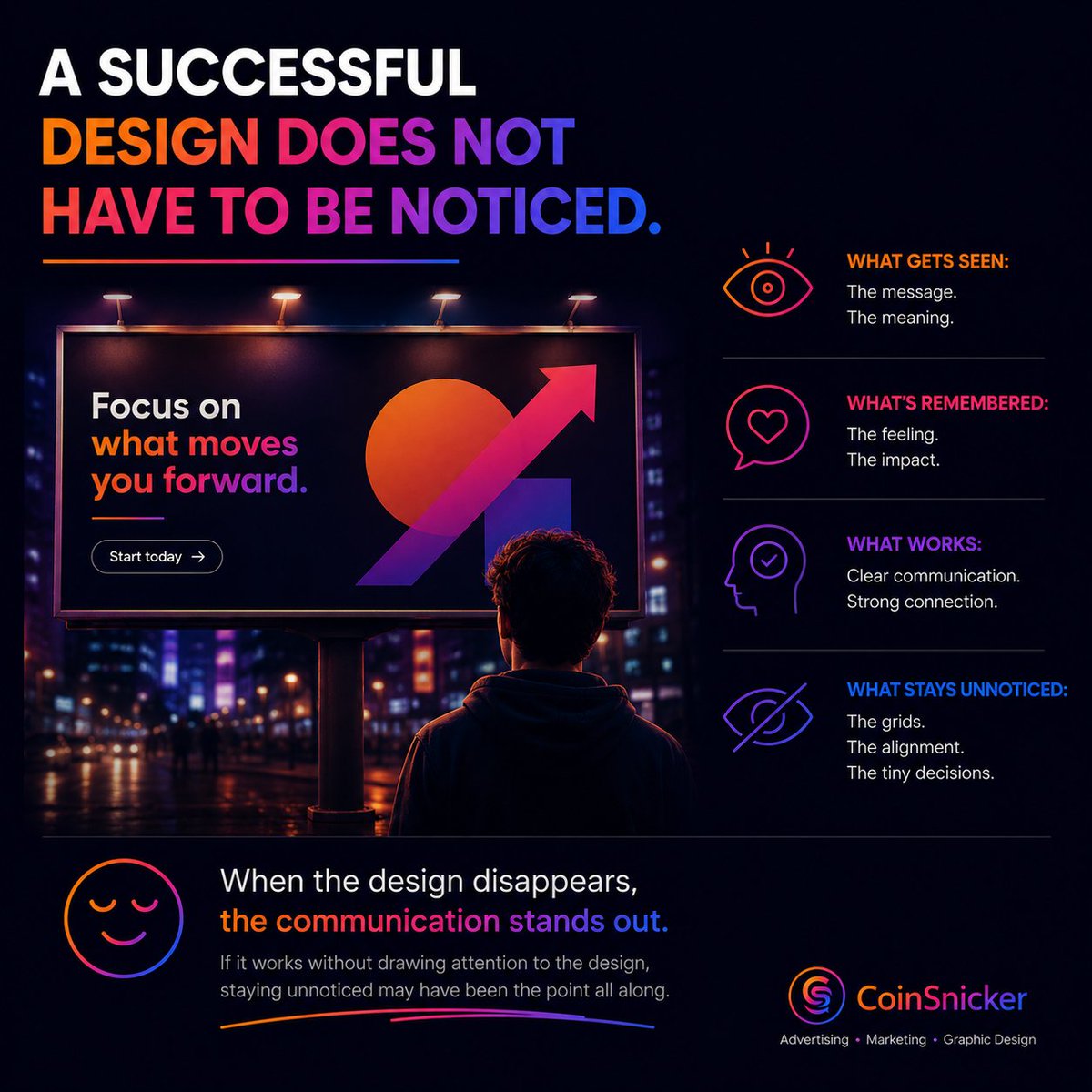
A successful design does not mean every decision has to be noticed.
Most of the time, what stands out is the message, not the design itself. If the communication works without drawing attention to its design decisions, staying unnoticed may have been the point all along.
If you have to explain every detail of a design, the problem may not be the audience.
Some ideas make sense in a presentation, but not in the design alone. If the message only becomes clear after an explanation, part of the communication may still be missing.
A single idea does not have to look the same everywhere.
A billboard has seconds. An Instagram post can be skipped. A product page is viewed by someone making a decision.
The idea can stay the same. The way it is communicated should change with the medium.
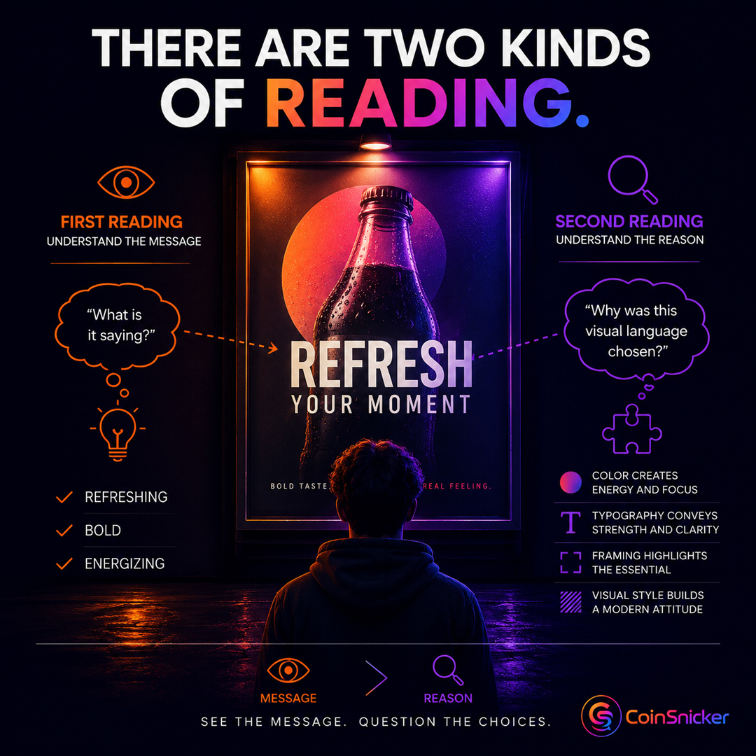
When looking at an advertisement, it is not enough to ask, "What is it saying?"
There is another question worth asking:
"Why was this particular visual language chosen to communicate that message?"
When you first see an advertisement, you may understand the message right away.
But that does not mean you also understand why it was presented that way.
Those are two different kinds of reading.🧵👇
The choice of color, typography, framing, or visual style is not only an aesthetic decision.
Each one is part of a communication decision about how the message should be presented.
When looking at a design, it is not enough to ask, What has been added?
There is another question worth asking:
What has been deliberately left out to make the message clearer?
A design that looks simple does not mean fewer decisions were made.
In many cases, the opposite is true.
The simplest designs often involve more careful choices about what to leave out.🧵👇
It is possible to include every piece of text, every visual, and every idea.
The harder part is deciding which ones actually strengthen the message.
Because every new element also changes the impact of the others.
When looking at a piece of communication, it is not enough to ask, "Does it capture attention?"
There is another question worth asking:
"After the first impression fades, what message actually remains?"
A design that captures attention does not automatically make its message memorable.
Sometimes what stays with us is not the idea itself, but only the visual effect.
Strong colors, an unusual composition, or striking typography can win the first glance.
But if those elements do not support the message, the lasting impression may be visual rather than meaningful.
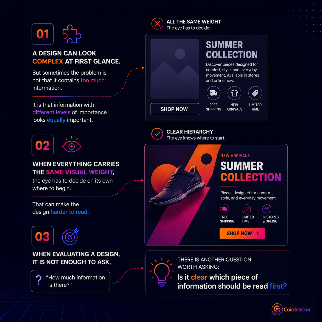
When evaluating a design, it is not enough to ask, How much information is there?
There is another question worth asking:
Is it clear which piece of information should be read first?
A design can look complex at first glance.
But sometimes the problem is not that it contains too much information.
It is that information with different levels of importance looks equally important
When the headline, body copy, call to action, and supporting details all carry the same visual weight, the eye has to decide on its own where to begin.
That can make the design harder to read.