@elonmusk because they are foolish, because those who have money do not care about the situation that the planet is currently experiencing. what a huge helplessness of mine.😔😔😔
Bayes' theorem updates probabilities with new evidence.
The image uses a Venn diagram showing red event A and yellow event B overlapping inside universal set U. Colored icons below represent the probability ratios: P(A) as red over box,
P(B|A) as yellow over red,
P(B) as yellow over box, and
P(A|B) as orange over yellow.
P(B|A) = P(B) P(A|B) / P(A) P(A|B) = P(A) P(B|A) / P(B)
It is used to find the probability a patient has a condition after receiving a positive test result.
I have my own theory here: many mathematicians have started using top-tier models and agentic systems. The effect is that they are finishing up very old projects that were left untouched for years. They realized that they had all the required ideas and tools but did not have a person to wrap things up. I think this "vacuum cleaner effect" will last for the next few years and will end up with a complete stall in most areas of mathematics. What will remain are very hard questions, and possibly some new ones. But once a question is within reach of the agent, it will get published almost automatically. People will remember this period of civilization as the "great purge of ideas". The outcome will be a vast intellectual startup where everyone is at ground zero, and the occasional genius will pop up to scale their ideas and drain it again until the thread dies.
The Quantum State of a Qubit .
A classical computer bit is like a coin lying flat on a table, either heads or tails, zero or one, with no uncertainty. A qubit is more like a coin spinning in the air; it truly embodies both possibilities at once. This isn’t because we are unsure of which side it will land on, but because while it's spinning, it is neither one thing nor the other. When you measure it, it settles into a definite outcome like a spinning coin that eventually lands. Until that moment, it exists in a superposition of both zero and one, with specific proportions of each part of its physical state.
The most fascinating idea in this diagram is the Bloch sphere, a simple-looking ball that maps every possible state a single qubit can have. The north pole of the sphere represents the state of definitely zero, the south pole represents definitely one, and every other point on the surface represents a different quantum superposition, a different mix of the two. The red arrow pointing from the center to the surface shows the qubit's state, and everything about the qubit's physics is encoded in the direction that arrow points. How much the arrow tilts tells you the measurement probabilities: an arrow pointing straight up means you will definitely measure zero, straight down means definitely one, and pointing sideways along the equator means a perfect fifty-fifty chance. Importantly, the arrow always reaches the surface, never sitting inside the sphere. A qubit in a perfectly controlled quantum state always lives on the surface. If it drifts into the interior, it means the quantum information has been damaged by unwanted interactions with the environment, which is why building real quantum computers is so challenging.
The second piece of information in the qubit's state is the phase, which is the horizontal rotation angle of the arrow around the vertical axis of the sphere. This is where things get truly strange. Two qubits can sit at the same height on the sphere, giving them the same measurement probabilities, but they can face different directions horizontally. While this difference is completely invisible if you measure either qubit directly, it becomes crucial when quantum states combine and interfere. Just like waves on water, where crests meeting crests create bigger waves and crests meeting troughs cancel out, quantum states with different phases interfere when combined through quantum operations. A quantum algorithm is essentially a carefully arranged sequence of these interferences, designed so incorrect answers cancel out while correct answers reinforce certainty. Every quantum gate, every operation in a quantum computer, corresponds to a physical rotation of the Bloch sphere, spinning the arrow from one direction to another. Designing a quantum algorithm is like choreographing a precise sequence of rotations. The entire power of quantum computing comes down to manipulating these two angles: one controlling what you see when you measure and the other controlling how states interfere, for a single arrow pointing at the surface of an ordinary sphere...
These symbols form the core vocabulary of logic and set theory in discrete math.
∀ stands for for all, ∃ for there exists, and ∃! for there exists a unique. The vertical bar | means such that, ∈ indicates an element is in a set, ∧ joins conditions with and, and ∨ with or. ⊆ denotes subset of while ∪ means set union.
It is used to formalize conditions when writing queries in SQL databases and verifying software correctness.
Did you know that regularized regression methods such as Ridge, Lasso, and Elastic Net are essentially extensions of classical OLS regression?
The idea is surprisingly simple:
OLS minimizes the sum of squared errors (SSE) between observed and predicted values. Ridge, Lasso, and Elastic Net use the same objective function, but add an extra penalty term to the optimization problem.
This additional penalty discourages overly large coefficient estimates and can be especially useful when:
🔹 Predictors are highly correlated (multicollinearity)
🔹 The model contains many predictors (risk of overfitting)
🔹 Prediction accuracy is more important than perfectly unbiased coefficients
As shown in the formulas below, the main difference between these methods lies in the penalty term:
🔹 Ridge: Uses squared coefficients (L2 penalty)
🔹 Lasso: Uses absolute coefficients (L1 penalty)
🔹 Elastic Net: Combines Ridge and Lasso penalties
In other words, these methods do not replace linear regression. They build directly on it by adding a penalty that controls model complexity. The result is often a better balance between bias and variance, leading to more stable predictions on new data.
I have just released a new module in the Statistics Globe Hub in which I explain Ridge, Lasso, and Elastic Net regression in much more detail, including the underlying theory, cross-validation, coefficient shrinkage, and fully reproducible R code examples using the glmnet package.
The Statistics Globe Hub is an ongoing learning program focused on practical skills in statistics, data science, AI, and programming with R and Python.
More information about the Hub: https://t.co/NA2b7UAXJ4
#RStats #DataScience #MachineLearning #Statistics #PredictiveModeling #AI #StatisticsGlobeHub
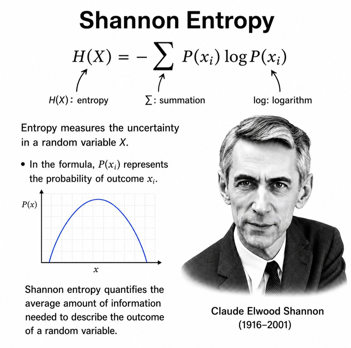
Shannon Entropy: Measuring Uncertainty in Information
H(X) = − Σ P(xᵢ) log P(xᵢ)
Introduced by Claude Shannon, this equation measures the average amount of information produced by a random source.
Entropy quantifies uncertainty. If an outcome is highly predictable, entropy is low. If outcomes are difficult to predict, entropy is high.
In the formula:
• H(X) = entropy of the random variable X
• P(xᵢ) = probability of outcome xᵢ
• Σ = sum over all possible outcomes
• log₂ = logarithm base 2, measuring information in bits
This deceptively simple equation laid the foundation for modern information theory and remains central to data compression, cryptography, telecommunications, machine learning, and the digital systems that power our world.
Julia sets revealed by Lagrangian Descriptors: iterate z²+c on the Riemann sphere, accumulate the orbit's step increments and the obtained field loses smoothness right along the Julia set. @marimo_io on #molab + GPU. Link 👇👇👇
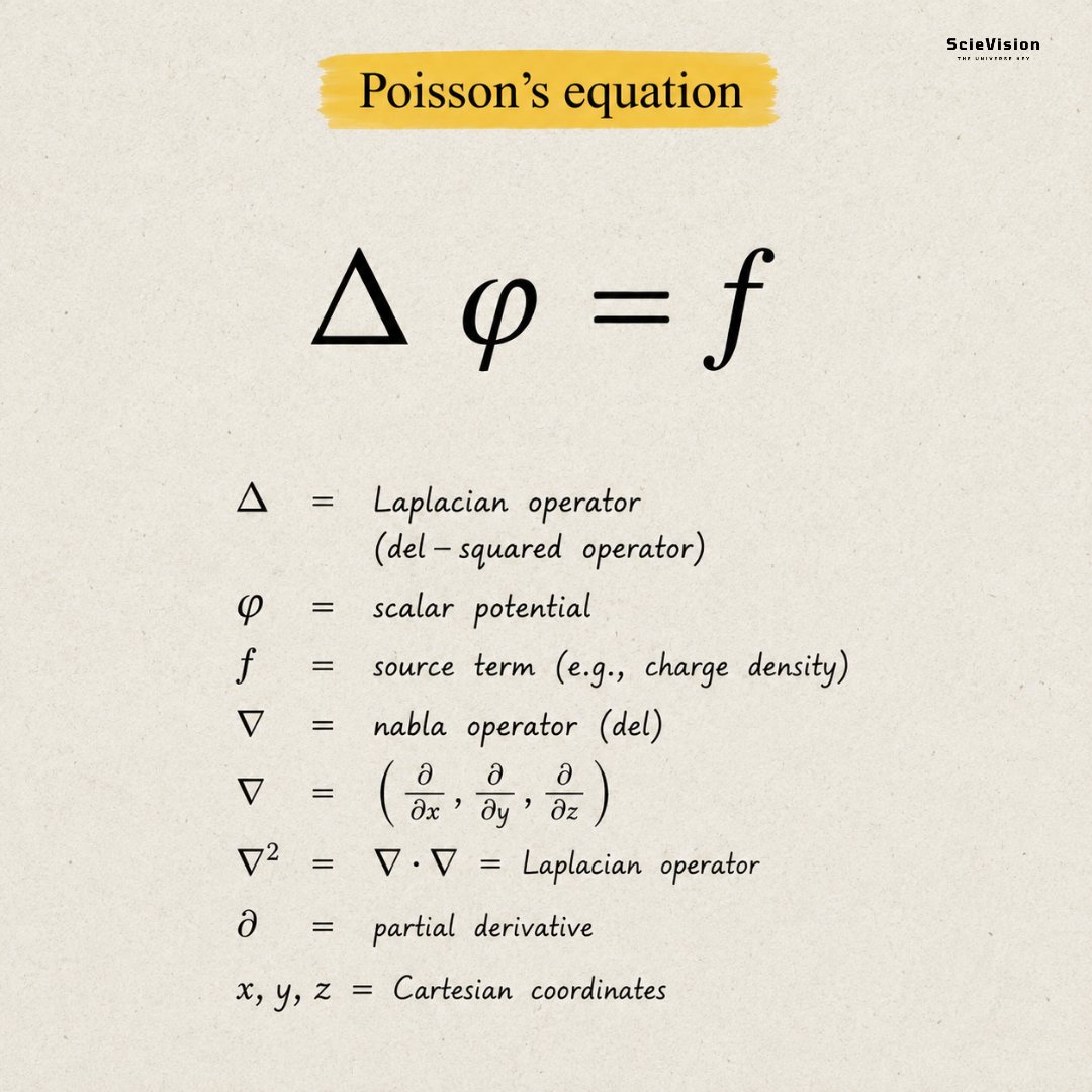
Poisson's equation ✍️
It conveys one straightforward idea: "things that exist in space leave a mark on the space around them." Imagine a heavy ball on a trampoline. The ball sinks and bends the surface beneath it; the larger the ball, the deeper the bend. Now picture that "bending" happening invisibly in the air around a magnet, an electric charge, or a planet. This invisible bending is the field, and the ball (or charge, or mass) is the source. Poisson's equation illustrates "the amount of bending you see at any point equals the strength of the source causing it." That's all there is to it. This concept is important because it shows how forces move through space without any physical contact. A magnet doesn't grab a paperclip with invisible hands; it bends the field around it, and the paperclip reacts to that bend. The equation quietly governs electricity, gravity, heat flow, and even water movement. Wherever something spreads outward from a source in nature, Poisson's equation is at play.
What if you could see exactly how a regression line splits the scatter in your data into what it explains and what it doesn’t?
The classic decomposition of variation in simple linear regression. At any point (Xᵢ, Yᵢ), the total deviation from the mean Ȳ breaks into two parts: the portion captured by the fitted line (Ŷᵢ) and the leftover residual.
Formulas:
SST = Σ(Yᵢ − Ȳ)² (total variation)
SSR = Σ(Ŷᵢ − Ȳ)² (explained by model)
SSE = Σ(Yᵢ − Ŷᵢ)² (unexplained)
In practice, this breakdown powers R² calculations used daily in finance to measure portfolio risk, in medicine to evaluate treatment effects, and in engineering to test product quality; turning raw data into reliable predictions.
Using dplyr and ggplot2 in R to analyze data can greatly simplify and enhance your data analysis process, especially when working with complex data sets like football wages.
Here are some key benefits:
✔️ Data Manipulation: With dplyr, you can easily filter, arrange, and summarize your data. For example, you can quickly find the highest-paid players or the average wages by team.
✔️ Data Visualization: ggplot2 allows you to create stunning visualizations. Imagine creating a bar chart showing the distribution of player wages across different leagues or a line graph tracking wage changes over the years.
✔️ Efficiency: Both dplyr and ggplot2 are part of the tidyverse, which means they work seamlessly together, saving you time and effort in data manipulation and visualization.
Here’s a simple example of what you can achieve:
1️⃣ Calculate the mean wage by age.
2️⃣ Summarize the mean wage by age, grouped by league.
3️⃣ Create a bar chart with ggplot2 to visualize the mean wage by club, colored by league.
I have created a video tutorial in collaboration with Wolf Riepl, where I demonstrate how to do this in practice: https://t.co/WEP8woE8LE
Furthermore, you may take a look at my extensive online course on "Data Manipulation in R Using dplyr & the tidyverse," which explains this and many other related topics more comprehensively.
More details are available at this link: https://t.co/dCT2uwurEh
#tidyverse #datasciencetraining #ggplot2 #RStats #DataVisualization #rstudioglobal #datascienceenthusiast #DataViz #Rpackage #Data #datastructure
The tidyplots package is an excellent tool for creating data visualizations in R. But the package itself is not the only highlight. It also comes with exceptionally well-written documentation.
Jan Broder Engler, the developer of tidyplots, has not only created the package but also written a full paper that explains how to use it in practice. The tidyplots paper is a great example of how package documentation can be done well. It clearly introduces the main ideas behind the package and shows how complex visualizations can be created with concise and readable code.
Throughout the paper, the tidyplots workflow is explained step by step. It shows how the package builds on ggplot2 while adding convenient helper functions and a tidyverse-style syntax. This approach makes it easier to create clean and consistent plots without writing long and complicated ggplot2 code.
Another strong aspect of the paper is the combination of explanations and practical examples. This makes it easy to follow along and understand how different types of visualizations are created while keeping the syntax consistent across tasks.
If you want to improve your data visualization workflow in R, the tidyplots paper is definitely worth reading. You can find it here: https://t.co/FhqkEY0N6b
If you would like to explore topics like this further, you can join my newsletter where I regularly share tips on statistical methods, data science, AI, and programming in R and Python.
Check out this link for more details: https://t.co/ktUcWo9XpO
#datasciencetraining #Rpackage #RStats #tidyverse