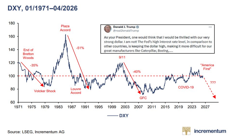
This remains one of the most important charts of the next few years ahead.
Do not underestimate the power of long-term decline in the dollar.
Ignore the near term moves in the counter direction, in the big picture the US dollar is at a critical juncture and US policymakers have no option but to devalue the currency.
The implications out of this move will be profound.
https://t.co/XiogYIdEzM
$XAGUSD / $PPIACO 1M;
#silver is already outperforming PPI since mid 2025
CPI and PPi (#inflation) is about to pick up and do a large third impulse
and #silver will do better during that periode
The ratio GOLD vs US CPI now has a truly historical breakout.
And, silver is in catch-up mode which will lead to its huge c&h breakout...
#gold#silver#joinus#strategy
COPPER VS GOLD
As is used to do, the copper-to-gold has bottomed 1.5 standard deviation below its long-term trend.
While the ratio is clearly at a cycle low and therefore presents an attractive risk-reward (reaching 1 standard deviation on the upside would indeed imply a 100% appreciation of copper relative to gold), its momentum also suggests the beginning of an upward trend. Indeed, its monthly MACD has recently turned positive for the first time since April 2022.
The risk-reward of offer by copper outpaces the gold's one at this stage.
$COPX $COPJ $GDX
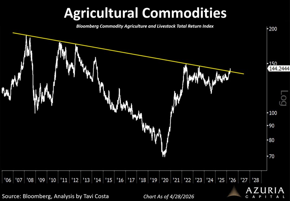
Agricultural commodities are now breaking out decisively from nearly 20-year resistance.
Just as expected:
When energy moves, food prices tend to follow.
This is deeply concerning for society, yet it aligns with the broader macro trend.
People will point to isolated narratives like droughts, but that misses the bigger picture.
This is a second-order effect of the energy issue.
https://t.co/II9JJhU4ql
🚨 THIS IS UNUSUAL
US 12-month inflation expectations have surged to 5.2%.
Fastest growth in history.
In just 3 weeks, markets have gone from pricing in rate cuts to rate hikes.
This is how it actually works:
Inflation UP → No more rate cuts - → Yields down → Liquidity goes to 0
Most people are still positioned for the old narrative.
That’s the problem.
They think:
- “cuts are coming”
- “risk is supported”
- “dip = buy”
That system is getting crowded on the wrong side.
Watch how fast pricing keeps shifting.
Most will realize this after the move is done.
BTW, I’ve predicted all the market tops and bottoms for the last 15 years.
When I EXIT the markets completely, I’ll say it here publicly, like I always do.
Turn notifications ON. Many people will wish they had followed me sooner.
1 of 5 thoughts for the weekend
The TALO (Trump Always Lashes Out) and TACO (Trump Always Chickens Out) dashboard
Implied vol ($VIX, $MOVE) firmly in the TACO zone
Oil, M2-adjusted, remains in the low end of its long-term cycle.
Remember that in today's dollar, the 1980 peak would now be equivalent to $560.
#OOTT $XLE $IEZ
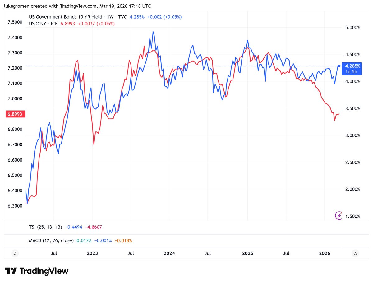
At the back of the yield curve, yields are moving higher across the board, and the UK 10-year GILT yield is testing the cycle highs from 2022. UK and US yields generally move in similar fashion, so this is something to watch as the US 10-year hit 4.28% on Friday.
10y UST yields (blue, RS) v. USDCNY (red, LS), since Russia invaded UKR in Feb-22.
Something changed in late 2025 (stronger CNY v. USD and higher 10y UST yield, instead of lower.)
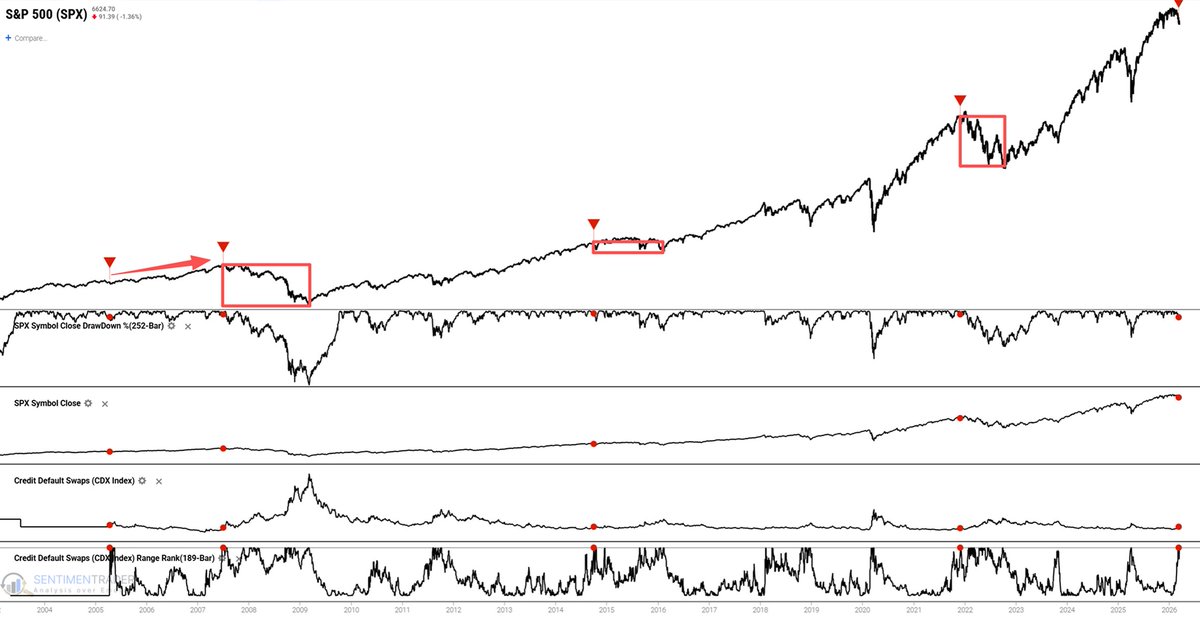
Credit markets are flashing a warning, but not in the usual way.
The cost of insuring against defaults hit a 9-month high while stocks remain near highs.
Historically, this setup has been unstable:
• Roughly half the time it led to sharp drawdowns
• The rest saw either minor pullbacks or continued gains
Risk doesn't disappear in these environments, it becomes asymmetric.
Are you aware of the pawn shop indicator?
History shows it has a pretty good track record.
Read the full breakdown in today's Morning Print.
https://t.co/hF5A6GIyif
This is one of the most compelling setups for agricultural commodities I have seen.
Broad commodities appear to be leading the move, while agricultural commodities remain just below a major historical resistance level.
A breakout could be the next step.
Here is where I elaborate further on this topic:
https://t.co/d5n9i5VcvQ
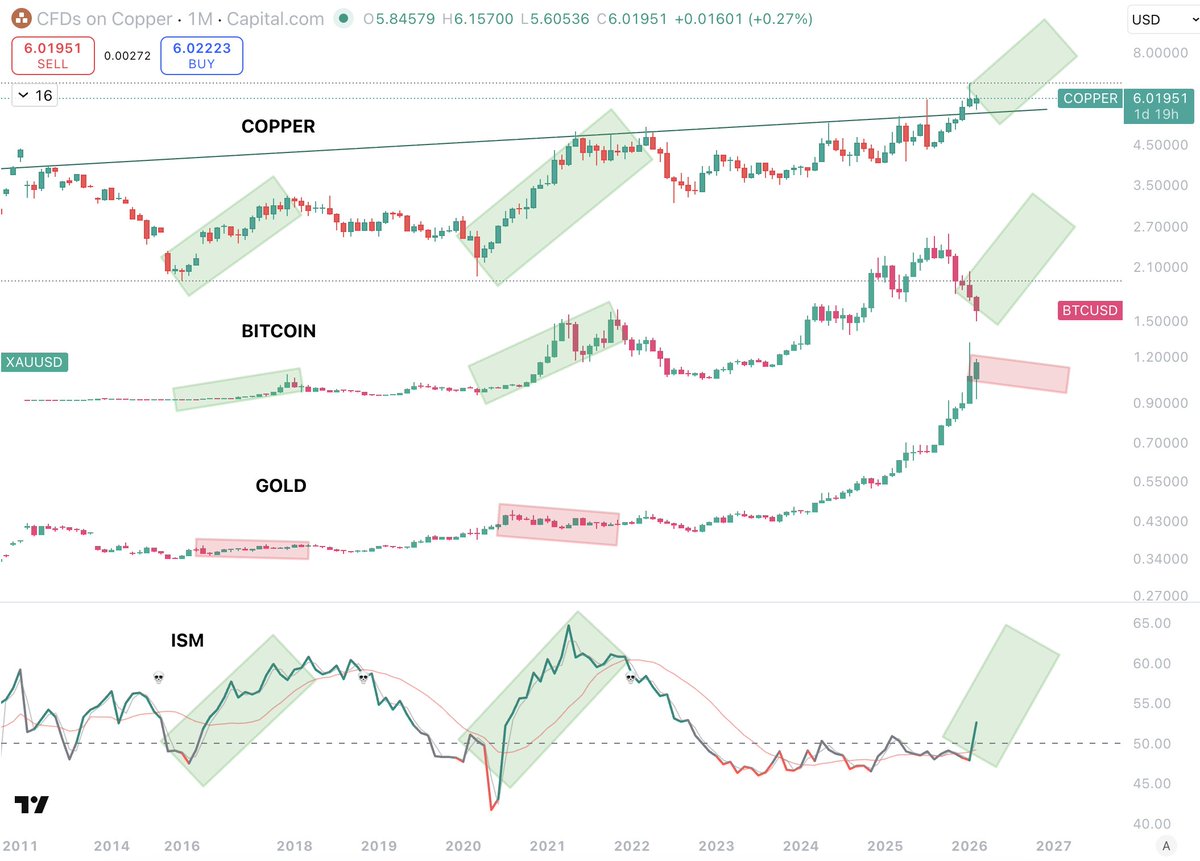
Everybody needs to see this chart.
If you are struggling to understand my thesis...
This is another simple and effective chart that tells a very broad macro picture, all in one.
its probably one of the best overall macro charts you could see.
What we are looking at here is:
- COPPER
- BITCOIN
- GOLD
- ISM
Now, these 4 charts all tell a very distinct story, but when you put them together, they tell almost everything.
Copper is an asset that signals overall expansion as it is the most used metal in construction and development of all forms, and now, with the added tailwind of AI.
Copper has broken out of a 20 year trend to the upside.
That is definitely something.
The demand for Copper is not going to slow down.
Next, Bitcoin, follows Copper almost tit for tat, because Bitcoin is a risk on asset that thrives in economic and business expansion.
And at the very bottom, ISM, which is the index for whether the economy is expanding or not.
So now, firstly, observe Copper and ISM... do we think that Copper breaking out of a 20 year range and ISM entering expansion for the first time is a coincidence?
It's not.
Now, look at every cycle top for Bitcoin. What do Copper and ISM look like at those moments?
At the peak of their epansion.... but right now, they are only at the beginning.
And with Copper breaking a 20 year trend, do we think this will be a small breakout?
No.
Lastly, lets now add in Gold.
Gold is important here because it is a risk off asset that thrives in periods of economic uncertainty.
What we can see here is that Gold runs whilst the others contract.
And we can see, every cycle, regardless of "4 year cycle"... this is a process that happens.
GOLD pumps in contraction
ISM moves into expansion w Copper pushing
Bitcoin follows
This is not an arbitrary 4 year number... this same process is happening right now, even thought it is totally out of line with the 4 year cycle.
Because it is not the 4 year cycle that matters...
It is the cycle of expansion and contraction that we can see here.
It is not a coincidence that this is all happening the same way it always does, even thought this time there has been a much longer gap between ISM contraction and expansion.
This chart tells us everything we need to know about the macro.
And it is, right now, entering large scale expansion...
Whilst everyone thinks its over.
This is nothing like 2022.