When did your county's population peak in the last 50+ years? Is your county in "double jeopardy"? Has it recovered since the turn of the century?
https://t.co/RsP3YwYc73
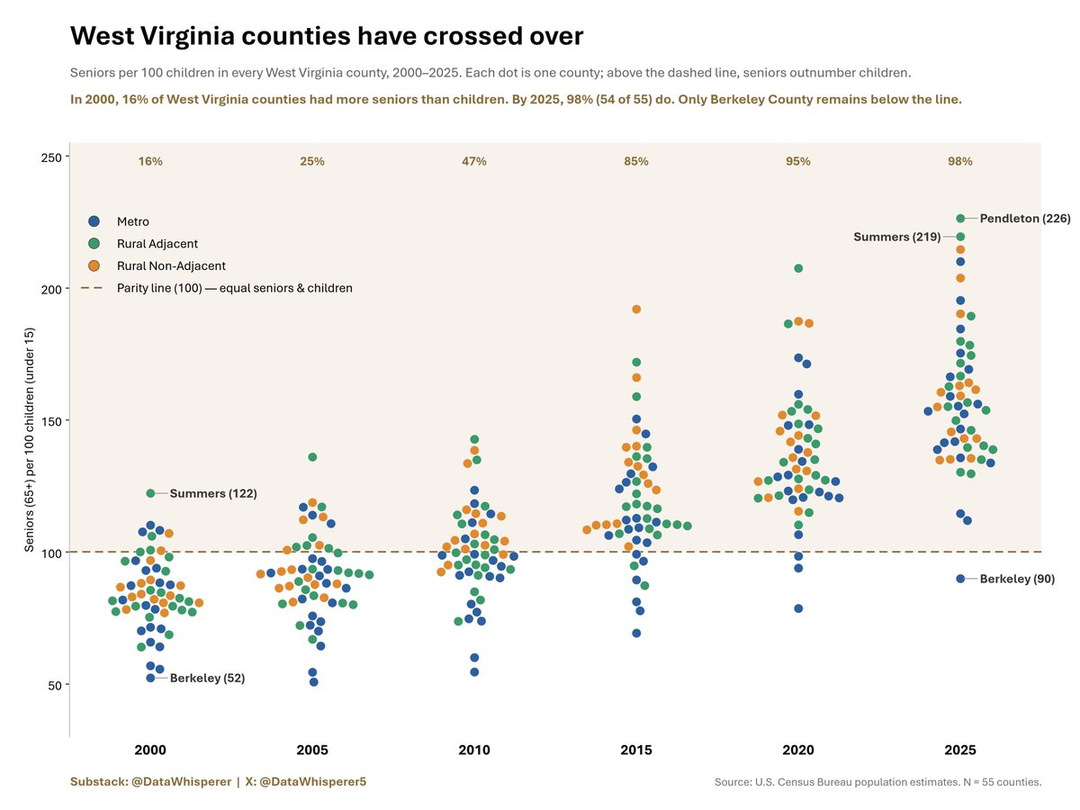
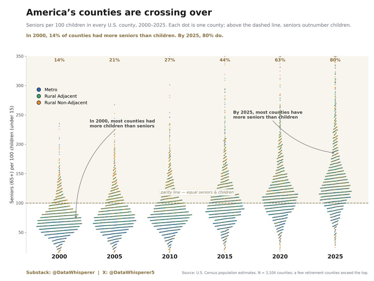
Check out this dot-plot (beeswarm) graph. Each dot is a U.S. county and their older-younger ratio. A number above 100 means there are more senior residents compared to children under age 15.
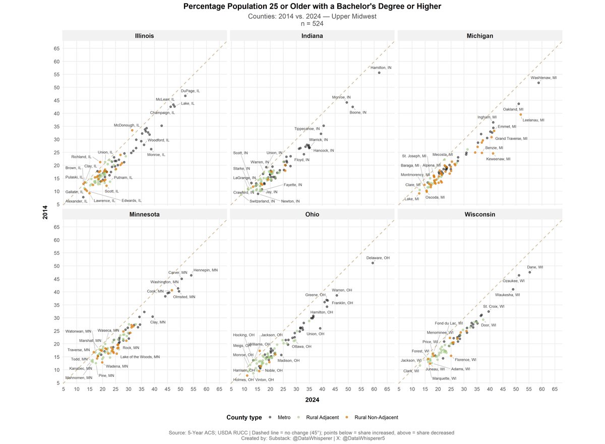
Scatter plot below shows #UpperMidwest counties (by type) and their share of population age 25 or older with a bachelor's degree or more, between 2014 and 2024. Of the 524 counties, only 11 saw their share decrease (5 in Illinois, 2 in Indiana, 1 in Minnesota, and 3 in Ohio).
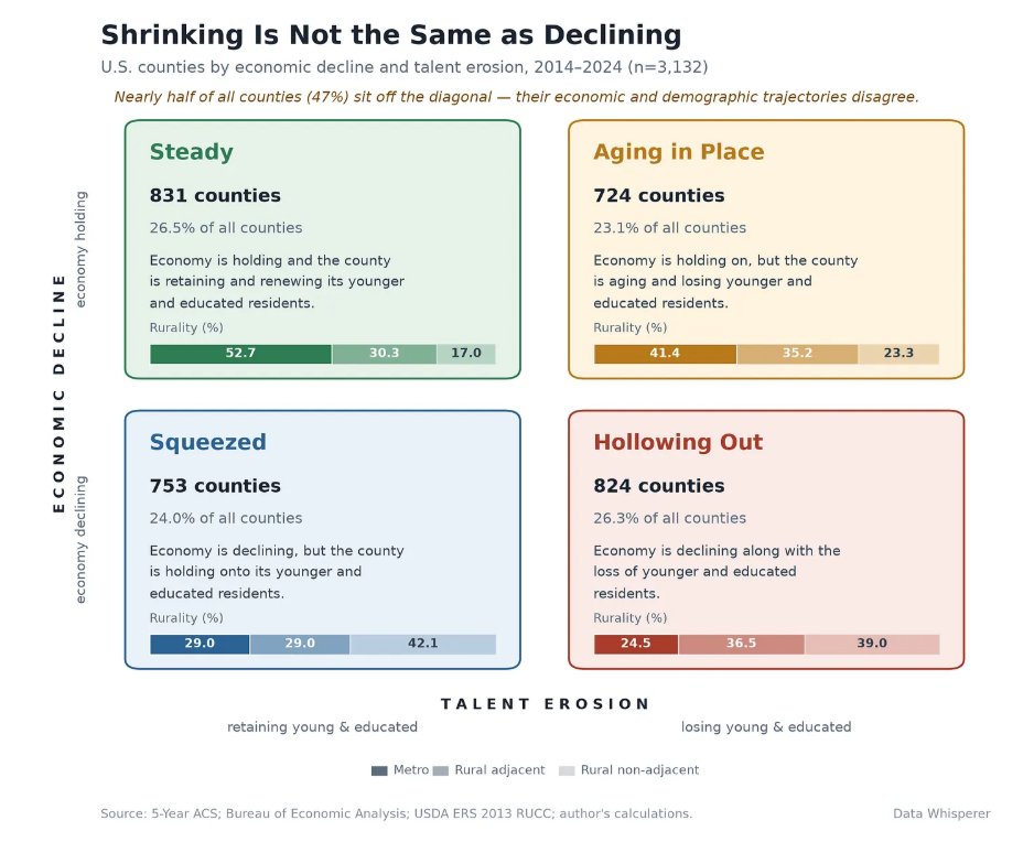
"Population loss has become shorthand for decline. This report suggests the shorthand is wrong. Nearly half of all US counties show a mismatch between their demographic & economic trajectories" https://t.co/VFT97c2su8