"UI/UX Designer | Crafting seamless and user-first digital experiences | Passionate about blending creativity with functionality to solve real-world problems."
1. Minimal + Punchy Style
🎯 In UX, less is powerful.
The simpler the design, the clearer the path.
✅ Reduces friction
✅ Feels intuitive
✅ Builds trust
Don't confuse simplicity with emptiness. It's strategy at its best.
#UXDesign#UIDesign#SimplicityMatters#DesignPrinciples
Top UI/UX Trends This Year 🚀
🔥 AI-Powered UX – Smart personalization
🎨 Glassmorphism & Neumorphism – Futuristic UI
🌙 Dark Mode – More apps embracing it
🖱️ Microinteractions – Enhancing usability
🔍 Voice & Gesture – Natural interactions
👉 Which trend excites you most? ⬇️
Dark Mode vs. Light Mode – Which One Wins? 🌙☀️
Light = Better in daylight ☀️ | Dark = Easier on eyes at night 🌙
💡 Best UX? Let users choose!
👉 Which do you prefer? ⬇️
#UXDesign#DarkMode#LightMode#UserExperience#UIDesign
Make Forms User-Friendly ✍️✅
🔹 Keep it short & clear
🔹 Use proper labels
🔹 Group related fields
🔹 Show real-time errors
🔹 Enable auto-fill
💡 Simple forms = Better conversions!
👉 What’s the most frustrating form you’ve faced? ⬇️
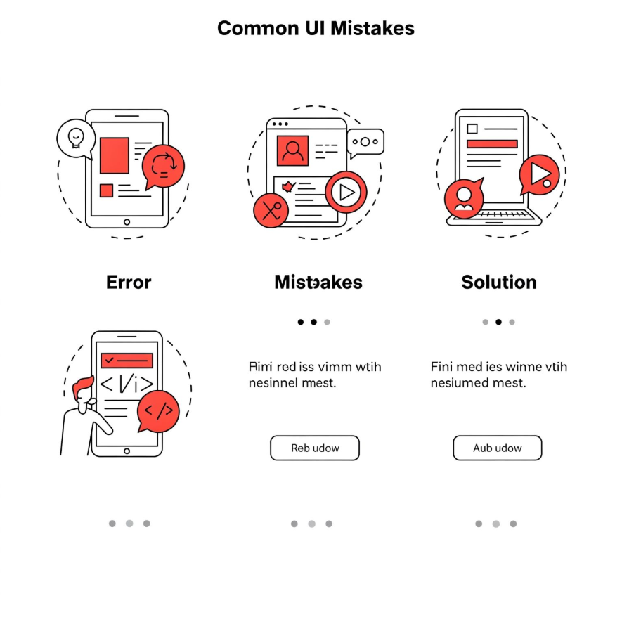
UI Mistakes & Fixes 🚨
❌ Tiny Click Areas → ✅ Bigger buttons
❌ Too Many Fonts/Colors → ✅ Keep it simple
❌ Poor Hierarchy → ✅ Use contrast & spacing
💡 Great UI is clear & intuitive!
👉 What’s your biggest UI pet peeve? ⬇️
#UXDesign#UIDesign#DesignMistakes#UXTips
Think Like a User, Not a Creator! 🤔
Great UX isn’t what we design—it’s how users experience it.
🔹 We assume: "This is easy!"
🔹 Users struggle: "Where’s that button?"
💡 Observe. Test. Adapt.
👉 Seen a design that forgot the user? Drop it below!
#UXDesign#UserExperience
Affordances & Signifiers in UI 🎯
Tapped something, but it didn’t work? Bad UX!
🔹 Affordance → What it can do.
🔹 Signifier → A cue how to use it.
Good UI guides, bad UI confuses.
👉 Seen a confusing UI? Share below! ⬇️
#UXDesign#UIDesign#Affordances#DesignThinking
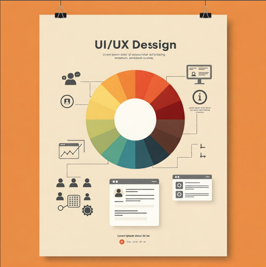
How Colors Influence UX
Colors shape emotions & decisions in UI/UX!
🔵 Blue = Trust (LinkedIn, Facebook)
🔴 Red = Energy (Netflix, YouTube)
🟢 Green = Growth (WhatsApp, Spotify)
🟠 Orange = Fun (Fanta, SoundCloud)
Beyond aesthetics, colors boost usability & brand perception.
✨ Microinteractions make UX feel alive! From the like animation on Instagram to a smooth button hover, these tiny details enhance usability and engagement.
What’s your favorite microinteraction in an app you use daily? 👀 #UX#Microinteractions
@JararMalik Thanks for the feedback! I'll work on aligning the text consistently to ensure it looks seamless across all images. Appreciate your suggestion!
Designed a platform for customers to explore and order cakes effortlessly. 🍰 Happy with the progress, but I know there’s room for growth!
What can I improve in design, functionality, or user experience? Your feedback is valuable!
#UIDesign#UXDesign#WebsiteDesign#Feedback
☕ Designed a coffee app UI with Auto Layout and clean padding for a seamless, user-friendly experience. Feedback is welcome! 🙌
#UIDesign#UXDesign#CoffeeApp#DesignJourney
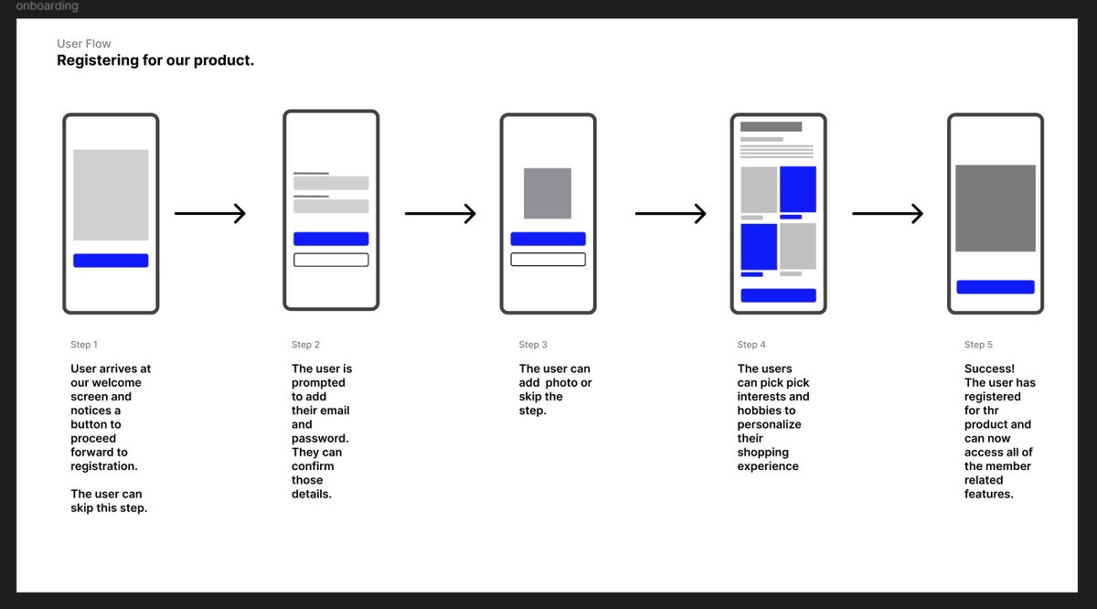
Created a 5-step registration flow today—simple, clear, and user-focused!
🎯 User flows = smoother journeys, happier users.
Thoughts? Share your tips!
#uiuxdesign#UserFlow#design
✨ Mastering UI Spacing ✨
Focused on spacing icons & titles for clarity. Applied the Gestalt principle of proximity to make designs intuitive. 🚀
Thoughts or tips? Let’s grow together! 😊
#UIDesign#GestaltPrinciple#LearningByDoing
🌤️ Excited to share my UI design for BlueHorizon Weather App! 🌞❄️
🔹 Simple login
🔹 Real-time weather updates & 4-day forecast
Clean, intuitive design for a better user experience!
💬 Any feedback?
#UIDesign#WeatherApp#AppDesign#UIUX#BlueHorizon