Choosing the correct sample size is one of the most important decisions in any research project. A sample that is too small may produce unreliable results, while an excessively large sample can waste time, effort, and resources.
Readable graph layouts rely on categorized guidelines to enhance clarity.
Basic rules prevent overlaps among vertices and edges. Semantic rules specify placements for key vertices along straight lines or curves, with designated sizes or positions at boundaries or centers. Structural rules promote hierarchical and symmetrical arrangements while minimizing edge crossings, bends, total lengths, and drawing area, along with uniform placement and convex faces.
It is used to generate clear visualizations in social network mapping and software architecture diagrams.
Polynomial regression is a powerful statistical tool used to model relationships between variables where the relationship is not strictly linear. It extends the regression model by fitting a polynomial equation to the data, capturing more complex patterns.
✔️ Better Fit for Non-Linear Data: Polynomial regression can capture curved relationships, providing a more accurate fit for certain types of data.
✔️ Flexible Model: This method adds higher-degree polynomial terms, allowing the model to capture non-linear relationships in the data more effectively.
✔️ Improved Predictive Power: By fitting the curve closely to the data points, polynomial regression can enhance the predictive performance of the model.
❌ Overfitting Risk: Using too high a degree can lead to overfitting, where the model becomes too complex and loses its ability to generalize to new data.
❌ Interpretation Complexity: As the degree of the polynomial increases, the model's interpretation becomes more difficult, which can be a barrier for practical application.
❌ Computational Cost: Higher-degree polynomials can be computationally expensive, particularly with large data sets.
The visualization demonstrates a polynomial regression applied to the mtcars data set in R programming, where the relationship between weight (wt) and miles per gallon (mpg) is modeled. The blue points represent the actual data, and the red curve shows the fitted polynomial regression line. This approach better captures the non-linear relationship than a simple linear model would.
Note: Despite modeling non-linear relationships, polynomial regression is still a linear model because it is linear in its parameters (the coefficients). The nonlinearity refers to the shape of the relationship between predictors and the target variable, not to the model’s mathematical structure.
I’ve created a tutorial explaining this topic in more detail: https://t.co/cL95288gzg
If you’re interested in mastering this topic and other statistical methods in R, check out my online course on Statistical Methods in R.
Check out this link for more details: https://t.co/7YQCRDKSPO
#DataAnalytics #datastructure #DataScientist #Data #RStats
Earth’s Sweet Spot Tilt: Why 23.26° Might Be One of Life’s Greatest Lucky Breaks
Planets don’t just spin — they lean. That lean, called axial tilt or obliquity, is one of the most powerful architects of a world’s climate, seasons, and potential to support https://t.co/lbfncnNHBR’s tilt of 23.26° is practically perfect — the ultimate Goldilocks angle. It delivers the four distinct seasons we know so well while preventing the kind of temperature extremes that would make large parts of the planet uninhabitable. This moderate tilt spreads sunlight in a way that keeps our climate relatively stable, drives gentle ocean currents and wind patterns, and allows liquid water to persist across vast regions https://t.co/t2FC0GLF7T that to our solar system neighbors:Uranus is tipped over at a wild 98°, essentially rolling on its side like a barrel. Its seasons last decades, with one pole plunged into decades-long darkness while the other bakes in continuous sunlight.
Venus is flipped almost completely upside down at 177.3° (spinning retrograde), resulting in a day longer than its year and a crushing, uniform greenhouse hell.
Mercury has almost zero tilt, so it experiences virtually no seasons — just blistering heat on one side and eternal cold on the other.
A planet’s axial tilt controls how sunlight falls across its latitudes over the course of its orbit. Too little, and climates become static and extreme. Too much, and seasons turn chaotic and brutal. The right tilt helps regulate temperature, drives weather systems, and creates the dynamic yet stable environment life seems to https://t.co/EQUZuoggFW astronomers hunt for habitable exoplanets, axial tilt has become a key factor in their assessments. The more we learn, the more we realize just how delicately balanced Earth’s cosmic posture really is — one of the many subtle reasons this blue marble became a thriving home for life.
Source: Laskar, J., & Robutel, P. (1993). The chaotic obliquity of the planets. Nature, 361(6413), 608–612.
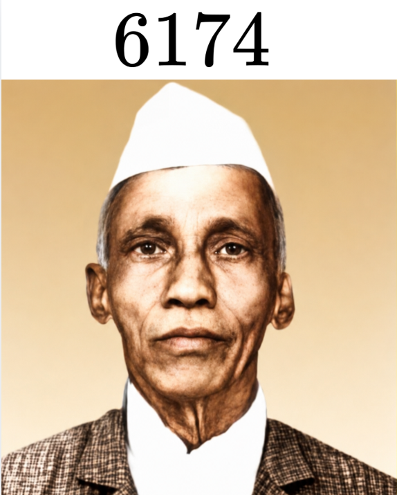
In 1949, the mathematician D. R. Kaprekar from Devlali, India, devised a process now known as Kaprekar's operation.
First, choose a four-digit number in which not all digits are the same (that is, not 1111, 2222, etc.).
Then rearrange the digits to form the largest and smallest numbers possible.
Finally, subtract the smallest number from the largest to obtain a new number, and repeat the operation with this result.
It is a simple procedure, but Kaprekar discovered that it leads to a surprising result.
Let’s try it, starting with the number 2005. The largest number that can be formed is 5200, and the smallest is 0025 (or simply 25). If one or more digits are zero, they must be placed on the left-hand side of the smallest number.
The steps are as follows:
5200 − 0025 = 5175
7551 − 1557 = 5994
9954 − 4599 = 5355
5553 − 3555 = 1998
9981 − 1899 = 8082
8820 − 0288 = 8532
8532 − 2358 = 6174
7641 − 1467 = 6174
Once we reach 6174, the process repeats itself, always returning 6174. This number is called a kernel of the operation. Not only is 6174 a kernel for Kaprekar’s operation, but it is also the only one—and it has another remarkable property.
Let’s try a different starting number, say 1789:
9871 − 1789 = 8082
8820 − 0288 = 8532
8532 − 2358 = 6174
Once again, we arrive at 6174.
Unlock the language of algebra with these core symbols.
From equal by definition and function composition to discriminants, inner products, and matrix inverses; everything you need for equations, proofs, and higher math in one clear layout.
These symbols are used daily by engineers designing circuits, data scientists building machine learning models, and physicists describing motion and forces.
THE BEST EXPLANATION OF HOW LLMS ACTUALLY WORK IS A FREE STANFORD LECTURE AND IT STARTS WITH A MOUSE EATING CHEESE
it's CS324, Stanford's large language models course, and the intro is sitting on the open web for anyone.
i clicked in skeptical. every "how AI works" thing online is either baby talk or a wall of equations. this is neither.
it opens with one tiny idea. a language model just guesses how likely a sentence is. "the mouse ate the cheese" gets a higher score than "the cheese ate the mouse." same words, but one makes sense and the model somehow knows that. that single example unlocked the whole thing for me.
then it builds, slowly, honestly:
> Shannon inventing this in 1948 to measure the "entropy" of English, decades before ChatGPT
> why old n-gram models forgot everything past a few words back
> how neural nets fixed the memory problem but cost a fortune to train
> how transformers finally cracked it in 2017 and everything exploded
it's written by Percy Liang's group at Stanford. real researchers. and there are clickable demos right in the notes so you can watch a model pick its next word live.
no paywall. no account. a graduate-level Stanford course, free, while people sell you a $300 "AI fundamentals" PDF that explains less.
if you've ever nodded along to "it predicts the next token" without really getting it, this is the one link that fixes that.
100% free. just open it and read.
https://t.co/l6Id0Zo8q2
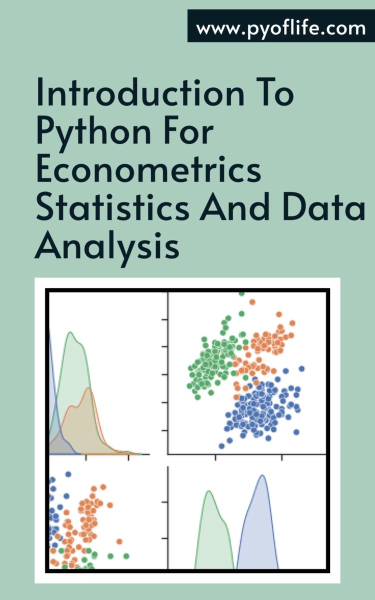
With its easy-to-learn syntax, powerful libraries, and flexible data structures, Python has become an essential tool for data scientists, economists, and statisticians. https://t.co/COTvxhp5DR
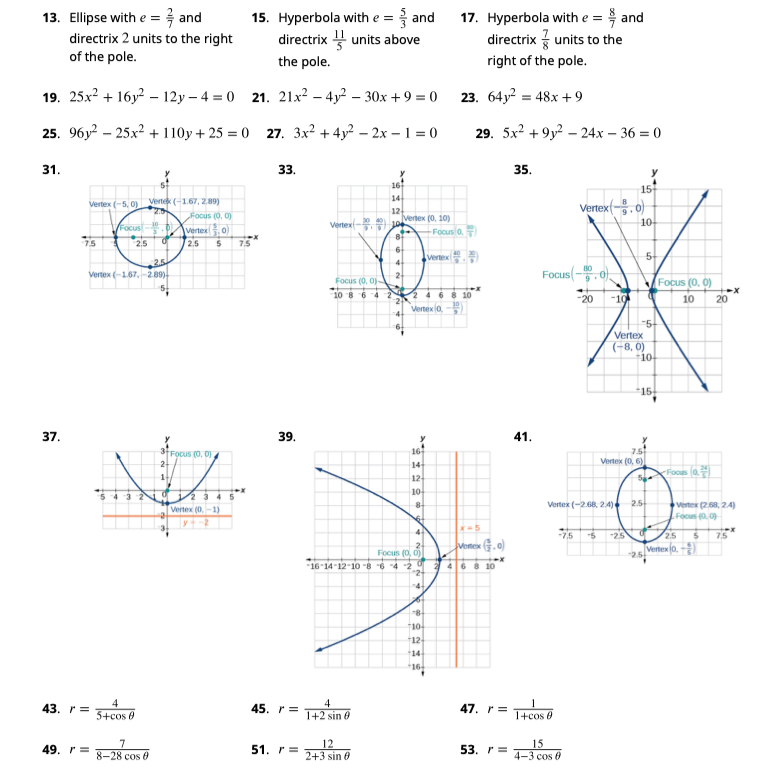
"Algebra 2" is another completely free textbook that covers a large portion of algebra at both the pre-university and early university levels.
With more than 1,100 pages and a large collection of worked examples, practice problems, and exercises, it covers linear equations, quadratic equations, polynomial equations, rational equations, radical equations, exponential and logarithmic equations, systems of equations, inequalities, and many of the fundamental concepts that form the backbone of algebra.
In my opinion, it is one of the most comprehensive free resources available for studying the theory of equations and the algebraic methods typically encountered in the first years of university.
https://t.co/Xf3qbA3hQO
3 hours lost. 4 citations that did not exist. 1 frustrated supervisor.
A PhD student I mentor learned this the hard way.
ChatGPT is not built for finding papers.
Understanding probability distributions is key to making informed decisions in statistics and data science. Probability distributions describe how the values of a variable are expected to behave, making them crucial for interpreting data and predicting outcomes.
Here are some key probability distributions:
🔹 Binomial distribution: This distribution models the number of successes in a fixed number of independent trials, where each trial has two possible outcomes (success or failure). It's often used in scenarios like flipping a coin or determining the probability of passing a test.
🔹 Poisson distribution: This distribution describes the number of events occurring within a fixed interval of time or space, assuming these events happen with a known constant mean rate and independently of the time since the last event. It's commonly used for modeling events like the number of emails received in an hour.
🔹 Normal distribution: Also known as the Gaussian distribution, this distribution represents data that clusters around a mean value. It is symmetric, with most observations falling close to the mean, making it applicable in various fields, from natural sciences to economics.
🔹 Uniform distribution: In this distribution, all outcomes are equally likely within a given range. It's the simplest form of distribution, where every event has the same probability of occurring, such as rolling a fair die.
🔹 Exponential distribution: This distribution models the time between events in a process where events occur continuously and independently at a constant rate. It's often used in scenarios like the time until the next earthquake or the lifespan of electronic components.
These distributions form the foundation for many statistical analyses and are essential for interpreting different types of data accurately.
A probability distribution can be visualized easily in R using the ggplot2 package. For example, a normal distribution can be displayed with a smooth curve using geom_density(). The visualization shown in this post illustrates the distributions explained above.
To learn more about this topic and related statistical methods, check out my online course on Statistical Methods in R.
Learn more by visiting this link: https://t.co/7YQCRDKSPO
#RStats #Rpackage #DataVisualization #Statistics #database