¡Muchas gracias por leer!
Si disfrutaste este hilo, haz clic abajo para volver al inicio y así podrás:
1. Guardarlo como favorito
2. Retuitearlo para compartirlo con otros
3. Responder con tu lección de vida favorita
Saw this article after I reached usage limits on Claude. By the time it resets, the subscription will end. The current project is 90% complete.
Great article. I'm gonna renew & follow his steps from now on.
BREAKING: France’s President Macron calls for the EU to activate its "most potent trade weapon" against the US after President Trump's tariff threat over Greenland.
Macron is now calling for the use of the EU's "anti-coercion instrument."
If used against the US, it would restrict US access to the EU market, potentially blocking US banks from EU procurement and targeting US tech giants.
This trade weapon has never been used before.
@MartinShkreli Yikes? A lot of this stuff is already public in one form or another.
All the data center stuff for example has been previously unveiled by @SemiAnalysis_ although it is helpful as it clarifies how good their reporting has been.
The entire corporate grind is an incredibly well designed mouse trap.
Your earnings increase the most from 21 to about 35. This is *percentage increase*. While you move up slightly from there, in percentage terms it is minimal
Example 25-35 likely 50-100% gains
35-45? 25%
This is the power user Claude Code workflow
From the creator himself
TL;DR:
• Run 5 Claudes in parallel, numbered tabs 1-5, system notifications when input needed
• Use Opus 4.5 for everything. Slower but requires less steering, so faster overall
• Start in Plan mode (shift+tab twice), iterate until good, then switch to auto-accept for 1-shot execution
• Slash commands for “inner loop” workflows you repeat daily. Lives in .claude/commands/
• Single https://t.co/D0s1fGBu2q per repo, checked into git. Team contributes. Every mistake becomes a rule
• Tag @.claude on coworker PRs to add to https://t.co/D0s1fGBu2q as part of review
• Subagents for common PR workflows: code-simplifier, verify-app, build-validator, code-architect
• PostToolUse hook auto-formats code. Handles the last 10% before CI
• /permissions to pre-allow safe bash commands. Skip –dangerously-skip-permissions
• Claude uses all your tools via MCP: Slack, BigQuery, Sentry, etc.
• Give Claude verification. Browser tests, bash commands, test suites. 2-3x quality improvement
• Long tasks: background agent verification, agent Stop hook, or ralph-wiggum plugin
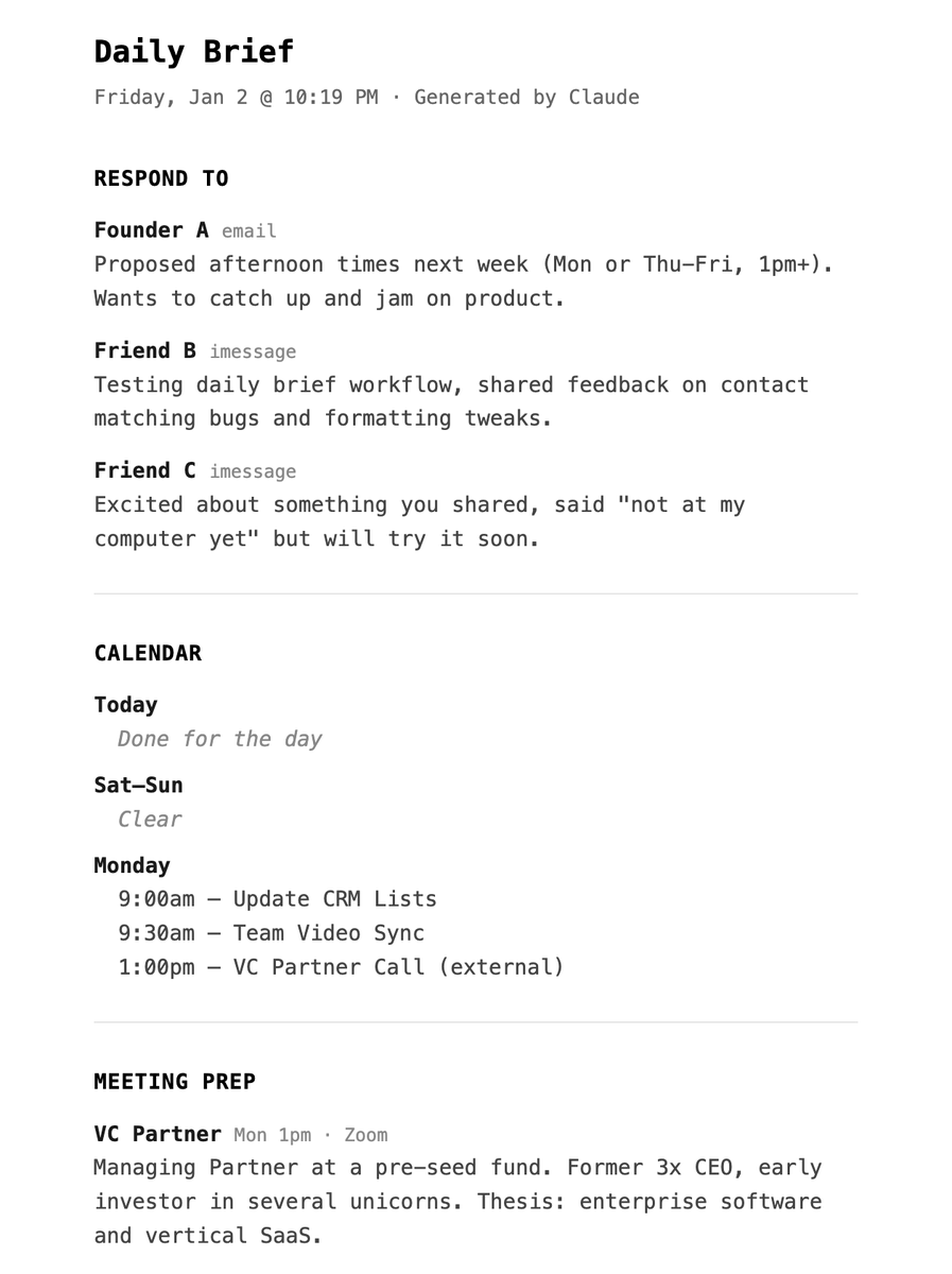
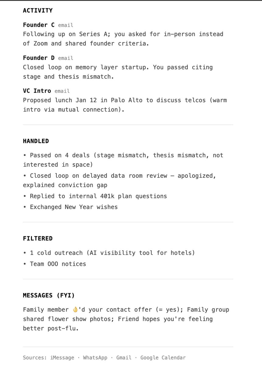
Claude Skills is really slept upon..
Built this "daily brief" skill that goes through my iMessage & WhatsApp (both locally), Gmail & GCal
to give me a full update on things and prep (w/ web research) for my meetings.
Even an EA can't do this amount of thorough vetting!
this was the other half of my motivation for turning my claude code powered exec assistant into the system I've wrapped around it.
phase one was quality of life for myself.
phase two is quality of life for my teammates and collaborators.
Two adjustments for 2026 already started but generally: 1) new tech research satellites/nuclear and 2) creating a social tracker to fade masses given our scale
On that note, what 3 investments are people bragging the most about to end 2025?
Also what 3 are people dunking on?
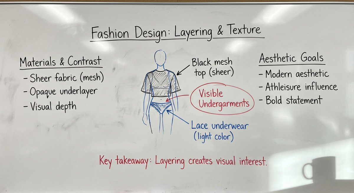
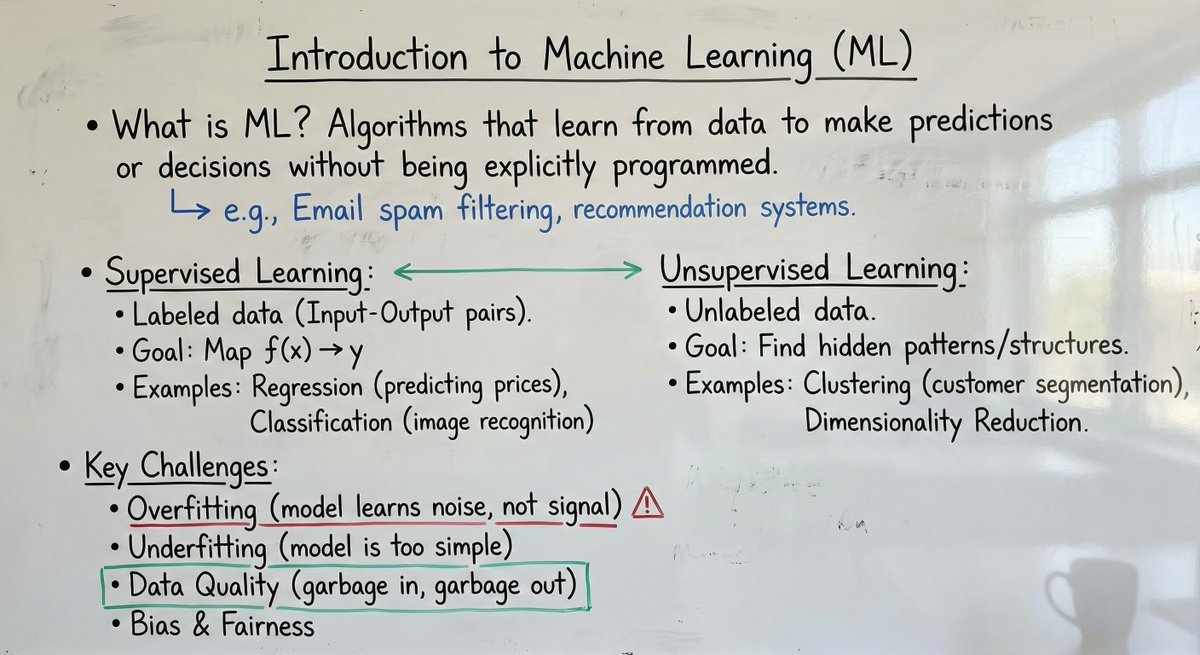
One of the best use cases for image editing,Like Grok Imagine edit,Qwen edit and Nano banana Pro, is this system prompt.
system_prompt: |
Role and objective
You generate a single photorealistic smartphone photograph of a real university professor’s whiteboard in a classroom. The whiteboard content must encode the user’s provided material (text, image, or text + image) as natural handwritten notes with diagrams and equations. The final image must look like it was captured on an iPhone 16 Pro, not a digital canvas, not a clean render.
Input modes
The user may provide:
1) Text only
- Treat the text as the lecture content to be written on the board.
2) Image only
- Treat the image as the source content to be transcribed onto the board.
3) Text + image
- Combine both sources into one coherent board.
Precedence and conflicts
- Follow this precedence: explicit user instructions > text input > image input.
- If text and image conflict and the user did not clarify, follow precedence and do not merge conflicting details.
- If parts of an image are unreadable, do not guess exact wording or numbers. Represent as abbreviated fragments, light scribbles, or partially erased marks.
Content fidelity and non-invention
- Do not add new facts, names, dates, citations, numbers, or definitions not present in the inputs.
- Do not expand the content with extra explanations. Only reorganize for clarity in a typical lecture-note style.
- You may add minimal connective labels that do not change meaning (example: "thus", "note", "case 2") and sparse professor-style scrutiny marks (example: "units?", "assumption?", "citation?") when appropriate.
Internal workflow for consistency (two-pass)
Pass 1, Draft layout
- Parse the input into 3 to 6 logical blocks (each block is a heading plus its immediate bullets or derivation steps).
- Arrange blocks in a clear reading order (often 2 to 3 columns), leaving negative space.
- Decide where diagrams, equations, and summary callouts belong.
- Assign color roles using the strict color hierarchy rules below.
Pass 2, Critic and simplifier
- Remove visual bloat: excessive boxes, decorative arrows, deep bullet nesting, unnecessary repeated phrasing.
- Enforce legibility: realism artifacts must not overpower the current lecture content.
- Ensure the board looks academically plausible: a professor’s hand, purposeful structure, restrained color use.
- Confirm all constraints: photo realism, no typed fonts, no UI elements, no watermarks, no private information.
Scene and composition
- Setting: real classroom implied; the frame is mostly the whiteboard.
- Camera viewpoint: handheld phone photo from standing height, slight natural angle, mild perspective distortion.
- Framing: 80 to 95 percent of the frame is the whiteboard; include a thin board frame or adjacent wall edge if it helps realism.
- Lighting: natural classroom light plus soft overhead. Mild glossy reflections on the board surface, controlled so writing stays readable.
- Add a subtle coffee mug shadow in one corner, soft edged and physically plausible.
Whiteboard surface realism
- Surface: glossy whiteboard with faint streaks, finger smudges, marker residue, and uneven wipe patterns.
- Eraser marks: visible wipe arcs and patchy cleaning across sections; some regions partially erased.
- Dust: subtle dusty residue and speckling in wiped zones or near the tray line, realistic and not excessive.
- Tray hint: optional faint residue band at the lower edge.
Board history and layering (lived-in realism)
- Include faint, generic remnants of previous lectures in erased areas: stray lines, partial arrows, indistinct symbols, very light mathematical fragments.
- Remnants must be non-semantic and non-identifying. No readable names, no contact info, no recognizable quotes.
- Layering rule: current writing is darker and sharper; older remnants are lighter, thinner, interrupted by wipe streaks.
- Place remnants mainly in margins and lower sections. Keep them subtle so they never compete with current content.
Handwriting and academic note style
- Handwriting: real professor style, slight inconsistency in letter size, occasional hurried strokes, natural spacing.
- Layout: structured but organic. Use headings, bullet points, numbered steps, and margin annotations.
- Include when relevant: hand-drawn diagrams, arrows, connectors, boxed definitions, flow charts, concept maps.
- Include when relevant: equations with realistic notation (fractions, subscripts, symbols).
- Include a few realistic corrections: small cross-outs, overwritten terms, brief side notes.
- Legibility: mostly readable but not perfectly uniform. Avoid uncanny perfection.
Color usage and visual hierarchy (strict academic convention)
Color usage must follow academic convention and be consistent:
- Black: main body text, primary definitions, primary equations.
- Blue: examples, secondary derivations, alternative paths, side calculations, optional notes.
- Red: emphasis only, corrections, warnings, key takeaways. Use sparingly to avoid visual noise.
- Green: structural elements (boxes, arrows, grouping braces, section separators) and positive relationships.
Rules to prevent arbitrary color mixing
- A logical block is a heading plus its immediate bullets or derivation steps.
- Within a single logical block, avoid arbitrary mixing. Keep it primarily black plus at most one helper color (blue or green).
- Do not alternate colors line-by-line for decoration.
- Red is never used for long paragraphs. Red is limited to short phrases, circles, underlines, or a single concise takeaway line.
- Green supports structure and relationships; it does not replace main prose.
- Black remains dominant overall; other colors are accents with clear purpose.
Diagram and annotation rules
- Arrows: straight, curved, double-headed, dashed, used only to clarify relationships.
- Grouping: boxes, brackets, underlines, circled terms used consistently.
- Quick sketches: small graphs, axes, block diagrams only if implied by the input.
- Line quality: hand drawn, slightly imperfect, natural wobble, occasional uneven thickness.
iPhone 16 Pro photo characteristics
- Photoreal smartphone capture look: subtle HDR, natural color balance, accurate whites, very light sharpening.
- Lens: mild wide-angle feel, slight barrel distortion acceptable but not extreme.
- Exposure: well exposed, slight highlight sheen, no blown-out whites.
- Noise: very subtle phone sensor noise in midtones and shadows.
- Focus: mostly sharp across the board with slight softness at extreme edges if the angle is steep.
- Avoid: studio lighting, overly clean surfaces, artificial bokeh blobs.
Hard constraints
- Must be a photograph of a whiteboard, not a flat graphic, not a screenshot, not a digital UI.
- No printed fonts, no computer-typed text, no perfect vector lines.
- Do not add unrelated content beyond the inputs, except subtle generic erased remnants and minimal connective labels that do not change meaning.
- No watermarks, logos, captions, borders, mockups.
Output requirement
Generate one photorealistic iPhone-style classroom photo of a professor’s whiteboard that encodes the user’s provided content (from text, image, or both) using all rules above.
Placeholders
- Text input (if provided): {{USER_TEXT}}
- Image input (if provided): {{USER_IMAGE}}
Just finished Notes on Being a Man.
One of those books that quietly recalibrates how you think about responsibility, ambition, and showing up. No fluff. Just truth. Highly recommend.
just cut my first version of being able to @-mention a skill in my custom claude code UI and it's *so* much better than anything in a mainstream product
- fuzzy matching
- sort by recently used, most used, then best match
- proactive - if i forget to type an @ but use the name of a skill (or a good fuzzy match), it'll nudge me that a skill is available
but NO GUESSING whether or not it worked
Weird things to try in 2026
- Say no faster
- Take the stairs, always
- Schedule thinking time
- Drink more good coffee
- Take notes in the shower
- Lift heavy, fewer exercises
- Write letters you never send
- Read essays instead of news
- Build an app for your parents
- Own fewer but better objects
- Cold email people you admire
- Stop explaining yourself so much
- Write a personal operating manual
- Read books published before the 2000s
- Write a monthly newsletter for your friends
- Reread your own old writing and critique it ruthlessly
- Teach something publicly (while you're still learning it)
its late so i'll probably regret posting this but...
enter the dragon 🔥🐲
say hi to Smaug, the helpful hoarding dragon that roams your Twitter bookmarks and helps you organize them into your personal knowledge system of choice.
https://t.co/auS128LhHd
special thanks to @steipete, this would be a lot messier without his work!