@goon_nguyen I started suspecting this sh*t a long time ago... but there's a catch. Their ''experiments'' are actually doing the work for the government. Remember that fat sponsorization they received from them? 500 billi? The robots that will supress the planet will be powered by that clown
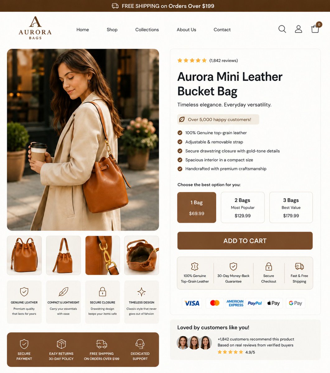
Founders, why does a $69 leather bag have a 'Subscribe & Save' toggle? Subscribing to a handbag?
That is a huge UX disconnect. It confuses buyers and kills conversions.
I design this Aurora Bags PDP by:
1. Killing the subscription.
2. Adding a tiered bundle anchor (Save on 3),
3. Stacking trust badges under the CTA to justify the price.
Drop your URL below for a free 1-min teardown.
DM 'Audit' to fix your leaks. https://t.co/I7R4yE4Eqx
#Shopify #DTC #CRO #UXDesign
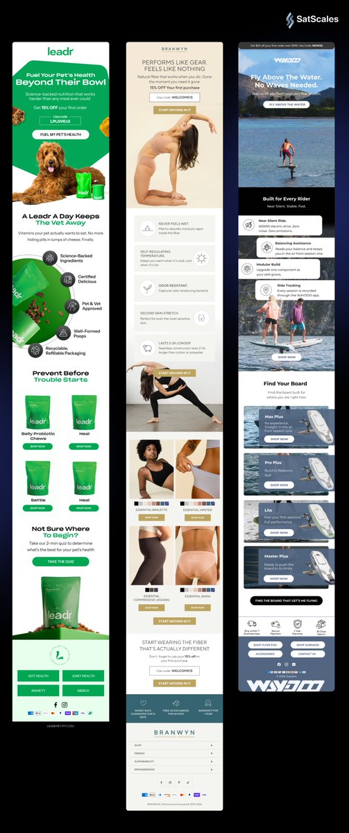
Before: just a product image.
After: clear headline, trust proof, CTA, and a reason to buy.
That’s how you turn a homepage into a sales page.
Need this for your store? DM “REDESIGN”.
#CRO#Shopify#WebDesign#Ecommerce
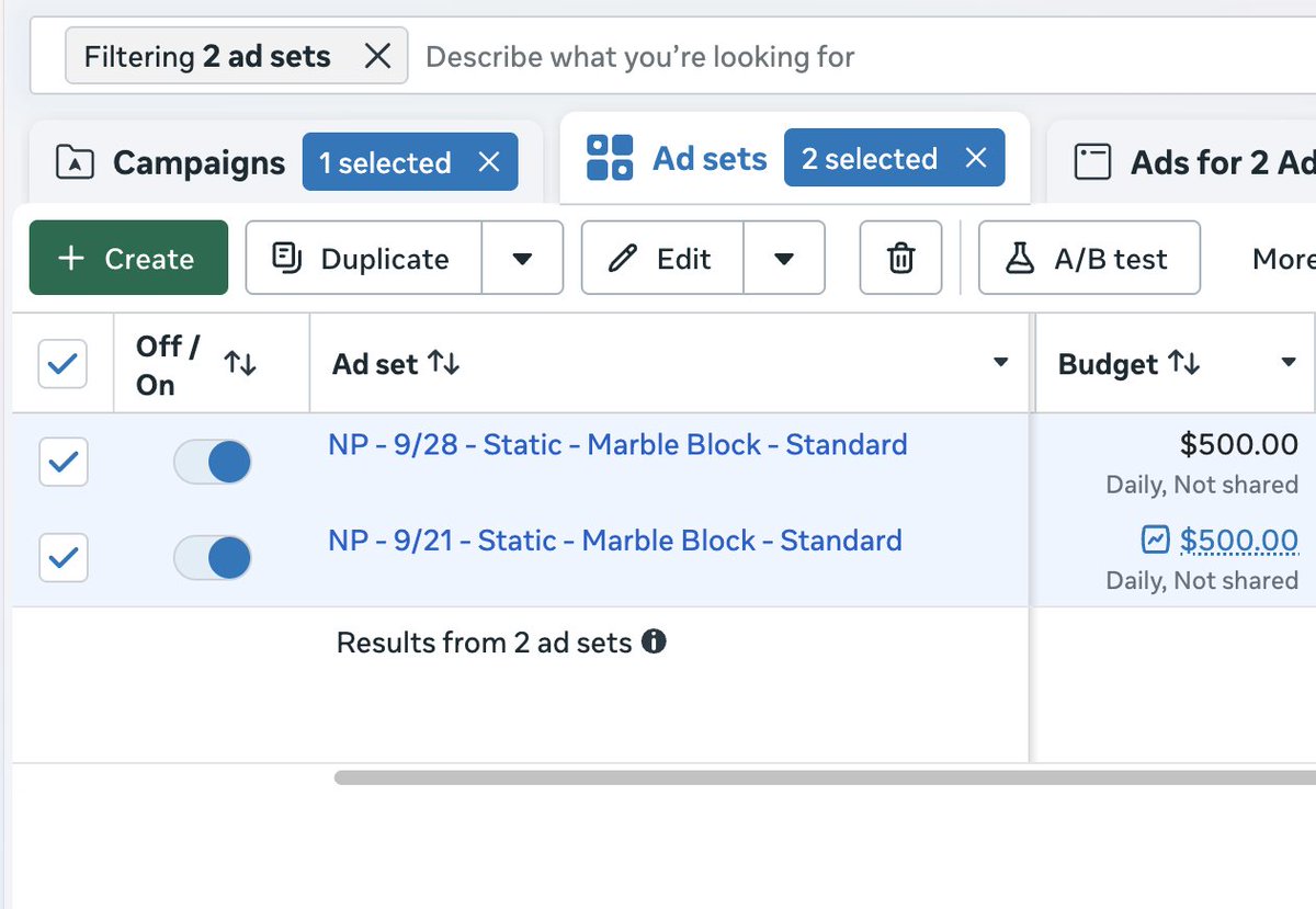
My favorite testing strategy for launching 100+ ads
Start with a big batch of ads and carve them down until you've tested everything...
1. Launch your batch tests
→ 20-30 ads per ad set
→ Budget at least 4x your average CPA
2. Let Meta pick
→ Within about 2 days, Meta locks onto 1-2 favorites per ad set
→ Mark those ads as winners "ad name - Winner"
3. Pull the winners out
→ Duplicate the favorites into your scaling campaign
→ Turn them off in the batch
Now carve it down like a marble block...
4. Repeat
→ With the favorites gone, Meta has to spend on the ads it skipped
→ New favorites show up, you pull those out too
→ Keep going until nothing worth keeping is left
5. Send the leftovers to the zombie campaign
→ Low cost cap, so they only spend when a purchase comes in cheap
→ Sometimes the ads Meta ignored twice turn into winners there
You find winners in days instead of weeks, and eventually every ad gets a real shot.
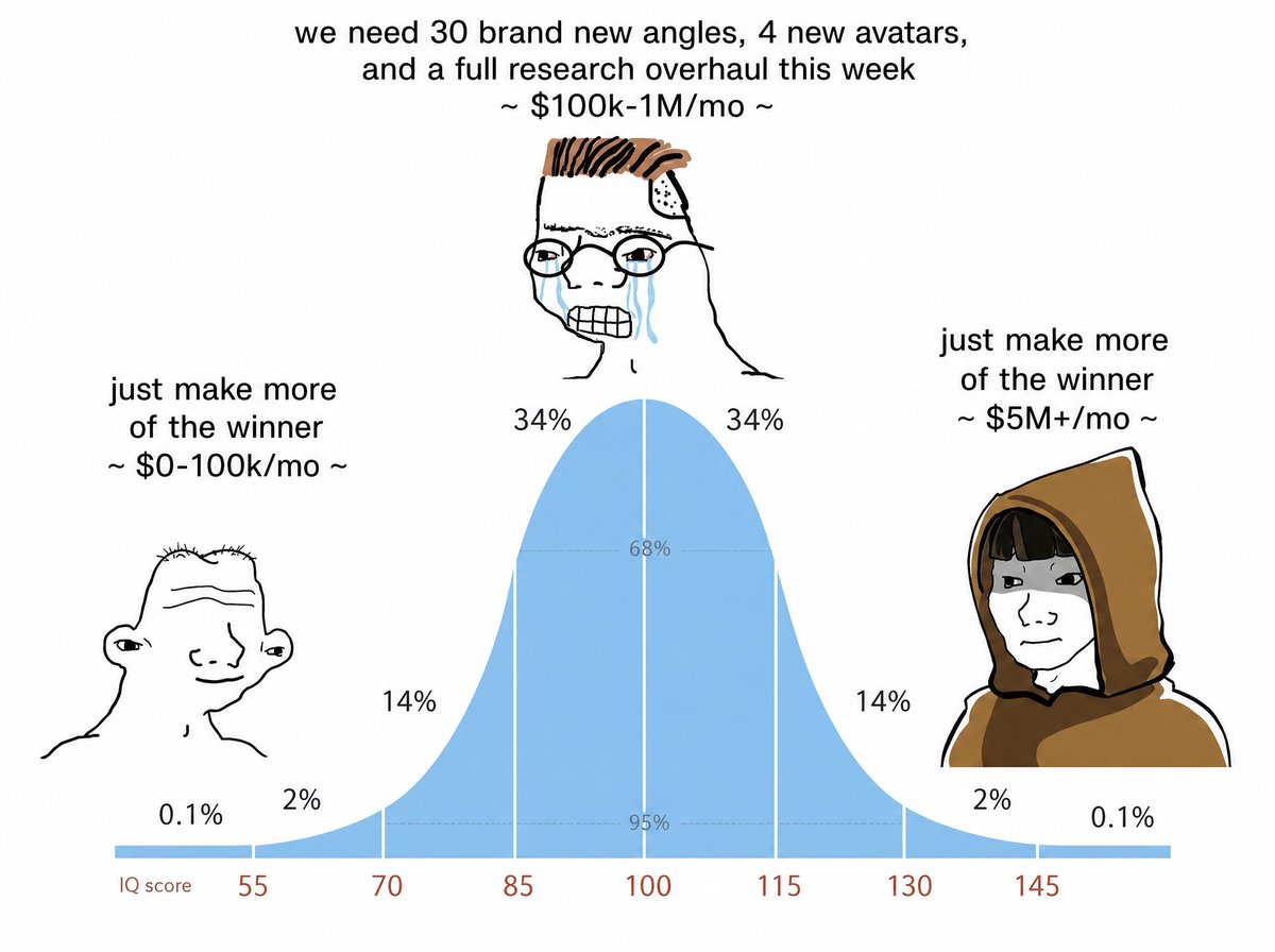
If your ad account is spending $1M/mo, the right iterations could get it to $5M/mo... in less than 30 days
and I'm saying this because i've seen it happen.
Most brands at $1M/month don't have a SOP for milking the shit out of their new winning angles/ avatars
truth is, every winning ad fatigues eventually.
When it does, their creative team goes looking for a brand new concept to replace it.
New concepts have a much lower hit rate, so spend in ad account drops.
The brands that are at 8 figs a month do the opposite. They take the winner they already have and turn it into 5+ more.
Here's how we iterate winners for our clients:
1- Perspective swap
A big men's health brand my team reviewed had a winner from the man's POV:
"my T was dropping and my wife stopped initiating sex."
The iteration used the exact same messaging from the wife's POV:
"I was worried about my husband."
Same angle and structure, told by a different person.
2- Sub-avatar swap
A gadget brand we work with had a winner about 2 college students who got laughed off Shark Tank and built a product in their dorm, inspiration led with a common enemy.
The iteration kept the exact skeleton:
the Shark Tank rejection, the authority, the underdog arc and the offer. The only change was the story.
Now it's a 19-year-old girl saving her grandpa's farm before the bank seizes it.
New authority figure, new sub avatar
The 2 ads have spent over $1.4M combined.
3- Format swap
Take the same winning messaging and put it in a new format:
Winning native → scrolling text video → AI UGC yapper → storytelling video ad
Singing ad → movie ad → claymation ad
Every new format reaches new placements with copy that's already proven.
4- Structure swap
"Here's what happens if a man takes X for 30 days"
You can turn this into -> "5 reasons men are taking nature's ozempic."
Same angle, new way of delivering it.
5- Mine the comments
The comments on your winners are free middle-of-funnel briefs:
"Does this work if I have high blood pressure?"
"What about hypothyroidism?"
"Does this work for women?"
Each of those is a new avatar the account hasn't tested yet. The last one is a couples transformation ad waiting to be made.
How to know what to iterate:
Low hook rate → change the visuals or the story in the hook. Take a big swing. Rewording one line isn't an iteration.
Low watch time → usually one of 2 things:
the AI animation isn't engaging or the pacing is too slow
the hook and body don't match. A solution-aware hook ("here's what happens if you take X for 4 weeks") going into a problem-aware body ("why your fat never melts despite eating clean") loses people fast.
The KPIs we hold:
50%+ hook rate
15-20 sec+ average watch time
Average watch time and ROAS move together, because the more people who reach the end, the more people see the CTA.
When there are proven winners in the account, run about 40-50% of each batch as iterations and the rest as new concepts.
Your next $1M/mo is probably sitting inside the winner you already have
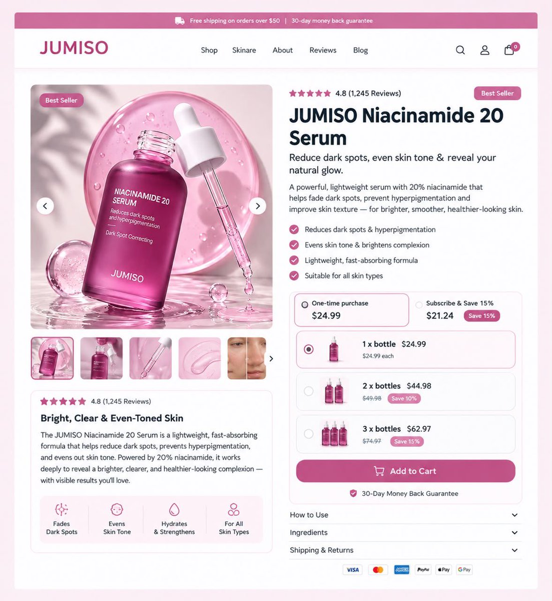
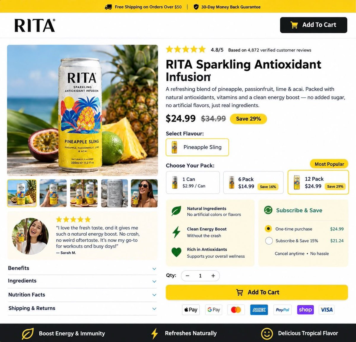
Redesigned this product page for JUMISO to maximize Average Order Value (AOV). 🌸
The trick? The "3 x bottles" bundle. It's positioned as the best value and saves the customer 15% while increasing the cart value.
Plus, the 30-day money-back guarantee at the top removes all risk.
Great design isn't just about aesthetics. It's about math. 📈
Want a page that makes people buy more?
DM me "PAGE" to get started. 🚀
👉 https://t.co/hY6w6sCsL6
#ecommerce #webdesign #CRO #Shopify #UXUI #skincare #beauty #marketing #DTC
Your product page can look beautiful and still lose sales.
That’s the problem I see too often with DTC stores.
You can have:
• Great product photography
• Strong branding
• Good traffic
• A solid product
…and still make customers work too hard to decide “Should I buy this?”
For this redesign, I focused on the things that actually reduce buying friction:
→ Clearer value proposition
→ Benefits customers can understand instantly
→ Better offer & bundle hierarchy
→ “Most Popular” and “Best Value” made obvious
→ Subscription positioned without confusion
→ Stronger social proof
→ Clearer CTA and trust signals
The goal isn’t to make the page prettier.
It’s to make the buying decision easier.
If your store is getting traffic but your product page isn’t converting the way you expect, DM me your product page.
WhatsApp https://t.co/hY6w6sBUVy
I’ll tell you what’s creating friction and what I’d change.
Your product page might be answering questions customers haven’t even asked yet while missing the one that matters: “Why should I buy this now?”
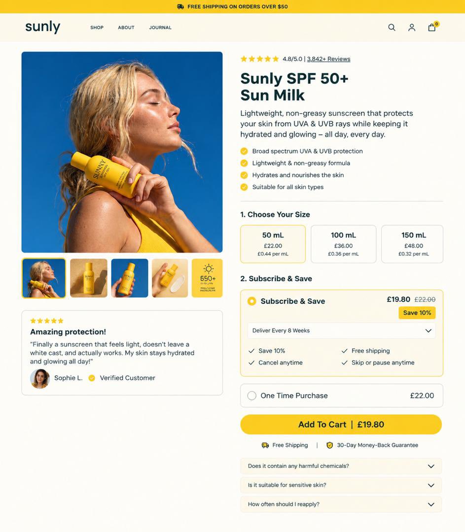
A lot of DTC product pages have the right ingredients:
✓ Good product photography
✓ Reviews
✓ Benefits
✓ Multiple sizes
✓ Subscribe & Save
✓ A big Add to Cart button
But they still create decision friction.
Customers shouldn’t have to hunt for:
→ Which option gives them the best value
→ What makes the product different
→ Whether they can trust it
→ Why they should subscribe
→ What happens after they click buy
That’s what I focused on in this redesign.
Less confusion. More clarity. Easier decisions.
Because a high-converting PDP isn’t just about making the product look good.
It should make buying feel obvious.
If your product page is getting traffic but conversions aren’t where you want them, send it to me. https://t.co/hY6w6sBUVy
I’ll look for the friction points that could be costing you sales.
#DTC #Ecommerce #CRO #Shopify #ProductPageDesign #ConversionRateOptimization #EcommerceDesign #LandingPageDesign #UXDesign #WebDesign #DTCBrands #EcommerceGrowth #ShopifyDesign #ConversionDesign #OnlineStore
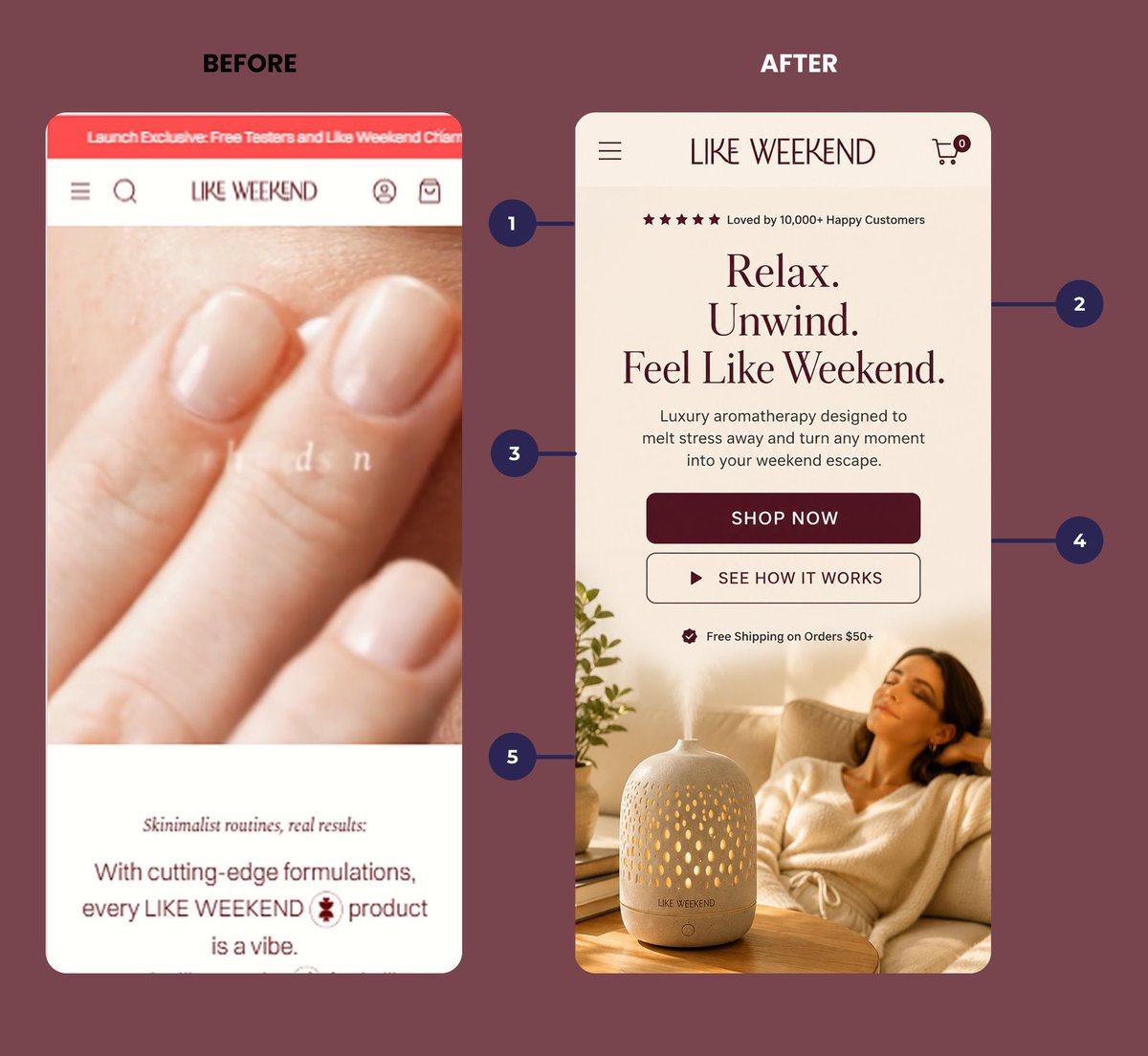
The 3-second rule for landing pages:
Open your page on mobile.
Look at it for 3 seconds.
Can you answer: Who is this for?
What does it do?
What should I do next?
If you can’t, neither can your customer.
And they’re gone.
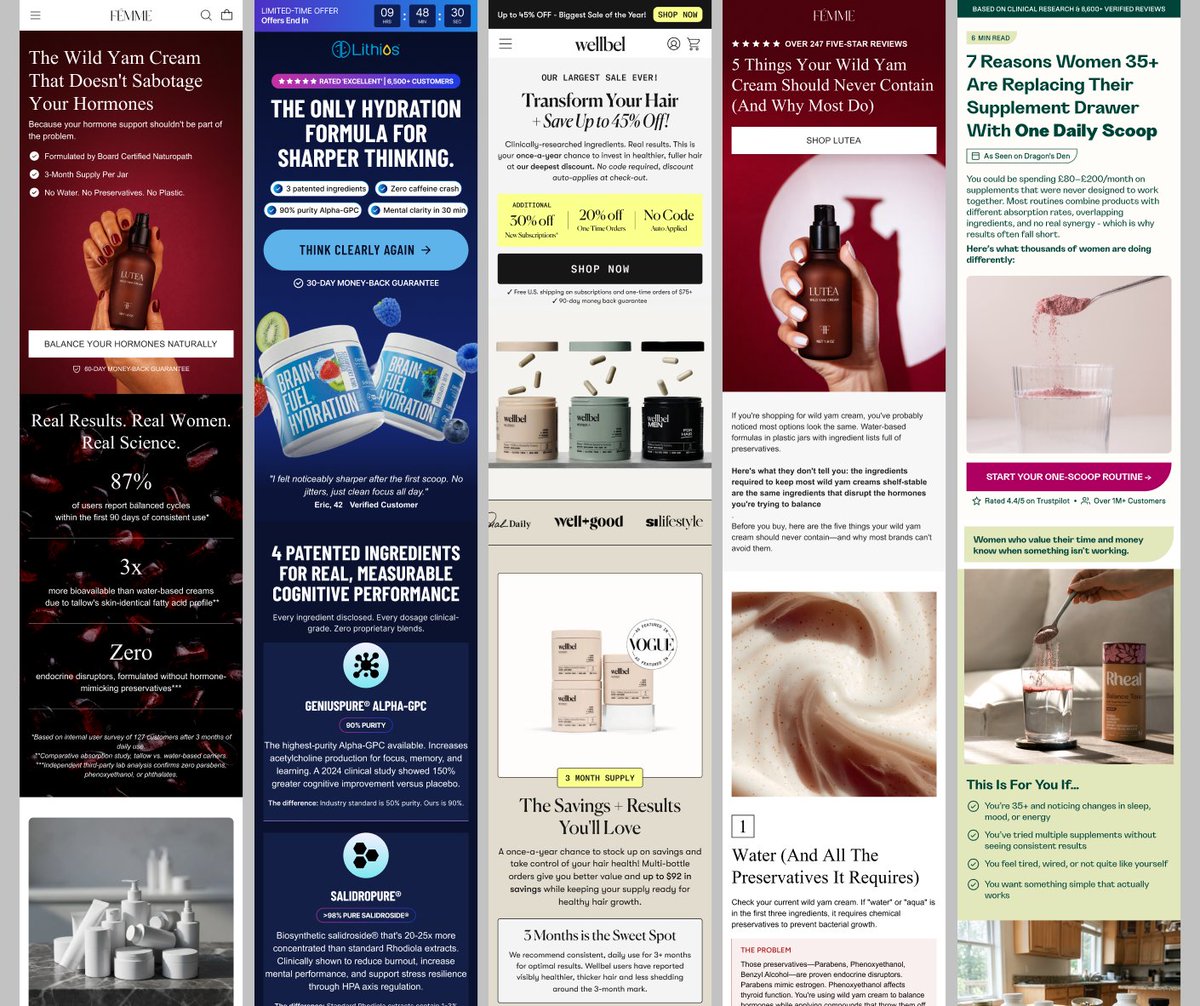
This redesign turns a soft brand into a buying experience.
Clear promise.
Stronger emotion.
Obvious CTA.
Trust before the scroll.
That’s how a homepage should sell.
Need your store redesigned for better conversions? DM “CRO”.
#Shopify#CRO#WebDesign#Ecommerce#UXDesign