Vault has been released for @CounterStrike Check it out!!: https://t.co/B0hj6u6IVi
Also @aowblacky made an awesome trailer for the map♥️: https://t.co/lMTkedLABs
@dotCatshark yeah, pretty much. Some people like that a little purple got into the spirit items. Seems like a massive downgrade basically across the board
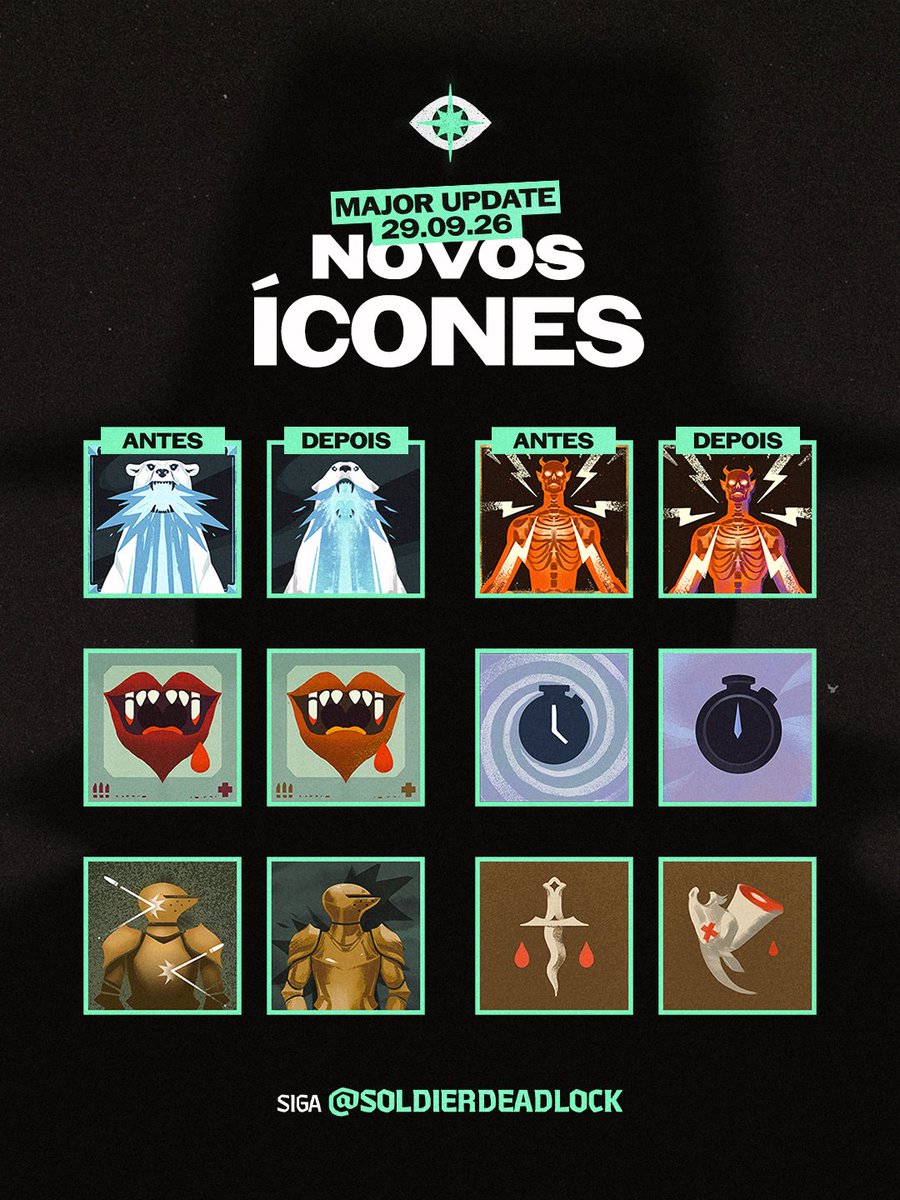
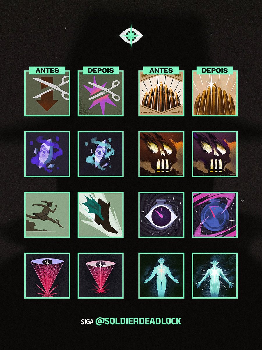
🚨| MUDANÇAS NOS ICONES DOS ITENS!
A maioria das mudanças são pequenas geralmente em tom de cores mas ainda sim as mudanças são interessantes.
⬇️ Mais mudanças abaixo!
@RlyMSTA I can't point to a single one that feels like an upgrade. I've looked at this entire thing like six times. Maybe you can make an argument for juggernaut, but it still looks terrible, so that's more of a lateral move
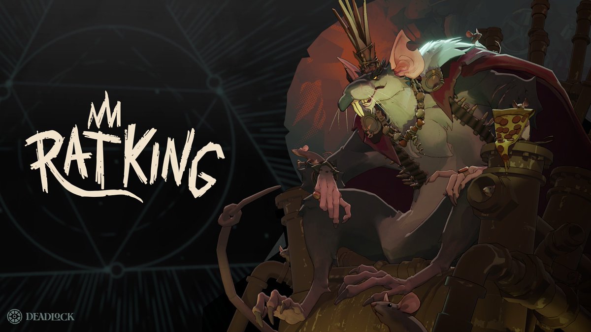
First look at the new Deadlock hero - The Rat King
Out of the sewers and into the streets, the rightful King of the Rats is here at last. Rodent-hating citizens of Manhattan won't be prepared to see his Scrap Grenade bouncing down Broadway, nor for his Swarm of Rats biting at their heels. By donning his Royal Pestments, the Rat King shakes off incoming damage, allowing him to bravely lead the charge into battle. His loyal subjects will feel awed and inspired when they see the great Banner of Rattania waving in the middle of combat, and those who oppose him will rue the day they ever thought they could overthrow the king. - "Oh the rats are taking over, baby!"
@beer4brin dispel, baffling. Downward arrow being cut clearly communicated "remove debuff" before. Now it's like "cut star". What is that supposed to mean? It doesn't even look better.
@Ekovwxyzz These icons are not the proper place to flex one's art skills IMO, clarity is so much more important. A simple idea like warp stone as a red stone is going to work a hundred times better than trying to get fancy.
@Ekovwxyzz Before it was obvious that it was a drum, and a little less obvious but it had a health cross on top (readability there wasn't perfect). Now it's extra hard to distinguish that it's a drum, and the health cross is somehow even harder to distinguish. Prior issues got worse, p much
@Ekovwxyzz New healing tempo is really hard to distinguish at a glance. Seems like a common problem with these new icons, they're super busy. I think the thought process behind these icons needs to be re-interrogated and corrected, because it's generating bad results