For the Interactive Map Day 25 #30DayMapChallenge, I've collaborated with @recifs, @mootari on @observablehq to build this fun game! Using #TensorflowJS and #facemesh, you have to use your nose to match places around the globe. Happy Thanksgiving Map Day! https://t.co/BogM22Z3Qn
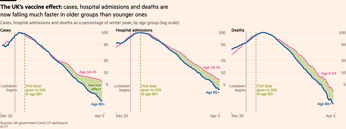
NEW: big international Covid data thread, focusing on the contest between vaccines & variants
First to the UK, where things are looking very good. The vaccine effect is still crystal clear, with more than 10,000 lives already estimated to have been saved https://t.co/bbuHMcyVhU
Changing jobs and extremely excited about joining fantastic @netlifedesign 🎉. At the same time shattered that I'll no longer be working with @bardrotzer - A rare and uniquely good person and genuinely the best colleague ever!
På lista over "verstingene (...) troner De britiske jomfruøyene, Bermuda og Cayman Islands – etterfulgt av Nederland, Sveits og Luxembourg": https://t.co/8Qs2LVepfu
"Det er mange store aktører som bruker skatteparadiser. Det betyr ikke at det er greit", skriver @ChristinaPlett i @Aftenposten i dag. https://t.co/FE7aUO5UVJ
#Norway takes gradual steps towards normalcy from the #Covid_19. Per 17 April, 137 dead, 165 persons hospitalized & 65 in intensive care. Kindergardens open tomorrow, schools partially in a week. #Confinement & #social_distancing work, even with outdoor activities allowed
At @washingtonpost, @Harry_Stevens' simulation of flatten the curve is the most viewed page of all time.
At @FT, the page with @jburnmurdoch's charts tracking #COVID19 is the most viewed page of all time.
Is there still any doubt of the importance and value of #dataviz?
THREAD: From today onwards, @TheEconomist will be tracking excess mortality from covid-19 in as many countries as possible. We have published interactive charts for six countries that have released this data. (1/14) https://t.co/v3x8RZRoCX
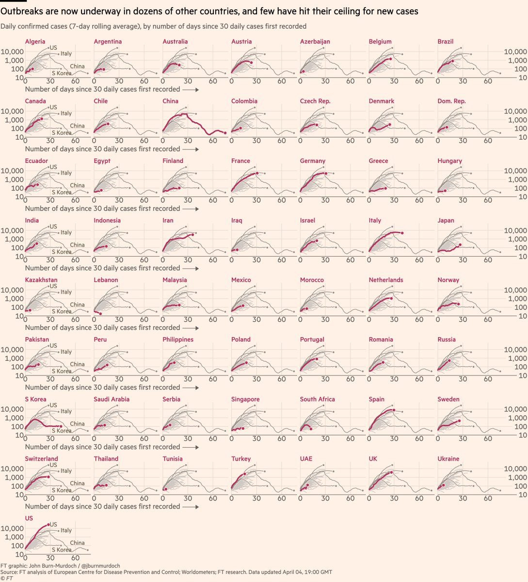
Finally, small multiples for daily cases:
• Sweden v Norway is instructive. Norway locked down & new cases are falling, Sweden didn’t & each day brings more new infections
• Japan’s outbreak continues
Live versions of all charts here: https://t.co/JxVd2cG7KI
For me, this chart is the most alarming of the latest batch.
US & UK daily death tolls are accelerating in a straight line on a log scale chart, i.e still increasing exponentially.
~All other countries had begun slowing the rate of increase in deaths by now.
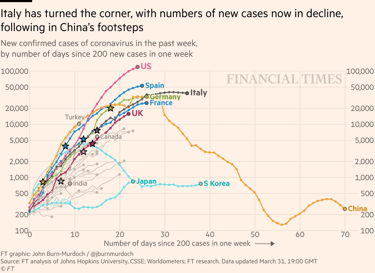
NEW: Tues 31 March = overhaul of coronavirus trajectories
As the story shifts, the charts shift. We’re now focusing on *new* cases & deaths rather than running totals.
Why? Because key for any country is when today’s new cases are fewer than yesterday’s
https://t.co/JxVd2cG7KI
We've gotten a lot of reader emails asking us if we'll have a FiveThirtyEight Covid model. We won't, because that's way too hard right now. @maggiekb1@jazzmyth & @laurabronner explain why so beautifully: https://t.co/OtHvlf0Brl
@Feiring Sant nok, men den 5-gangen gjelder jo for alle strategiene, også frislipp. Altså om vi egentlig ligger på 20k nå, kunne reell worst case vært 100k. (Og der brøyt jeg mitt eget forsett om å ikke bli atter en hobbyepidemiologist/-matematiker :-)). Blir spennende å følge linjene!
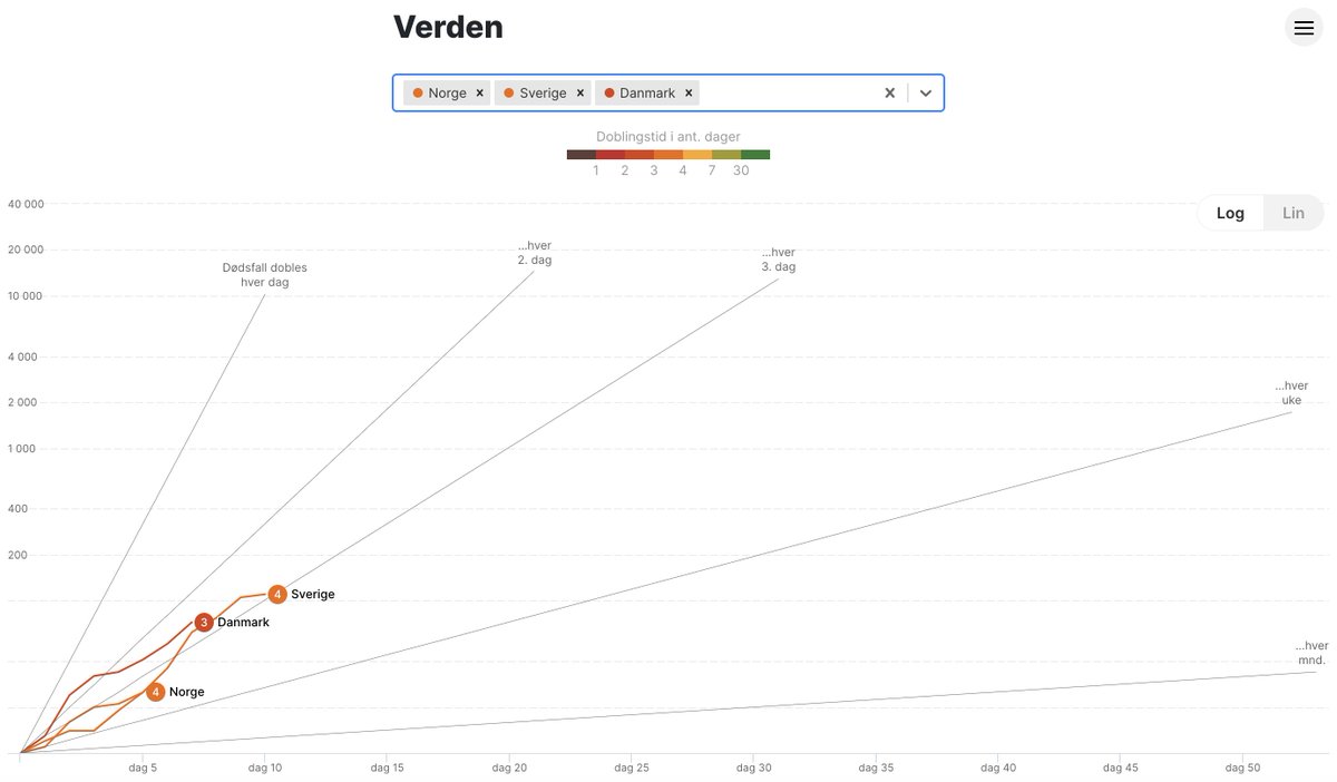
Nye grafer som følger den faktiske utviklingen opp mot effektprognosene til FHI. Flere på intensivplasser enn forventet. Se kontekst på https://t.co/N6ZM5NoGqS (cc @Feiring )
@Feiring Takk! Og nei, er litt urovekkende. Men bedre nyheter for innleggelser og registrert smitteomfang. Og de tallene tyder på at det kunne vært langt verre..