Designed in Figma.
Built in Framer.
Would love to hear your thoughts on conversational experiences in industries outside traditional AI products.
🔗 https://t.co/O4nEm71G2C
💼 WIP — shaping a platform where learning meets real-world impact.
Built to highlight instructors, build trust, and make enrolling feel like the obvious next step.
👉 Let’s bring your product to life → https://t.co/Opuws9H6OV
Averoo is now live on @framer
Designed with clarity, motion, and precision at its core
A premium template for brands that value simplicity done right
Take a look below👇
Most LinkedIn banners look good.
Very few actually say something.
I designed this series for a brand in the “avant-garde corporate entertainment” space, where mystery, sound, and digital experiences all live under one identity.
Three banners.
One system.
No noise—just intention.
Milestone unlocked 🎉
I’m now a Top Rated UX/UI Designer with a 100% Job Success score on Upwork.
Behind that badge are hours spent refining user flows, improving information architecture, and designing intuitive experiences.
For me, great design isn’t just about visuals, it’s about creating clear, user-centered product experiences that actually work.
The numbers reflect the commitment. And numbers don’t lie.
If you're building a product and need thoughtful UX/UI design, I’d love to connect.
#UXDesign #UIDesign #ProductDesign #Upwork
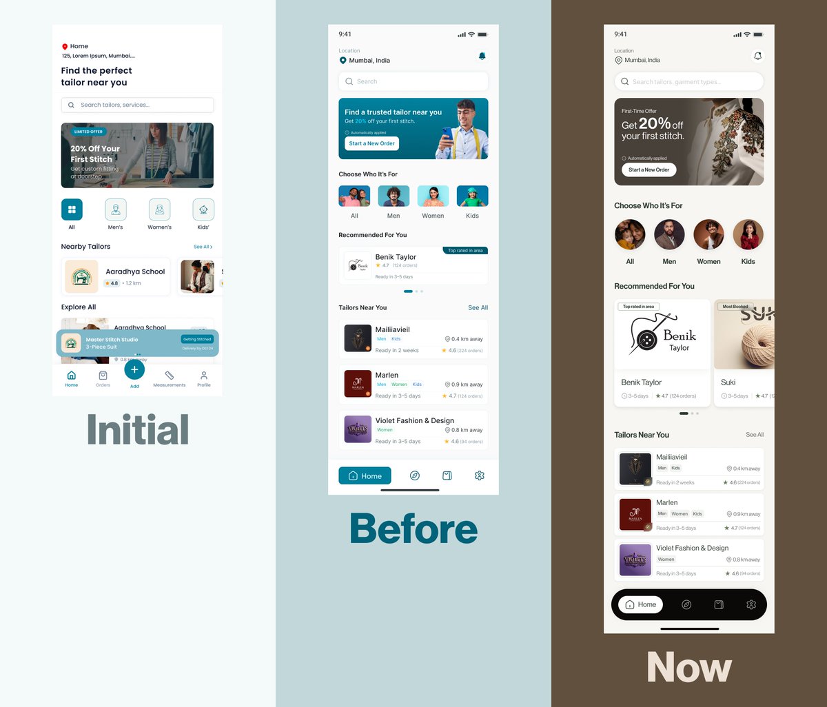
I got a contract on Upwork to redesign the flow and interface of an app, while still retaining the brand feel.
I restructured the experience to be more intuitive and user-friendly. It made sense. It worked.
Then we went ahead to do user research.
And that’s when we realised something.
The app felt too techy for the industry it was in.
So we went back to the drawing board.
This time, the structure was solid. The foundation was there. But the interface? It didn’t feel like where it belonged.
That phase gave me sleepless nights.
At first, I kept playing around with colours. Trying different palettes. Adjusting tones. Going back and forth. Hoping something would click.
Nothing did.
After a good number of front and back, I had to pause and rethink my approach.
Instead of asking, “What colours work?”
I started asking, “What kind of branding would truly resonate with this platform and its audience?”
That shift changed everything.
It felt like wandering in a desert and finally finding water.
Because once the brand direction became clear, the interface started designing itself.
Sometimes the problem isn’t the layout.
Sometimes it’s the identity.
#ProductDesign #UIUX #UXDesign #BrandStrategy #UserResearch #AppDesign #DesignJourney