Most crypto products are designed by people who don't use them.
I'm a UI/UX designer. I also trade futures on a funded prop account using ICT/SMC.
I design for crypto & finance because I know what it feels like when a confirmation modal hides slippage from you.
@NickDoesDesign tools you build for yourself reveal what bothers you about existing ones. cheapest UX research there is. plus they end up better than anything you'd buy because they fit a one-person workflow.
@Ahmedcreatives same applies to product redesigns. most teams ship "v2" when they should ship "v1.5." what's worth keeping is usually 80% of the existing UI. the 20% you actually need to change is the part everyone's afraid to identify.
@tokenterminal@SolanaFndn@solana "every methodology published" is the part that matters. most crypto data products show numbers without showing how they're calculated. trust me bro analytics doesn't scale. methodology in the open turns it into something you can verify and dispute.
@pascaldottrade I love the style but Line charts doesn't match with thesis "Built For Traders" Clean Candle chart is a must have for every trading terminal.
@NickDoesDesign this. taste shows up in restraint. the things you decide not to add. AI tools are great at adding. they're terrible at editing. that's still the designer's job.
@Ledger "real signature, real device confirmation." finally. software guardrails are just software the agent can bypass. hardware can't. every agent-defi pitch has been faking this layer for a year.
@coinbase putting the structural differences right in the launch tweet (valuation-based index pricing, IPO conversion risk, lower liquidity) is the move. most pre-IPO products bury this in a help center. starting honest sets the trust bar.
trust wallet markets shows LINK at "+0.00%" while the chart shows obvious price movement. one of the two is lying. when the headline number and the visual contradict, users stop trusting either.
@BitgetWallet the bar for "pay with any crypto" is showing what you're actually spending. how much DOGE is $20 in tacos? if the wallet hides that math people bounce. shows up as anxiety in the checkout flow.
@_deeptrade the gap between "tx confirmed" and "balance updated" is where trust breaks. users open the wallet and see the old number and assume something went wrong. solving it at the data layer beats slapping on a loading spinner.
@Lovable drawing directly on a design + AI reading the markup is the right primitive. text-prompting an AI to "change the button to red" is friction. drawing a red X on the button IS the change request. closer to how designers actually think.
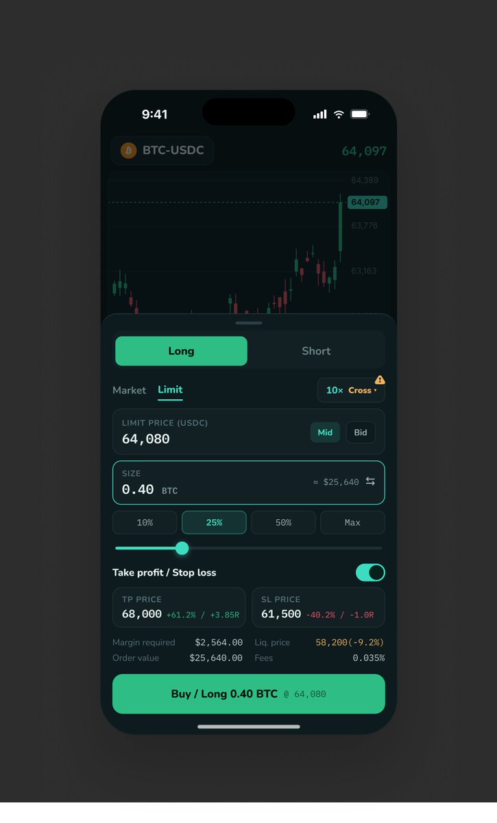
hyperliquid mobile, concept. 1 of 5.
positions with R-multiple, time-in, liq distance color-coded by danger. "set a stop to see R" replaces empty values with a nudge.
the friction is the feature.
@HyperliquidX
@GMX_IO@RYex_finance "API, SDK, MCP" listed as equal building blocks is the move. most perp DEXs treat agents as a "supported feature." gmx putting MCP next to the SDK treats it as part of the core dev experience. agents aren't visitors. they're built-in.
@safe@rimeissner warnings are a UI patch on a security problem. the next layer is making the wrong action impossible, not just unrecommended. UI > guard rails. infrastructure > UI.