Building @usedaymark, an AI data analyst for Shopify brands. Writing about DTC profitability, acquisition and retention through the numbers dashboards miss.
We looked at how D2C brands and performance agencies are running Meta ads in 2026. Here are 5 ideas worth testing.
A few findings stood out from agency case studies, ad account research, and experienced advertisers.
1. When ads stop scaling, try changing the offer
An ad that works at $500/day may struggle at $2,000/day.
As you increase spend, you need to reach more buyers, and the cost of getting each new customer can rise.
Sometimes, making more creatives won't solve this.
Try selling a starter kit or a 2-pack instead of a single product. A larger first order with better margins can give you more room to spend on finding customers.
2. Don't rely only on UGC videos
UGC is popular, but simple image ads are still performing well.
Motion's 2026 study of over 578,000 Meta creatives found that offer-focused images and product demos were among the formats most likely to attract high ad spend.
A clear product photo with a strong offer can be worth testing against an expensive creator video.
Try different formats before investing your whole creative budget in one.
3. An ad getting no spend doesn't mean it failed
Meta often gives most of the budget to a few ads while others barely get shown.
That makes it hard to know whether a new idea is actually good.
Meta's Creative Testing feature lets you set aside part of your budget to give different ads a fair test.
Try testing 2 to 3 very different ideas with enough budget to learn something, rather than uploading 20 ads and hoping Meta picks the right one.
4. A drop in performance isn't always ad fatigue
New ads often perform well at first because Meta can reach people who already know your brand.
Once those shoppers are reached, the ads start reaching more people who have never heard of you.
The cost per purchase may rise, even though the creative itself is still good.
Before replacing an ad, check how results differ between people who already know your store and new audiences.
You might be turning off an ad just as it starts finding new customers.
5. More ad sets don't always mean better targeting
Splitting a $100 daily budget across five similar ad sets gives each one less data to learn from.
This can make it harder for Meta to find the right buyers.
Try combining similar audiences into fewer ad sets. Let different creatives speak to different customer needs.
Keep separate ad sets when you actually need different budgets, offers, or locations.
One thing I found interesting is how often better results come from fixing the offer or the testing process, rather than changing targeting settings.
For founders running Meta ads, which of these have you tested?
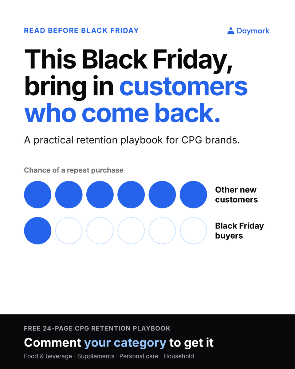
Planning Black Friday for your CPG brand?
Which offer will bring you customers who buy again?
Three things to check as you plan:
1. Find the first product that brings people back.
Group last year’s new customers by the first product they bought. Check how many bought again within 90 days. Your biggest Black Friday seller may not be the one that brings customers back.
2. Check what happens after the discount.
Compare customers who bought through different offers. Did they buy again at full price, or wait for another sale? Use this to decide which offers to run again this year.
3. Change your reminders for customers who stock up.
Someone buying a three-pack will run out later than someone buying one. Send reorder reminders based on how much they bought. Until then, help them get the most from the product.
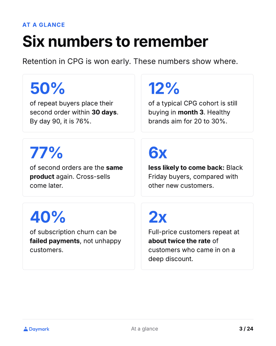
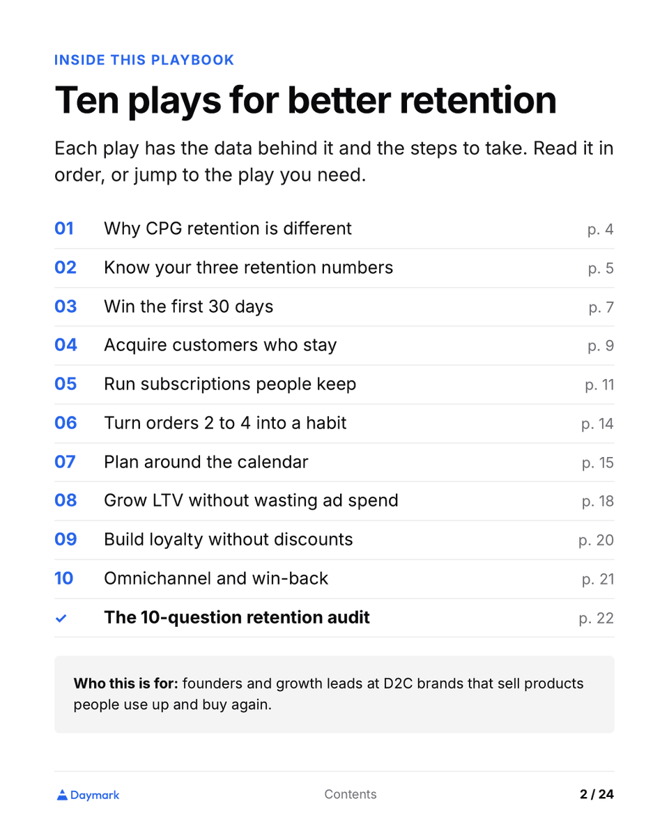
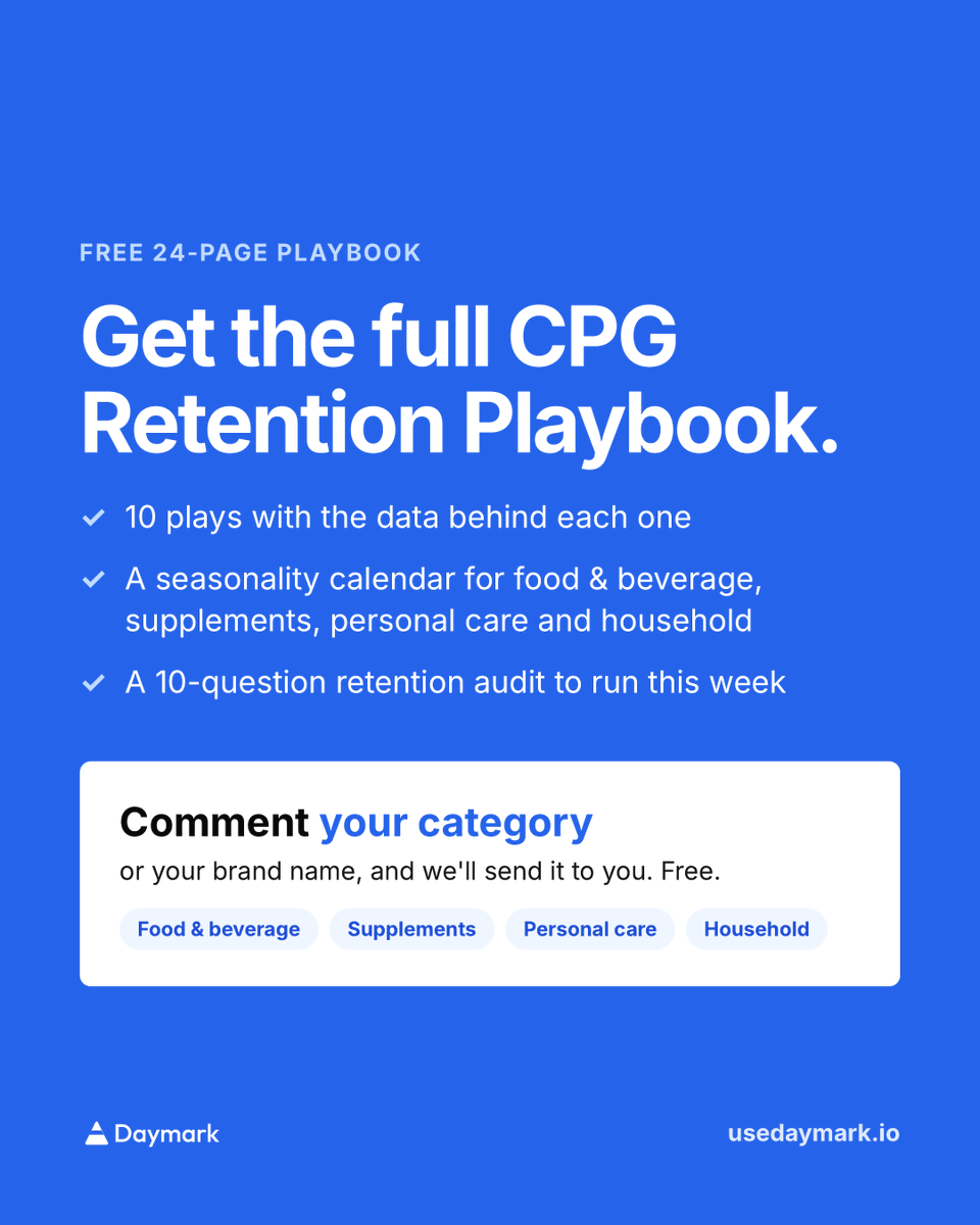
We put together a free CPG Retention Playbook to help you make these choices.
It covers which products bring customers back, what to send after their first order, why subscribers leave, and how to encourage another purchase without always offering a discount.
For founders and growth teams selling food, drinks, supplements, personal care or household products.
Comment your category and we’ll send you the playbook.
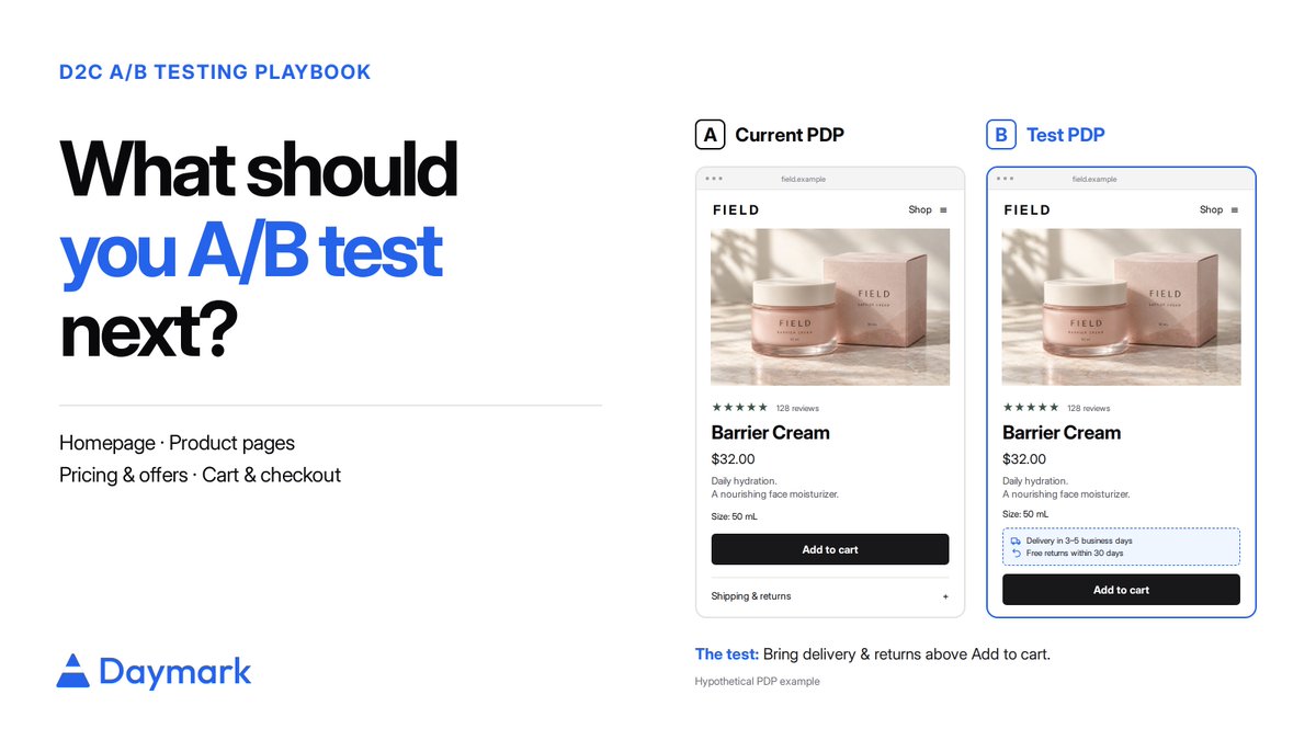
We helped 12 brands build their CRO A/B testing framework. The same mistakes showed up almost every time.
Brands had good tools. but they were missing a clear way to run and read the tests.
1. Testing without enough traffic.
If your page gets a few hundred visitors a week, a small test will never give you a real answer.
2. Testing without a reason.
"Let's try a green button" teaches you nothing when it loses.
3. Stopping as soon as one side is ahead.
Early leads flip. Day one winners are often gone by day ten.
4. Picking the winner on the wrong number.
More add-to-carts can still mean less money in the bank.
5. Reading one average for everyone.
A flat result often hides a mobile win and a desktop loss.
The brands that got this right ran fewer tests and read each one with care.
I put the full fix for each of these into a playbook. Comment "Framework" and I will send it over.
lesson from this week:
patience is important, but so is creating more chances for things to work.
still figuring out the balance between waiting and opening new fronts.
5 numbers most Shopify stores don't track until something goes wrong.
Your ROAS looks healthy and your repeat rate is climbing. But profit isn't keeping up, and you can't see why.
Often you're paying Meta and Google for customers who were already coming back. Pull last month's orders from returning customers and check the source on each, using UTM tags or the referrer in Shopify. If a big share came through retargeting or a search for your own brand name, that's spend you can cap. Repeat orders should mostly come from email, SMS, direct, and organic.
Sales grew 20% last quarter. Profit barely moved, and you haven't changed a single price.
Filter your orders to first-time customers and count how many used a discount code, month by month. If that share went from 30% to 60%, that's where the margin went. It also means your offer is doing more of the selling than your product, which is worth fixing before you scale spend.
You put most of your budget behind your best seller because it converts well. A year later, repeat revenue is flat.
Group customers by the product in their first order and see how many ordered again within 90 days. A customer and order export in a spreadsheet is enough. Often a smaller product brings in buyers who come back far more often. That's the product your ads should lead with, even if its first-order ROAS looks worse.
A new channel shows your best ROAS in months, so you double the budget. Two months later, refunds are up.
Match refunded orders to the channel that first brought each customer in. Some audiences buy on impulse and send it back. Return rate by channel tells you which ROAS numbers hold up after 30 days.
Your top seller sells out on a Thursday. Restock lands the next Wednesday. The ads ran the whole time, sending people to a sold-out page.
Whenever a hero product runs low, check where your active ads point and pause anything going to a product you can't ship. It's the simplest check here and often the fastest way to waste money.
Check the first four once a month and the last one every week.
Which one would surprise you most if you checked it today?
We talked with 20+ Shopify brands over the last 2 months. Different categories. Different scale. Almost every one was stuck on the same handful of problems.
Not one of them asked us for better dashboards.
Here is what actually came up.
1. Winning a customer keeps getting more expensive.
"Same ads, same offer, and it costs more every month."
Ad costs keep climbing, and the cheap early buyers run out. The smarter ones stopped looking at blended CAC and started splitting it by first order vs. second. New-customer acquisition was bleeding money. Repeat orders were basically free. So they capped new spend and moved the budget into the 30 days right after someone's first purchase, where it actually paid back.
2. Ads stop working out of nowhere.
"A winner ran for three weeks, then just died."
The usual reaction is to launch ten more versions of the same ad. That gives the algorithm nothing new. The ones who got out of it stopped iterating on the winning creative entirely and went back to talking to customers. New angle, new hook, new reason to care. The best-performing ad one founder ran was a near word-for-word screenshot of a customer review.
3. One channel is holding up the whole brand.
"Meta is 80% of our sales and it scares me."
One flagged account or a CPM spike turns a good month into a bad one. The ones who slept better did not try to "diversify" in the abstract. They picked one owned channel and got obsessive about it. One brand ran a back-in-stock SMS list and it quietly became their highest-ROI channel, because those people already wanted to buy.
4. One in three orders comes back.
"Every return costs us twice, and half of it we can't even resell."
The usual move is to make returns smoother. Better portal, faster refund. The ones who actually cut returns did the opposite. They dug into why things came back, and almost all of it was sizing. So they rewrote the product pages. Real measurements, fit notes from customers, photos on different body types. Fewer wrong orders went out, so fewer came back.
We are talking to more founders over the next few weeks.
If you run a Shopify brand, which of these four is hitting you hardest right now? Or is it something we did not list?
AI makes it easier to do almost everything faster, but there are two different things we can improve:
Efficiency: can we do X with less time, money, or effort?
Effectiveness: will doing X actually help us achieve our goal?
AI is very good at helping with the first. We still need to think carefully about the second.
An effective team can succeed even if it isn’t perfectly efficient, but efficiency alone doesn’t make a team effective.
Most D2C brands spend most of their energy on one question:
How do we get more people to the store?
More Meta ads. More creators. More campaigns. More traffic.
But there's another one worth sitting with: What's stopping the people already on your store from buying?
Because a lot of the time the problem isn't traffic. It's a bunch of small things scattered across the buying journey that quietly create doubt or friction.
A customer lands on your homepage. Can they figure out what you sell and why they should trust you, fast?
They open a product page. Can they actually see:
→ what they're getting
→ reviews and proof
→ expected delivery
→ return and replacement info
→ payment options
→ whether it's in stock
Then they add to cart. Is it clear:
→ what discount got applied
→ shipping cost
→ taxes or extra charges
→ the final amount they'll actually pay → what happens next in checkout
And then there's the stuff most teams almost never check:
→ Do the shipping and return-policy pages actually work?
→ Is important information buried too deep?
→ Is guest checkout obvious?
→ Are there pointless steps before payment?
→ Could the free-shipping threshold be nudging up basket size?
→ Is the mobile experience as clean as desktop?
On their own, each of these looks minor.
Put together, they're often the difference between a visitor who buys and one who quietly leaves.
Actually finding them means going through the homepage, product pages, cart, checkout, policy pages and navigation by hand, then working out which issues are worth fixing first.
And once you've found them, you still have to answer: what do we change, why does it matter, and what do we fix first?
We kept hearing this same problem from D2C teams, so we built a quick tool that runs a full conversion analysis of your store
Want one for your store? Drop your URL in the comments or DM it to me, and I'll send over the detailed report.
A bad sales day can come from fewer qualified visits, weaker conversion or lower order value.
Check those three before opening Ads Manager.
If traffic held and checkout completion collapsed, changing acquisition will hide the failure.
Start at the last healthy step in the funnel.
A Shopify operator recently shared this weekly funnel:
2,338 sessions
122 added to cart
13 reached checkout
0 orders
Traffic was down from its peak, but 13 people still reached checkout. The zero at the end gives the investigation a much better starting point than “sales are down.”
I would work backward from the last healthy step.
First confirm that Shopify truly recorded no orders and that the purchase event did not merely stop firing. Then compare checkout completion with the previous healthy weeks by device, browser, region, and traffic source.
Next, line up the date of the change with anything that touched the buying path:
- payment settings or gateway errors;
- shipping rates and delivery promises;
- theme, cart, consent, or checkout changes;
- a promotion ending or an important variant going out of stock.
The same method works when the break happens earlier.
If product views are stable but add-to-cart collapses, inspect the affected products and page experience. If paid sessions rise while qualified product views do not, inspect traffic quality and campaign-to-page fit. If purchase behavior is healthy but revenue falls, look at order value and product mix.
An overall conversion-rate chart mixes all of those failures together.
The team should leave the first review with a sentence this specific:
"Checkout completion fell on US mobile traffic after Tuesday. Product demand and add-to-cart behavior stayed within their normal range."
That sentence tells the team where to test. “Customers have stopped buying” does not.
Where did the last unexplained sales drop begin in your funnel?
@fridayresearch_ Right, though organic lands on PDPs too. The page isn't doing a new job. The difference is the shopper, AI visitors already did the research and comparison in the assistant, so they arrive further along. Same page, more decided buyer.
Shopify says shoppers arriving from AI search convert nearly 50% better than organic-search visitors and place orders with 14% higher value.
AI-referred orders also grew almost 13x year over year in Q1 2026.
Those are strong network-level signals. They are not a reason to rename every ecommerce SEO roadmap “GEO” by Monday.
Organic search still sends Shopify merchants more sessions than every tracked AI platform combined. The next useful step is to find out whether AI referrals behave differently in your own store.
I would compare AI referrals from ChatGPT, Perplexity, Gemini, Copilot, Claude, and Grok against organic search on:
> the products and page types where each visit begins;
> purchase rate and order value;
> new versus returning customers;
> discounts, refunds, and the products bought together.
Landing-page mix matters. Shopify found that more than half of AI-referred sessions begin on a product page, compared with about 20% of organic-search sessions. A visitor who arrives after asking an assistant for a specific product is further along than someone browsing a collection from Google.
Suppose AI referrals represent only 1% of sessions but concentrate on three high-margin products and convert into mostly new customers. That is enough evidence to improve the product data, proof, availability, and comparisons around those items.
If the traffic is tiny, poorly tagged, or dominated by existing customers looking for the brand, the aggregate Shopify benchmark should not decide the roadmap.
The interesting question is no longer whether AI shopping is real. It is which products, customers, and revenue it is already creating for your store.
Are you seeing purchases from AI referrals yet, or only visits?
> Source: Shopify's Q1 2026 commerce analysis found AI-referred product-page sessions converting nearly 50% better than organic search, with 14% higher average order values. The channel remains smaller than organic search.
https://t.co/0ldJP0KcOG
An 18% return rate gives three teams three different answers, unless the business agrees on what it's dividing by.
Take 1,000 orders that contain 1,600 units. Say 190 customers return 260 units worth $24,000, out of $150,000 in gross revenue.
That one store now has three return rates:
> Unit return rate: 16.25% (260 / 1,600)
> Order return rate: 19% (190 / 1,000)
> Revenue return rate: 16% ($24,000 / $150,000)
Each team needs a different one. Warehouse planning needs the unit rate. Customer experience needs the order rate, because one returned item still means that customer went through a return. Finance needs the revenue rate, plus the real cost of processing those returns.
Timing matters as much as the denominator. If December orders come back in January, a report grouped by refund date makes January's products and campaigns eat December's problem. So judge a SKU, campaign, or promotion by the original order cohort. Keep refund-month reporting for cash planning.
A store-wide return rate still won't tell you where to act. For that, build a SKU-level table. Track these fields:
> Units sold and returned — shows operational volume
> Returned revenue — stops a tiny product with a scary percentage from grabbing all the attention
> Fully loaded cost per return — adds shipping, processing, handling, and resale loss
> Reason code — points to who owns the fix
> First-time vs repeat customer — shows whether the product hurts acquisition or an existing relationship
Sort by total contribution lost to returns first. Then look at the reason.
The reason usually points straight to the owner. Sizing and fit means product specs, photography, or the size guide. "Not as described" means merchandising. Damage means packaging or fulfillment. Changed mind is where your policy and exchange design matter most.
That order matters. Tightening your whole return policy because one high-volume SKU runs small punishes every customer and leaves the real problem untouched. Fixing the size info can save the sale and cut the return.
A good return report ends with a named SKU, a reason, an owner, and the dollars at stake. "Return rate: 18%" just ends with a meeting.
A blended repeat-purchase rate can stay flat even while your newest customers are getting better. It can also rise for the wrong reason: you acquired more customers who naturally reorder, even if your retention program did nothing.
A good cohort table shows both the trend and the reason behind it.
You can build the first version from a Shopify orders export.
1. Trim the export to a few columns: customer ID or email, order ID, order date, order value, discounts, and product. Shopify often exports one row per line item, so collapse it to one row per order before you count orders.
2. Find each customer's first order date. Turn it into a first-order month. That month is their permanent cohort label.
3. For every later order, count the months since that customer's first order. The first purchase is month 0, the next calendar month is month 1, and so on.
4. Build a table: first-order month down the rows, months since acquisition across the columns.
5. Put two numbers in each cell: the percent of the original customers who ordered, and the cumulative contribution dollars that cohort has generated.
Read down a column to compare cohorts at the same age. If the March cohort has a 17% month-two repeat rate and January had 11%, retention may be improving. Read across a row to see how one cohort fades and when reorders tend to land.
The table gets far more useful after two more splits:
- first product purchased
- acquisition source or campaign group
Say month-two retention rises from 11% to 17% after you launch a post-purchase flow. Looks like a lifecycle win. But if the newer cohort also has twice as many subscription-friendly products, the product mix might be the real cause. If the mix held steady and the lift shows up across every acquisition source, the flow has a much stronger case.
The same logic exposes acquisition quality. One campaign can bring in cheap first orders from customers who never come back. Another can look expensive on the first order but produce your best twelve-month contribution curve. A blended retention number hides both.
The next step is timing. For each major first-product group, find the median number of days between order one and order two. Send replenishment or cross-sell messages just before that natural reorder window, then compare the next cohort at the same age.
A good cohort table tells you which customers to acquire, when to reach them, and whether your change actually worked. A colorful triangle without those cuts is just a report.
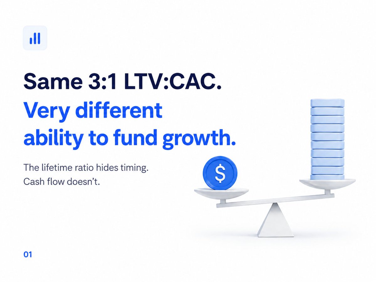
Two DTC brands can post the same 3:1 LTV:CAC and still have very different ability to fund growth.
Look at two example cohorts:
Same 3:1 LTV:CAC, very different businesses:
Brand A — $60 CAC, $180 LTV, pays back in 4 months
Brand B — $60 CAC, $180 LTV, pays back in 14 months
Brand A earns back the acquisition dollar in four months, then puts it to work again. Brand B waits fourteen months to earn that same dollar back. If Brand B is acquiring fast, cash leaves the business well before the earlier cohorts return it.
The lifetime ratio hides this. It squeezes months of incoming cash into a single number, so timing disappears.
For a transactional DTC business, calculate payback from the real cohort curve. Don't divide CAC by an average monthly contribution. Repeat orders don't arrive on a steady schedule. A coffee subscription, a skincare refill, and a sofa all pay back on different clocks.
The cohort method is simple:
1. Group new customers by the month of their first order.
2. Assign acquisition spend to that cohort. Use blended spend when channel attribution is shaky.
3. Take contribution from the first order after product cost, fulfillment, fees, discounts, and expected returns.
4. Add contribution from repeat orders in each later month.
5. Payback is the first month cumulative contribution passes the cohort's acquisition cost.
Now you can answer three separate questions:
- LTV:CAC: Is the customer worth acquiring over your chosen time window?
- Payback: How long is cash tied up?
- Cohort size and growth rate: How much cash is tied up at once?
A 3:1 ratio with four-month payback can support faster acquisition. The same ratio with fourteen-month payback might call for slower growth, cheaper acquisition, better first-order contribution, or more working capital.
Don't borrow a payback target from a blog post or a playbook. Decide what your own business can afford. How long can you go on covering acquisition costs before customers pay you back? That limit depends on your margin, how often people reorder, and how much cash you have to work with. This is why 3:1 can look great on a slide while your bank balance drops every month.
“We need a 4x ROAS” sounds like a target. It is usually a borrowed number with no connection to the product's margin.
The break-even calculation is:
"break-even ROAS = 1 / pre-ad contribution margin rate"
Pre-ad contribution means the share of net revenue left after COGS, payment fees, shipping, fulfillment, discounts, and expected returns, but before ad spend. Keeping “pre-ad” in the name matters. If you use a margin that already subtracts advertising, you count ad spend twice.
Pre-ad margin → Break-even ROAS → At 4x ROAS
20% → 5.0x → Loss-making
30% → 3.33x → Thin profit
40% → 2.5x → Profitable
50% → 2.0x → Strong profit
The same campaign result can be a problem for one SKU and a win for another. A blended account target hides that difference.
There is a second issue when spend is increasing: average ROAS does not tell you whether the next dollar worked.
Suppose a brand spends $50,000 and generates $160,000 in attributable revenue. Average ROAS is 3.2x. It then raises spend to $70,000 and revenue reaches $200,000. The dashboard still shows a respectable 2.86x average.
The extra $20,000 coincided with only $40,000 of extra revenue.
"marginal ROAS = change in revenue / change in spend = $40,000 / $20,000 = 2.0x"
If the brand's pre-ad contribution margin is 35%, break-even is 2.86x. The existing spend may still be profitable, while the budget increase destroys contribution.
A period-over-period difference is a diagnostic, not proof that spend caused the revenue change. Seasonality, promotions, and product availability can all move the numerator. Use a geo holdout, budget step test, or another controlled comparison when the decision is large enough to justify it.
This is the review I would run before scaling a campaign:
1. Calculate the break-even ROAS for the actual product mix being sold.
2. Use net revenue after expected returns, not gross platform revenue.
3. Separate new-customer acquisition from retargeting and returning-customer sales.
4. Compare marginal ROAS on the last budget increase with the break-even line.
Platform ROAS remains useful for relative comparison inside the platform. The scaling decision needs product margin and marginal performance. An account can carry a healthy historical average for weeks after the newest spend has stopped paying for itself.
An $80 checkout can leave $8.30 for the business.
This illustrative order is intentionally ordinary. The customer uses a 10% code. The product has a reasonable gross margin. Acquisition costs $22. Nothing looks alarming inside any single system.
$80.00 checkout price
-8.00 discount
-------
$72.00 net sale
-27.00 landed product cost
-2.39 card fee
-7.50 shipping subsidy
-2.00 pick and pack
-22.00 acquisition cost
-2.81 expected return cost
-------
$8.30 contribution from the order
The expected return cost is a provision based on the product's historical return behavior. Waiting for the physical return makes a good week look better than it was and moves the loss into a later period.
Most store reporting stops somewhere around net sales, product cost, and payment fees. The ad platform knows acquisition cost but not the rest of the order economics. The fulfillment provider knows shipping and handling but not the discount or the campaign. Each system can report its part correctly while the team overstates the order's value.
Start with the 20 SKUs that account for the most revenue or ad spend. Calculate contribution per order for each SKU, then split it by:
- discounted versus full-price orders;
- new versus returning customers;
- paid versus non-paid acquisition;
- returned versus kept orders.
That split often changes the decision. A hero SKU can produce attractive gross profit and poor new-customer contribution because it carries the ad budget. A lower-volume product can look mediocre in the catalog report and become the strongest retention product when returning customers buy it without acquisition cost.
I would prioritize the output in this order:
1. High-volume products with negative contribution: pause, reprice, or fix immediately.
2. High-volume products with thin contribution: inspect discounting, shipping, and paid-customer mix.
3. Low-volume products with strong contribution: test whether they can absorb more merchandising or acquisition.
Store-wide gross margin averages the good products with the bad ones. This order-level walk shows which products deserve growth and which ones are borrowing profit from the rest of the catalog.