📌Interested in learning more about the interactive maps which have been added to #LondonsPovertyProfile this year? @wpi_economics
Spatial data scientist @oobr of @CDRC_UK who built them gives insight in his most recent blog post https://t.co/dCQszxK1tb
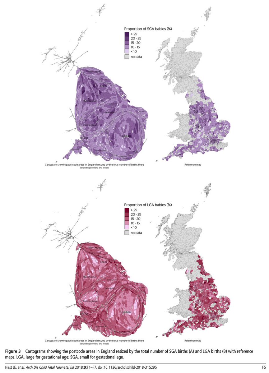
Wealth disparities for babies born in England evident from birth: Women living in the most deprived parts are most likely to have babies of low birthweight. Poverty and disadvantage are still a real issue here https://t.co/ZztdgBOw9y (via @DrJaneHirst) #inequality#health
Apologies for the problems with our website. https://t.co/tbR9FMSMbG is up and running again, though with a bit of instability. We are working in improving its performance!
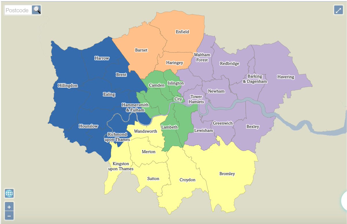
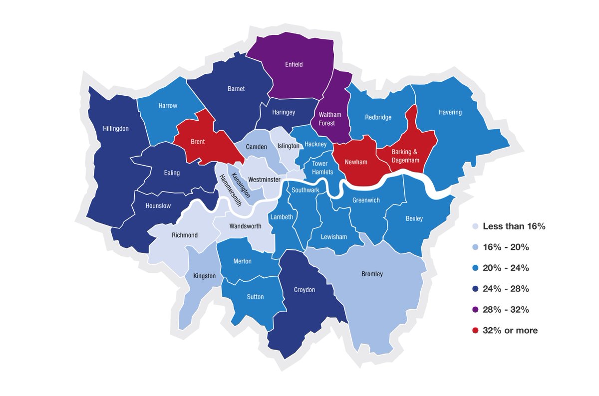
Nearly 3,000 households in Brent were placed in temporary accommodation in the first quarter of 2017. But the percentage of them who were placed outside the borough is the lowest of any London borough – less than 5%.
The long hot summer before the war? Peak Inequality at the Wilderness Festival. Danny Dorling taking the hang-over slot. Talking - Book Tent 10am on Sunday August 5th 2018. Is this the summer of the worse income inequality Britain will record? What Next?
https://t.co/CxycnTAnR6
The Londonmapper website is currently down due to technical issues. We are working on a fix and will do our best to have it up and running again very soon!
1 in 5 working residents in Redbridge earn less than the London Living Wage. This is close to the London average.
But unlike in almost all other boroughs, this rate in Redbridge has not worsened since 2013.
@iGiGL @WildLondon Some more #cartography tips: No total numbers on choropleth maps (colours need to represent relative data).Points for sightings are perhaps the most useful way for representing this small amount of data.