Founder & CEO of Grunt.
Passionate about design, data visualization and communication. Opinionated strategy consultant. Crazy about numbers. DMs are open 🎉
@chrija We at @gruntpro have already solved this for PowerPoint. I recommend that you check it out. It feels like magic🪄
Reach out if you want to learn more, or check out https://t.co/brmEApN96I
MASTERSKONK søndag: Best siste 6 hull av Viktor Hovland & World #1 og lederen Scottie Scheffler. Retweet for Hovland, ´like´for Scheffler. #ESNgolf@BUYINSPAIN1#Cobra
@IamRameezC@powerpoint Shameless plug: I recommend that you check out https://t.co/brmEApMBha to integrate PowerPoint with Excel for great data visualizations 👍
We get so many questions about how to style time-based data in @powerpoint. Watch our latest tutorial (4 min) to learn our best practices 🎉https://t.co/Vu6qnpX9p3
Fascinating that a billion dollar fund actually reports the classical scale-up hockey stick in their financial outlook 🚀😂
(taken from an actual half-year report)
We've finally started to update our video gallery with training videos for @gruntpro. The first video on charting is live here: https://t.co/7E6rdx5WPe
More will follow soon!
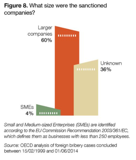
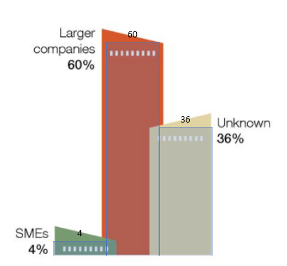
Yeah, and what's the answer? It's definitely not easy to get a proper feeling from this visualization. Never a good idea to reduce the readability just to get a "cool" style.
@f_thomassen I'd rather use a donut than a pie. It's easier to read, and nicer as well 🥳 A pie/donut can work well if you have 4 or fewer things to compare, and ideally with non-equal shares. If you've got anything more I'd go with bars.
If you're wondering 🤔 – the answer is that you're meant to look at the lower part of the columns. Could have been the tallest part. Could have been the average. Could have been the white dotted line 🤷♂️