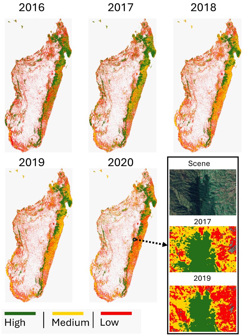
Do protected areas still maintain mammal assemblages of the past? Our work led by Dr. Jiekun He showed that this is true for ungulates, but not for large carnivores https://t.co/tEPApfVxdx
Nunca, JAMÁS, interpretes un coeficiente de correlación sin mirar antes el diagrama de dispersión. 📉
¿Por qué? Porque los números pueden ser engañosos. Existe un ejemplo clásico en estadística llamado el "Cuarteto de Anscombe".
#analytics#VisualizaciónDeDatos#Estadística
If you're still using raw R outputs for presentations, it's time for an upgrade! Tools like gtsummary bring your statistical results to life, making them much more digestible for non-technical audiences.
While base R functions like summary(fit) work well for statisticians, they can be too complex for stakeholders who aren’t familiar with the detailed output. The tbl_regression() function from gtsummary makes it easy to present regression results clearly.
In addition, gtsummary is highly versatile - it’s not just limited to linear regression. You can apply it to generalized linear models, survival analyses, and more. The package even allows you to include p-values, confidence intervals, and other important statistics directly within the tables, helping you to better communicate statistical results.
Here are a few standout benefits:
✅ Simplified output that’s easier for stakeholders to understand
✅ Works seamlessly with a variety of models
✅ Customizable tables with key statistics like p-values, confidence intervals, and more
The visualization included here was originally shared in a post by Dr. Alexander Krannich. Thanks to Alexander for inspiring me to create this post.
Interested in more tips on data science, statistics, Python, and R? Be sure to sign up for my free email newsletter! Check out this link for more details: https://t.co/ktUcWo9XpO
#datasciencetraining #StatisticalAnalysis #Rpackage #RStats #DataAnalytics #R4DS
An analysis of fossil mammals suggests that Mexico served as a long-term evolutionary “holding pen” where North American species adapted and diversified for millions of years before sweeping into South America 2.8 million years ago.
The findings in Science clarify the timing of one of Earth's most consequential migrations and may help explain why North American mammals were more successful migrants than those from South America. https://t.co/xGSNr2DPI7
🚨Desde hace +40 años se advierte sobre el uso incorrecto del R². Sin embargo, sigue siendo una de las métricas más malinterpretadas en los modelos de regresión.
Todavía se repite una afirmación tan popular como errónea:
"Si el R² es alto, el modelo es bueno."
Recordemos:👇🧵
La forma de descubrir paquetes en R está cambiando gracias a la IA
Imagina que necesitas realizar una tarea con R, pero no sabes si la función que buscas existe o no, y en qué paquete.
Esta app de IA tiene la solución👇
#RStats#ProgramacionR#DataScience#CienciaDeDatos
There are lies, damn lies, and statistics!
Este libro le mostrará la importancia de la estadística y el diseño experimental. #ciencia
¡Léalo antes de iniciar sus experimentos científicos!
https://t.co/SR7TzxGPnJ
GeoLibre v2.0.0 is here!
GeoLibre is a free and open-source geospatial platform that runs everywhere: as a native desktop app, in the browser, on Android, and embedded right inside Jupyter notebooks. It brings modern web mapping, cloud-native data formats, and a full processing toolbox together in one place, all built on MapLibre and https://t.co/Iu3zs18eJk with no proprietary lock-in.
Our first major release adds a true 3D globe, takes mapping beyond Earth to Mars and the Moon, lets styles round-trip with QGIS, and turns loaded vector layers into editable, save-back-to-source data.
What's new in v2.0.0
- Planetary mapping: explore Mars, the Moon, and other bodies with the OpenPlanetaryMap basemaps, a per-project ellipsoid, and a planet switcher right in the Layers panel.
- CesiumJS 3D globe: switch any map pane to a photorealistic 3D globe that stays camera-synced with your 2D maps and mirrors the layer stack.
- True 3D data: render vector layers with Z coordinates, load TIN/MultiPatch 3D shapefiles, and display KML/KMZ Collada (.dae) 3D models.
- Symbology interchange: import and export vector styling as OGC SLD, QGIS QML, and Mapbox GL style JSON, so styles round-trip between GeoLibre, QGIS, and the Mapbox/MapLibre ecosystem.
- Editable source layers: edit vector layers and write the changes back to their source, including GeoPackage and GeoJSON files and PostGIS database tables.
- Weather and sky: a new Weather menu with live cloud and precipitation radar overlays (RainViewer), plus a Google Earth-style sun position simulation for realistic lighting.
- Terrain and lighting: double-click the terrain control to set vertical exaggeration, and view any scene in true 3D relief.
- Smarter data import: bring in CSV without coordinates as an attribute table, split GPX track points and route points into separate layers, and load macOS-zipped and projected-CRS shapefiles.
- Raster in the browser: build normalized-difference indices for any HTTP COG and extract COG/WMS/XYZ bounding-box subsets client-side.
- Field Calculator upgrades: compute geometry length and area directly on your features.
- Attribute table: multi-select rows with Ctrl and Shift, plus faster navigation.
- Google Earth-style extras: "View in Google Maps / Google Earth" actions, camera-reset keyboard shortcuts, and a UTM easting/northing grid mode for the Gridlines overlay.
- New plugins: a Mapillary coverage and street-level image viewer, a Historical Imagery panel, and an Elevation Profile tool.
- Fully localized: all 13 language catalogs are complete, so the entire UI is translatable.
Try it out
- Launch GeoLibre Web: https://t.co/8gMtkVtfnm
- GitHub: https://t.co/VXq8c1o2Nd
- Documentation: https://t.co/7VA2AQoCUc
- Release notes: https://t.co/M0kRTsFXR0
#GIS #GeospatialData #OpenSource #RemoteSensing #DataVisualization #MapLibre #GeoLibre
While Principal Component Analysis (PCA) is a powerful tool for simplifying complex data, it's important to recognize its limitations. Awareness of these boundaries can help us use PCA more effectively and avoid potential pitfalls. Here's what to keep in mind:
Sensitivity to Scaling:
🔹 Issue: PCA is sensitive to the scale of your variables. Differences in variance due to scale can skew the analysis, giving undue weight to variables with larger scales.
🔹 Solution: Standardize data before applying PCA to ensure each variable contributes equally to the analysis.
Linear Assumptions:
🔹 Challenge: PCA assumes linearity, meaning it looks for linear relationships between variables. It might not capture complex, non-linear interactions well.
🔹 Consideration: Explore other dimensionality reduction techniques like t-SNE or UMAP for non-linear data structures.
Interpretation Difficulties:
🔹 Obstacle: The principal components generated by PCA are linear combinations of original variables and may not have a direct, interpretable meaning.
🔹 Approach: Careful examination and domain knowledge are necessary to interpret the components meaningfully.
Loss of Information:
🔹 Reality: Reducing dimensions means some information is inevitably lost. The discarded components, although less significant, might still contain valuable insights.
🔹 Balance: Decide on the number of components to retain by considering the trade-off between simplicity and information loss.
Making the Most of PCA:
Recognizing these limitations doesn't diminish PCA's value but rather enhances its utility by guiding its application. It's about using the right tool for the job, with a clear understanding of its capabilities and constraints.
Looking to deepen your understanding of PCA, including how to navigate its limitations in practice? Explore our comprehensive course on PCA in R programming. More information: https://t.co/DUfoAHuxxD
#datastructure #DataAnalytics #RStats #DataAnalytics #datasciencetraining #R4DS
Many people struggle with this: transforming data from long to wide format and vice versa. This common task in data analysis can make your analysis easier and more insightful.
Here’s why and when to reshape your data:
1️⃣ Long to Wide:
✅ Simplifies comparisons across multiple variables
✅ Ideal for creating summary tables
✅ Useful for visualization tools that prefer wide format
Example: Converting survey results where each row represents a response, and columns are questions. This helps in directly comparing responses to different questions.
2️⃣ Wide to Long:
✅ Helps in analysis when dealing with repeated measures
✅ Essential for certain types of statistical models
✅ Makes it easier to apply functions across groups
Example: Transforming yearly sales data from wide format (each year as a column) to long format (year as a variable). This allows for easier time-series analysis.
For R users, the pivot_wider and pivot_longer functions from the tidyverse are perfect tools to reshape your data effectively.
🔄 pivot_wider: Transforms long data into a wide format by spreading a key-value pair across multiple columns.
🔄 pivot_longer: Converts wide data into a long format by gathering columns into key-value pairs.
I've created a quick tutorial that explains how to apply these functions in R: https://t.co/6fn2WndeFh
If you want to improve your data manipulation and tidyverse skills in general, consider enrolling in my course, "Data Manipulation in R Using dplyr & the tidyverse."
More info: https://t.co/dCT2uwurEh
#coding #tidyverse #Rpackage #RStats #Data
🚨 new blog post!
"The Hidden Architecture of Ecological Networks Under Biodiversity Loss"
read the blog here: https://t.co/cNoiq6bfjm
and paper here: https://t.co/rG4tYl0Waf
@iadiza.conicet
@mflormiguel
GeoLibre v0.5.0 is out! This update significantly expands data format support, making it easier to work with a wide range of geospatial datasets in a lightweight, modern GIS environment.
Newly supported formats and services include: GeoJSON, Shapefile, GeoPackage, GeoParquet, KML/KMZ, FlatGeobuf, PMTiles MBTiles, GeoTIFF, Zarr, LiDAR point clouds, Gaussian Splatting, and ArcGIS services.
GeoLibre is a lightweight, cloud-native GIS built with MapLibre and Tauri. It runs directly in the browser and is also available as a standalone cross-platform desktop application at only ~30 MB.
GitHub: https://t.co/VXq8c1oACL
Website: https://t.co/7VA2AQpaJK
Live demo: https://t.co/Cq5Mg3oRDo
Feedback, ideas, and contributions are welcome.
#geospatial #opensource #maplibre
Recent studies have revealed the synchronization of neuromodulators including norepinephrine, serotonin, acetylcholine, dopamine, and histamine during sleep.
A new #ScienceReview explores what potential role the synchronization of these oscillations may play in health. https://t.co/fcDdHm1SDP
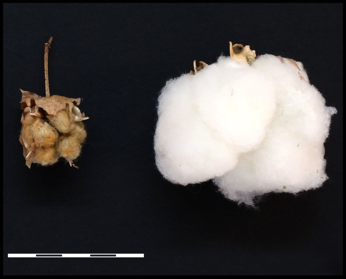
A study of wild cotton identifies the Yucatán Peninsula of México as the site of domestication for both perennial forms and later annualized cultivars. The process entailed long-term accumulation of mutations, rather than rapid changes. In PNAS: https://t.co/nlc5Ms4REg
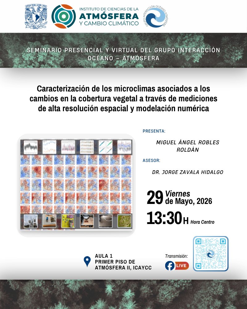
🌿🌡️ #ViernesDeSeminario | Grupo IOA
¿Por qué algunas zonas de una ciudad pueden sentirse más cálidas o frescas que otras? 🤔
Entérate este viernes 29 de mayo 👇
👨💻Miguel A. Robles
⏰ 13:30 h (Centro de México)
Síguenos en vivo: https://t.co/uOHwV0BE3h
#Clima#urbano