@benjamin_hilton@holmesjtg These are reminiscent of the Bradbury story A Sound of Thunder, in which time travellers to the past accidentally kill a butterfly. On their return to the present, everything is slightly different, and the spelling of words has changed minutely.
@paulg Does this make you query how suggestible everybody is? I.e. are you confident that you are not so massively wrong on other topics as are certain Russians/Trump supporters? I'm wondering what my/the west's blind spots are...
@driscollis Using Python 101 to write my first code: a 'solver' for Wordle, suggesting words based on letter frequencies. Has really helped my understanding of loops, functions, data types and conditional logic. Thanks! 🙏🐍
@cortexfutura@ejames_c Ha, I did not know that! Well thanks, I'm using your programming cloze cards to learn JS and emacs key bindings for ledger-cli and it's a great system.
@ejames_c@cortexfutura I found this article about learning R with spaced repetition really useful. I'm taking a similar approach with learning JavaScript. https://t.co/giJ6K5uy1W
@visakanv Except when watching TV, then it's: we are watching the exact same thing, why do you think I will know this thing the director has chosen to withhold from us? Perhaps, if we keep watching, we will find out!
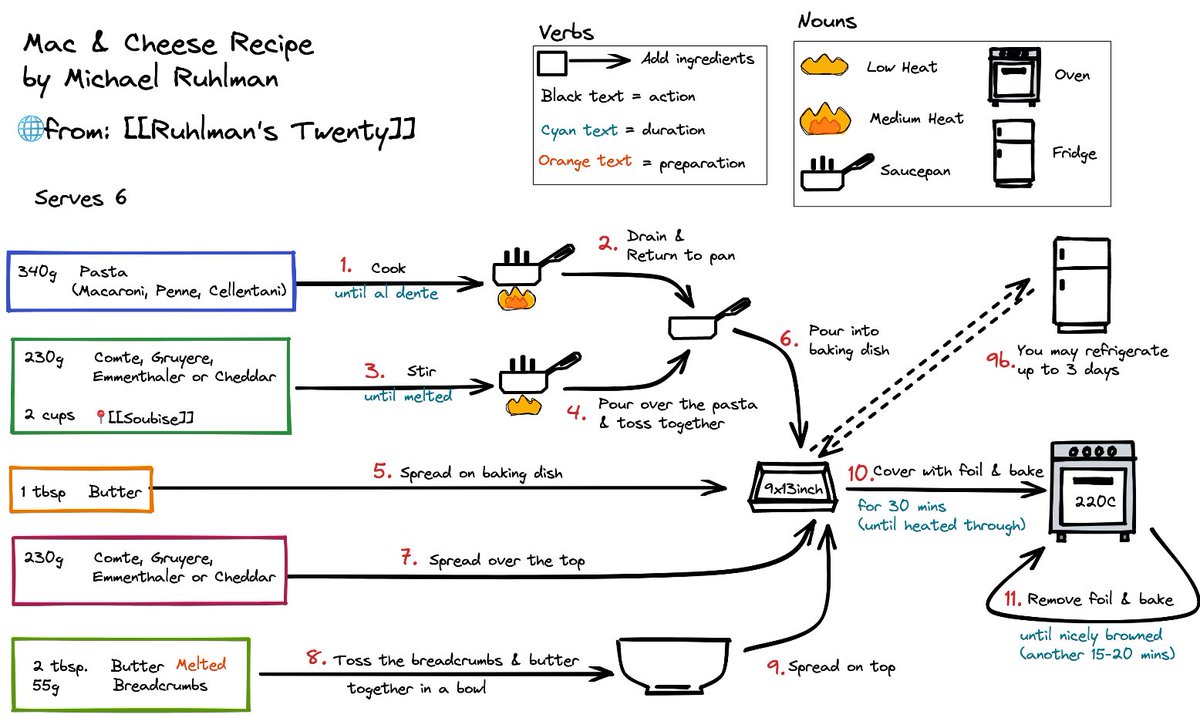
@stephsmithio Internet recipes are book recipes plus adverts. No attempt has been made to reflect that it is a different medium. A rethink is definitely overdue. https://t.co/2o6jRfSwEk
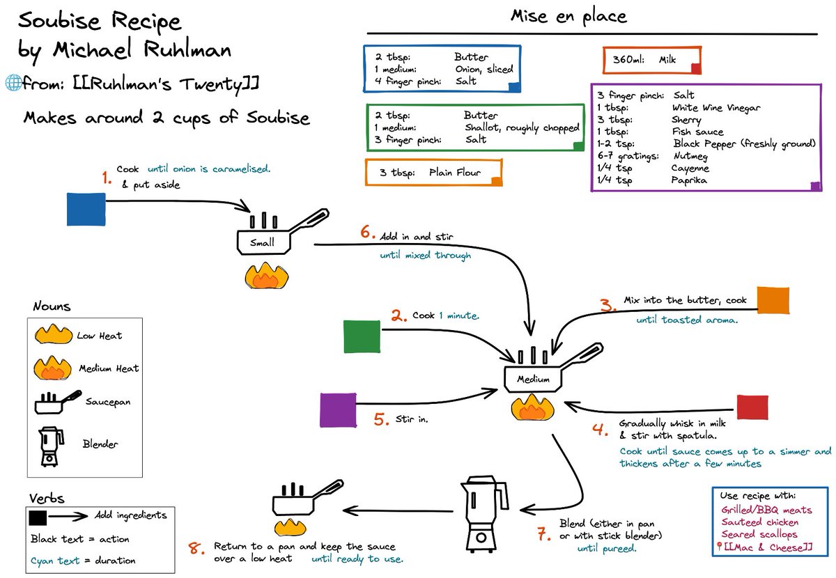
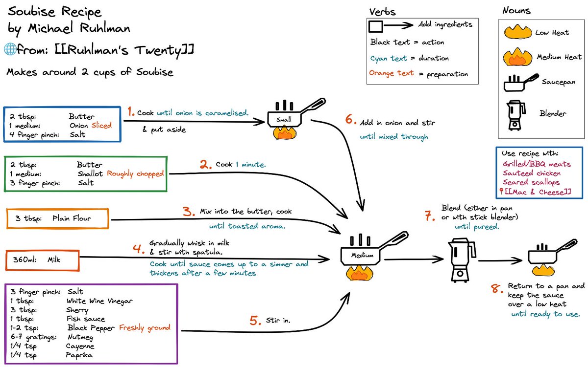
The presentation of recipes hasn’t changed much over the years, but can they be more effectively presented as visuals? Here’s two versions of a favourite recipe for Soubise sauce by @ruhlman using @excalidraw in @obsdmd. What do you think? Which do you find easier to follow?
@FredipusRex@ruhlman@excalidraw@obsdmd Haha it's hard to stop one you start tinkering. I think the final one is the best of them, and is the most straightforward visually. I'm definitely going to experiment with more complex recipes to see if they can be presented with the same clarity.
The presentation of recipes hasn’t changed much over the years, but can they be more effectively presented as visuals? Here’s two versions of a favourite recipe for Soubise sauce by @ruhlman using @excalidraw in @obsdmd. What do you think? Which do you find easier to follow?
@FredipusRex@ruhlman@excalidraw@obsdmd You opted to keep the ingredients together at the top, rather than integrated/aligned to the steps. Was this to keep the schema clear? One of my 'frustrations' with normal recipes us having to switch between the methods and ingredients, and losing my place.
@FredipusRex@ruhlman@excalidraw@obsdmd I think that's excellent, thanks for the redesign! I like your use of placeholders (red triangle), which definitely helps to keep the presentation tidy. What software was this in?
@streets_behind_ @ruhlman@excalidraw@obsdmd Thanks, I think that’s the consensus opinion. I want to try to combine the aesthetics of the first the practicality of the second!
@avierspaul @ruhlman@excalidraw@obsdmd Exactly! I find I’m always going forwards and backwards between the methods and ingredients and getting lost somewhere in between.
@z9sx7wox @ruhlman@excalidraw@obsdmd Thanks - that’s what I’m trying to achieve. For the reader to be firmly oriented in where in the recipe they are and what is coming up next.
@anymy@ruhlman@excalidraw@obsdmd Yeah that’s a good point - I think I can re-arrange somehow. It’s definitely my favourite from an aesthetic standpoint.
@ruhlman@excalidraw@obsdmd@ChronicleBooks Thanks so much - I’m game if you are! Love sketching out these recipes (as well as cooking them). Yeah, I agree that left looks better but right is easier to follow. Want them to be aesthetic but also convey the recipe as simply as possible!