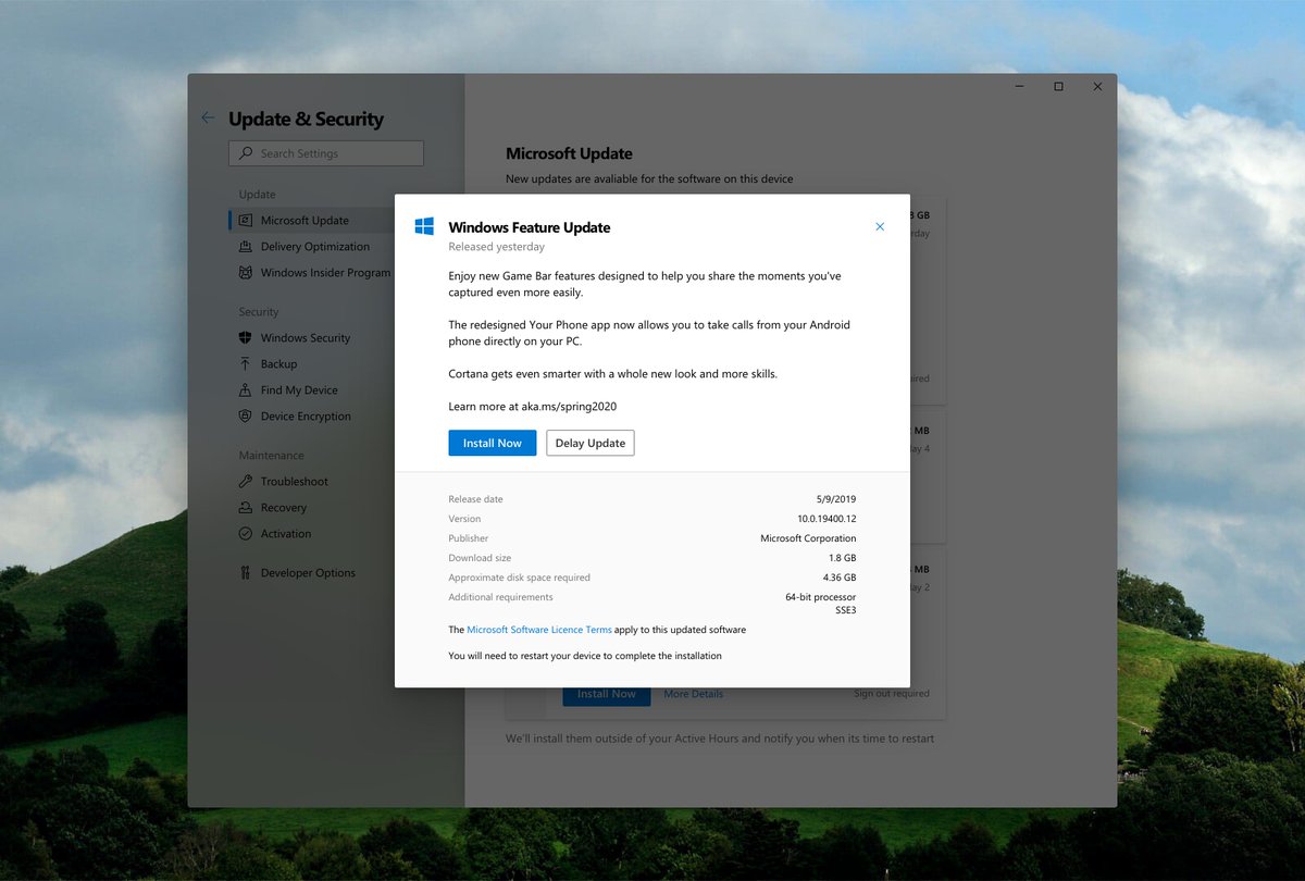
The “More Details” dialog gives you additional info such as version number, additional requirements, and required disk space.
(Wording of things needs to be improved.)
Saw a tweet that got me thinking: How could the update experience be refined?
I think it’s time Windows went back to showing more information on what you’re about to install, and also let you install them separately.
It's refreshing to set yourself a goal that doesn't have any extra constraints.
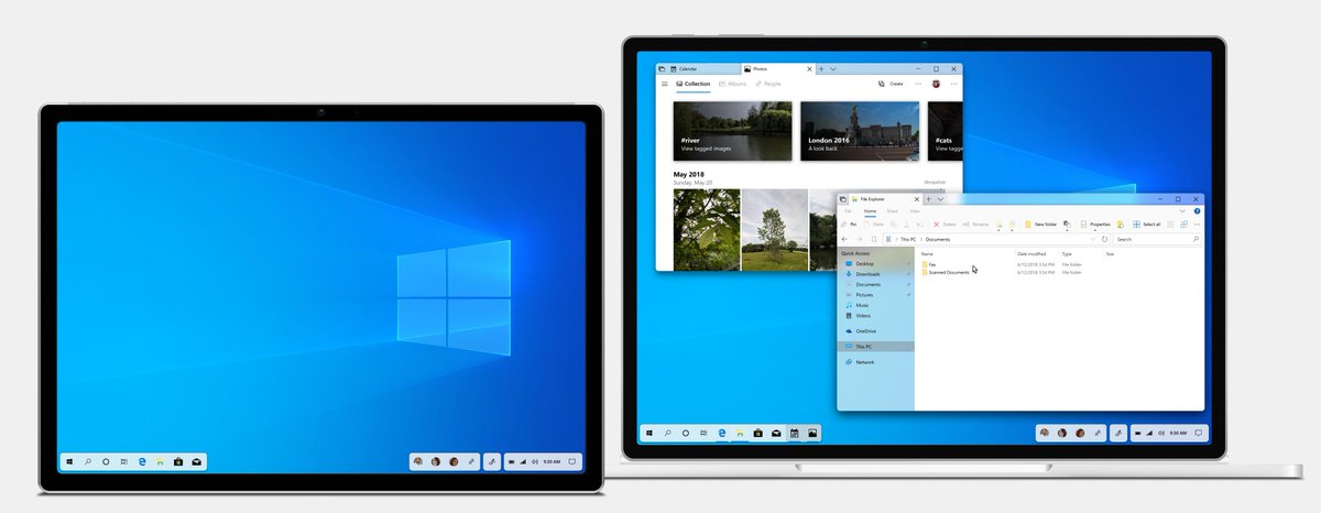
A lot of the Explorer work I have done so far focuses on retaining existing ideas—so what about something that takes a lot more inspiration from OneDrive web and other file managers? (WIP) 🗃✨
I have always wondered how the Windows experience could be further tailored for tablets—even more drastically than Windows 8 was.
Many different ideas later, I've finally settled on something and I wanted to share the initial design.
Meet "Cortana OS" (working title).
Office's icons have been given a visual overhaul. Maybe it's time the splash screens also changed? (excuse the slightly off colors, I had to pick them directly off the marketing material)
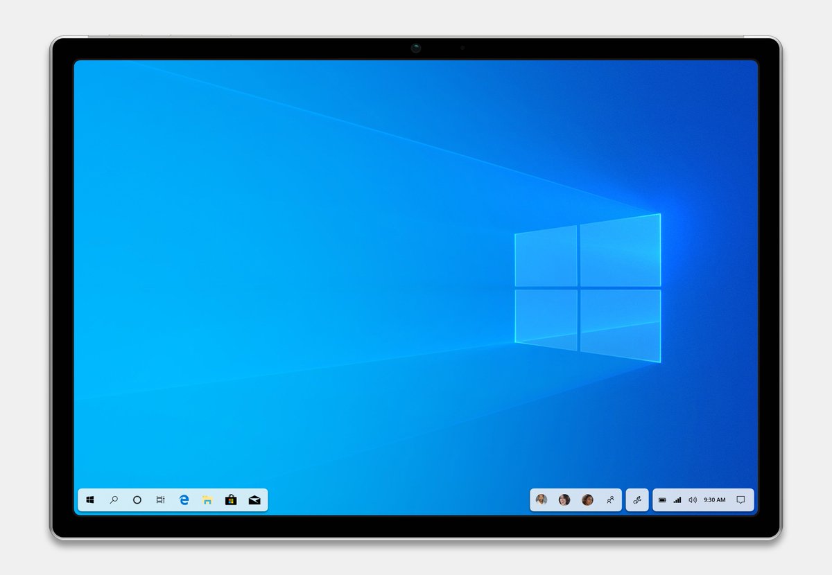
Weird thing that popped into my head earlier: a Surface Pro with thinner bezels and rounded screen corners with the floating taskbar concept also having rounded corners to match.
Not the best, but here's a couple of mocked up photos showing on this new screen would look "on-device".
Yeah...SP4s, but the overall chassis design hasn't changed much since then, especially the screen.
(Image credits: https://t.co/U4Uds16bnv and https://t.co/aqvzoUGhJT)
Apple made a big move with its desktop app store. We asked @ItsMichaelWest to envision what would happen if Microsoft followed suit. https://t.co/eFsi7cDFwh
I've been working with @itsmichaelwest on a concept work of Windows for foldable devices. We're calling it #projectmeta. Stay tuned.
https://t.co/DBJWzhJ9ml
https://t.co/Ke9nEpbjPW
https://t.co/MqyNlGwYSg